
Search results for "Traffic areas" in Home Design Ideas

 Main Line Kitchen Design
 is a unique business model! We are a group of skilled Kitchen Designers each with many years of experience planning kitchens around the Delaware Valley. And we are cabinet dealers for 8 nationally distributed cabinet lines much like traditional showrooms.
Appointment Information
Unlike full showrooms open to the general public, Main Line Kitchen Design works only by appointment. Appointments can be scheduled days, nights, and weekends either in your home or in our office and selection center. During office appointments we display clients kitchens on a flat screen TV and help them look through 100’s of sample doorstyles, almost a thousand sample finish blocks and sample kitchen cabinets. During home visits we can bring samples, take measurements, and make design changes on laptops showing you what your kitchen can look like in the very room being renovated. This is more convenient for our customers and it eliminates the expense of staffing and maintaining a larger space that is open to walk in traffic. We pass the significant savings on to our customers and so we sell cabinetry for less than other dealers, even home centers like Lowes and The Home Depot.
We believe that since a web site like Houzz.com has over half a million kitchen photos, any advantage to going to a full kitchen showroom with full kitchen displays has been lost. Almost no customer today will ever get to see a display kitchen in their door style and finish because there are just too many possibilities. And the design of each kitchen is unique anyway. Our design process allows us to spend more time working on our customer’s designs. This is what we enjoy most about our business and it is what makes the difference between an average and a great kitchen design. Among the kitchen cabinet lines we design with and sell are Jim Bishop, 6 Square, Fabuwood, Brighton, and Wellsford Fine Custom Cabinetry.
 Robin's Nest Interiors
LIVING ROOM
This week’s post features our Lake Forest Freshen Up: Living Room + Dining Room for the homeowners who relocated from California. The first thing we did was remove a large built-in along the longest wall and re-orient the television to a shorter wall. This allowed us to place the sofa which is the largest piece of furniture along the long wall and made the traffic flow from the Foyer to the Kitchen much easier. Now the beautiful stone fireplace is the focal point and the seating arrangement is cozy. We painted the walls Sherwin Williams’ Tony Taupe (SW7039). The mantle was originally white so we warmed it up with Sherwin Williams’ Gauntlet Gray (SW7019). We kept the upholstery neutral with warm gray tones and added pops of turquoise and silver.
We tackled the large angled wall with an oversized print in vivid blues and greens. The extra tall contemporary lamps balance out the artwork. I love the end tables with the mixture of metal and wood, but my favorite piece is the leather ottoman with slide tray – it’s gorgeous and functional!
The homeowner’s curio cabinet was the perfect scale for this wall and her art glass collection bring more color into the space.
The large octagonal mirror was perfect for above the mantle. The homeowner wanted something unique to accessorize the mantle, and these “oil cans” fit the bill. A geometric fireplace screen completes the look.
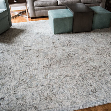
The hand hooked rug with its subtle pattern and touches of gray and turquoise ground the seating area and brings lots of warmth to the room.
DINING ROOM
There are only 2 walls in this Dining Room so we wanted to add a strong color with Sherwin Williams’ Cadet (SW9143). Utilizing the homeowners’ existing furniture, we added artwork that pops off the wall, a modern rug which adds interest and softness, and this stunning chandelier which adds a focal point and lots of bling!
The Lake Forest Freshen Up: Living Room + Dining Room really reflects the homeowners’ transitional style, and the color palette is sophisticated and inviting. Enjoy!
 Tile Doctor Ltd
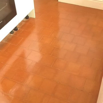
Here’s a job I recently completed in the heartland of the English pottery industry, Stoke-on-Trent. In this particular instance I was commissioned by my client to restore the appearance of the Quarry tiled floor in her kitchen which as you can see from the photo below was far from looking it’s best. Quarry tiles are typically a very hard wearing stone, but in high traffic areas like a kitchen, even this type of tile will require regular maintenance.
My first task, before beginning the restoration, was to remove the kickboards from around the bottom of the kitchen units, to prevent them from being damaged during the process. The next step was to acid wash the tiles using Tile Doctor Grout Clean-Up which was scrubbed into the tiles to remove old grout and plaster that had become stuck to the surface of the tiles at some point in the past. Once this had done its job I rinsed the entire floor with water washing away the excess soiled residue and any trace of acid.
The next step was to give the tiles a good clean using Tile Doctor Pro Clean, which is a high alkaline cleaner suitable for use on a range of natural stone floors. This was left to dwell on the tiles for ten minutes, allowing it time to seep into the stone to get underneath – and lift out – the ingrained dirt. I then agitated the solution with a scrubbing brush to remove the muck from the surface of the tiles. The floor was then given another rinse with water, and this was extracted using a wet vacuum.
I left the floor to dry after cleaning for more than 24 hours, making sure that it would be ready for sealing the next day. Upon my return to the house I checked the floor was dry and then sealed the floor using four coats of Tile Doctor Seal & Go, which provides a robust surface seal and a durable low-sheen finish. The product is suitable for use on internal, unsealed, porous surfaces.
The photographs above bears witness to the massive improvement which has been made to the quarry tiles, which has not only completely transformed the look of the tiles but also the appearance of the kitchen.
Trevor Preece
Staffordshire Tile Doctor
Find the right local pro for your project
 Tile Doctor Ltd
Roundhay is an affluent area of North Leeds which is well-known for the fantastic Roundhay Park. The park is large enough to contain two lakes, extensive woodland, formal gardens and even golf courses! It’s the premier attraction for anyone fortunate enough to live in the area, or anyone visiting from nearby.
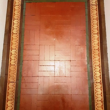
I recently visited a customer who lives in Roundhay and was looking for help in restoring the small Victorian tiled entranceway at the front of her house. The tiles were in a shocking state, but it’s not hard to imagine why – the entrance to a house receives a lot of foot traffic and is not typically taken care of regularly. These tiles were also marked with paint splashes left over from decoration work, making them look even worse.
The appearance of the entranceway did not set the right standard for the rest of the house, so the property owner was keen to have it restored professionally.
The appearance of the entranceway did not set the right standard for the rest of the house, so the property owner was keen to have it restored professionally.
The appearance of the entranceway did not set the right standard for the rest of the house, so the property owner was keen to have it restored professionally.
The appearance of the entranceway did not set the right standard for the rest of the house, so the property owner was keen to have it restored professionally.
I informed the customer that I could have the tiles rejuvenated within a day’s work. To begin, I used a scrapper and wire wool brush to manually remove some of the most stubborn paint marks.
Following this, I applied a strong solution of Tile Doctor Remove and Go, before leaving the product to dwell for about an hour. Remove and Go is multi-purpose stripping agent that can remove any adhesive and paint deposits, as well as many types of old coatings and sealers.
To work the product deep into the tiles, I agitated with an abrasive cleaning pad and then rinsed the area with fresh water. This had the desired affect and all the unsightly paint marks were removed.
Next, I gave the floor another thorough clean to remove any general muck and ingrained dirt. This was done using our high-alkaline cleaner, which we typically use on Victorian tiles, known as Tile Doctor Pro-Clean. In fact, Pro-Clean is a very reliable cleaner for all types of tile and grout including natural stone, Limestone, Slate and Travertine, amongst others.
Since I told the customer I would able to finish the job within a day, I dried the floor quickly using a heat gun so it could be sealed there and then. To seal the floor, I applied four coats of Tile Doctor Seal and Go, which is a topical sealer formulated to provide maximum protection along with a high-quality, low sheen finish.
As you can see from the photos above, the entranceway was absolutely transformed. These tiles are now a true asset to the rest of the property, rather than looking out of place! I’m please to say my customer was amazed by how quickly such a big difference could be made and left the following glowing feedback.
I can’t believe the before and after pictures. The restoration of the tiles is top quality, they are so much brighter and richer in colour – especially without the garage paint hiding the detail! Nigel did an amazing job, even better than I could have hoped for, and is a lovely guy as well. Would definitely recommend.
Nigel Stoker
North West Yorkshire Tile Doctor
 Twelve Stones Designs, LLC
The owners of this kitchen had spent the money to upgrade the finishes in their kitchen upon building the home 12 years ago, but after living in the space for several years they realized how nonfunctional the layout really was. The (then) two preschool aged children had grown into busy, hungry teenagers with many friends who also liked to hang out at the house. So the family needed a more functional kitchen with better traffic flow, space for daily activities revolving around the kitchen at different times of day, and a kitchen that could accommodate cooking for and serving large groups. Furthermore, the dark, traditional finishes no longer reflected the homeowners’ style. They requested a brighter, more relaxed, coastal style that reflected their love of the seaside cities they like to visit.
Originally, the kitchen was U-shaped with a narrow island in the middle. The island created narrow aisles that bottle-necked at the dishwasher, refrigerator, and cooktop areas. There was a pass-through from the foyer into the kitchen, but the owners never liked that the pass-through was also located so close to the powder room. The awkward proximity was unappealing and made guests feel uncomfortable.
The kitchen’s storage was made up of lots of narrow cabinets, apothecary drawers, clipped corner units, and very few drawers. It lacked useful storage for the larger items the family used on a daily basis. And the kitchen’s only pantry was small closet that had only builder-grade, narrow shelving with no illumination to be able to see the contents inside.
Overall, the kitchen’s lighting plan was poorly executed. Only six recessed cans illuminated the entire kitchen and nook areas. The under cabinet lighting was not evenly distributed either. In fact, the builder had mis-placed the under cabinet lighting around the decorative pilasters which made for choppy, dark cubbies. Further, the builder didn’t include any lighting over the sink or the bar area, which meant whoever was doing the dishes was always in their own shadow. That, coupled with the steep overhang of the game room above made the bar area feel like a dim, cavernous space that wasn’t inviting or task oriented. The kitchen looked out into the main living space, but the raised bar and a narrow wall (which held the only large cabinet in the kitchen) created more of a barrier than a relationship to the living room or breakfast nook. In fact, one couldn’t even see the breakfast nook from the cooktop or sink areas due to its orientation. The raised bar top was too narrow to comfortably sit to either dine at or chat from due to the lack of knee space. The the homeowners confided that the kitchen felt more like a dark, dirty prison than place where the family, or their guests, wanted to gather and commune.
The clients' needs and desires were:
➢ to create a kitchen that would be a space the family loved to be in; to relate to the adjacent spaces all around, and to have better flow for entertaining large groups
➢ to remove the walls between the breakfast nook and living area and to be able to utilize the natural light from the windows in both those areas
➢ to incorporate a functional chopping block for prepping fresh food for home cooked meals, an island with a large sink and drain board, 2 pull out trash cans, and seating for at least the 2 teens to eat or do homework
➢ to design a kitchen and breakfast nook with an airy, coastal, relaxed vibe that blended with the rest of the house's coastal theme
➢ to integrate a layered lighting plan which would include ample general illumination, specific task lighting, decorative lighting, and lots of illuminated storage
➢ to design a kitchen with not only more storage for all the husband’s kitchen gadgets and collection of oils and spices, but smart storage, including a coffee/breakfast bar and a place to store and conceal the toaster oven and microwave
➢ to find a way to utilize the large open space between the kitchen, pantry area, and breakfast nook
Twelve Stones Designs achieved the owner's goals by:
➢ removing the walls between the kitchen and living room to allow the natural light to filter in from the adjacent rooms and to create a connection between the kitchen, nook, and living spaces for a sense of unity and communion
➢ removing the existing pantry and designing 3 large pantry style cabinets with LED tape lights and rollout drawers to house lots of kitchen appliances, gadgets, and tons of groceries. We also took the cabinets all the way up to the 9’ ceiling for additional storage for seasonal items and bulk storage.
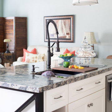
➢ designing 2 islands - 1 with a gorgeous black walnut chopping block that houses a drawer for chopping and carving knives and a custom double pull out trash unit for point of use utilization - and 1 that houses the dishwasher, a large Blanco Gourmet sink with integrated drain board, woven baskets for fresh root vegetables and kitchen towels, plenty of drawer storage for kitchen items, and bar seating for up to 4 diners.
➢ closing off the space between the kitchen and the powder room to create a beautiful new private alcove for the powder room as well as adding some decorative storage. This also gave us space to include more tall storage near the new range for precision placement of the husband’s extensive oil and spice collection as well as a location for a combo-steam oven the wife wanted for baking and cooking healthy meals.
The project is enhanced functionally by:
➢ incorporated USB and standard receptacles for the kids’ laptops and phone charging in the large island
➢ designing the small island to include additional open shelving for items used on a daily basis such as a variety of bowls, plates, and colanders. This set up also works well for the husband who prefers to “plate” his dinners in restaurant-style fashion before presenting them to the table.
➢ the integration of specific storage units, such as double stacked cutlery drawers, a custom spice pull-out, a Kuerig coffee and tea pod drawer, and custom double stacked utensil drawers
➢ moving the refrigerator to the old oven location - this eliminated the bottle neck as well as created a better relationship to the eating table. It also utilizes the floor space between the pantry, nook, and kitchen
➢ creating a banquet style breakfast nook - this banquette seating not only doubles the amount of seating for large gatherings but it better utilizes the odd space between the kitchen and the previous nook area. It also helps to create a distinct pathway from the mudroom room through the pantry area, kitchen, nook, and living room.
➢ the coffee/breakfast bar area which includes the perfect location for the concealed microwave and toaster oven, convenient storage for the coffee pods and tea accoutrements. Roll-out drawers below also house the smoothie maker, hot water kettle, and a plethora of smoothie-making ingredients such as protein powders, smoothie additives, etc. Furthermore, the drawers below the Keurig house measuring utensil, cutlery, baking supplies and tupperware storage.
➢ incorporating lots of wide drawers and pullouts to accommodate large cookware.
➢ utilizing as much vertical space as possible by building storage to the ceiling which accommodates the family’s abundant amount of serving platters, baking sheets, bakeware, casserole dishes, and additional cutting boards.
The project is enhanced aesthetically by:
➢ new 5-piece Versailles pattern porcelain tile that now seamlessly joins the entire down stairs area together creating a bright, cohesiveness feeling instead of choppy separated spaces - it also adds a coastal feeling
➢ designing a cabinet to conceal the microwave and toaster oven
➢ the coastal influenced light fixtures over the nook table and island
➢ the sandy colors of the Langdon Cambria countertops. The swirling pattern and sparkling quartz pieces remind the homeowner of black-and-tan sandy beaches
➢ the striped banquet seating whose creamy white background and blue-green stripes were the inspiration for the cabinet and wall colors.
➢ All the interior doors were painted black to coordinate with the blacks and grays in the backsplash tile and countertop. This also adds a hint of tailored formality to an otherwise casual space.
➢ the use of WAC's Oculux small aperture LED units for the overhead lighting complimented with Diode LED strips for task lighting under the cabinets and inside the pantry and glass wall cabinets. All of the lighting applications are on separate dimmer switches.
Innovative uses of materials or construction methods by Realty Restoration LLC:
➢ Each 1-1/2” x 3” block of reclaimed end-grain black walnut that makes up the center island chopping block was hand milled and built in the shop. It was designed to look substantial and proportional to the surrounding elements, executed by creating the 4 inch tall top with a solid wood chamfered edge band.
➢ The metal doors on either side of the vent hood were also custom designed for this project and built in the Realty Restoration LLC shop. They are made 1x2, 11-gauge mild steel with ribbed glass. Weighing 60 lbs a piece, heavy duty cabinet hinges were added to support the weight of the door and keep them from sagging.
➢ Under-cabinet receptacles were added along the range wall in order to have a clean, uninterrupted backsplash.
Design obstacles to overcome:
➢ Because we were removing the demising walls between the kitchen and living room, we had to find a way to plumb and vent the new island. We did this by tunneling through the slab (the slab had post tension cables which prevented us from just trenching) to run a new wet vent through a nearby structural wall. We pulled the existing hot and cold lines between upper floor joists and ran them down the structural wall as well and up through a conduit in the tunnel.
➢ Since we were converting from wall overs to a gas range it allowed us to utilize the 220 feed for the wall ovens to provide a new sub panel for all the new kitchen circuits
➢ Due to framing deficiencies inherited from the original build there was a 1-1/2” differential in the floor-to-ceiling height over a 20 foot span; by utilizing the process of cutting and furring coupled with the crown moulding details on the cabinet elevations we were able to mask the problem and provide seamless transitions between the cabinet components.
Evidence of superior craftsmanship:
➢ uniquely designed, one-of-a-kind metal “X” end panels on the large island. The end panels were custom made in the Realty Restoration LLC shop and fitted to the exact dimensions of the island. The welding seams are completely indistinguishable - the posts look like they are cut from a single sheet of metal
➢ square metal posts on the small island were also custom made and designed to compliment and carry through the metal element s throughout the kitchen
➢ the beautiful, oversized end panels on the pantry cabinets which give the breakfast nook a tailored look
➢ integrating a large format 5 piece Versailles tile pattern to seamlessly flow from the existing spaces into the new kitchen space
➢ By constructing a custom cabinet that jogged around a corner we could not remodel (housing the entry way coat closet) we were able to camouflage the adjacent wall offset within the upper and lower cabinets. By designing around the existing jog in the structural walls we accomplished a few things: we were able to find the space to house, and hide, the microwave and toaster oven yet still have a clean cohesive appearance from the kitchen side. Additionally, the owners were able to keep their much needed coat closet and we didn’t have to increase the budget with unnecessary structural work.

 Skill Construction & Design, LLC
It sparkles, it shimmers, it glitters, its glass. Glass mosaics are everywhere, from gorgeous kitchen backsplashes like this one, to color baths and reflective fireplaces. But as beautiful as this backsplash is, it’s only the beginning of this great kitchen.
Our kitchen begins with a little bump, a simple little peninsula with room for one. Upon the deep dark espresso cabinets sits the contrasting countertop. The super glossy white stone with subtle swirls reflects the colors of the glass mosaics. We gave the peninsula a little overhang and pulled up an enticing contemporary stool.
Although the kitchen space is fairly large, two walls contained openings to other spaces, while a third contained a large and sunny bay window. Rather than bottle neck our traffic flow, we chose to make the most of the walls we had. We started with a deep undermount stainless steel sink with a far-reaching faucet with pull out spray. Beside this, we placed our contemporary stainless steel dishwasher.
To keep the feeling open and airy we installed dark floating shelves, which really pop against our multicolored glass backsplash. We added lighting under the bottom shelf for extra sparkle, as well as the perfect task lighting.
We needed some wall cabinets, not just for storage but to compliment our microwave. Above the stainless steel stove our matching microwave serves multipurpose, from cooking, to venting, to task lighting the stove. When space counts, make the most of it. We nestled our stove beside the dishwasher, giving ourselves room for a landing zone at the end. The cooking area feels even more spacious set next to our large bay window.
To give us the greatest amount of storage, we added a floor to ceiling pantry. Although it is only 12″ deep, it’s 48″ wide. The clean “slab” style door create an uncluttered look that compliments the patterning of the floor. We used 6″ x 24″ porcelain wood look flooring. This flooring exploded on the market not too long ago, giving you the look of hardwoods, without fear of water, dents and scratches. The floor will never need to be refinished, no matter how much abuse it takes.
Look at all that storage. There’s even room on the bottom for that huge mixer we all seem to have. The pantry gives us plenty of room for all we need to store and it’s 12″ depth means it’s easy to find what you’re looking for. No more pulling out half your stored items just to find that product in the very back.
We round out this fabulous kitchen with a full-sized, bottom freezer, French door refrigerator. Espresso panels encase the sides while a deep and tall upper cabinet gives us room to store some more. By placing the refrigerator between the two entrances to the kitchen, family and friends can get a beverage without getting in the cook’s way.
To direct our lighting around the room and focus on specific areas, we used a long track of spot lights with a contemporary look. Between the window in the daytime, spots and undercabinet lights at night, the kitchen is always bright, even with the darker cabinetry.
http://www.rjkconstructioninc.com/
 Skill Construction & Design, LLC
It sparkles, it shimmers, it glitters, its glass. Glass mosaics are everywhere, from gorgeous kitchen backsplashes like this one, to color baths and reflective fireplaces. But as beautiful as this backsplash is, it’s only the beginning of this great kitchen.
Our kitchen begins with a little bump, a simple little peninsula with room for one. Upon the deep dark espresso cabinets sits the contrasting countertop. The super glossy white stone with subtle swirls reflects the colors of the glass mosaics. We gave the peninsula a little overhang and pulled up an enticing contemporary stool.
Although the kitchen space is fairly large, two walls contained openings to other spaces, while a third contained a large and sunny bay window. Rather than bottle neck our traffic flow, we chose to make the most of the walls we had. We started with a deep undermount stainless steel sink with a far-reaching faucet with pull out spray. Beside this, we placed our contemporary stainless steel dishwasher.
To keep the feeling open and airy we installed dark floating shelves, which really pop against our multicolored glass backsplash. We added lighting under the bottom shelf for extra sparkle, as well as the perfect task lighting.
We needed some wall cabinets, not just for storage but to compliment our microwave. Above the stainless steel stove our matching microwave serves multipurpose, from cooking, to venting, to task lighting the stove. When space counts, make the most of it. We nestled our stove beside the dishwasher, giving ourselves room for a landing zone at the end. The cooking area feels even more spacious set next to our large bay window.
To give us the greatest amount of storage, we added a floor to ceiling pantry. Although it is only 12″ deep, it’s 48″ wide. The clean “slab” style door create an uncluttered look that compliments the patterning of the floor. We used 6″ x 24″ porcelain wood look flooring. This flooring exploded on the market not too long ago, giving you the look of hardwoods, without fear of water, dents and scratches. The floor will never need to be refinished, no matter how much abuse it takes.
Look at all that storage. There’s even room on the bottom for that huge mixer we all seem to have. The pantry gives us plenty of room for all we need to store and it’s 12″ depth means it’s easy to find what you’re looking for. No more pulling out half your stored items just to find that product in the very back.
We round out this fabulous kitchen with a full-sized, bottom freezer, French door refrigerator. Espresso panels encase the sides while a deep and tall upper cabinet gives us room to store some more. By placing the refrigerator between the two entrances to the kitchen, family and friends can get a beverage without getting in the cook’s way.
To direct our lighting around the room and focus on specific areas, we used a long track of spot lights with a contemporary look. Between the window in the daytime, spots and undercabinet lights at night, the kitchen is always bright, even with the darker cabinetry.
http://www.rjkconstructioninc.com/
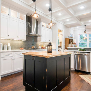

 Robin's Nest Interiors
It was a pleasure to help this single dad transform a previous French Country motif into a Handsome Space with Masculine Vibe. The homeowner loves the blues you find in the Caribbean so we used those as accent colors throughout the rooms.
Entry
We painted the walls Sherwin Williams’ Latte (SW6108) to add warmth. We accessorized the homeowner’s beautiful burl wood cabinet with vibrant artwork and whimsical Chinese horses. I always recommend task lighting in a Foyer, if possible, and the rectangular lamp shade is the perfect shape to fit on the small end of the cabinet.
Powder Room
I adore the Candace Olson wallpaper we used in the Powder Room. The blocks look like sections of wood. It works great with the existing granite. Other examples of wallpaper here and here.
Great Room
We touched every surface in this Great Room from painting the walls Nomadic Desert (SW6107) to painting the ceiling Double Latte (SW9108) to make the room feel cozier to replacing the carpet with this transitional style with striated pattern to painting the white built-ins.
Furniture placement was a real challenge because the grand piano needed to stay without blocking the traffic flow through the space. The homeowner also wanted us to incorporate his chess table and chairs. We centered a small seating area in front of the fireplace utilizing two oversized club chairs and an upholstered ottoman with a wood tray that slides. The wood bases on the chairs helps their size not overpower the room. The velvet ottoman fabric with navy, azure, and teal blues is a showstopper.
We used the homeowner’s wonderful collection of unique puzzle boxes to accessorize the built-ins. We just added some pops of blues, greens and silver. The homeowner loves sculptural objects so the nickel twig wall decor was the perfect focal point above the mantle. We opted not to add anything to the mantle so it would not distract from the art piece.
We added decorative drapery panels installed on short rods between each set of doors. The homeowner was open to this abstract floral pattern in greens and blues!
We reupholstered the cushions for the chess table chairs in a fun geometric fabric that coordinates with the panel fabric. The homeowner does not use this set of doors to access the deck so we were able to position the table directly in front of them.
Kelly Sisler of Kelly Faux Creations worked her magic on the built-ins. We used Sherwin Williams’ Mega Greige (SW7031) as the base and then applied a heavy bronze glaze. It completely transformed the Great Room. Other examples of painting built-ins here and here.
We hoped you enjoyed this Handsome Space with Masculine Vibe. It was quite a transformation!
 Skill Construction & Design, LLC
It sparkles, it shimmers, it glitters, its glass. Glass mosaics are everywhere, from gorgeous kitchen backsplashes like this one, to color baths and reflective fireplaces. But as beautiful as this backsplash is, it’s only the beginning of this great kitchen.
Our kitchen begins with a little bump, a simple little peninsula with room for one. Upon the deep dark espresso cabinets sits the contrasting countertop. The super glossy white stone with subtle swirls reflects the colors of the glass mosaics. We gave the peninsula a little overhang and pulled up an enticing contemporary stool.
Although the kitchen space is fairly large, two walls contained openings to other spaces, while a third contained a large and sunny bay window. Rather than bottle neck our traffic flow, we chose to make the most of the walls we had. We started with a deep undermount stainless steel sink with a far-reaching faucet with pull out spray. Beside this, we placed our contemporary stainless steel dishwasher.
To keep the feeling open and airy we installed dark floating shelves, which really pop against our multicolored glass backsplash. We added lighting under the bottom shelf for extra sparkle, as well as the perfect task lighting.
We needed some wall cabinets, not just for storage but to compliment our microwave. Above the stainless steel stove our matching microwave serves multipurpose, from cooking, to venting, to task lighting the stove. When space counts, make the most of it. We nestled our stove beside the dishwasher, giving ourselves room for a landing zone at the end. The cooking area feels even more spacious set next to our large bay window.
To give us the greatest amount of storage, we added a floor to ceiling pantry. Although it is only 12″ deep, it’s 48″ wide. The clean “slab” style door create an uncluttered look that compliments the patterning of the floor. We used 6″ x 24″ porcelain wood look flooring. This flooring exploded on the market not too long ago, giving you the look of hardwoods, without fear of water, dents and scratches. The floor will never need to be refinished, no matter how much abuse it takes.
Look at all that storage. There’s even room on the bottom for that huge mixer we all seem to have. The pantry gives us plenty of room for all we need to store and it’s 12″ depth means it’s easy to find what you’re looking for. No more pulling out half your stored items just to find that product in the very back.
We round out this fabulous kitchen with a full-sized, bottom freezer, French door refrigerator. Espresso panels encase the sides while a deep and tall upper cabinet gives us room to store some more. By placing the refrigerator between the two entrances to the kitchen, family and friends can get a beverage without getting in the cook’s way.
To direct our lighting around the room and focus on specific areas, we used a long track of spot lights with a contemporary look. Between the window in the daytime, spots and undercabinet lights at night, the kitchen is always bright, even with the darker cabinetry.
http://www.rjkconstructioninc.com/
 Horticultural Solutions, LLC
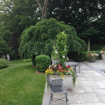
This lushous tree at the corner of the pool deck is coming in nicely. We planted it a few years ago and have shaped it for artistic expression & development.
The owners of the property really enjoy to labors of our love.
Great pools and property deserve beautiful Urns at point. This helps with the flow of the traffic to and from the pool house or main house in addition to adding color when the perennial gardens haven't come in as of yet.
This property is in Bedford, New York.
Many find rejuvenation and relaxation by vacationing in lavish resorts that offer beautiful atmospheres or surroundings, imagine getting that escape in your own home. This can include walking gardens taking your imagination to places. We offer experiences in our design through accents of moss covered toad stools, crafted areas of flower blooms amongst floor greens leading to layered boulder settings to rest, or extended stone patio areas dressed in overflowing urns and the light sounds of soothing water flow which is then completed with the view from the entertaining outdoor bar of lush lawns spotted with magically shaped White Oaks. These details describe some of which inspire and our customers. Great gardens can do great things for the beholder. We create healthy and sustainable all season environments of fragrance, color and visual depth.
We are proud to be Fairfield and Westchester County’s Fine Landscaping and Landscape Maintenance Service Company by providing our clients with over 30 years of what they expect from a quality design, installation and follow-up landscaper.
We are fully insured and licensed by the State of Connecticut and the County of Westchester and specialized in servicing the landscape needs of the finest of homes in Greenwich, New Canaan, Bedford Hills, Chappaqua, Armonk and several other beautiful towns and hamlets surrounding them. We believe that some key characteristics of our business set us apart from other landscapers. The mentality built into our age and experience allows us to serve all landscaping and hardscaping projects— as large as they may get — while also being reliable and responsive. We are a locally owned business which means that each client receives individualized service based on their needs and their landscape’s growing conditions. To minimize the damage done to garden beds and hardscapes (pathways, waterfalls and pools) from other portions of the property’s maintenance, so we offer these services along with the garden servicing plan, entitled The ‘All Scapes’ Maintenance Service Agreement . Please contact us any time of the year. We are always working on something to beautify your world.
See us at our website: http://www.horticulaturalsolutionsny.com
Landscape Design: http://www.horticulaturalsolutionsny.com/gallery
Landscape Plans: http://www.horticulturalsolutionsny.com/design
Landscape Consultation: http://www.horticulturalsolutionsny.com/consultation
Tree installation: See us at our website: http://www.horticulturalsolutionsny.com/trees
Masonry: See us at our website: http://www.horticulturalsolutionsny.com/masonry
Portfolio: http://www.horticulturalsolutionsny.com/portfolio
Bedford Hills Portfolio: http://www.horticulturalsolutionsny.com/portfolio/BedfordHills
New Canaan Portfolio: http://www.horticulturalsolutionsny.com/portfolio/NewCanaan
Fairfield County Portfolio: http://www.horticulturalsolutionsny.com/portfolio/Fairfield
Westport Portfolio: http://www.horticulturalsolutionsny.com/portfolio/Westport
Greenwich Portfolio: http://www.horticuturalsolutionsny.com/portfolio/Greenwich
Katonah Portfolio: http://www.horticulturalsolutionsny.com/portfolio/Katonah
Chappaqua Portfolio: http://www.horticulturalsolutionsny.com/portfolio/Chappaqua
Armonk Portfolio: http://www.horticulturalsolutionsny.com/portfolio/Armonk
Scardale Portfolio: http://www.horticulturalsolutionsny.com/portfolio/Scardale
Pound Ridge Portfolio: http://www.horticulturalsolutionsny.com
Landscape Design: http://www.horticulturalsolutionsny.com/gallery
Landscape Plans: http://www.horticulturalsolutionsny.com/design
Landscape Consultation: http://www.horticulturalsolutionsny.com/consultation
Tree installation: See us at our website: http://www.horticulturalsolutionsny.com
Masonry: See us at our website: http://www.horticulaturalsolutionsny.com
Portfolio: http://www.horticulturalsolutionsny.com
Bedford Hills Portfolio: http://www.horticulturalsolutionsny.com
New Canaan Portfolio: http://www.horticulturalsolutionsny.com
Fairfield County Portfolio: http://www.horticulturalsolutionsny.com
Westport Portfolio: http://www.horticulturalsolutionsny.com
Greenwich Portfolio: http://www.horticulturalsolutionsny.com
Katonah Portfolio: http://www.horticulturalsolutionsny.com
Chappaqua Portfolio: http://www.horticulturalsolutionsny.com
Armonk Portfolio: http://www.horticulturalsolutionsny.com
Scardale Portfolio: http://www.horticulturalsolutionsny.com
Pound Ridge Portfolio: http://www.horticulturalsolutionsny.com
 Skill Construction & Design, LLC
It sparkles, it shimmers, it glitters, its glass. Glass mosaics are everywhere, from gorgeous kitchen backsplashes like this one, to color baths and reflective fireplaces. But as beautiful as this backsplash is, it’s only the beginning of this great kitchen.
Our kitchen begins with a little bump, a simple little peninsula with room for one. Upon the deep dark espresso cabinets sits the contrasting countertop. The super glossy white stone with subtle swirls reflects the colors of the glass mosaics. We gave the peninsula a little overhang and pulled up an enticing contemporary stool.
Although the kitchen space is fairly large, two walls contained openings to other spaces, while a third contained a large and sunny bay window. Rather than bottle neck our traffic flow, we chose to make the most of the walls we had. We started with a deep undermount stainless steel sink with a far-reaching faucet with pull out spray. Beside this, we placed our contemporary stainless steel dishwasher.
To keep the feeling open and airy we installed dark floating shelves, which really pop against our multicolored glass backsplash. We added lighting under the bottom shelf for extra sparkle, as well as the perfect task lighting.
We needed some wall cabinets, not just for storage but to compliment our microwave. Above the stainless steel stove our matching microwave serves multipurpose, from cooking, to venting, to task lighting the stove. When space counts, make the most of it. We nestled our stove beside the dishwasher, giving ourselves room for a landing zone at the end. The cooking area feels even more spacious set next to our large bay window.
To give us the greatest amount of storage, we added a floor to ceiling pantry. Although it is only 12″ deep, it’s 48″ wide. The clean “slab” style door create an uncluttered look that compliments the patterning of the floor. We used 6″ x 24″ porcelain wood look flooring. This flooring exploded on the market not too long ago, giving you the look of hardwoods, without fear of water, dents and scratches. The floor will never need to be refinished, no matter how much abuse it takes.
Look at all that storage. There’s even room on the bottom for that huge mixer we all seem to have. The pantry gives us plenty of room for all we need to store and it’s 12″ depth means it’s easy to find what you’re looking for. No more pulling out half your stored items just to find that product in the very back.
We round out this fabulous kitchen with a full-sized, bottom freezer, French door refrigerator. Espresso panels encase the sides while a deep and tall upper cabinet gives us room to store some more. By placing the refrigerator between the two entrances to the kitchen, family and friends can get a beverage without getting in the cook’s way.
To direct our lighting around the room and focus on specific areas, we used a long track of spot lights with a contemporary look. Between the window in the daytime, spots and undercabinet lights at night, the kitchen is always bright, even with the darker cabinetry.
http://www.rjkconstructioninc.com/
 Skill Construction & Design, LLC
It sparkles, it shimmers, it glitters, its glass. Glass mosaics are everywhere, from gorgeous kitchen backsplashes like this one, to color baths and reflective fireplaces. But as beautiful as this backsplash is, it’s only the beginning of this great kitchen.
Our kitchen begins with a little bump, a simple little peninsula with room for one. Upon the deep dark espresso cabinets sits the contrasting countertop. The super glossy white stone with subtle swirls reflects the colors of the glass mosaics. We gave the peninsula a little overhang and pulled up an enticing contemporary stool.
Although the kitchen space is fairly large, two walls contained openings to other spaces, while a third contained a large and sunny bay window. Rather than bottle neck our traffic flow, we chose to make the most of the walls we had. We started with a deep undermount stainless steel sink with a far-reaching faucet with pull out spray. Beside this, we placed our contemporary stainless steel dishwasher.
To keep the feeling open and airy we installed dark floating shelves, which really pop against our multicolored glass backsplash. We added lighting under the bottom shelf for extra sparkle, as well as the perfect task lighting.
We needed some wall cabinets, not just for storage but to compliment our microwave. Above the stainless steel stove our matching microwave serves multipurpose, from cooking, to venting, to task lighting the stove. When space counts, make the most of it. We nestled our stove beside the dishwasher, giving ourselves room for a landing zone at the end. The cooking area feels even more spacious set next to our large bay window.
To give us the greatest amount of storage, we added a floor to ceiling pantry. Although it is only 12″ deep, it’s 48″ wide. The clean “slab” style door create an uncluttered look that compliments the patterning of the floor. We used 6″ x 24″ porcelain wood look flooring. This flooring exploded on the market not too long ago, giving you the look of hardwoods, without fear of water, dents and scratches. The floor will never need to be refinished, no matter how much abuse it takes.
Look at all that storage. There’s even room on the bottom for that huge mixer we all seem to have. The pantry gives us plenty of room for all we need to store and it’s 12″ depth means it’s easy to find what you’re looking for. No more pulling out half your stored items just to find that product in the very back.
We round out this fabulous kitchen with a full-sized, bottom freezer, French door refrigerator. Espresso panels encase the sides while a deep and tall upper cabinet gives us room to store some more. By placing the refrigerator between the two entrances to the kitchen, family and friends can get a beverage without getting in the cook’s way.
To direct our lighting around the room and focus on specific areas, we used a long track of spot lights with a contemporary look. Between the window in the daytime, spots and undercabinet lights at night, the kitchen is always bright, even with the darker cabinetry.
http://www.rjkconstructioninc.com/
 Skill Construction & Design, LLC
It sparkles, it shimmers, it glitters, its glass. Glass mosaics are everywhere, from gorgeous kitchen backsplashes like this one, to color baths and reflective fireplaces. But as beautiful as this backsplash is, it’s only the beginning of this great kitchen.
Our kitchen begins with a little bump, a simple little peninsula with room for one. Upon the deep dark espresso cabinets sits the contrasting countertop. The super glossy white stone with subtle swirls reflects the colors of the glass mosaics. We gave the peninsula a little overhang and pulled up an enticing contemporary stool.
Although the kitchen space is fairly large, two walls contained openings to other spaces, while a third contained a large and sunny bay window. Rather than bottle neck our traffic flow, we chose to make the most of the walls we had. We started with a deep undermount stainless steel sink with a far-reaching faucet with pull out spray. Beside this, we placed our contemporary stainless steel dishwasher.
To keep the feeling open and airy we installed dark floating shelves, which really pop against our multicolored glass backsplash. We added lighting under the bottom shelf for extra sparkle, as well as the perfect task lighting.
We needed some wall cabinets, not just for storage but to compliment our microwave. Above the stainless steel stove our matching microwave serves multipurpose, from cooking, to venting, to task lighting the stove. When space counts, make the most of it. We nestled our stove beside the dishwasher, giving ourselves room for a landing zone at the end. The cooking area feels even more spacious set next to our large bay window.
To give us the greatest amount of storage, we added a floor to ceiling pantry. Although it is only 12″ deep, it’s 48″ wide. The clean “slab” style door create an uncluttered look that compliments the patterning of the floor. We used 6″ x 24″ porcelain wood look flooring. This flooring exploded on the market not too long ago, giving you the look of hardwoods, without fear of water, dents and scratches. The floor will never need to be refinished, no matter how much abuse it takes.
Look at all that storage. There’s even room on the bottom for that huge mixer we all seem to have. The pantry gives us plenty of room for all we need to store and it’s 12″ depth means it’s easy to find what you’re looking for. No more pulling out half your stored items just to find that product in the very back.
We round out this fabulous kitchen with a full-sized, bottom freezer, French door refrigerator. Espresso panels encase the sides while a deep and tall upper cabinet gives us room to store some more. By placing the refrigerator between the two entrances to the kitchen, family and friends can get a beverage without getting in the cook’s way.
To direct our lighting around the room and focus on specific areas, we used a long track of spot lights with a contemporary look. Between the window in the daytime, spots and undercabinet lights at night, the kitchen is always bright, even with the darker cabinetry.
http://www.rjkconstructioninc.com/
Sponsored
Delaware, OH

Buckeye Basements, Inc.
Central Ohio's Basement Finishing ExpertsBest Of Houzz '13-'21
 Main Line Kitchen Design
 is a unique business model! We are a group of skilled Kitchen Designers each with many years of experience planning kitchens around the Delaware Valley. And we are cabinet dealers for 8 nationally distributed cabinet lines much like traditional showrooms.
Unlike full showrooms open to the general public, Main Line Kitchen Design works only by appointment. Appointments can be scheduled days, nights, and weekends either in your home or in our office and selection center. During office appointments we display clients kitchens on a flat screen TV and help them look through 100’s of sample doorstyles, almost a thousand sample finish blocks and sample kitchen cabinets. During home visits we can bring samples, take measurements, and make design changes on laptops showing you what your kitchen can look like in the very room being renovated. This is more convenient for our customers and it eliminates the expense of staffing and maintaining a larger space that is open to walk in traffic. We pass the significant savings on to our customers and so we sell cabinetry for less than other dealers, even home centers like Lowes and The Home Depot.
We believe that since a web site like Houzz.com has over half a million kitchen photos any advantage to going to a full kitchen showroom with full kitchen displays has been lost. Almost no customer today will ever get to see a display kitchen in their door style and finish because there are just too many possibilities. And the design of each kitchen is unique anyway.
 Skill Construction & Design, LLC
It sparkles, it shimmers, it glitters, its glass. Glass mosaics are everywhere, from gorgeous kitchen backsplashes like this one, to color baths and reflective fireplaces. But as beautiful as this backsplash is, it’s only the beginning of this great kitchen.
Our kitchen begins with a little bump, a simple little peninsula with room for one. Upon the deep dark espresso cabinets sits the contrasting countertop. The super glossy white stone with subtle swirls reflects the colors of the glass mosaics. We gave the peninsula a little overhang and pulled up an enticing contemporary stool.
Although the kitchen space is fairly large, two walls contained openings to other spaces, while a third contained a large and sunny bay window. Rather than bottle neck our traffic flow, we chose to make the most of the walls we had. We started with a deep undermount stainless steel sink with a far-reaching faucet with pull out spray. Beside this, we placed our contemporary stainless steel dishwasher.
To keep the feeling open and airy we installed dark floating shelves, which really pop against our multicolored glass backsplash. We added lighting under the bottom shelf for extra sparkle, as well as the perfect task lighting.
We needed some wall cabinets, not just for storage but to compliment our microwave. Above the stainless steel stove our matching microwave serves multipurpose, from cooking, to venting, to task lighting the stove. When space counts, make the most of it. We nestled our stove beside the dishwasher, giving ourselves room for a landing zone at the end. The cooking area feels even more spacious set next to our large bay window.
To give us the greatest amount of storage, we added a floor to ceiling pantry. Although it is only 12″ deep, it’s 48″ wide. The clean “slab” style door create an uncluttered look that compliments the patterning of the floor. We used 6″ x 24″ porcelain wood look flooring. This flooring exploded on the market not too long ago, giving you the look of hardwoods, without fear of water, dents and scratches. The floor will never need to be refinished, no matter how much abuse it takes.
Look at all that storage. There’s even room on the bottom for that huge mixer we all seem to have. The pantry gives us plenty of room for all we need to store and it’s 12″ depth means it’s easy to find what you’re looking for. No more pulling out half your stored items just to find that product in the very back.
We round out this fabulous kitchen with a full-sized, bottom freezer, French door refrigerator. Espresso panels encase the sides while a deep and tall upper cabinet gives us room to store some more. By placing the refrigerator between the two entrances to the kitchen, family and friends can get a beverage without getting in the cook’s way.
To direct our lighting around the room and focus on specific areas, we used a long track of spot lights with a contemporary look. Between the window in the daytime, spots and undercabinet lights at night, the kitchen is always bright, even with the darker cabinetry.
http://www.rjkconstructioninc.com/

 Hueber Industries
This railing was the first planned update of the Fort Collins, CO couples home renovation. The wavy lines give the room a natural feel. Design and fabrication by Hueber Industries LLC. Photo: Rory Schaar.
 Skill Construction & Design, LLC
It sparkles, it shimmers, it glitters, its glass. Glass mosaics are everywhere, from gorgeous kitchen backsplashes like this one, to color baths and reflective fireplaces. But as beautiful as this backsplash is, it’s only the beginning of this great kitchen.
Our kitchen begins with a little bump, a simple little peninsula with room for one. Upon the deep dark espresso cabinets sits the contrasting countertop. The super glossy white stone with subtle swirls reflects the colors of the glass mosaics. We gave the peninsula a little overhang and pulled up an enticing contemporary stool.
Although the kitchen space is fairly large, two walls contained openings to other spaces, while a third contained a large and sunny bay window. Rather than bottle neck our traffic flow, we chose to make the most of the walls we had. We started with a deep undermount stainless steel sink with a far-reaching faucet with pull out spray. Beside this, we placed our contemporary stainless steel dishwasher.
To keep the feeling open and airy we installed dark floating shelves, which really pop against our multicolored glass backsplash. We added lighting under the bottom shelf for extra sparkle, as well as the perfect task lighting.
We needed some wall cabinets, not just for storage but to compliment our microwave. Above the stainless steel stove our matching microwave serves multipurpose, from cooking, to venting, to task lighting the stove. When space counts, make the most of it. We nestled our stove beside the dishwasher, giving ourselves room for a landing zone at the end. The cooking area feels even more spacious set next to our large bay window.
To give us the greatest amount of storage, we added a floor to ceiling pantry. Although it is only 12″ deep, it’s 48″ wide. The clean “slab” style door create an uncluttered look that compliments the patterning of the floor. We used 6″ x 24″ porcelain wood look flooring. This flooring exploded on the market not too long ago, giving you the look of hardwoods, without fear of water, dents and scratches. The floor will never need to be refinished, no matter how much abuse it takes.
Look at all that storage. There’s even room on the bottom for that huge mixer we all seem to have. The pantry gives us plenty of room for all we need to store and it’s 12″ depth means it’s easy to find what you’re looking for. No more pulling out half your stored items just to find that product in the very back.
We round out this fabulous kitchen with a full-sized, bottom freezer, French door refrigerator. Espresso panels encase the sides while a deep and tall upper cabinet gives us room to store some more. By placing the refrigerator between the two entrances to the kitchen, family and friends can get a beverage without getting in the cook’s way.
To direct our lighting around the room and focus on specific areas, we used a long track of spot lights with a contemporary look. Between the window in the daytime, spots and undercabinet lights at night, the kitchen is always bright, even with the darker cabinetry.
http://www.rjkconstructioninc.com/

 Tile Doctor Ltd
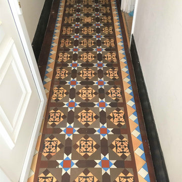
This client owned a property in Haringey, North London, which had a classic Victorian tiled floor laid in the hallway. Unfortunately, the floor was in a bad state, the tiles were dull and dirty and there was a missing section by the bottom of the stairs that had been back filled with cement. Fortunately for him however his neighbour decided to remove their front path which was made with matching tiles and so he was able acquire replacements from him. He then contacted us to see if we could use those tiles to fill in the missing ones and revive the whole floor with a clean and seal at the same time.
Before quoting for the restoration work, I paid a visit to the property to survey the floor. I can give quotes from photographs, but much prefer to visit and conduct a test clean, and in this case, I was able to check the spare tiles he had acquired. From that I emailed a quote which the client was happy with, so we arranged a date to return and do the work.
This was a large job, so I teamed up with Jackson Davis the Central London Tile Doctor and whilst Jackson started on cleaning the floor, I took the reclaimed tiles outside and carefully grinded off the excess cement and adhesive from them and cleaned them by hand. We managed to do this by about 3pm. Jackson and I work on a lot of jobs together so it made sense to work as a bubble from the beginning of Covid so we could continue to work together, with two of us on the job it also means we can get the job done quicker.
Cleaning the floor involved applying a 200-grit diamond burnishing pad to the tile lubricated with a strong dilution of Tile Doctor Remove and Go, the slurry was then rinsed off the floor with more water and then extracted with an industrial vacuum. The process was repeated on stubborn areas until we were satisfied the tiles were really clean.
We then moved onto carefully removing the cement from the floor at the bottom of the stairs and cleaning up the base. Once done the newly renovated replacement tiles were laid in place using a rapid setting adhesive which meant they could be grouted later that day before heading home. The floor was then left overnight to dry off.
We then returned the following day and took some moisture readings with the damp meter. The readings were within the expected range, so we were good to go ahead and apply the sealer. If the floor is not dry the seal will not cure properly, and this can lead to a patchy finish.
Three coats of Tile Doctor Colour Grow were applied to seal the tiles. This is a colour intensifying impregnating sealer that works from with and will gives the Victorian tiles durable protection, ideal for a high traffic area such as the hallway. In addition, Colour Grow is a fully breathable sealer so it will allow for moisture to rise through the tile and evaporate, this is critical for floors of this age that will not have the benefit of a damp proof membrane installed under the floor.
The hallway is now looking transformed by the work we did, we certainly thought so, but more importantly our client was very happy with the result and now has the floor he hoped for.
Andrew Newstead
North London Tile Doctor
 Tile Doctor Ltd
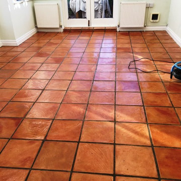
This couple, who live in the seaside resort of Brighton, had purchased their house four months before Christmas and wanted to have the fantastic Terracotta tiled floor in the kitchen and conservatory looking its best before the festive period, since they had family visiting. The floor was looking washed out and it was clear the sealer had failed in the high traffic areas and was now allowing dirt to penetrate into the pores of the tile making it difficult to clean.
We often get calls from new home owners keen to put their own stamp on a property shortly after moving in; stone floors rarely come with cleaning instructions so if you have a stone floor it makes sense to get in touch, so we can advise you on how best to maintain it.
We provided a quote which included stripping the floor of old sealers, cleaning, oiling and then sealing it again to restore cleanliness and character to the Terracotta. There was a lot to do and two areas to clean so I anticipated it would take four days to complete.
Having accepted the quote our first task upon returning to the property was to give the Terracotta tiles a deep clean and remove any remaining sealer present on the tile. This was achieved by applying a strong combination of Tile Doctor Pro-Clean and Tile Doctor NanoTech HBU to the tiles and then covering it in a plastic sheet, so it wouldn’t dry out. This method allows the products to really soak into the pores of the Terracotta and draw out the dirt. I should also mention that Pro-Clean is a very effective Tile and Grout cleaner whilst HBU enhances it by adding nano-sized cleaning particles.
The plastic blanket was left in place for a few hours before being peeled off and then the cleaning products scrubbed into the tile and grout using a black pad fitted to a rotary floor machine and hand brushes. The now soiled product was rinsed off with water which was then extracted using a wet vacuum. The floor was inspected, and stubborn marks spot treated until the floor was clean.
After thoroughly cleaning the Terracotta over two days, we left the floor to completely dry off over the weekend. The tiles would need to be sufficiently dry to receive fresh sealant, as excess moisture can cloud the sealant and prevent it from working correctly.
When we returned to the property, we proceeded to apply Tile Doctor Stone Oil to the tiles. Stone Oil is a sealer which restores the colour and texture of tiled floors, as well as mechanical strength once cured.
We applied a single coat of the Stone Oil before topping it up with multiple coats of Tile Doctor Seal and Go, a topical sealer which provides a high-quality sheen finish to help accentuate the appearance of the Terracotta tiles as well as adding protection.
You can see the results of the restoration below. The couple were so impressed that they have now agreed to have Tile Doctor visit once a year (at a fraction of the cost of the original restoration) to complete a maintenance clean. This will make sure this Terracotta is always looking at its best!
Mick Conlon
East Sussex Tile Doctor

 Rochelle Lynne Design
Karen was an existing client of ours who was tired of the crowded and cluttered laundry/mudroom that did not work well for her young family. The washer and dryer were right in the line of traffic when you stepped in her back entry from the garage and there was a lack of a bench for changing shoes/boots.
Planning began… then along came a twist! A new puppy that will grow to become a fair sized dog would become part of the family. Could the design accommodate dog grooming and a daytime “kennel” for when the family is away?
Having two young boys, Karen wanted to have custom features that would make housekeeping easier so custom drawer drying racks and ironing board were included in the design. All slab-style cabinet and drawer fronts are sturdy and easy to clean and the family’s coats and necessities are hidden from view while close at hand.
The selected quartz countertops, slate flooring and honed marble wall tiles will provide a long life for this hard working space. The enameled cast iron sink which fits puppy to full-sized dog (given a boost) was outfitted with a faucet conducive to dog washing, as well as, general clean up. And the piece de resistance is the glass, Dutch pocket door which makes the family dog feel safe yet secure with a view into the rest of the house. Karen and her family enjoy the organized, tidy space and how it works for them.
223