
Search results for "Trends emerging" in Home Design Ideas

 Reborn Cabinets Inc.
If you haven’t heard the term “aging in place” already, you’re going to hear it more and more in the next ten years. The term as emerged as more and more adults expressed their desire to stay in their own homes for as long as possible. Rather than moving into a community built around increased accessibility needs, home owners are looking to the kitchen and bath remodeling industry to innovate the spaces in their home where they perform the most important tasks.
As most long-time home owners realize, the need for accessibility and safety first presents itself in the bathroom. If balance is becoming an issue for a homeowner, the first concern that tends to arise is an exponentially increased fall-risk in the bathroom. Each year, one-third of individuals report a fall, and two thirds of those who fall will fall again in the next six months. Finally, falls are the leading cause of death from injury for people over 65. Individuals coping with injury, recovering from surgery, arthritis and other similar health issues are at an even higher risk of falling. In other words, every day, more and more people are finding the act of bathing or showering difficult, worrisome or even painful!
For those seeking to age in place, this is where acrylic tub-to-shower conversions, like Reborn Cabinets Bath Solutions, are incredibly helpful, and can dramatically improve a person’s quality of life. Highly customizable to meet anyone’s daily bathing needs, acrylic tub-to-shower conversions give home owners the option to add benches, safety rails, and even the ability to install a barrier-free design—easy entry for those who require wheelchairs or walkers.
But the aging in place-crowd isn’t simply looking for strictly functional solutions to their daily routine. Since these innovations are changing their already-existing bathroom, there is a need to move these accessible spaces beyond function and keep them stylish. Again, aging in place is all about keeping your house a home—not a “facility.”
Reborn Bath Solutions is a versatile product, allowing home-owners to choose from a great selection of colors and a wide array of fixtures. Sure, the “bathroom of your dreams” may look a little different these days, but you deserve it! Give us a call, and we’ll help you stay in your home and keep your daily sense of confidence!

 Trilogy Construction Company
Great glass scallop tile detail. This tile is bordered by slabs of white marble.
Bathroom - modern bathroom idea in Miami
Bathroom - modern bathroom idea in Miami

 Estero Builders, Inc.
Sandprints Photography
Inspiration for a mid-sized contemporary backyard deck remodel in San Luis Obispo with a fire pit and no cover
Inspiration for a mid-sized contemporary backyard deck remodel in San Luis Obispo with a fire pit and no cover
Find the right local pro for your project

 Breathe Design Studio
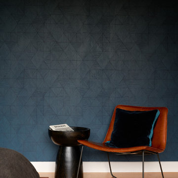
Completed in 2018, this Westlake Hills duplex, designed by Alterstudio Architects, underwent a dramatic transformation by mixing light & airy with dark & moody design. The goal of the project was to create a more intimate environment using a more saturated and dramatic palette. Additionally, it draws from warmer wood tones such as walnut alongside luxurious textures, particularly in navy, dark grey, and emerald green. The end result is an elegant, timeless, and comfortable space conducive to cozying up with a book at the end of a long day.

 Prestige Custom Building & Construction, Inc.
Staircase - mid-sized traditional wooden straight wood railing staircase idea in New York with painted risers
 Interior Pros - Design Studio
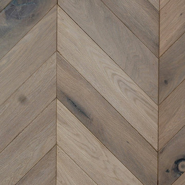
The grey trend has evolved in the last twelve months. Nowadays browns, beige and a touch of grey are in demand. Greige is the new buzzword.
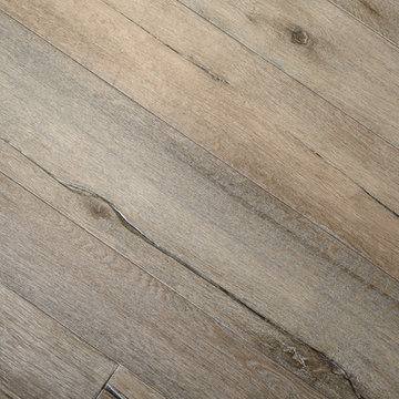
Heavier hand scraped or contoured products, the rage that started around 2005 has taken a back seat in most areas, while a softer wire brushed "ceruse effect" seen mostly on White Oak has been remarkably strong showing no effects of becoming “dated” like the others mentioned.
Ceruse Color Possibilities
There are numerous color combinations to the "cerused" process with the most popular being white or off white. This design trend in hardwood flooring can have darker gray white oak with a mild ceruse off white effect.
There are limitless possibilities in either a prefinished hardwood floor or with what we can create for you in a custom on-site finished hardwood floor.
If something suits your fancy, contact us and we can work on creating just the look and sense of style you are looking for.

 Stonelace Designs
Originally, the exterior of the Napa ranch residence was a standard knocked down stucco finish. We covered over the entire exterior of the house with a natural plaster product that has been made in Italy for centuries, known as Rialto or Vero. This product is a combination of slaked lime mixed with 60% reconstituted crushed marble dust. Quarried from the legendary Carrara marble mines. The finish itself is a vertically combed striated texture embedded into the plaster. While it cures, a transparent group of patinas are applied to the stone-like plaster substance to create a look of an aged villa.


 DKOR Interiors Inc.- Interior Designers Miami, FL
Miami Interior Designers - Residential Interior Design Project in Fort Lauderdale, FL. A classic Mediterranean home turns Contemporary by DKOR Interiors.
Photo: Alexia Fodere
Interior Design by Miami and Ft. Lauderdale Interior Designers, DKOR Interiors.
www.dkorinteriors.com

 Village Home Stores
Full-overlay Rustic Beech cabinets in the "Charleston" door style and "Briarwood" finish.
Village Home Stores
Example of a large mountain style kitchen design in Chicago
Example of a large mountain style kitchen design in Chicago

 Ashley Martin Home
Bedroom - large transitional master light wood floor and brown floor bedroom idea in Orlando with white walls, a standard fireplace and a tile fireplace

 Alex Buckman Studio
Single Colony Pendant fitting well into its Scandinavian setting.
Example of a mid-sized urban master painted wood floor bedroom design in Wellington with white walls
Example of a mid-sized urban master painted wood floor bedroom design in Wellington with white walls


 Stonebridge Mosaics
A beautiful design of Thassos and Mother of Pearl in a very unique shade of blue!
Minimalist bathroom photo in New York
Minimalist bathroom photo in New York

 safe ZOnea
If you’re active on GardenWeb sharing plant photos, asking for advice, tracking seasonal progress you already understand how much detail goes into gardening. Soil pH, rainfall, emerging leaves, bloom counts, fertilizer schedules it adds up fast. But all that rich information often remains buried in posts, lists or memory. What if you could visualize that data and turn it into clear quick insights? That’s where a graph maker becomes a game-changer for your gardening workflow.
1. Why garden data belongs on a graph
On GardenWeb, you’ll find forums for everything from perennial care, vegetable gardening, patios, herbs, even cooking and craft projects. While plant lovers share observations and ask questions, many track progress manually in spreadsheets or memory. A graph maker flips that around:
Instead of a list of numbers (e.g., “Soil test: pH 6.4 in May, 6.1 in October”), you get a line graph showing the decline over time.
Instead of guessing which plant bloomed most, you see a bar chart comparing counts across plants.
Instead of manually calculating average rainfall effect, you plot scatter points of bloom count vs. rainfall.
By turning your data into visuals, you’re not just recording—you’re analysing, learning and improving. For GardenWeb users this means smarter decisions: Which fertilizer actually improves bloom count? Which shady spot recovers slower? A graph maker gives clarity.
2. What is a graph maker and how to use one
A graph maker is a web tool or software that lets you input raw data (numbers, dates, categories) and output visual charts like line graphs, bar charts, scatter plots, etc. It might allow you to import a spreadsheet, select chart type, customize colours, label axes, and export the image for your blog, forum post or personal log.
Here’s how you could apply it for gardening:
Log blooms per week for each rose plant.
Using the graph maker, choose line graph to track changes over weeks.
Label your y-axis “Number of Blooms”, x-axis “Week of Year”.
Add colour lines for each plant for easy comparison.
Export as PNG and embed it in a GardenWeb forum post: “See bloom trend for my ‘Peace’ vs ‘Knock Out’ roses”.
This isn’t just pretty-to-look-at: it makes the trend obvious, invites discussion (“Hey, your ‘Knock Out’ line dips after week 28—what changed?”) and helps you refine your routine.
3. Use these specific scenarios on GardenWeb
A. Soil pH and plant health tracking
After multiple tests you have pH values over time and bloom results. Upload both datasets into the graph maker, produce a dual-axis line graph: soil pH on one axis, bloom count on the other. Post your findings in the “Soil, Fertility & Nutrients” forum and get feedback.
B. Seasonal pest or disease appearance
Record number of aphids spotted each month and whether you used treatment. A bar chart via the graph maker can show pre- and post-treatment figures. Then ask the “Insect & Disease Control” forum for advice based on your visual data.
C. Yield comparison between varieties
You grow two zucchini varieties. You keep weekly yield in pounds. Use the graph maker for a side-by-side bar chart. Share in the “Vegetable Gardening” forum: “Which was better this year? See the chart”.
D. Rainfall vs growth rate
You log weekly rainfall and growth (in cm) of your tomato plants. Use scatter plot in graph maker. If a pattern emerges, you’re ready to post: “Is my growth plateau due to drought? Chart shows a clear correlation.”
4. Why this elevates your GardenWeb contributions
When you post with a chart made by a graph maker, you’re doing more than asking or showing off. You’re investigating. You’re analysing. You invite the community to give feedback on data, not just anecdotes. That elevates the discussion. Instead of “My plant died, any ideas?” you post “See this graph of pH drop and bloom count—what might be the limiting factor?” High-quality visuals raise your post’s value and garner more thoughtful responses.
Plus, your posts become useful references for others: someone else can say, “Cool graphic, can you share your data sheet?” You build credibility and help the forum become a learning hub—not just a Q&A board.
5. Tips for using a graph maker effectively in the GardenWeb context
Keep it simple: One chart, one insight. Don’t overcrowd.
Label clearly: Titles, axis labels, units (e.g., cm/week, mg/L, °F).
Use readable colours: Avoid faint tones that vanish on mobile.
Annotate when needed: Add notes like “Fertiliser switched week 12” or “Shade cloth added”.
Provide context in your post: Don’t leave the chart alone—write a few sentences explaining what it shows and what you’re seeking.
Embed carefully: Make sure your image displays properly in GardenWeb; check mobile view.
Share raw data: If possible link to your spreadsheet so others can replicate or comment.
Be open to feedback: The chart invites questions; embrace them.
6. Possible pitfalls and how to avoid them
Bad data = bad chart: If your measurements aren’t consistent, your graph will mislead. Use standardized data collection.
Too much complexity: Multi-axis charts, too many variables—confusing. Stick to one or two variables.
Overlooking mobile viewers: Many GardenWeb users browse via phones. Use large fonts and simple visuals.
Ignoring the narrative: Chart alone won’t answer. Explain what it means and what you need.
Outdated charts: If you update your data annually, keep your visuals current or label them clearly as “2024 data”.
7. Final thoughts
On GardenWeb you’ll find a vibrant community of gardeners, DIYers, cooks and design lovers.Using a graph maker for your posts and progress turns your experience from casual hobby-logging into smart data-driven gardening. You’ll not only learn more—your peers will learn more, too.
So next time you log your plant growth, record your yield, test your soil or track pests—don’t just note it. Plot it. Use a graph maker. Share it in the forum. Let your garden tell the story, and let the community help you write the next chapter.




 Parkes & Lamb Interiors
Mary Craven Photography
Inspiration for a transitional bathroom remodel in Nashville
Inspiration for a transitional bathroom remodel in Nashville
 Betty Wasserman Art & Interiors
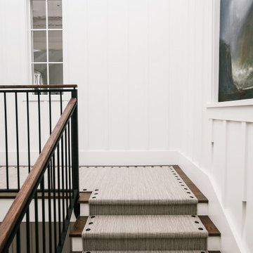
Modern luxury meets warm farmhouse in this Southampton home! Scandinavian inspired furnishings and light fixtures create a clean and tailored look, while the natural materials found in accent walls, casegoods, the staircase, and home decor hone in on a homey feel. An open-concept interior that proves less can be more is how we’d explain this interior. By accentuating the “negative space,” we’ve allowed the carefully chosen furnishings and artwork to steal the show, while the crisp whites and abundance of natural light create a rejuvenated and refreshed interior.
This sprawling 5,000 square foot home includes a salon, ballet room, two media rooms, a conference room, multifunctional study, and, lastly, a guest house (which is a mini version of the main house).
8