
Search results for "Typical challenges" in Home Design Ideas
 Architect
Why Mattress Thickness Is One of the Most Misunderstood Specs
When most people shop for a memory foam mattress, they focus on firmness, materials, and brand. Thickness tends to be an afterthought — or worse, treated as a proxy for quality. The assumption goes: thicker equals better. That assumption is wrong in a meaningful number of cases, and getting it wrong means waking up with exactly the kind of stiffness, pressure pain, or lower back ache you bought a new mattress to avoid.
The right thickness for a memory foam mattress is not a single number. It is a combination of your body weight, your sleep position, and any specific health conditions you are managing. A 14-inch mattress that provides ideal support for a 250-pound side sleeper may cause a 115-pound stomach sleeper to experience spinal misalignment all night. A 10-inch mattress that works perfectly for a back sleeper of average build offers inadequate pressure relief for a heavier side sleeper whose hips need to sink further into the comfort layer before the support base engages.
This guide maps thickness to the factors that actually determine whether a mattress works for your body. It covers the science of mattress layers, the three primary variables (weight, position, condition), and a complete decision table so you can find your ideal thickness without guesswork.
Understanding Mattress Thickness: Layers, Not Just Height
A memory foam mattress’s total thickness is the sum of its individual layers, and those layers serve entirely different functions. Two mattresses that are both 12 inches thick may feel radically different because their comfort layer depths and support core thicknesses are distributed differently.
The Two Parts That Matter
Every memory foam mattress has two functional zones: the comfort layer at the top and the support core at the bottom. The comfort layer — which in quality mattresses consists of gel-infused viscoelastic foam, transition foam, and a cooling cover — is the zone that contours to your body, relieves pressure, and cushions the joints. The support core — high-density foam or pocketed springs in a hybrid — is the zone that keeps the spine aligned and prevents the entire body from sinking into the mattress.
The key relationship is this: the comfort layer must be deep enough for your body’s heaviest pressure points to sink in fully before the firmer support core pushes back. If it is too shallow, those pressure points press against a firm surface and cause localised pain. If the support core is too thin, the whole mattress sags under body weight and the spine loses alignment regardless of how comfortable the top feels.
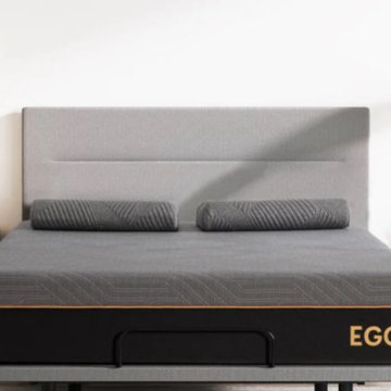
Here is how EGOHOME’s Black series layers map to these functions:
Layer
Material
Function
EGOHOME Technology
Cover (0.5–1")
Fabric + cooling tech
Temperature regulation, hygiene
Anti-heat™ Graphene Cooling Cover
Comfort layer (2–6")
Gel foam, AeroFusion™
Pressure relief, contouring
Copper Gel AeroFusion™ Foam
Transition layer (1–2")
Mid-density foam
Prevents sinkage past comfort zone
BraceSleeper™ Support Foam (upper)
Support core (6–12")
High-density foam or coils
Spinal alignment, edge support
BraceSleeper™ Support Foam (core)
Thickness alone does not tell you how a mattress will perform. A 14-inch mattress with a 2-inch comfort layer and a 12-inch support core will feel firm and supportive. A 14-inch mattress with a 6-inch comfort layer and an 8-inch support core will feel plush and contouring. Always check the comfort layer depth, not just the total inches.
Memory Foam Mattress Thickness Ranges: What Each Category Delivers
Here is a complete breakdown of what to expect from each thickness range and who each suits best:
Thickness
Profile
Best Use Case
Body Weight
Best Sleep Position
6–8"
Low profile
Children, bunk beds, guest rooms, adjustable bases
Under 130 lbs
Kids, lightweight, occasional use
8–10"
Standard-thin
Stomach sleepers, lightweight adults, budget setups
Under 130 lbs
Stomach, lightweight back sleepers
10–12"
Standard
Most adults, back sleepers, back pain relief
130–230 lbs
Back, stomach, combo sleepers
12–14"
High-profile
Side sleepers, plus-size, pressure relief
130–230 lbs+
Side sleepers, hip/shoulder pain
14"+
Premium
Plus-size sleepers, heavy duos, luxury setups
230 lbs+
Plus-size, side sleepers, chronic pain
6–8 Inches: Low-Profile (Specific Use Cases Only)
Low-profile mattresses in the 6 to 8 inch range are designed for specific applications rather than general adult use. They work well on bunk beds and trundle beds where height clearance is limited, for children’s beds where a lower sleep surface is safer, on adjustable bases where the mattress needs to flex significantly, and for lightweight individuals under 130 pounds who need minimal depth to reach the support core. For a standard adult of average build, a mattress under 8 inches is unlikely to provide adequate comfort layer depth for sustained pressure relief.
8–10 Inches: Standard-Thin (Stomach Sleepers and Lightweight Adults)
The 8 to 10 inch range is the practical starting point for most adult use. At this thickness, there is enough comfort layer to provide basic pressure relief without the excessive depth that allows heavier body sections to sink past the support zone. Stomach sleepers in particular benefit from this range: when sleeping face down, the goal is to keep the hips from sinking lower than the shoulders and chest, which would create a downward bow in the lumbar spine. A thinner mattress with a firmer feel prevents this hyperextension more reliably than a thicker, softer model. EGOHOME offers 8-inch memory foam options suited to this profile.
10–12 Inches: Standard (The Sweet Spot for Most Adults)
The 10 to 12 inch range is the most broadly appropriate thickness for adults of standard build. At this depth, a quality memory foam mattress contains enough comfort layer material to contour genuinely around the hips and shoulders without allowing the body to bottom out into the support core. It also contains enough support core depth to maintain spinal alignment under continuous body weight across seven or eight hours. Back sleepers of standard weight (130 to 230 pounds) typically find this range the most supportive, as the lumbar region receives adequate underlying resistance without the excessive softness that taller mattresses can develop under consistent pressure.
12–14 Inches: High-Profile (Side Sleepers and Plus-Size Sleepers)
The 12 to 14 inch range addresses two specific needs: side sleepers who require a deep enough comfort layer to allow the shoulder and hip to sink in while the waist remains supported, and heavier individuals whose body weight requires more foam depth before reaching full support core engagement. For a side sleeper of standard or higher body weight, a comfort layer of less than 4 to 6 inches is often not deep enough for the shoulder to sink fully into an aligned position. The result is an upward lateral bow in the thoracic spine that causes shoulder and upper back pain upon waking. The EGOHOME Black 14-inch Pro and Hybrid models are built specifically for this thickness range.
14 Inches and Above: Premium and Plus-Size
Mattresses at 14 inches or more are appropriate for plus-size sleepers over 230 pounds and for couples where one partner is significantly heavier. At higher body weights, a greater depth of both comfort material and support foam is required because the heavier load compresses the foam more aggressively. A support core that adequately resists a 160-pound sleeper may allow excessive sinkage under a 280-pound sleeper, causing the hips to drop past the point of lumbar support. EGOHOME’s Black 14-inch Firm model includes a 12-inch BraceSleeper™ Support Foam core specifically designed to resist this deep compression under higher body weights.
Thickness by Body Weight: The Primary Determining Factor
Body weight is the single most important variable in thickness selection because it directly determines how far the body sinks into the foam. The same mattress will feel completely different to a 120-pound sleeper versus a 240-pound sleeper, because the heavier person compresses the foam significantly more deeply.
Lightweight Sleepers (Under 130 lbs)
Lightweight sleepers do not need and often cannot benefit from thick mattresses. Because they exert less pressure on the foam, they may not compress a 14-inch mattress deeply enough to feel the support core at all, resulting in a floating sensation with insufficient underlying resistance. For lightweight sleepers, 8 to 10 inches provides adequate comfort layer depth for full pressure relief. The EGOHOME Black 10-inch Classic (medium feel) is the appropriate starting point for this weight category.
Standard-Weight Sleepers (130–230 lbs)
Standard-weight adults represent the broadest population of mattress buyers, and the 10 to 12 inch range was designed specifically for this group. At this weight range, the body compresses the comfort layer meaningfully enough for the foam to contour around pressure points, while the support core remains thick enough to prevent excessive sinkage. The EGOHOME Black 12-inch and the Black 10-inch ranges both address this category, with the 12-inch models being more appropriate for side sleepers who need the extra comfort layer depth.
Plus-Size Sleepers (Over 230 lbs)
Heavier sleepers require 12 to 14 inches at minimum to prevent bottoming out — the point at which body weight compresses through the comfort layer entirely and the sleeper feels the firm support core directly. Bottoming out eliminates pressure relief completely and can significantly worsen joint pain and lower back stiffness. EGOHOME recommends a suggested maximum of 300 pounds per person across their mattress range, and the 14-inch Hybrid and 14-inch Firm models are engineered with the deeper support cores required to handle higher body weights without performance degradation over time.
Thickness by Sleep Position: Matching Depth to Alignment Needs
Side Sleepers: 12 Inches or More
Side sleeping places the body’s heaviest pressure points — the shoulder and hip — in direct contact with the mattress. These points need to sink into the comfort layer deeply enough that the spine remains horizontal from head to toe. If the comfort layer is too thin or too firm, the shoulder cannot descend fully into the mattress, and the spine develops an upward lateral curve between the shoulder and the head. This causes the neck, shoulder, and upper back tension that many side sleepers report upon waking.
Side sleepers of standard weight need at least 12 inches, with a soft to medium-soft comfort layer. EGOHOME’s Black 12-inch Pro (soft feel, 7.5 out of 10 cooling score) is specifically recommended for side sleepers managing back, shoulder, or joint pain. The Black 14-inch Pro (medium-soft, 8 out of 10 cooling) adds additional comfort layer depth for those who need greater pressure relief.
Back Sleepers: 10–12 Inches
Back sleeping is the most spinal-alignment-friendly position because the body’s weight is distributed relatively evenly across the mattress. The primary challenge for back sleepers is lumbar support: the natural inward curve of the lower back creates a gap between the lumbar spine and the mattress surface that must be filled by the foam contouring upward into it. A mattress that is too soft allows the pelvis to sink excessively, flattening this curve and creating lower back compression. A mattress that is too firm cannot conform into the lumbar curve at all.
For back sleepers, 10 to 12 inches with a medium or medium-firm feel provides the optimal combination. EGOHOME’s Black 12-inch Hybrid (medium-firm, 6.5 out of 10 cooling) is specifically noted as ideal for back sleepers, combining pocketed spring zoned support with gel foam contouring for precise lumbar engagement.
Stomach Sleepers: 8–10 Inches
Stomach sleepers face the opposite alignment challenge from side sleepers. Rather than needing the mattress to yield deeply at the joints, they need the mattress to maintain a flat, firm surface that prevents the hips from sinking below the chest. If the hips drop lower than the upper body, the lumbar spine hyperextends into an arched position that compresses the posterior vertebral joints and causes significant lower back pain.
Stomach sleepers need a thinner mattress with a firmer feel. The EGOHOME Black 14-inch Firm is specifically recommended for stomach sleepers and heavier sleepers who need maximum surface resistance. Its 12-inch BraceSleeper™ Support Foam core provides the deep, unyielding base that prevents hip sinkage without requiring a thin mattress that compromises comfort.
Best Thickness for Back Pain: The Medium-Firm 10–12 Inch Principle
For people managing chronic lower back pain, herniated discs, sciatica, or general spinal stiffness, mattress thickness interacts with back health in a specific way that differs from general sleep comfort recommendations.
The key principle for back pain is controlled contouring. You need enough foam depth to relieve pressure at the hips and shoulders, but not so much depth that the foam develops a sag under the heavier sections of the body over time. Excessive thickness combined with a soft comfort layer is one of the most common causes of mattress-induced back pain — the sleeper sinks into a gentle hammock shape that feels comfortable initially but compresses the lumbar discs continuously throughout the night.
10–12 Inches: The Optimal Back Pain Range
A medium-firm mattress of 10 to 12 inches addresses both needs simultaneously. It provides adequate foam depth for genuine pressure relief at the hips and shoulders without the risk of comfort layer collapse that taller, softer mattresses can develop. The support core at this thickness is deep enough to maintain consistent lumbar support from the first night through years of regular use.
For side sleepers with lower back pain, the recommendation extends to 12 inches with a soft feel to ensure the hip can sink into full alignment. For back sleepers with lower back pain, 10 to 12 inches with a medium-firm feel is the target. For stomach sleepers with lower back pain, a firmer feel at any thickness is more important than depth — preventing hip sinkage is the priority.
⚠️ Mattresses over 14 inches with very soft comfort layers are a common hidden cause of lower back pain. The deep softness feels luxurious initially but allows the lumbar region to sag into misalignment through the night. If you sleep on a thick, very soft mattress and wake with lower back stiffness, the mattress — not your position — may be the cause.
Complete Thickness Decision Table: Your Position × Your Weight
Use this table to find your recommended thickness and the matching EGOHOME model:
Sleep Position
Body Weight
Ideal Thickness
EGOHOME Recommendation
Side sleeper
Under 130 lbs
12"
EGOHOME Black 12” Pro (soft, 7.5/10 cool)
Side sleeper
130–230 lbs
12–14"
EGOHOME Black 14” Pro (medium-soft, 8/10 cool)
Side sleeper
Over 230 lbs
14"
EGOHOME Black 14” Hybrid (medium-firm, 8.5/10 cool)
Back sleeper
Under 130 lbs
10"
EGOHOME Black 10” Classic (medium, 6/10 cool)
Back sleeper
130–230 lbs
10–12"
EGOHOME Black 12” Hybrid (medium-firm, 6.5/10 cool)
Back sleeper
Over 230 lbs
12–14"
EGOHOME Black 14” Hybrid (medium-firm, 8.5/10 cool)
Stomach sleeper
Under 130 lbs
8–10"
EGOHOME 8" Memory Foam (firm, standard support)
Stomach sleeper
130–230 lbs
10–12"
EGOHOME Black 10” Hybrid (medium-firm, 6.5/10 cool)
Stomach sleeper
Over 230 lbs
12–14"
EGOHOME Black 14” Firm (firm, 7/10 cool)
Combination
Any weight
10–14"
EGOHOME Black 14” Pro or 14” Hybrid
? If you are between two categories — for example, a 220-pound back sleeper with occasional side sleeping — choose the model suited to your heavier variable. A 12” hybrid model handles the heavier weight and still adapts to position changes. When in doubt, go medium-firm over soft.
EGOHOME Memory Foam Mattresses by Thickness
EGOHOME’s range spans 6 to 14 inches across memory foam and hybrid constructions, with every model carrying CertiPUR-US® and OEKO-TEX® Standard 100 certification, a 10-year warranty, a 100-night home trial, and free shipping and returns across the contiguous U.S.
For 8–10 Inch Needs
The EGOHOME 8-inch memory foam and Black 10-inch Classic and Hybrid models cover the lightweight and stomach sleeper range. The 10-inch Classic offers a medium feel suited to back and side sleepers under 130 pounds. The 10-inch Hybrid adds pocketed spring support for better lumbar engagement and airflow.
For 10–12 Inch Needs
The EGOHOME Black 12-inch range — Classic, Pro, and Hybrid — is the most widely applicable thickness tier. The 12-inch Classic (soft, cool 6/10) suits side sleepers and those with joint pain. The 12-inch Hybrid (medium-firm, cool 6.5/10) is specifically recommended for back sleepers and standard-weight adults across positions. The 12-inch Pro (soft, cool 7.5/10) is the top choice for side sleepers dealing with shoulder or hip pain.
For 12–14 Inch Needs
The EGOHOME Black 14-inch series is the flagship range. The 14-inch Pro (medium-soft, cool 8/10) is designed for side sleepers and pressure-relief-first buyers. The 14-inch Hybrid (medium-firm, cool 8.5/10) handles all sleep positions and is the strongest all-rounder in the range. The 14-inch Firm is built for stomach sleepers and heavier individuals, with a 12-inch BraceSleeper™ Support Foam core that resists sinkage under higher body weights.
Frequently Asked Questions
Is a thicker memory foam mattress always better?
No. Thickness should match your body weight and sleep position, not simply be maximised. A 14-inch mattress with a very soft comfort layer can cause back pain in lightweight sleepers or stomach sleepers by allowing excessive sinkage. A well-calibrated 10-inch mattress will consistently outperform an oversized 14-inch model for the wrong body type.
What thickness of memory foam is good for back pain?
A medium-firm mattress of 10 to 12 inches is the most widely recommended range for lower back pain. It provides enough foam depth for genuine pressure relief without the risk of comfort layer collapse that causes lumbar sagging. Side sleepers with back pain may benefit from 12 inches with a softer feel to ensure hip and shoulder alignment.
What is the minimum thickness for a memory foam mattress for adults?
For most adults, 8 inches is the practical minimum for sustained comfort. Below 8 inches, there is often insufficient comfort layer depth for pressure relief across a full night of sleep. The exception is stomach sleepers who may intentionally choose 8 inches for a firmer surface that prevents hip sinkage.
Does mattress thickness affect how long it lasts?
Yes, indirectly. A mattress that is too thin for the body weight it supports will experience faster comfort layer compression and develop sags and pressure indentations earlier than one appropriately sized for that load. Choosing the correct thickness for your weight extends the usable lifespan of the mattress. EGOHOME mattresses are expected to last 6 to 8 years with proper care, with regular rotation every 3 to 6 months recommended.
Can I use a thick mattress on an adjustable base?
Memory foam mattresses up to 14 inches are generally compatible with adjustable bases, though the mattress should be flexible enough to bend at the head and foot sections without cracking or deforming. EGOHOME mattresses are confirmed compatible with adjustable bases. For very thick or firm mattresses, check the specific flex requirements of your adjustable base before purchasing.
Final Thoughts
The best thickness for a memory foam mattress is not the thickest you can find or the most expensive number on the specification sheet. It is the thickness that aligns precisely with your body weight, your sleep position, and any specific conditions you are managing — then pairs that depth with a comfort layer and support core calibrated to work
 Vetter Architects
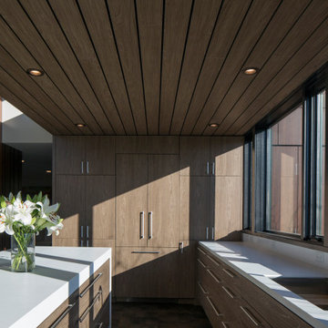
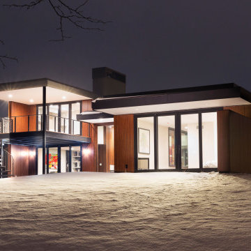
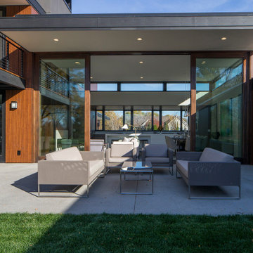
The mHouse is the brainchild of a magazine publisher intent on changing the way houses are constructed and how their owners relate to them. Named after one of the company’s website, the mHouse serves as a built manifesto of innovative panel materials such as rice hull composites and thermally fused laminate – becoming a case study house for over 30 international material suppliers.
The design challenge was quite clear – how to use a series of new materials unproven in the US building trades to create a beautiful house that meets the unique needs of today’s family. The result is a building that is highly rational in its construction systems, while encouraging social gathering.
The mHouse serves as a direct counterpoint to the typical suburban builder home – creating unique outdoor spaces in place of the typical open lawn, a variety of different views in contrast to one major view, and expressing a confidence in the future over nostalgia for the past.
Through a series of layers and nodes, the landscape grounds the house and heightens the views from inside, using indigenous plantings applied in non-traditional ways, the landscape mirrors the house in rethinking the suburban home.
The mHouse strikes a balance between proven methods and innovative solutions, resulting in one version of what is possible with these materials and setting the stage for future iterations and new possibilities.
Size
Total Finished Area: 3,405 sf
Completion Date
September 2015
Services
Architecture
Interior Design Consultant: Amy Carman Design
Landscape Consultant: Texten
 KURV Architecture DPC (Alex Hughes Architects)
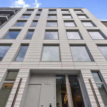
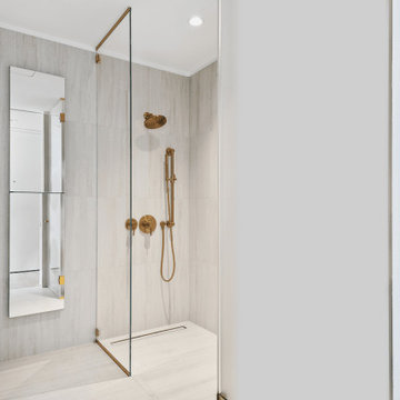
Located in the heart of Manhattan’s Lower East Side, the building was erected on a shallow commercial lot between two 120 year old masonry buildings and a new residential rental building. 330 Grand Street is a mix of 725 SF 1BRs and 1050 SF 2BR apartments. It also contains a 1100 SF two story duplex as well as private and public rooftop space, large private balconies for most units and two large private terraces for the ground floor units.
330 Grand Street was originally designed and approved at the NYC DOB as a prefabricated modular building. During the pandemic, as shipping costs skyrocketed putting the project at risk, we suggested redesigning the building as a reinforced cast-in-place concrete structure. Concrete was readily available and prices had not been affected by the demand increase that many other materials suffered in the pandemic. We took this opportunity to raise floor to ceiling heights, enlarge high performance windows and redistribute the buildings MEPFS and Structural Systems to create very open floor plans.
The challenge was to create a luxurious sensorial living experience with very limited means. In a city with very high construction costs, low cost residential buildings in the area are usually devoid of good quality, design and character. Our approach was to aim high for the end user, prioritizing natural light, open space with long visual perspectives, high ceilings and as always, rejecting the use of predefined building templates.
Our biggest challenge was to ensure that the small spaces feel as clean cut, large and bright as possible. Several unique design decisions were made to ensure low cost and high quality;
Floor plans were laid out so that spaces were wide open and free of clutter from mechanical or structural interruptions. Therefore all infrastructure was placed in lateral demising walls, which in turn act as the unit’s storage and kitchen. The apartments feel wide open, are super quiet and have more storage space than any other comparable apartment in the city.
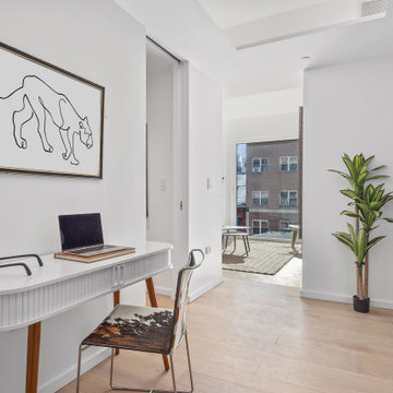
To solve the problem of the site’s shallow commercial lot which is typically prone to dark interior spaces we focused our attention on the building’s envelope. Instead of the usual small punched window openings, oversized high performance windows were designed to ensure that light penetrated as far as possible into the units. In the smaller 1BR units, the full 50’ depth of the lot is perceived by partitioning spaces with sliding pocket doors that can be retracted to allow deep visual perspectives, making the sight lines in the space feel longer, larger, more ample than normal. In addition to the full height glazing, each unit above the 2nd floor receives a 7 foot covered balcony, adding 120 to 240 sf to each apartment, something unusual in New York City buildings. The space is large enough for a full size dining table, when the weather permits being outside.
We also worked hard to ensure modularity. For example, all kitchen units are all identical throughout the building. The idea of modularity and the economy of the repetitive unit is exercised to the maximum through the building.
Hardware, appliances, flooring, wall coverings and material finishes are all carefully selected to feel bespoke, high quality and unique.
It was important to KURV that the result of this work manifest into something that would deeply connect with the end user and sustain relationships with the consumers of this space.
All images by KURV Architecture ©
Find the right local pro for your project
 KURV Architecture DPC (Alex Hughes Architects)
Located in the heart of Manhattan’s Lower East Side, the building was erected on a shallow commercial lot between two 120 year old masonry buildings and a new residential rental building. 330 Grand Street is a mix of 725 SF 1BRs and 1050 SF 2BR apartments. It also contains a 1100 SF two story duplex as well as private and public rooftop space, large private balconies for most units and two large private terraces for the ground floor units.
330 Grand Street was originally designed and approved at the NYC DOB as a prefabricated modular building. During the pandemic, as shipping costs skyrocketed putting the project at risk, we suggested redesigning the building as a reinforced cast-in-place concrete structure. Concrete was readily available and prices had not been affected by the demand increase that many other materials suffered in the pandemic. We took this opportunity to raise floor to ceiling heights, enlarge high performance windows and redistribute the buildings MEPFS and Structural Systems to create very open floor plans.
The challenge was to create a luxurious sensorial living experience with very limited means. In a city with very high construction costs, low cost residential buildings in the area are usually devoid of good quality, design and character. Our approach was to aim high for the end user, prioritizing natural light, open space with long visual perspectives, high ceilings and as always, rejecting the use of predefined building templates.
Our biggest challenge was to ensure that the small spaces feel as clean cut, large and bright as possible. Several unique design decisions were made to ensure low cost and high quality;
Floor plans were laid out so that spaces were wide open and free of clutter from mechanical or structural interruptions. Therefore all infrastructure was placed in lateral demising walls, which in turn act as the unit’s storage and kitchen. The apartments feel wide open, are super quiet and have more storage space than any other comparable apartment in the city.
To solve the problem of the site’s shallow commercial lot which is typically prone to dark interior spaces we focused our attention on the building’s envelope. Instead of the usual small punched window openings, oversized high performance windows were designed to ensure that light penetrated as far as possible into the units. In the smaller 1BR units, the full 50’ depth of the lot is perceived by partitioning spaces with sliding pocket doors that can be retracted to allow deep visual perspectives, making the sight lines in the space feel longer, larger, more ample than normal. In addition to the full height glazing, each unit above the 2nd floor receives a 7 foot covered balcony, adding 120 to 240 sf to each apartment, something unusual in New York City buildings. The space is large enough for a full size dining table, when the weather permits being outside.
We also worked hard to ensure modularity. For example, all kitchen units are all identical throughout the building. The idea of modularity and the economy of the repetitive unit is exercised to the maximum through the building.
Hardware, appliances, flooring, wall coverings and material finishes are all carefully selected to feel bespoke, high quality and unique.
It was important to KURV that the result of this work manifest into something that would deeply connect with the end user and sustain relationships with the consumers of this space.
All images by KURV Architecture ©
 KURV Architecture DPC (Alex Hughes Architects)
Located in the heart of Manhattan’s Lower East Side, the building was erected on a shallow commercial lot between two 120 year old masonry buildings and a new residential rental building. 330 Grand Street is a mix of 725 SF 1BRs and 1050 SF 2BR apartments. It also contains a 1100 SF two story duplex as well as private and public rooftop space, large private balconies for most units and two large private terraces for the ground floor units.
330 Grand Street was originally designed and approved at the NYC DOB as a prefabricated modular building. During the pandemic, as shipping costs skyrocketed putting the project at risk, we suggested redesigning the building as a reinforced cast-in-place concrete structure. Concrete was readily available and prices had not been affected by the demand increase that many other materials suffered in the pandemic. We took this opportunity to raise floor to ceiling heights, enlarge high performance windows and redistribute the buildings MEPFS and Structural Systems to create very open floor plans.
The challenge was to create a luxurious sensorial living experience with very limited means. In a city with very high construction costs, low cost residential buildings in the area are usually devoid of good quality, design and character. Our approach was to aim high for the end user, prioritizing natural light, open space with long visual perspectives, high ceilings and as always, rejecting the use of predefined building templates.
Our biggest challenge was to ensure that the small spaces feel as clean cut, large and bright as possible. Several unique design decisions were made to ensure low cost and high quality;
Floor plans were laid out so that spaces were wide open and free of clutter from mechanical or structural interruptions. Therefore all infrastructure was placed in lateral demising walls, which in turn act as the unit’s storage and kitchen. The apartments feel wide open, are super quiet and have more storage space than any other comparable apartment in the city.
To solve the problem of the site’s shallow commercial lot which is typically prone to dark interior spaces we focused our attention on the building’s envelope. Instead of the usual small punched window openings, oversized high performance windows were designed to ensure that light penetrated as far as possible into the units. In the smaller 1BR units, the full 50’ depth of the lot is perceived by partitioning spaces with sliding pocket doors that can be retracted to allow deep visual perspectives, making the sight lines in the space feel longer, larger, more ample than normal. In addition to the full height glazing, each unit above the 2nd floor receives a 7 foot covered balcony, adding 120 to 240 sf to each apartment, something unusual in New York City buildings. The space is large enough for a full size dining table, when the weather permits being outside.
We also worked hard to ensure modularity. For example, all kitchen units are all identical throughout the building. The idea of modularity and the economy of the repetitive unit is exercised to the maximum through the building.
Hardware, appliances, flooring, wall coverings and material finishes are all carefully selected to feel bespoke, high quality and unique.
It was important to KURV that the result of this work manifest into something that would deeply connect with the end user and sustain relationships with the consumers of this space.
All images by KURV Architecture ©
 AquaTerra Outdoors
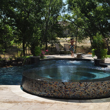
A new homeowner of a beautiful Mediterranean style home requested a pool combining a variety of outdoor living amenities. The request included an infinity edge pool and spa that would accommodate an area for a volleyball net, bar top, and fire pit all within a natural environment; and of course, a budget. Needless to say, it was a challenging process combining all of these requests and blending them into a space dedicated for a pool that led us to the aquatic environment seen in these images. The project resulted in building a large free form pool with strong classical lines, shapes, and symmetry. The shape allows the pool to blend within the natural environment as well as continue to be a strong architectural element that compliments the beauty of the Mediterranean home. The infinity edge spa includes 14 waterway jets with the nearest possible equipment location that is more than 100’ away. The pool was not only an aesthetic design challenge but also required mutual respect for the project’s complex hydraulic and construction details. In the process of construction, the homeowner decided the infinity edge basin should also be designed to function as a secondary spa. This secondary basin/spa can be used in large entertaining situations or if the family wants to take advantage of the fire pit while soaking. The glass tile was selected to magnify the beauty of the infinity edge spa and the overall design. The vessel was carefully cleaned and sealed to minimize efflorescence and staining that typically occurs over time. The decorative pedestals and urns seen around the pool edge are equipped for irrigation and drainage to allow for ease of year around maintenance and combine the elegance of the landscape with the hardscape. This Mediterranean inspired project blends some of the best materials available today and is the focal point of the home owner’s new property.
Photography: Daniel Driensky
 KURV Architecture DPC (Alex Hughes Architects)
Located in the heart of Manhattan’s Lower East Side, the building was erected on a shallow commercial lot between two 120 year old masonry buildings and a new residential rental building. 330 Grand Street is a mix of 725 SF 1BRs and 1050 SF 2BR apartments. It also contains a 1100 SF two story duplex as well as private and public rooftop space, large private balconies for most units and two large private terraces for the ground floor units.
330 Grand Street was originally designed and approved at the NYC DOB as a prefabricated modular building. During the pandemic, as shipping costs skyrocketed putting the project at risk, we suggested redesigning the building as a reinforced cast-in-place concrete structure. Concrete was readily available and prices had not been affected by the demand increase that many other materials suffered in the pandemic. We took this opportunity to raise floor to ceiling heights, enlarge high performance windows and redistribute the buildings MEPFS and Structural Systems to create very open floor plans.
The challenge was to create a luxurious sensorial living experience with very limited means. In a city with very high construction costs, low cost residential buildings in the area are usually devoid of good quality, design and character. Our approach was to aim high for the end user, prioritizing natural light, open space with long visual perspectives, high ceilings and as always, rejecting the use of predefined building templates.
Our biggest challenge was to ensure that the small spaces feel as clean cut, large and bright as possible. Several unique design decisions were made to ensure low cost and high quality;
Floor plans were laid out so that spaces were wide open and free of clutter from mechanical or structural interruptions. Therefore all infrastructure was placed in lateral demising walls, which in turn act as the unit’s storage and kitchen. The apartments feel wide open, are super quiet and have more storage space than any other comparable apartment in the city.
To solve the problem of the site’s shallow commercial lot which is typically prone to dark interior spaces we focused our attention on the building’s envelope. Instead of the usual small punched window openings, oversized high performance windows were designed to ensure that light penetrated as far as possible into the units. In the smaller 1BR units, the full 50’ depth of the lot is perceived by partitioning spaces with sliding pocket doors that can be retracted to allow deep visual perspectives, making the sight lines in the space feel longer, larger, more ample than normal. In addition to the full height glazing, each unit above the 2nd floor receives a 7 foot covered balcony, adding 120 to 240 sf to each apartment, something unusual in New York City buildings. The space is large enough for a full size dining table, when the weather permits being outside.
We also worked hard to ensure modularity. For example, all kitchen units are all identical throughout the building. The idea of modularity and the economy of the repetitive unit is exercised to the maximum through the building.
Hardware, appliances, flooring, wall coverings and material finishes are all carefully selected to feel bespoke, high quality and unique.
It was important to KURV that the result of this work manifest into something that would deeply connect with the end user and sustain relationships with the consumers of this space.
All images by KURV Architecture ©


 Vetter Architects
The mHouse is the brainchild of a magazine publisher intent on changing the way houses are constructed and how their owners relate to them. Named after one of the company’s website, the mHouse serves as a built manifesto of innovative panel materials such as rice hull composites and thermally fused laminate – becoming a case study house for over 30 international material suppliers.
The design challenge was quite clear – how to use a series of new materials unproven in the US building trades to create a beautiful house that meets the unique needs of today’s family. The result is a building that is highly rational in its construction systems, while encouraging social gathering.
The mHouse serves as a direct counterpoint to the typical suburban builder home – creating unique outdoor spaces in place of the typical open lawn, a variety of different views in contrast to one major view, and expressing a confidence in the future over nostalgia for the past.
Through a series of layers and nodes, the landscape grounds the house and heightens the views from inside, using indigenous plantings applied in non-traditional ways, the landscape mirrors the house in rethinking the suburban home.
The mHouse strikes a balance between proven methods and innovative solutions, resulting in one version of what is possible with these materials and setting the stage for future iterations and new possibilities.
Size
Total Finished Area: 3,405 sf
Completion Date
September 2015
Services
Architecture
Interior Design Consultant: Amy Carman Design
Landscape Consultant: Texten
 Spire Integrated Systems Inc.
Sustainable Design Meets Smart Technology
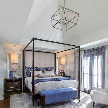
This home featured a request from the client to use as many environmentally friendly materials and fabrics as possible. Many common shade manufacturers use materials with PVC plastic, which is known for off-gassing hazardous chemicals that linger in the air in the home for years. The main floor roller shades met the client’s request for an eco-friendly fabric by utilizing motorized shades with GreenScreen fabric. In other rooms, the designer and client wanted the classic look and soft fabrics with roman shades and drapery tracks on several windows in the house. By partnering with the interior designer and fabric workroom, we were able to provide a custom solution for motorization of roman shades and drapery.
Lighting Control
The client is able control all of the lighting and window treatments in the house with a single control system. This eliminates the need for extra devices on the wall or remote controls that clutter up the space and get lost. By utilizing the custom window treatments, the house is able to conserve energy by keeping the house warmer in the winter, and cooler in the summer by providing insulation and blocking sunlight. The lighting control system further helps to conserve energy by beautifully dimming LED lights as well as using quick buttons that turn off all of the lights in the house, or un-occupied rooms, with the press of a single button.
Motorized Window Treatments
Motorized window treatments add a high level of convenience to any project, especially those with many windows in hard to reach places. The challenge with many manufacturers is a limitation of style and fabric selection, some may be as basic as only roller shades. Often times these come with un-reliable, wireless controls.
On this Birmingham, MI project completed in March 2019, we partnered with the interior designer and drapery workroom to provide a truly unique solution. The homeowner and designer’s requests included many different styles of window treatments including rollers shades, roman shades and motorized draperies. Typically, this would result in a collection of various shade manufacturers with unsightly remotes scattered across each room or stuck to the wall for control. Utilizing standard offerings, coupled with an incredible team effort by the designer and drapery workroom, we provided all of the requested styles of window treatments, and were able to control them all on a single system. This means that each room has a single, elegant keypad built into the wall that controls not only the window treatments, but the lighting as well.
When leaving/entering the home, all of the window coverings can be raised or lowered with a single button press. Shades and draperies can also be set to operate based on the time of day for automatic day-to-day operation using sunlight as a guide. In the end, we achieved convenience, function and sophisticated style.
 Banker Wire
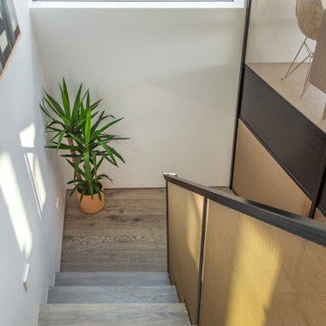
When envisioning the Hygeia Lot 3 single family residential home in Encinitas, California, Lindsay and Rory Brown of The Brown Studio sought to weave unique architectural details throughout the minimalist design scheme. To add depth to the overall look and feel of the space, and to complement the home’s existing ‘hard’ angles, the team selected Banker Wire’s IPZ-25 woven wire mesh. Specified in a stainless steel and brass finish, the wire mesh was utilized to create the interior stairway railing, which functions as the focal point of the lower lounge room area.
Adding an elegant touchpoint to the space, the wire mesh reiterates the angular look and feel while providing much-needed depth through the stainless steel and brass finish. Similarly, for the project-at-large, the design team favored a seamless indoor/outdoor design scheme, with the Banker Wire mesh application helping to achieve this; the exterior of the home features Gabion rock walls, created using an enclosing wire structure to secure the rocks into a wall formation. By adding the wire mesh interior stairway railing, the design team was able to create an indoor/outdoor connection through highlighting these unique wire touchpoints.
“The Hygeia Lot 3 house is full of unique angles and architectural details—it’s two levels of playful design and carefully crafted architectural details,” says Loryn Cook, Designer, The Brown Studio. “We wanted to use materials that reflect this line of thinking, and Banker Wire’s architectural mesh provided the stability and breathability we were after.”
The simple, lightweight material of the IPZ-25 wire mesh pattern—which has a 54% open area—utilizes a mixture of stainless steel to achieve balanced sturdiness; when mixed with the copper-based alloy of brass, a beautiful contrast occurs, while the team’s custom system holds the wire in place. Through utilizing different wire diameters for the warp and shute—achieving balanced stiffness in both directions—the intercrimp surface gives the material a high degree of reflective energy. As a result, the mesh pattern imitates an array of colors that changes as the viewer moves throughout the space.
“For this project, we wanted a material that was permeable enough to see through, but detailed enough to catch the eye,” adds Cook. “IPZ-25 provides a myriad of different textures and colors, depending on the perspective from which it is viewed from—we love it specifically for this effect.”
In regards to the fabrication process, Robert Richter, Owner of Flur Metals, notes that although it was initially a challenge, this project is proof that the outcome is well worth it.
“We typically utilize more rigid mesh types for this kind of application, but because of how unique IPZ-25 is, The Brown Studio came to us asking if we could make it work,” says Richter. “We did not shy away from the challenge; this project was exciting, as we were able to utilize such a delicate, beautiful mesh, but a non-traditional way. Once one side was ‘tac’d in,’ we pulled it tight, and ‘tac’d’ the other side to the frame. Then, the border was welded to another frame that sandwiched the mesh in place,” adds Richter. “This application is proof that it can be done! It’s still one of my favorite projects we have ever worked on.”
 AquaTerra Outdoors
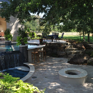
A new homeowner of a beautiful Mediterranean style home requested a pool combining a variety of outdoor living amenities. The request included an infinity edge pool and spa that would accommodate an area for a volleyball net, bar top, and fire pit all within a natural environment; and of course, a budget. Needless to say, it was a challenging process combining all of these requests and blending them into a space dedicated for a pool that led us to the aquatic environment seen in these images. The project resulted in building a large free form pool with strong classical lines, shapes, and symmetry. The shape allows the pool to blend within the natural environment as well as continue to be a strong architectural element that compliments the beauty of the Mediterranean home. The infinity edge spa includes 14 waterway jets with the nearest possible equipment location that is more than 100’ away. The pool was not only an aesthetic design challenge but also required mutual respect for the project’s complex hydraulic and construction details. In the process of construction, the homeowner decided the infinity edge basin should also be designed to function as a secondary spa. This secondary basin/spa can be used in large entertaining situations or if the family wants to take advantage of the fire pit while soaking. The glass tile was selected to magnify the beauty of the infinity edge spa and the overall design. The vessel was carefully cleaned and sealed to minimize efflorescence and staining that typically occurs over time. The decorative pedestals and urns seen around the pool edge are equipped for irrigation and drainage to allow for ease of year around maintenance and combine the elegance of the landscape with the hardscape. This Mediterranean inspired project blends some of the best materials available today and is the focal point of the home owner’s new property.
Photography: Daniel Driensky
 Spire Integrated Systems Inc.
Sustainable Design Meets Smart Technology
This home featured a request from the client to use as many environmentally friendly materials and fabrics as possible. Many common shade manufacturers use materials with PVC plastic, which is known for off-gassing hazardous chemicals that linger in the air in the home for years. The main floor roller shades met the client’s request for an eco-friendly fabric by utilizing motorized shades with GreenScreen fabric. In other rooms, the designer and client wanted the classic look and soft fabrics with roman shades and drapery tracks on several windows in the house. By partnering with the interior designer and fabric workroom, we were able to provide a custom solution for motorization of roman shades and drapery.
Lighting Control
The client is able control all of the lighting and window treatments in the house with a single control system. This eliminates the need for extra devices on the wall or remote controls that clutter up the space and get lost. By utilizing the custom window treatments, the house is able to conserve energy by keeping the house warmer in the winter, and cooler in the summer by providing insulation and blocking sunlight. The lighting control system further helps to conserve energy by beautifully dimming LED lights as well as using quick buttons that turn off all of the lights in the house, or un-occupied rooms, with the press of a single button.
Motorized Window Treatments
Motorized window treatments add a high level of convenience to any project, especially those with many windows in hard to reach places. The challenge with many manufacturers is a limitation of style and fabric selection, some may be a s basic as only roller shades. Often times these come with un-reliable, wireless controls.
On this Birmingham, MI project completed in March 2019, we partnered with the interior designer and drapery workroom to provide a truly unique solution. The homeowner and designer’s requests included many different styles of window treatments including rollers shades, roman shades and motorized draperies. Typically, this would result in a collection of various shade manufacturers with unsightly remotes scattered across each room or stuck to the wall for control. Utilizing standard offerings, coupled with an incredible team effort by the designer and drapery workroom, we provided all of the requested styles of window treatments, and were able to control them all on a single system. This means that each room has a single, elegant keypad built into the wall that controls not only the window treatments, but the lighting as well.
When leaving/entering the home, all of the window coverings can be raised or lowered with a single button press. Shades and draperies can also be set to operate based on the time of day for automatic day-to-day operation using sunlight as a guide. In the end, we achieved convenience, function and sophisticated style.
 Vetter Architects
The mHouse is the brainchild of a magazine publisher intent on changing the way houses are constructed and how their owners relate to them. Named after one of the company’s website, the mHouse serves as a built manifesto of innovative panel materials such as rice hull composites and thermally fused laminate – becoming a case study house for over 30 international material suppliers.
The design challenge was quite clear – how to use a series of new materials unproven in the US building trades to create a beautiful house that meets the unique needs of today’s family. The result is a building that is highly rational in its construction systems, while encouraging social gathering.
The mHouse serves as a direct counterpoint to the typical suburban builder home – creating unique outdoor spaces in place of the typical open lawn, a variety of different views in contrast to one major view, and expressing a confidence in the future over nostalgia for the past.
Through a series of layers and nodes, the landscape grounds the house and heightens the views from inside, using indigenous plantings applied in non-traditional ways, the landscape mirrors the house in rethinking the suburban home.
The mHouse strikes a balance between proven methods and innovative solutions, resulting in one version of what is possible with these materials and setting the stage for future iterations and new possibilities.
Size
Total Finished Area: 3,405 sf
Completion Date
September 2015
Services
Architecture
Interior Design Consultant: Amy Carman Design
Landscape Consultant: Texten
 ATA Architects Inc
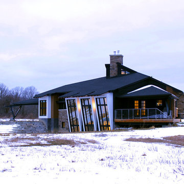
Function meets form in the Delta House, which incorporates innovative building solutions for our challenging rural Canadian climate. Perhaps more akin to aeronautics than architecture, biomimetic processes drove the problem-solving approach while seeking multiple functions for each component. A typical Canadian home grows up and out of the site, exposing more of the facade to the elements. Instead of building up, the focus here was to make better use of the lower level. A section of the house was dug out on the south side, making room for three main glazed boxes. The spaces and bedrooms of a typical second floor were transferred to the more protected basement, thus lowering the volume of conditioned air within the dwelling.
To minimize energy losses through the glazing, ATA centralized the windows on the south side of the building, while minimizing the glazing on other facades. The centralized windows became the “three sisters” allowing the winter sun into the main floor and lower level of the house. The aerodynamic delta shape of the building was tested in a wind tunnel and was designed to minimize energy loss due to contact with the turbulent winter wind. The sisters are tilted 10 degrees towards the sun, leveraging the properties of glass as a reflector, when the sun is at a high angle of incidence in the summer.
The house also contains an innovative thermal mass battery in the basement slab and a connected radiative masonry fireplace. Excess heat, gathered at the top of the tent-like roof is directed down and reheated through the chimney before being drawn into the basement slab for storage. Openings in the floor areas ensure the energy is equally distributed throughout the dwelling.
Read an article in the Globe and Mail about ATA’s Delta project here.
 Banker Wire
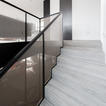
When envisioning the Hygeia Lot 3 single family residential home in Encinitas, California, Lindsay and Rory Brown of The Brown Studio sought to weave unique architectural details throughout the minimalist design scheme. To add depth to the overall look and feel of the space, and to complement the home’s existing ‘hard’ angles, the team selected Banker Wire’s IPZ-25 woven wire mesh. Specified in a stainless steel and brass finish, the wire mesh was utilized to create the interior stairway railing, which functions as the focal point of the lower lounge room area.
Adding an elegant touchpoint to the space, the wire mesh reiterates the angular look and feel while providing much-needed depth through the stainless steel and brass finish. Similarly, for the project-at-large, the design team favored a seamless indoor/outdoor design scheme, with the Banker Wire mesh application helping to achieve this; the exterior of the home features Gabion rock walls, created using an enclosing wire structure to secure the rocks into a wall formation. By adding the wire mesh interior stairway railing, the design team was able to create an indoor/outdoor connection through highlighting these unique wire touchpoints.
“The Hygeia Lot 3 house is full of unique angles and architectural details—it’s two levels of playful design and carefully crafted architectural details,” says Loryn Cook, Designer, The Brown Studio. “We wanted to use materials that reflect this line of thinking, and Banker Wire’s architectural mesh provided the stability and breathability we were after.”
The simple, lightweight material of the IPZ-25 wire mesh pattern—which has a 54% open area—utilizes a mixture of stainless steel to achieve balanced sturdiness; when mixed with the copper-based alloy of brass, a beautiful contrast occurs, while the team’s custom system holds the wire in place. Through utilizing different wire diameters for the warp and shute—achieving balanced stiffness in both directions—the intercrimp surface gives the material a high degree of reflective energy. As a result, the mesh pattern imitates an array of colors that changes as the viewer moves throughout the space.
“For this project, we wanted a material that was permeable enough to see through, but detailed enough to catch the eye,” adds Cook. “IPZ-25 provides a myriad of different textures and colors, depending on the perspective from which it is viewed from—we love it specifically for this effect.”
In regards to the fabrication process, Robert Richter, Owner of Flur Metals, notes that although it was initially a challenge, this project is proof that the outcome is well worth it.
“We typically utilize more rigid mesh types for this kind of application, but because of how unique IPZ-25 is, The Brown Studio came to us asking if we could make it work,” says Richter. “We did not shy away from the challenge; this project was exciting, as we were able to utilize such a delicate, beautiful mesh, but a non-traditional way. Once one side was ‘tac’d in,’ we pulled it tight, and ‘tac’d’ the other side to the frame. Then, the border was welded to another frame that sandwiched the mesh in place,” adds Richter. “This application is proof that it can be done! It’s still one of my favorite projects we have ever worked on.”
 Vetter Architects
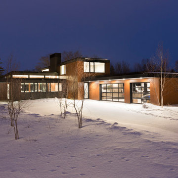
The mHouse is the brainchild of a magazine publisher intent on changing the way houses are constructed and how their owners relate to them. Named after one of the company’s website, the mHouse serves as a built manifesto of innovative panel materials such as rice hull composites and thermally fused laminate – becoming a case study house for over 30 international material suppliers.
The design challenge was quite clear – how to use a series of new materials unproven in the US building trades to create a beautiful house that meets the unique needs of today’s family. The result is a building that is highly rational in its construction systems, while encouraging social gathering.
The mHouse serves as a direct counterpoint to the typical suburban builder home – creating unique outdoor spaces in place of the typical open lawn, a variety of different views in contrast to one major view, and expressing a confidence in the future over nostalgia for the past.
Through a series of layers and nodes, the landscape grounds the house and heightens the views from inside, using indigenous plantings applied in non-traditional ways, the landscape mirrors the house in rethinking the suburban home.
The mHouse strikes a balance between proven methods and innovative solutions, resulting in one version of what is possible with these materials and setting the stage for future iterations and new possibilities.
Size
Total Finished Area: 3,405 sf
Completion Date
September 2015
Services
Architecture
Interior Design Consultant: Amy Carman Design
Landscape Consultant: Texten
 Spire Integrated Systems Inc.
Sustainable Design Meets Smart Technology
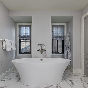
This home featured a request from the client to use as many environmentally friendly materials and fabrics as possible. Many common shade manufacturers use materials with PVC plastic, which is known for off-gassing hazardous chemicals that linger in the air in the home for years. The main floor roller shades met the client’s request for an eco-friendly fabric by utilizing motorized shades with GreenScreen fabric. In other rooms, the designer and client wanted the classic look and soft fabrics with roman shades and drapery tracks on several windows in the house. By partnering with the interior designer and fabric workroom, we were able to provide a custom solution for motorization of roman shades and drapery.
Lighting Control
The client is able control all of the lighting and window treatments in the house with a single control system. This eliminates the need for extra devices on the wall or remote controls that clutter up the space and get lost. By utilizing the custom window treatments, the house is able to conserve energy by keeping the house warmer in the winter, and cooler in the summer by providing insulation and blocking sunlight. The lighting control system further helps to conserve energy by beautifully dimming LED lights as well as using quick buttons that turn off all of the lights in the house, or un-occupied rooms, with the press of a single button.
Motorized Window Treatments
Motorized window treatments add a high level of convenience to any project, especially those with many windows in hard to reach places. The challenge with many manufacturers is a limitation of style and fabric selection, some may be a s basic as only roller shades. Often times these come with un-reliable, wireless controls.
On this Birmingham, MI project completed in March 2019, we partnered with the interior designer and drapery workroom to provide a truly unique solution. The homeowner and designer’s requests included many different styles of window treatments including rollers shades, roman shades and motorized draperies. Typically, this would result in a collection of various shade manufacturers with unsightly remotes scattered across each room or stuck to the wall for control. Utilizing standard offerings, coupled with an incredible team effort by the designer and drapery workroom, we provided all of the requested styles of window treatments, and were able to control them all on a single system. This means that each room has a single, elegant keypad built into the wall that controls not only the window treatments, but the lighting as well.
When leaving/entering the home, all of the window coverings can be raised or lowered with a single button press. Shades and draperies can also be set to operate based on the time of day for automatic day-to-day operation using sunlight as a guide. In the end, we achieved convenience, function and sophisticated style.
 KURV Architecture DPC (Alex Hughes Architects)
Located in the heart of Manhattan’s Lower East Side, the building was erected on a shallow commercial lot between two 120 year old masonry buildings and a new residential rental building. 330 Grand Street is a mix of 725 SF 1BRs and 1050 SF 2BR apartments. It also contains a 1100 SF two story duplex as well as private and public rooftop space, large private balconies for most units and two large private terraces for the ground floor units.
330 Grand Street was originally designed and approved at the NYC DOB as a prefabricated modular building. During the pandemic, as shipping costs skyrocketed putting the project at risk, we suggested redesigning the building as a reinforced cast-in-place concrete structure. Concrete was readily available and prices had not been affected by the demand increase that many other materials suffered in the pandemic. We took this opportunity to raise floor to ceiling heights, enlarge high performance windows and redistribute the buildings MEPFS and Structural Systems to create very open floor plans.
The challenge was to create a luxurious sensorial living experience with very limited means. In a city with very high construction costs, low cost residential buildings in the area are usually devoid of good quality, design and character. Our approach was to aim high for the end user, prioritizing natural light, open space with long visual perspectives, high ceilings and as always, rejecting the use of predefined building templates.
Our biggest challenge was to ensure that the small spaces feel as clean cut, large and bright as possible. Several unique design decisions were made to ensure low cost and high quality;
Floor plans were laid out so that spaces were wide open and free of clutter from mechanical or structural interruptions. Therefore all infrastructure was placed in lateral demising walls, which in turn act as the unit’s storage and kitchen. The apartments feel wide open, are super quiet and have more storage space than any other comparable apartment in the city.
To solve the problem of the site’s shallow commercial lot which is typically prone to dark interior spaces we focused our attention on the building’s envelope. Instead of the usual small punched window openings, oversized high performance windows were designed to ensure that light penetrated as far as possible into the units. In the smaller 1BR units, the full 50’ depth of the lot is perceived by partitioning spaces with sliding pocket doors that can be retracted to allow deep visual perspectives, making the sight lines in the space feel longer, larger, more ample than normal. In addition to the full height glazing, each unit above the 2nd floor receives a 7 foot covered balcony, adding 120 to 240 sf to each apartment, something unusual in New York City buildings. The space is large enough for a full size dining table, when the weather permits being outside.
We also worked hard to ensure modularity. For example, all kitchen units are all identical throughout the building. The idea of modularity and the economy of the repetitive unit is exercised to the maximum through the building.
Hardware, appliances, flooring, wall coverings and material finishes are all carefully selected to feel bespoke, high quality and unique.
It was important to KURV that the result of this work manifest into something that would deeply connect with the end user and sustain relationships with the consumers of this space.
All images by KURV Architecture ©
 Vetter Architects
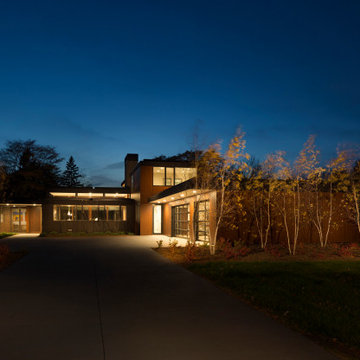
The mHouse is the brainchild of a magazine publisher intent on changing the way houses are constructed and how their owners relate to them. Named after one of the company’s website, the mHouse serves as a built manifesto of innovative panel materials such as rice hull composites and thermally fused laminate – becoming a case study house for over 30 international material suppliers.
The design challenge was quite clear – how to use a series of new materials unproven in the US building trades to create a beautiful house that meets the unique needs of today’s family. The result is a building that is highly rational in its construction systems, while encouraging social gathering.
The mHouse serves as a direct counterpoint to the typical suburban builder home – creating unique outdoor spaces in place of the typical open lawn, a variety of different views in contrast to one major view, and expressing a confidence in the future over nostalgia for the past.
Through a series of layers and nodes, the landscape grounds the house and heightens the views from inside, using indigenous plantings applied in non-traditional ways, the landscape mirrors the house in rethinking the suburban home.
The mHouse strikes a balance between proven methods and innovative solutions, resulting in one version of what is possible with these materials and setting the stage for future iterations and new possibilities.
Size
Total Finished Area: 3,405 sf
Completion Date
September 2015
Services
Architecture
Interior Design Consultant: Amy Carman Design
Landscape Consultant: Texten
 Grand Appliance and TV
Placement of your TV relative to your furniture, speakers, etc. is crucial to the overall design aesthetic. If your TV will be mounted above a cabinet with nothing on top of it, we typically recommend the bottom of the TV be no less than two inches and no more than six inches from the top of the cabinet. The latter, six inches, should only be with very large TVs and/or very tall ceilings.
If there will be a speaker or some sort of decoration on top of the table, we typically error on the side of less space from the top of whatever that is to the bottom of the TV rather than more.
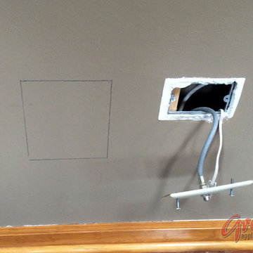
This job was particularly interesting because we were dealing with a curved TV mounted above a soundbar with the added design challenge of incorporating the existing chair rail on the wall.
In the end, we decided to marry the bottom of the soundbar with the top of the chair rail.
From that decision, we could determine the top of the soundbar and place the TV wall bracket in such a way that there would be a 1-2 inch gap between the bottom of the TV and the wall mounted soundbar.
Note that your TV mount comes in two parts. One part attaches to the wall, the other part is usually two arms that connect to the TV. The two parts essentially hook together for an easy hanging installation. Its important to measure according to where the hooking will take place (rather than the outside edge of the TV per se) in order to achieve proper spacing.
15