
Search results for "Uncovers" in Home Design Ideas

 Kathleen Jennison
An Arts & Crafts Bungalow is one of my favorite styles of homes. We have quite a few of them in our Stockton Mid-Town area. And when C&L called us to help them remodel their 1923 American Bungalow, I was beyond thrilled.
As per usual, when we get a new inquiry, we quickly Google the project location while we are talking to you on the phone. My excitement escalated when I saw the Google Earth Image of the sweet Sage Green bungalow in Mid-Town Stockton. "Yes, we would be interested in working with you," I said trying to keep my cool.
But what made it even better was meeting C&L and touring their home, because they are the nicest young couple, eager to make their home period perfect. Unfortunately, it had been slightly molested by some bad house-flippers, and we needed to bring the bathroom back to it "roots."
We knew we had to banish the hideous brown tile and cheap vanity quickly. But C&L complained about the condensation problems and the constant fight with mold. This immediately told me that improper remodeling had occurred and we needed to remedy that right away.
The Before: Frustrations with a Botched Remodel
The bathroom needed to be brought back to period appropriate design with all the functionality of a modern bathroom. We thought of things like marble countertop, white mosaic floor tiles, white subway tile, board and batten molding, and of course a fabulous wallpaper.
This small (and only) bathroom on a tight budget required a little bit of design sleuthing to figure out how we could get the proper look and feel. Our goal was to determine where to splurge and where to economize and how to complete the remodel as quickly as possible because C&L would have to move out while construction was going on.
The Process: Hard Work to Remedy Design and Function
During our initial design study, (which included 2 hours in the owners’ home), we noticed framed images of William Morris Arts and Crafts textile patterns and knew this would be our design inspiration. We presented C&L with three options and they quickly selected the Pimpernel Design Concept.
We had originally selected the Black and Olive colors with a black vanity, mirror, and black and white floor tile. C&L liked it but weren’t quite sure about the black, We went back to the drawing board and decided the William & Co Pimpernel Wallpaper in Bayleaf and Manilla color with a softer gray painted vanity and mirror and white floor tile was more to their liking.
After the Design Concept was approved, we went to work securing the building permit, procuring all the elements, and scheduling our trusted tradesmen to perform the work.
We did uncover some shoddy work by the flippers such as live electrical wires hidden behind the wall, plumbing venting cut-off and buried in the walls (hence the constant dampness), the tub barely balancing on two fence boards across the floor joist, and no insulation on the exterior wall.
All of the previous blunders were fixed and the bathroom put back to its previous glory. We could feel the house thanking us for making it pretty again.
The After Reveal: Cohesive Design Decisions
We selected a simple white subway tile for the tub/shower. This is always classic and in keeping with the style of the house.
We selected a pre-fab vanity and mirror, but they look rich with the quartz countertop. There is much more storage in this small vanity than you would think.
The Transformation: A Period Perfect Refresh
We began the remodel just as the pandemic reared and stay-in-place orders went into effect. As C&L were already moved out and living with relatives, we got the go-ahead from city officials to get the work done (after all, how can you shelter in place without a bathroom?).
All our tradesmen were scheduled to work so that only one crew was on the job site at a time. We stayed on the original schedule with only a one week delay.
The end result is the sweetest little bathroom I've ever seen (and I can't wait to start work on C&L's kitchen next).
Thank you for joining me in this project transformation. I hope this inspired you to think about being creative with your design projects, determining what works best in keeping with the architecture of your space, and carefully assessing how you can have the best life in your home.

 Wolfgang Pichler Design Inc.
A vacant, worn office space should be transformed into a show apartment / showroom. The existing space had been used as an office structure since the 1960s. Located on the 4th floor of a ten-floor reinforced concrete skeleton, the area is already high enough to receive a great amount of light, which is particularly noticeable at dawn and dusk: sunrises and sunsets conjure up the most spellbinding blends of light.
The existing structure and also the technical equipment were completely outdated and needed to be completely rebuilt: suspended ceilings were removed and walls changed. The result is a modern city apartment of almost 100 m2 (about 1,070 sqft) – divided into a large living space, 2 rooms, 1 bathroom, 1 powder room and 1 utility room. The existing window facades could not be changed, but they are part of the concept anyway, namely to bring as much light as possible into the room. A controlled ventilation system ensures optimal air quality even with closed windows. The central kitchen element serves as a kind of separation of the living area and the dining area. Here customers and guests are served, people communicate, cook together, drink a glass of wine. Clients experience living.
The rough reinforced concrete ribbed slaps were uncovered and painted white to give the room more height, which is accentuated by the lighting concept with ceiling-mounted spotlights. The dark oak floor creates a successful contrast to the brightly designed rooms. The wittily positioned pedestal areas hide all technical elements, such as the supply air openings of the living room ventilation. Flush-fitting door elements in the walls with a chalked brick look show in detail the special feature of the room. The central wall elements were deliberately not pulled up to the ceiling, but are separated by a glass element to show the continuity of the construction.
Most of the furniture was designed by Wolfgang Pichler. Within the course of this project he was able to implement his holistic approach in the field of construction technology, architecture and furniture design and skillfully combine it with design classics. Scandinavian classics can be found in the concept just as much as pieces he collected during his career and furniture he developed for the company VITEO, which he founded in 2002. The project illustrates the added value of an architectural holistic approach.

 Irons Brothers Construction Inc
We remodeled this unassuming mid-century home from top to bottom. An entire third floor and two outdoor decks were added. As a bonus, we made the whole thing accessible with an elevator linking all three floors.
The 3rd floor was designed to be built entirely above the existing roof level to preserve the vaulted ceilings in the main level living areas. Floor joists spanned the full width of the house to transfer new loads onto the existing foundation as much as possible. This minimized structural work required inside the existing footprint of the home. A portion of the new roof extends over the custom outdoor kitchen and deck on the north end, allowing year-round use of this space.
Exterior finishes feature a combination of smooth painted horizontal panels, and pre-finished fiber-cement siding, that replicate a natural stained wood. Exposed beams and cedar soffits provide wooden accents around the exterior. Horizontal cable railings were used around the rooftop decks. Natural stone installed around the front entry enhances the porch. Metal roofing in natural forest green, tie the whole project together.
On the main floor, the kitchen remodel included minimal footprint changes, but overhauling of the cabinets and function. A larger window brings in natural light, capturing views of the garden and new porch. The sleek kitchen now shines with two-toned cabinetry in stained maple and high-gloss white, white quartz countertops with hints of gold and purple, and a raised bubble-glass chiseled edge cocktail bar. The kitchen’s eye-catching mixed-metal backsplash is a fun update on a traditional penny tile.
The dining room was revamped with new built-in lighted cabinetry, luxury vinyl flooring, and a contemporary-style chandelier. Throughout the main floor, the original hardwood flooring was refinished with dark stain, and the fireplace revamped in gray and with a copper-tile hearth and new insert.
During demolition our team uncovered a hidden ceiling beam. The clients loved the look, so to meet the planned budget, the beam was turned into an architectural feature, wrapping it in wood paneling matching the entry hall.
The entire day-light basement was also remodeled, and now includes a bright & colorful exercise studio and a larger laundry room. The redesign of the washroom includes a larger showering area built specifically for washing their large dog, as well as added storage and countertop space.
This is a project our team is very honored to have been involved with, build our client’s dream home.
Find the right local pro for your project

 Western Outdoor Designs
San Diego Landscape Designer, Western Outdoor Design and Build, from pavers to pool design, our all-star team of in-house landscape designers, landscape architects and builders can manage your remodel from concept to completion. We specialize in backyard renovations; we design and build the lavish and luxurious outdoor living spaces Southern California is known for.
 Charter Custom Homes
The phone rings early in the morning, and it’s a long-time client who treats our team of skilled craftsmen like family, continually lauding our work. It’s these types of clients we all have and all love and, of course, will drop anything to help.
As I navigate my usual morning commute, I’m greeted by a forlorn sigh and the description of the freak-fire which destroyed their beloved outdoor living area (along with the home’s family room, kitchen, and master bedroom). Getting past the initial shock, we had to act quickly to ensure their safety. Quite the start to the morning.
Challenges with this project run deeper than just the build: security of the entire affected area, good and sensitive communication, and navigating a pandemic lockdown can cause even the strongest-willed person to throw their hands up and call it quits.
When the fire broke out, it took out the entire backyard and portions of the home, making the structure unlivable. We needed to mitigate the fire damage and make sure the house was secure against break-ins, but also, no damage existed that could cause harm to the neighbors.
It’s these moments where relationships matter. The client needed a trusted and established partner to begin the rebuilding process. Professional knowledge is only one part of the puzzle. It’s here an empathetic ear, and extra solace goes far to remind the client all can be rebuilt.
Lastly, none of us saw the difficulties a pandemic would bring. At a time when a person was about to use every square foot of their home to shelter-in-place, our client would be in the middle of a rebuild with no use of their beautiful outdoor living area to get through the day. Luckily, we were able to work with the city of Clyde Hill and continue through an emergency services waiver.
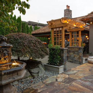
What was done? The outdoor living area included a complete rebuild of the gazebo, including a large sitting area and fire pit. Stone patios were replaced, and additional stone was chosen to create a secondary, uncovered living area with a fire pit to enjoy during the summer months.
The build is a testament to superb craftsmanship and design. However, we believe excellence also includes the holistic approach to listen deeply, empathize and understand a client’s history, external pressures of the world, and build community and relationship.


 Amazing Spaces
Ilir Rizaj
Large transitional single-wall dark wood floor eat-in kitchen photo in New York with an undermount sink, shaker cabinets, gray cabinets, granite countertops, white backsplash, ceramic backsplash, stainless steel appliances and an island
Large transitional single-wall dark wood floor eat-in kitchen photo in New York with an undermount sink, shaker cabinets, gray cabinets, granite countertops, white backsplash, ceramic backsplash, stainless steel appliances and an island

 Gregg Lipton
Solid Cherry wood and stainless steel top panel set into a solid Cherry edgeband. Available with or without the scalloped apron detail. Available in round, rectangle, oval, and extension tables.
 Simply Home Decorating
This beautiful North Vancouver home belongs to a nature-loving and health-conscious couple, Emma and Vince (names changed), their two young children, and their dog, Jasper. When they contacted us about renovating and furnishing their kitchen and family room, we walked in and saw a world of potential waiting to be uncovered.
Before: Larkhall Crescent Home:
Like many original North Vancouver homes, the interior was definitely dated. We encountered late ‘80s finishes in powder pink and teal green, old carpet, and a kitchen that wasn’t maximized to suit this family’s modern-day lifestyle. However, the size of the rooms offered us a ton of space with which to get creative.
Knowing our clients’ love of cooking, need for work spaces (Emma and Vince both work remotely), and growing family, we developed a design concept that would increase usable space, optimize storage, and create intimacy in this large area. As for the style, we were inspired by their European roots, inventing a new and modern take on “Belgian Farmhouse” style. Now, the home is truly one-of-a-kind.
After: Warm & Cozy Family Room:
Fresh, bright, and comfortable, this living area has been transformed! We started with the fireplace as a focal point, selecting aged brick tiles for added texture and a crisp wood mantle. The taupe-coloured sectional infuses the room with visual warmth and serves the added purpose of separating the family room from the kitchen.
Emma and Vince were also keen on using non-toxic materials in their home, and we were happy to oblige. To meet their needs, we sourced natural wood elements and sought out Canadian-made products - that adhere to high health standards - whenever possible.
Look closer at the elements of this space, and you will find this stunning, honeycomb-patterned rug in earthy gold, beige, and charcoal tones. It’s plush to the touch and full of visual texture that brings this room’s colour palette together. We sourced these two-tone chairs with caning, petrified wood side table, black sconces, and botanical prints in greyscale from local artist, Heather Johnston.
We topped off the space with this dark wood and rattan console that offers storage facing the kitchen and presents an opportunity to display cherished items. The result is a cozy lounging space brimming with comfort and functionality. It’s perfect for enjoying quality family time, or Emma can simply slide the coffee table away to make room for her morning yoga practice.
Now, let’s turn around and give some attention to the kitchen. Do you remember what the original kitchen looked like? If not, scroll back up, because the transformation is shocking…
Moody & Welcoming Kitchen for Healthy Living:
This kitchen looks very different from how it started, right? Though we didn’t touch any walls, the kitchen has almost doubled in usable space! We created a long, extended island with storage, an outlet for small appliances, and seating for comfortable prep, after-school snacking, or mingling among friends.
On the other side of the island, the family has even more storage and an integrated dishwasher within easy reach of the sink, perfect for quick clean-up. From this angle, you can also see the expansive custom Shaker cabinetry in white and the integrated double ovens. These facilitate their cooking experience and gave us the opportunity to add an additional surprise…
A coffee garage station and more hidden storage! Keeping these items located along the perimeter allows them to be accessed by the family or their guests without someone getting under the cook’s feet. These are the little details that make everyday life easier and more enjoyable.
Moving deeper into the kitchen, the seamless induction cooktop topped with a freestanding concealed hood fan commands attention in a soft yet prominent way. The natural wood accent mirrors the fireplace mantle, and the choice of off-black wood-grain cabinets not only continues our black-and-white colour palette but adds a sense of depth and contrast. The corner sink is located to the right and perfectly positioned with a view of their thriving backyard.
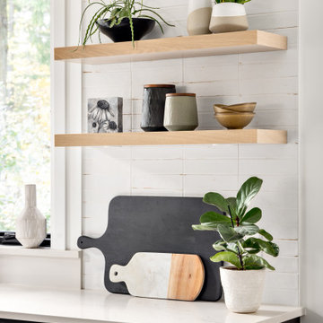
To invite more of this family’s character into the space, we mixed metals for interest — matte black, dark pewter, and warm brass — and created open shelves in white oak for their plants and decor. You can also glimpse the tumbled edge of the backsplash tile, which echoes the rustic brick of the fireplace. It adds that farmhouse charm while still feeling timeless and sophisticated.
Last but not least, we designed this dining banquette in the bay window (with integrated bench storage, of course), where the family can share a meal together, the kids can do homework, or Emma and Vince can work and enjoy a change of scenery from their offices. Like the other spaces in the home, it was designed to be beautiful, multi-functional, and long-lasting.
Praise from Our Clients:
It is clear that we love this home, but what did our clients have to say?
“Lori is a visionary and masters execution to the finest detail all at the same time. When she first met us to know more about who we are and how we live, she could right away envision how we could use the space in our kitchen and living room…The results exceeded our expectations.
Lori and her team were also a delight to work with — coordination with all the trades, fast problem-solving, regular updates, professional and friendly attitude of her entire team — made it the dream team. Thank you SHD for making our space so beautiful!”
In turn, we are so grateful for this family’s trust, their open communication, and for being wonderful people with whom to work. (So, thank you!)
 Schedio Spaces
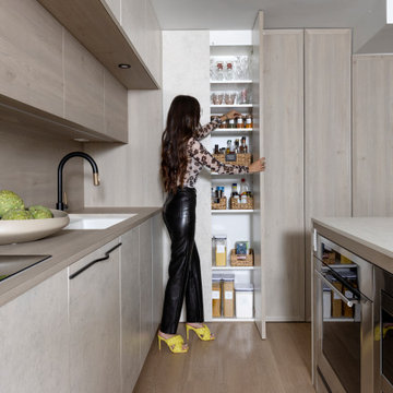
Starting its life as a dark, walled in space with inadequate cabinetry and multiple awkward components, I knew the only way forward with this penthouse kitchen, was for it to undergo a complete rebuild.
The clients were hoping to welcome a child in the years following this renovation, however they love to entertain so also wanted a modern and sophisticated kitchen. Therefore, the task became marrying functional
indestructibility with clean, elevated design, resulting in a timeless, architecturally forward kitchen with sensible storage and innovated finishes.
The first and most important task when addressing the modernization of this kitchen, was to remove the existing walls that closed off the space. Accomplishing this allowed for a more free-flowing feel and opened the sightline to the rest of the unit. This also invited the opportunity for a new, more welcoming floor plan including the addition of a large island with
ample counter space and optional eat-in functionality.
In order to maximize functional efficiency and overall aesthetic value, I knew the plumbing required substantial relocation. However, with concrete ceilings and floors, combined with a strata unwilling to allow trenching of
the slab, moving the plumbing to the most effective location was no easy feat.
Ultimately, I was able to accomplish this by creating a hidden channel inside the cabinetry that allowed the plumbing to be redirected to the ideal location without visible detection.
Creatively, I was inspired by the idea of injecting dimension, by way of juxtaposing materials that wouldn’t necessarily be found together in nature,
yet worked harmonious when combined. You’ll notice the cabinet fronts are all made of solid Dekton – a manmade stone that while costly, is nearly indestructible. This created the base in which we inset the countertop,
backsplash and surround, all made in a wood-like material. As if a huge ice-cream scoop glided into a slab of solid stone, uncovering beautiful layered depths of wood. I worked with a local company to custom
manufacture this is a high impact, one-of-a-kind laminate specifically for this project. It’s nonporous, fingerprint resistant and antimicrobial. It offers a matte finish which has a beautiful hand-feel resembling real wood but because it’s manmade, it’s not subjected to the same expansion and contraction of natural wood, making it an exceptional choice for this application.
Final details also include a touchless kitchen faucet, integrated appliances, hidden storage, Italian lighting, delicate Australian hardware and smart switches and plugs.
 Irons Brothers Construction Inc
We remodeled this unassuming mid-century home from top to bottom. An entire third floor and two outdoor decks were added. As a bonus, we made the whole thing accessible with an elevator linking all three floors.
The 3rd floor was designed to be built entirely above the existing roof level to preserve the vaulted ceilings in the main level living areas. Floor joists spanned the full width of the house to transfer new loads onto the existing foundation as much as possible. This minimized structural work required inside the existing footprint of the home. A portion of the new roof extends over the custom outdoor kitchen and deck on the north end, allowing year-round use of this space.
Exterior finishes feature a combination of smooth painted horizontal panels, and pre-finished fiber-cement siding, that replicate a natural stained wood. Exposed beams and cedar soffits provide wooden accents around the exterior. Horizontal cable railings were used around the rooftop decks. Natural stone installed around the front entry enhances the porch. Metal roofing in natural forest green, tie the whole project together.
On the main floor, the kitchen remodel included minimal footprint changes, but overhauling of the cabinets and function. A larger window brings in natural light, capturing views of the garden and new porch. The sleek kitchen now shines with two-toned cabinetry in stained maple and high-gloss white, white quartz countertops with hints of gold and purple, and a raised bubble-glass chiseled edge cocktail bar. The kitchen’s eye-catching mixed-metal backsplash is a fun update on a traditional penny tile.
The dining room was revamped with new built-in lighted cabinetry, luxury vinyl flooring, and a contemporary-style chandelier. Throughout the main floor, the original hardwood flooring was refinished with dark stain, and the fireplace revamped in gray and with a copper-tile hearth and new insert.
During demolition our team uncovered a hidden ceiling beam. The clients loved the look, so to meet the planned budget, the beam was turned into an architectural feature, wrapping it in wood paneling matching the entry hall.
The entire day-light basement was also remodeled, and now includes a bright & colorful exercise studio and a larger laundry room. The redesign of the washroom includes a larger showering area built specifically for washing their large dog, as well as added storage and countertop space.
This is a project our team is very honored to have been involved with, build our client’s dream home.
 Irons Brothers Construction Inc
We remodeled this unassuming mid-century home from top to bottom. An entire third floor and two outdoor decks were added. As a bonus, we made the whole thing accessible with an elevator linking all three floors.
The 3rd floor was designed to be built entirely above the existing roof level to preserve the vaulted ceilings in the main level living areas. Floor joists spanned the full width of the house to transfer new loads onto the existing foundation as much as possible. This minimized structural work required inside the existing footprint of the home. A portion of the new roof extends over the custom outdoor kitchen and deck on the north end, allowing year-round use of this space.
Exterior finishes feature a combination of smooth painted horizontal panels, and pre-finished fiber-cement siding, that replicate a natural stained wood. Exposed beams and cedar soffits provide wooden accents around the exterior. Horizontal cable railings were used around the rooftop decks. Natural stone installed around the front entry enhances the porch. Metal roofing in natural forest green, tie the whole project together.
On the main floor, the kitchen remodel included minimal footprint changes, but overhauling of the cabinets and function. A larger window brings in natural light, capturing views of the garden and new porch. The sleek kitchen now shines with two-toned cabinetry in stained maple and high-gloss white, white quartz countertops with hints of gold and purple, and a raised bubble-glass chiseled edge cocktail bar. The kitchen’s eye-catching mixed-metal backsplash is a fun update on a traditional penny tile.
The dining room was revamped with new built-in lighted cabinetry, luxury vinyl flooring, and a contemporary-style chandelier. Throughout the main floor, the original hardwood flooring was refinished with dark stain, and the fireplace revamped in gray and with a copper-tile hearth and new insert.
During demolition our team uncovered a hidden ceiling beam. The clients loved the look, so to meet the planned budget, the beam was turned into an architectural feature, wrapping it in wood paneling matching the entry hall.
The entire day-light basement was also remodeled, and now includes a bright & colorful exercise studio and a larger laundry room. The redesign of the washroom includes a larger showering area built specifically for washing their large dog, as well as added storage and countertop space.
This is a project our team is very honored to have been involved with, build our client’s dream home.

 Heller & Associates
The extension of this home integrated the roof lines in the rear and creates new dining, living, and kitchen space covered, but still open to the outdoors. Horizontal Azek fascia boards and copper gutters frame a tongue and groove ceiling. The ceiling is mitered on all corners, and trimmed into a pan to define the sitting and dining space. Stainless cabinets and appliances with concrete counter tops that are waterfall down on both sides of island provide the ultimate luxury in this addition. Balancing with the covered space is an adjacent aggregate concrete patio. In addition to the covered space, there is a concrete floating gas firebox surrounded by four outdoor captain’s chairs which offer an additional outdoor room to gather and enjoy the outdoor living. This new space in this Bloomfield Village residence was completed in 2015 and has become the favorite space to congregate.

 TOC design & construction inc.
Formal Dining in a relax setting by Tania Scardellato – TOC design
Remodeling your home can be a lengthy and time consuming process, especially if you opt to renovate the entire house rather than just one room. However, even just by updating the decor in your home you can create a beautiful and fresh looking space. One space that is particularly easy to overhaul is the dining room. This is one of the smaller rooms in the home and contains a minimal amount of furniture, making the remodeling process quick and simple.
An essential factor of dining room design is the color scheme of this space. When searching for the best paint colors for a dining room you should keep a few things in mind, including your design, the size of the room, and the décor of the rest of your house. Because it tends to be smaller than most rooms in the home you do not want to choose a really dark or overwhelming color like black or bright fuchsia. Rather save these hues as accents in dark wood furniture, curtains, pictures, and other wall art. In this dining room we kept the colors neutral and added more accents to hi-gloss moldings, highlighting the architecture of the space and creating space definition with a TOUCH OF CLASS - TOC
When it comes to lighting for the dining room you have a lot of options such as chandeliers or wall sconces, however natural light is always best. If you already have windows in this space try to keep them uncovered or use sheer fabric curtains to allow optimum illumination in throughout the day. If your dining room does not have windows there are other options available that can help to brighten and open up this area
Accessorizing your dining room with the right accents is very important to tie in all aspects of the design. For example, an elegant table centerpiece can make the dining space feel more homey and relaxed. You can accent a kitchen island or dining table with a stunning vase of festive flowers, ornamental fruits and vegetables, or a basket of decorative glass ornaments. However, try to keep the ornamentation to a minimum to prevent cluttering the countertops. Sometimes the table itself can be an accent piece. The dining room creates an elegant focal point that contains different colors, textures, and patterns. Similarly, leather chairs surrounding solid oak dining room furniture add the element of texture and color while creating a rustic, old world atmosphere. Regardless of the look you are trying to obtain, or the room in which you are redecorating, we can help create the style custom to suit your needs
 Simply Home Decorating
This beautiful North Vancouver home belongs to a nature-loving and health-conscious couple, Emma and Vince (names changed), their two young children, and their dog, Jasper. When they contacted us about renovating and furnishing their kitchen and family room, we walked in and saw a world of potential waiting to be uncovered.
Before: Larkhall Crescent Home:
Like many original North Vancouver homes, the interior was definitely dated. We encountered late ‘80s finishes in powder pink and teal green, old carpet, and a kitchen that wasn’t maximized to suit this family’s modern-day lifestyle. However, the size of the rooms offered us a ton of space with which to get creative.
Knowing our clients’ love of cooking, need for work spaces (Emma and Vince both work remotely), and growing family, we developed a design concept that would increase usable space, optimize storage, and create intimacy in this large area. As for the style, we were inspired by their European roots, inventing a new and modern take on “Belgian Farmhouse” style. Now, the home is truly one-of-a-kind.
After: Warm & Cozy Family Room:
Fresh, bright, and comfortable, this living area has been transformed! We started with the fireplace as a focal point, selecting aged brick tiles for added texture and a crisp wood mantle. The taupe-coloured sectional infuses the room with visual warmth and serves the added purpose of separating the family room from the kitchen.
Emma and Vince were also keen on using non-toxic materials in their home, and we were happy to oblige. To meet their needs, we sourced natural wood elements and sought out Canadian-made products - that adhere to high health standards - whenever possible.
Look closer at the elements of this space, and you will find this stunning, honeycomb-patterned rug in earthy gold, beige, and charcoal tones. It’s plush to the touch and full of visual texture that brings this room’s colour palette together. We sourced these two-tone chairs with caning, petrified wood side table, black sconces, and botanical prints in greyscale from local artist, Heather Johnston.
We topped off the space with this dark wood and rattan console that offers storage facing the kitchen and presents an opportunity to display cherished items. The result is a cozy lounging space brimming with comfort and functionality. It’s perfect for enjoying quality family time, or Emma can simply slide the coffee table away to make room for her morning yoga practice.
Now, let’s turn around and give some attention to the kitchen. Do you remember what the original kitchen looked like? If not, scroll back up, because the transformation is shocking…
Moody & Welcoming Kitchen for Healthy Living:
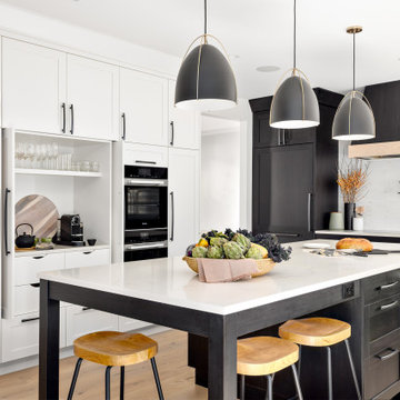
This kitchen looks very different from how it started, right? Though we didn’t touch any walls, the kitchen has almost doubled in usable space! We created a long, extended island with storage, an outlet for small appliances, and seating for comfortable prep, after-school snacking, or mingling among friends.
On the other side of the island, the family has even more storage and an integrated dishwasher within easy reach of the sink, perfect for quick clean-up. From this angle, you can also see the expansive custom Shaker cabinetry in white and the integrated double ovens. These facilitate their cooking experience and gave us the opportunity to add an additional surprise…
A coffee garage station and more hidden storage! Keeping these items located along the perimeter allows them to be accessed by the family or their guests without someone getting under the cook’s feet. These are the little details that make everyday life easier and more enjoyable.
Moving deeper into the kitchen, the seamless induction cooktop topped with a freestanding concealed hood fan commands attention in a soft yet prominent way. The natural wood accent mirrors the fireplace mantle, and the choice of off-black wood-grain cabinets not only continues our black-and-white colour palette but adds a sense of depth and contrast. The corner sink is located to the right and perfectly positioned with a view of their thriving backyard.
To invite more of this family’s character into the space, we mixed metals for interest — matte black, dark pewter, and warm brass — and created open shelves in white oak for their plants and decor. You can also glimpse the tumbled edge of the backsplash tile, which echoes the rustic brick of the fireplace. It adds that farmhouse charm while still feeling timeless and sophisticated.
Last but not least, we designed this dining banquette in the bay window (with integrated bench storage, of course), where the family can share a meal together, the kids can do homework, or Emma and Vince can work and enjoy a change of scenery from their offices. Like the other spaces in the home, it was designed to be beautiful, multi-functional, and long-lasting.
Praise from Our Clients:
It is clear that we love this home, but what did our clients have to say?
“Lori is a visionary and masters execution to the finest detail all at the same time. When she first met us to know more about who we are and how we live, she could right away envision how we could use the space in our kitchen and living room…The results exceeded our expectations.
Lori and her team were also a delight to work with — coordination with all the trades, fast problem-solving, regular updates, professional and friendly attitude of her entire team — made it the dream team. Thank you SHD for making our space so beautiful!”
In turn, we are so grateful for this family’s trust, their open communication, and for being wonderful people with whom to work. (So, thank you!)
 Tile Doctor Ltd
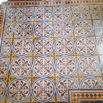
This very old Encaustic tiled flooring was uncovered at a property in Chester when the present owners started to undertake renovation. They removed the carpets and vinyl tiles from the hallway, revealing the Encaustic tiles to find that they were in truly horrific condition. This included being covered by heavy dirt, dust and, in some parts, by a sticky black bitumen.
Encaustic tiles are made out of compressed cement, and were commonly used in properties built during the Edwardian and Victorian period. This gives us a good idea of just how old these tiles are – but the owners were keen to see what Tile Doctor could do to restore their condition.
The black bitumen was my main concern when it came to cleaning the tiles. To remove this, along with all the other dirt and dust, our powerful cleaner for heavy soil buildup, known as Tile Doctor Remove and Go, was applied.
The product, which is also effective for removing adhesive and paint stains, was worked into the tiles then left to dwell for thirty minutes, before being scrubbed with a black pad fitted to a rotary machine. The resulting cleaning residue was soaked up with a wet vac machine. This cleaning process was repeated once more over to get the tiles as clean as possible, before leaving them to dry overnight.
The next day, damp readings were taken to make sure the floor was dry enough to seal. It’s essential to take damp readings before sealing – especially with old tiled floors that may not have a damp proof membrane installed – as even the slightest amount of excess moisture can damage the performance of the sealer.
Two types of sealer were used in this situation. First to be applied was a single coat of Tile Doctor Colour Grow, an impregnating, colour intensifying sealer which enhances the best shades in the tiles. Following this, four coats of Tile Doctor Seal and Go were applied. This is a topical sealer, which means it builds a layer of protection on the surface of the floor, while also providing an aesthetically pleasing low-sheen finish.
The customer was over the moon at the end result. At first the floor looked to be with a lost cause, but with the right cleaning methods and products it has been a restored to a standard where it almost appears new. Another satisfied customer!
Alastair Robb
West Cheshire Tile Doctor
 Wolfgang Pichler Design Inc.
A vacant, worn office space should be transformed into a show apartment / showroom. The existing space had been used as an office structure since the 1960s. Located on the 4th floor of a ten-floor reinforced concrete skeleton, the area is already high enough to receive a great amount of light, which is particularly noticeable at dawn and dusk: sunrises and sunsets conjure up the most spellbinding blends of light.
The existing structure and also the technical equipment were completely outdated and needed to be completely rebuilt: suspended ceilings were removed and walls changed. The result is a modern city apartment of almost 100 m2 (about 1,070 sqft) – divided into a large living space, 2 rooms, 1 bathroom, 1 powder room and 1 utility room. The existing window facades could not be changed, but they are part of the concept anyway, namely to bring as much light as possible into the room. A controlled ventilation system ensures optimal air quality even with closed windows. The central kitchen element serves as a kind of separation of the living area and the dining area. Here customers and guests are served, people communicate, cook together, drink a glass of wine. Clients experience living.
The rough reinforced concrete ribbed slaps were uncovered and painted white to give the room more height, which is accentuated by the lighting concept with ceiling-mounted spotlights. The dark oak floor creates a successful contrast to the brightly designed rooms. The wittily positioned pedestal areas hide all technical elements, such as the supply air openings of the living room ventilation. Flush-fitting door elements in the walls with a chalked brick look show in detail the special feature of the room. The central wall elements were deliberately not pulled up to the ceiling, but are separated by a glass element to show the continuity of the construction.
Most of the furniture was designed by Wolfgang Pichler. Within the course of this project he was able to implement his holistic approach in the field of construction technology, architecture and furniture design and skillfully combine it with design classics. Scandinavian classics can be found in the concept just as much as pieces he collected during his career and furniture he developed for the company VITEO, which he founded in 2002. The project illustrates the added value of an architectural holistic approach.
 Wolfgang Pichler Design Inc.
A vacant, worn office space should be transformed into a show apartment / showroom. The existing space had been used as an office structure since the 1960s. Located on the 4th floor of a ten-floor reinforced concrete skeleton, the area is already high enough to receive a great amount of light, which is particularly noticeable at dawn and dusk: sunrises and sunsets conjure up the most spellbinding blends of light.
The existing structure and also the technical equipment were completely outdated and needed to be completely rebuilt: suspended ceilings were removed and walls changed. The result is a modern city apartment of almost 100 m2 (about 1,070 sqft) – divided into a large living space, 2 rooms, 1 bathroom, 1 powder room and 1 utility room. The existing window facades could not be changed, but they are part of the concept anyway, namely to bring as much light as possible into the room. A controlled ventilation system ensures optimal air quality even with closed windows. The central kitchen element serves as a kind of separation of the living area and the dining area. Here customers and guests are served, people communicate, cook together, drink a glass of wine. Clients experience living.
The rough reinforced concrete ribbed slaps were uncovered and painted white to give the room more height, which is accentuated by the lighting concept with ceiling-mounted spotlights. The dark oak floor creates a successful contrast to the brightly designed rooms. The wittily positioned pedestal areas hide all technical elements, such as the supply air openings of the living room ventilation. Flush-fitting door elements in the walls with a chalked brick look show in detail the special feature of the room. The central wall elements were deliberately not pulled up to the ceiling, but are separated by a glass element to show the continuity of the construction.
Most of the furniture was designed by Wolfgang Pichler. Within the course of this project he was able to implement his holistic approach in the field of construction technology, architecture and furniture design and skillfully combine it with design classics. Scandinavian classics can be found in the concept just as much as pieces he collected during his career and furniture he developed for the company VITEO, which he founded in 2002. The project illustrates the added value of an architectural holistic approach.
 Simply Home Decorating
The kitchen may be the heart of a home, but the dining room is where the family gathers to enjoy special occasions, create and pass on traditions, and savour each other’s company free from distractions. The family behind this particular dining room enjoys doing just that.
When they are not traveling the world, Matthew and Anna (names changed) love to cook meals at home with their teenage daughter, entertain family and friends, and live amongst their cherished travel souvenirs and heirlooms. Their dining room, however, was far from the perfect backdrop for these experiences.
Before: Dining Room:
When Matthew and Anna contacted us, they imagined a space that would comfortably seat 8 to 10 people and incorporate their beautiful inherited dining table and sideboard in a fresh, modern way. Above all, they wanted a dining room that they would feel proud to share.
They worked with us to design, lightly renovate, and furnish their dining room and adjacent living space. Now, the room is nothing short of inviting and elevated.
Classic Yet Contemporary Dining Room:
Viewed from the living area, the dining room is a hidden gem waiting to be discovered. Matthew and Anna wanted dark blue for the walls, and we couldn’t have been happier to find the perfect shade for them. By leaning darker, this rich blue creates the perception of depth, making the room feel enticing, comfortable and secluded.
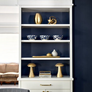
The previous built-ins were underwhelming and lacked function, so we designed wider, taller, double sided cabinets that integrated the existing bulk-head, and then accessorized the shelves with the family’s travel finds, books, and decor. Topping these units with brass art lights not only blends contemporary and traditional styles, it also draws attention to the dining table’s modern show-stopping chandelier. You can’t miss it.
Inside the dining room, the effect is equally impressive: enveloping yet spacious, warm yet cool, classic yet contemporary. We incorporated their heirloom pieces seamlessly into the design thanks to the 1:2 ratio. For every traditional piece, we introduced two more modern or contemporary pieces — clean lines, subtle curves, and lustrous brass hardware. The result is a collected yet updated look.
In any room with dark walls, lighting is of the utmost importance. We placed a mirror adjacent to the window to reflect natural light throughout the room, and we kept the trim and ceiling white for brightness. To provide maximum versatility, we provided multiple light sources that can be adjusted to create different levels of light to suit any mood or occasion. These include: pot lights and a chandelier on dimmers, a sculptural trilight lamp on the sideboard, and art lights on the bookcases and above important art pieces.
The built-ins have another surprise waiting inside this special dining room:
Double-sided built-ins: dining room shelving and living room shelving.
Rather than keep them white like we did in the living room, we painted the back wall of the book cases the same dark blue as the walls in the rest of the room. This reduces the contrast with the surrounding walls and emphasizes the white outline of the cabinets. We also love the dark blue walls’ role as a beautiful backdrop for this family’s treasures. The brass accessories and hand-painted vases and bowls feel like part of the experience.
Of course, what is beauty without function? It may not look like it, but the base storage is only accessible from the dining room side. The units include deep cabinets for storing serving ware, as well as another delightful surprise: silverware drawers lined in luxurious navy velvet!
Lastly, we designed this beautiful nook for their heirloom sideboard. From afar, the wall looks as if it has texture and perhaps a touch of shine. Up close, you will notice that it is actually navy blue wallpaper with tiny golden dots. This unique touch accentuates the brass in the room touches throughout the space.. The room feels curated, contemporary, and full of character.
Words of Praise:
Anna and Matthew were thrilled with their new dining room and with the design process itself, which is always the highest compliment. They said:
“Working with Lori and her team at Simply Home Decorating was a great experience. The design they came up with was both beautiful and practical for our family. Renovations can be stressful but working with Simply Home made the process much more pleasant.
“Simply Home's project management and their longstanding relationships with reliable trades meant we could relax, knowing that everything was taken care of. If an issue arose, the entire Simply Home team was quick to address it. They were excellent at communicating with us—we never felt like we didn't know what was going on. We would highly recommend working with Simply Home Decorating.”
Thank you, Matthew and Anna! We are honoured to have been part of your journey and wish your family many happy memories in these new spaces.
Now, is it your turn? Are you ready to uncover the hidden potential in your home? If so, contact us here to start the conversation or download my guide Uncovering the Hidden Potential in Your Home below to learn more about what we can do for you.
 Irons Brothers Construction Inc
We remodeled this unassuming mid-century home from top to bottom. An entire third floor and two outdoor decks were added. As a bonus, we made the whole thing accessible with an elevator linking all three floors.
The 3rd floor was designed to be built entirely above the existing roof level to preserve the vaulted ceilings in the main level living areas. Floor joists spanned the full width of the house to transfer new loads onto the existing foundation as much as possible. This minimized structural work required inside the existing footprint of the home. A portion of the new roof extends over the custom outdoor kitchen and deck on the north end, allowing year-round use of this space.
Exterior finishes feature a combination of smooth painted horizontal panels, and pre-finished fiber-cement siding, that replicate a natural stained wood. Exposed beams and cedar soffits provide wooden accents around the exterior. Horizontal cable railings were used around the rooftop decks. Natural stone installed around the front entry enhances the porch. Metal roofing in natural forest green, tie the whole project together.
On the main floor, the kitchen remodel included minimal footprint changes, but overhauling of the cabinets and function. A larger window brings in natural light, capturing views of the garden and new porch. The sleek kitchen now shines with two-toned cabinetry in stained maple and high-gloss white, white quartz countertops with hints of gold and purple, and a raised bubble-glass chiseled edge cocktail bar. The kitchen’s eye-catching mixed-metal backsplash is a fun update on a traditional penny tile.
The dining room was revamped with new built-in lighted cabinetry, luxury vinyl flooring, and a contemporary-style chandelier. Throughout the main floor, the original hardwood flooring was refinished with dark stain, and the fireplace revamped in gray and with a copper-tile hearth and new insert.
During demolition our team uncovered a hidden ceiling beam. The clients loved the look, so to meet the planned budget, the beam was turned into an architectural feature, wrapping it in wood paneling matching the entry hall.
The entire day-light basement was also remodeled, and now includes a bright & colorful exercise studio and a larger laundry room. The redesign of the washroom includes a larger showering area built specifically for washing their large dog, as well as added storage and countertop space.
This is a project our team is very honored to have been involved with, build our client’s dream home.
136