
Search results for "Uninteresting" in Home Design Ideas
 Kevin Caron Studios, L.L.C.
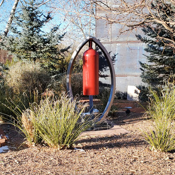
This colorful wind chime bell adds life to an otherwise uninteresting spot.
Design ideas for a large contemporary landscaping in Phoenix.
Design ideas for a large contemporary landscaping in Phoenix.
 MK Development & Investment LLC
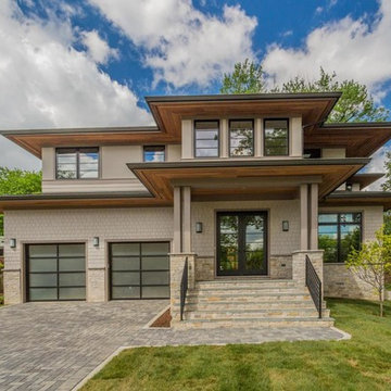
Inspiration for a contemporary beige two-story house exterior remodel in DC Metro
 Amanda Martocchio Architecture
Photo credit Jane Beiles
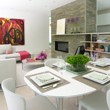
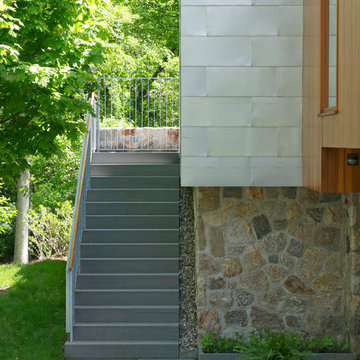
Located on a beautiful property with a legacy of architectural and landscape innovation, this guest house was originally designed by the offices of Eliot Noyes and Alan Goldberg. Due to its age and expanded use as an in-law dwelling for extended stays, the 1200 sf structure required a renovation and small addition. While one objective was to make the structure function independently of the main house with its own access road, garage, and entrance, another objective was to knit the guest house into the architectural fabric of the property. New window openings deliberately frame landscape and architectural elements on the site, while exterior finishes borrow from that of the main house (cedar, zinc, field stone) bringing unity to the family compound. Inside, the use of lighter materials gives the simple, efficient spaces airiness.
A challenge was to find an interior design vocabulary which is both simple and clean, but not cold or uninteresting. A combination of rough slate, white washed oak, and high gloss lacquer cabinets provide interest and texture, but with their minimal detailing create a sense of calm.
Find the right local pro for your project
 Heirloom Wood Studio
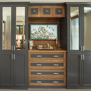
The challenge of this brand new high rise condo was to stay in keeping with the contemporary finishes of this Denver interior while giving a nod to the owners' more traditional taste. The bigger challenge was to prevent this essentially storage wall from looking flat and boring. Working with designer Linda Sease, our senior designer developed this brilliant vignette featuring a special door design that retains simplicity of lines while attaining an elegant almost glitzy style.
Another challenge was the almost full wall window on the right which forced a shallow column of display over a stack of shoe roll-outs. This forced a stepped out pair of columns for hanging clothes above matching stacks of roll-outs for clothes storage. This articulation actually improves the design by preventing an otherwise unbroken and uninteresting storage wall. Finally a clever set of two-tone drawers featuring a pair of jewelry organizer drawers in black (see photo), with TV over and at the top a swing up opening cabinet for media equipment.
Glitz and a feeling of luxurious living is enhanced with beveled mirrored doors, beveled glass doors and beveled edge glass shelves.
The slate blue French doors with antique mirror between the master bedroom and living room provide extra privacy as well as enhancing the almost spartan trim and open plan kitchen to a feeling of luxury.
 Amanda Martocchio Architecture
Photo credit Jane Beiles
Located on a beautiful property with a legacy of architectural and landscape innovation, this guest house was originally designed by the offices of Eliot Noyes and Alan Goldberg. Due to its age and expanded use as an in-law dwelling for extended stays, the 1200 sf structure required a renovation and small addition. While one objective was to make the structure function independently of the main house with its own access road, garage, and entrance, another objective was to knit the guest house into the architectural fabric of the property. New window openings deliberately frame landscape and architectural elements on the site, while exterior finishes borrow from that of the main house (cedar, zinc, field stone) bringing unity to the family compound. Inside, the use of lighter materials gives the simple, efficient spaces airiness.
A challenge was to find an interior design vocabulary which is both simple and clean, but not cold or uninteresting. A combination of rough slate, white washed oak, and high gloss lacquer cabinets provide interest and texture, but with their minimal detailing create a sense of calm.
 Otogawa-Anschel Design-Build
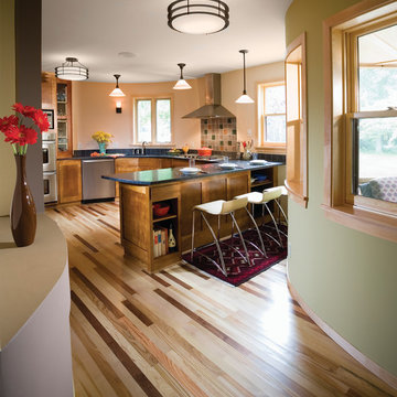
There is always an easy way out. A simple, uninteresting solution that neither challenges nor engages the mind or the soul. The 50s rambler is a simple structure that lacks character and charm. Its greatest contribution to architecture was the single floor living concept. We came to this project because the homeowners believed their home had the potential to be something more and had invested their time and creativity into developing ideas for what it could become. We embraced the opportunity to collaborate with the homeowner to create a home that was unique, thoughtful, customized for their use, and cared for.
The curved exterior shell of this addition wraps around to accommodate a screen porch under a lifted peak. Inside, the new kitchen follows the curve with custom cabinets and honed granite creating a dynamite space for a chef. Shade tree, bamboo and honed slate flooring weave the living room, dining room, bathroom and kitchen together. Walls jog and jump with color and dimension.
One of the major challenges was to ensure that the space could accommodate large family gatherings of 12 – 16 people yet still feel intimate and comfortable for two people when guests were not present. As you move through the home you will notice that none of the spaces feel cavernous or restrictive. Careful attention was paid to mapping out the space to create areas that were cozy and appropriate while taking traffic patterns into consideration. The dining room entrances are staggered which creates the illusion of two separate spaces. The warm red halogen lights further encourage a sense of scale. One can easily extend the dining room table to accommodate a large crowd without causing guests to feel uncomfortable or confined.
The use of color is an often noted feature in our projects. Our philosophy is that the selection of color for the walls is as important as the selection of all the other materials. Color influences everything we do and gives us direction for how to feel, where to go, where to stop, and how to interact. It is the binding component between all the elements in a design. It bends, bounces, twists, manipulates light and the eye, and is required to fully develop and design a space.
This project was an exciting and rewarding challenge, and we are grateful to the homeowners for asking us to be a part of it and to opening up their home to the public. We hope that you will enjoy your time visiting this remarkably transformed home.
highlights
Re-use of existing housing stock
Icynene insulation
Super-insulated ceilings
Remnant granite countertops
Energy Star windows
Shade tree floors
Bamboo floors
Hardishingle siding
Halogen lights
Dimmers and separated task lighting
Energy efficient Panasonic fans
Locally manufactured cabinets
FSC certified millwork
Energy Star appliances
Dual flush toilet
 Susan Currie Design
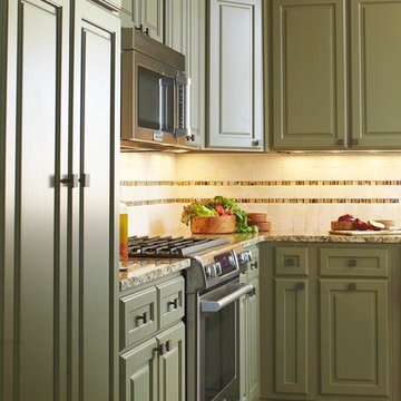
Susan Currie Design renovated this Lawrenceville kitchen and transformed it from a uninteresting all-white room with older appliances into a lively, colorful space. Custom cabinetry features raised panels and 5-piece drawer fronts, painted in a mossy green color. New appliances, countertops, and backsplash were added to compliment the updated cabinetry, and existing wood floors were stained a rich brown tone. The earthy color palette of soft green, creams and light browns makes the room feel understated.

 Amanda Martocchio Architecture
Photo credit Jane Beiles
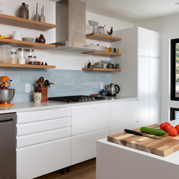
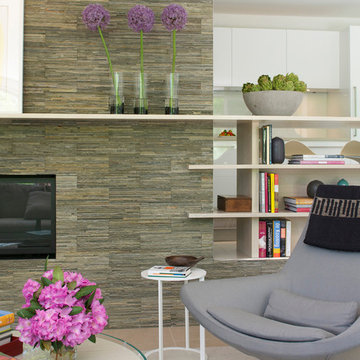
Located on a beautiful property with a legacy of architectural and landscape innovation, this guest house was originally designed by the offices of Eliot Noyes and Alan Goldberg. Due to its age and expanded use as an in-law dwelling for extended stays, the 1200 sf structure required a renovation and small addition. While one objective was to make the structure function independently of the main house with its own access road, garage, and entrance, another objective was to knit the guest house into the architectural fabric of the property. New window openings deliberately frame landscape and architectural elements on the site, while exterior finishes borrow from that of the main house (cedar, zinc, field stone) bringing unity to the family compound. Inside, the use of lighter materials gives the simple, efficient spaces airiness.
A challenge was to find an interior design vocabulary which is both simple and clean, but not cold or uninteresting. A combination of rough slate, white washed oak, and high gloss lacquer cabinets provide interest and texture, but with their minimal detailing create a sense of calm.
Located on a beautiful property with a legacy of architectural and landscape innovation, this guest house was originally designed by the offices of Eliot Noyes and Alan Goldberg. Due to its age and expanded use as an in-law dwelling for extended stays, the 1200 sf structure required a renovation and small addition. While one objective was to make the structure function independently of the main house with its own access road, garage, and entrance, another objective was to knit the guest house into the architectural fabric of the property. New window openings deliberately frame landscape and architectural elements on the site, while exterior finishes borrow from that of the main house (cedar, zinc, field stone) bringing unity to the family compound. Inside, the use of lighter materials gives the simple, efficient spaces airiness.
A challenge was to find an interior design vocabulary which is both simple and clean, but not cold or uninteresting. A combination of rough slate, white washed oak, and high gloss lacquer cabinets provide interest and texture, but with their minimal detailing create a sense of calm.
 Totman Style
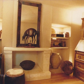
A small un-interesting room became an unusual and inviting sanctuary by creating a wall of recessed niches and a faux fireplace. The room was fully upholstered in natural hemp adding texture as well as soundproofing for a peaceful retreat in a busy household.
 Jetton Construction, Inc.
Charles Debbas Architecture
Lane McNab Interiors
Joe Fletcher Photography
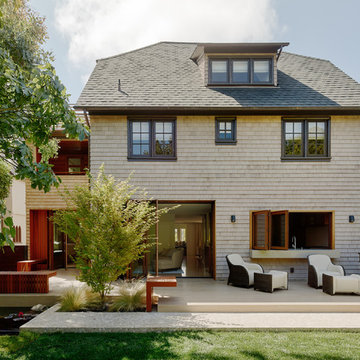
Transitional two-story wood exterior home idea in San Francisco
Transitional two-story wood exterior home idea in San Francisco
 QUARVE CONTRACTING INC
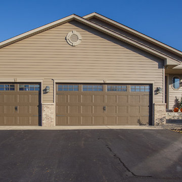
The garage side of the front of the house was expansive but uninteresting. We installed larger two-tone steel headers with keystone insets above the doors, as well as a coordinating round vent with keystones in the upper gable area.
 AMB Design
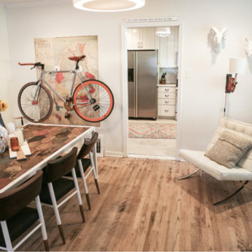
The Dining Room: Adding Naturals
Uninterested in dark wood floors, we opted to sand them down to raw and just leave it. When I asked the floor installers to sand the floors and then leave, they shuddered at the thought of not protecting the wood. But we knew what we wanted, and it was completely worth it to add more of that used patina that amounts to real living. If you spill something on raw floors, you can always just sand it by hand. It’s surprisingly simple to live with this undercooked vibe.
 Amanda Martocchio Architecture
Photo credit Jane Beiles
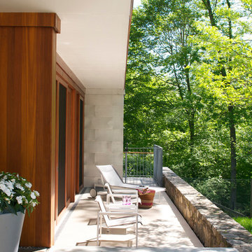
Located on a beautiful property with a legacy of architectural and landscape innovation, this guest house was originally designed by the offices of Eliot Noyes and Alan Goldberg. Due to its age and expanded use as an in-law dwelling for extended stays, the 1200 sf structure required a renovation and small addition. While one objective was to make the structure function independently of the main house with its own access road, garage, and entrance, another objective was to knit the guest house into the architectural fabric of the property. New window openings deliberately frame landscape and architectural elements on the site, while exterior finishes borrow from that of the main house (cedar, zinc, field stone) bringing unity to the family compound. Inside, the use of lighter materials gives the simple, efficient spaces airiness.
A challenge was to find an interior design vocabulary which is both simple and clean, but not cold or uninteresting. A combination of rough slate, white washed oak, and high gloss lacquer cabinets provide interest and texture, but with their minimal detailing create a sense of calm.
 JONATHAN CALVERT | Interiors Photographer
JONATHAN CALVERT
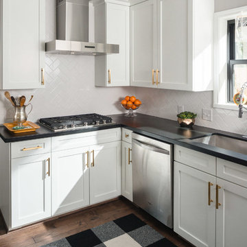
Kitchen - transitional l-shaped dark wood floor and brown floor kitchen idea in Houston with an undermount sink, shaker cabinets, white cabinets, gray backsplash and stainless steel appliances
Kitchen - transitional l-shaped dark wood floor and brown floor kitchen idea in Houston with an undermount sink, shaker cabinets, white cabinets, gray backsplash and stainless steel appliances
 Hixon Interiors, Inc.
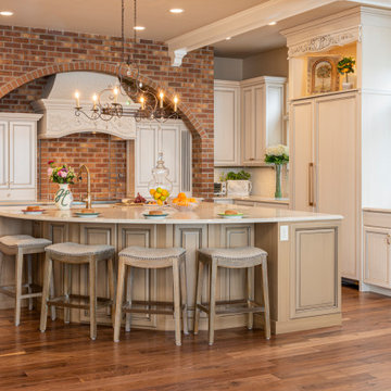
Inspiration for a french country l-shaped medium tone wood floor and brown floor kitchen remodel in Denver with quartz countertops, brick backsplash, an island, recessed-panel cabinets, beige cabinets, paneled appliances and beige countertops
 Amanda Martocchio Architecture
Photo credit Jane Beiles
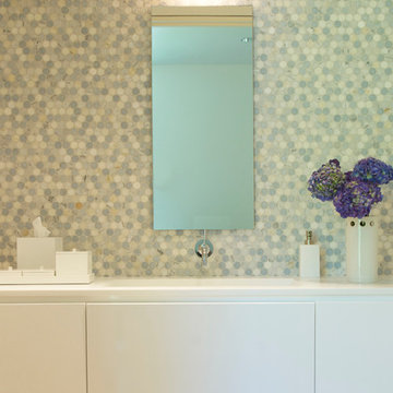
Located on a beautiful property with a legacy of architectural and landscape innovation, this guest house was originally designed by the offices of Eliot Noyes and Alan Goldberg. Due to its age and expanded use as an in-law dwelling for extended stays, the 1200 sf structure required a renovation and small addition. While one objective was to make the structure function independently of the main house with its own access road, garage, and entrance, another objective was to knit the guest house into the architectural fabric of the property. New window openings deliberately frame landscape and architectural elements on the site, while exterior finishes borrow from that of the main house (cedar, zinc, field stone) bringing unity to the family compound. Inside, the use of lighter materials gives the simple, efficient spaces airiness.
A challenge was to find an interior design vocabulary which is both simple and clean, but not cold or uninteresting. A combination of rough slate, white washed oak, and high gloss lacquer cabinets provide interest and texture, but with their minimal detailing create a sense of calm.
 Vandamm Interiors
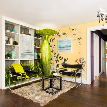
This is a landing in an old farmhouse which was unused and very uninteresting. We gave it life and attitude.
Vandamm Interiors by Victoria Vandamm
 User
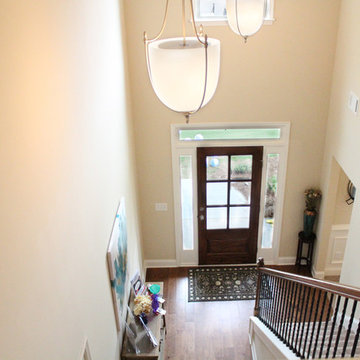
UserLook out over the twp-story foyer in The Lanier plan with double large pendant lights from Progress Lighting and iron picket railing to the stained 6 pane front entrance door. Photos by Chris Campbell

3