
Search results for "Visually expanded" in Home Design Ideas
 Gather and Spruce Design Remodel
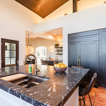
We wanted to maximize space and functional storage for this family of 5. We accomplished this by expanding the island to make it a more functional space for their family. We also created a feature wall for Wolf double ovens, Sub-Zero refrigeration, and a ton of pantry space! We opened the kitchen to the dining room to create a more unified space. The homeowners had an unusable desk area that we eliminated and maximized the space by adding a wet bar complete with wine refrigerator and built-in ice maker. The pantry wall behind the wet bar maximizes storage because, can you REALLY ever have too much storage? Swipe to see before.
 Crystal Kitchen + Bath
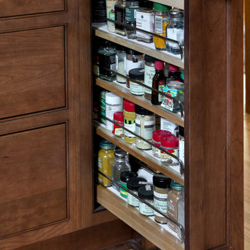
The goal for this 1939 Tudor-style story-and-a-half home was to create a kitchen that offered the conveniences, storage, and performance of a modern workspace while preserving the warmth, craftsmanship, and vintage charm that made the home special. The client, an avid home cook, wanted the room to feel as though it had always belonged to the house, with thoughtful upgrades that respected the original architecture rather than competing with it. Just as important, she needed a more efficient layout with enough storage for small appliances, so everyday cooking would no longer require carrying items up from the lower level.
Several existing conditions shaped the design approach. The kitchen retained original, amber-stained birch woodwork that the client wished to keep, and the compact footprint was interrupted by six doorways and two windows, none of which were to be moved, altered, or replaced. A previous flooring update had left the door casings undercut too short, creating visible gaps where the casing met the floor. The existing vintage 40-inch range also lacked proper ventilation, yet the client wished to accommodate a refrigerator, dishwasher, cooktop, double ovens, built-in microwave, and effective venting above the cooktop into the new kitchen layout.
To honor the original millwork, beaded inset-style cherry cabinetry was selected in a soft, hand-rubbed finish that will deepen over time and develop a natural patina. Charcoal-gray soapstone countertops complement the cabinetry while reinforcing the historic character of the home with an organic, timeworn texture. The former breakfast nook was transformed into a butler’s pantry, adding valuable base cabinet storage and expanded work surfaces for frequently used small appliances. Also in the butler’s pantry, a single upper cabinet was paired with open shelves to give an open, airy feeling while adding character and practical storage. A classic single-bowl apron-front workstation sink contributes both period-appropriate character and practical prep and cleanup function.
Because the home’s openings were such a defining feature, the design worked within the existing architecture instead of altering it. Custom plinth blocks were created for each doorway to extend the original casing gracefully down to the new natural red oak flooring, resolving the earlier construction issue while adding a detail that feels authentic to the age of the house. Despite the number of door and window openings, the new layout provides a significantly more functional, built-in kitchen with an improved work triangle for serious cooking.
Appliance placement was carefully planned to deliver the requested performance without overwhelming the small room. Three cooking functions (double ovens & microwave) were consolidated into one location with a GE Café double oven featuring Advantium Technology, while the client’s compact 31-inch refrigerator was reused to preserve space. A sleek 30-inch induction cooktop provides efficient cooking, and a Vent-A-Hood ARS ductless vent hood supplies needed ventilation without requiring a duct run to the exterior.
The finish palette balances richness, texture, and historical sensitivity. A deeply textured navy backsplash tile adds depth and dramatic shadow play against the soapstone, while wallpaper in the back entry echoes the tile’s geometric pattern to visually connect the adjoining spaces. Oil-rubbed bronze cabinet hardware and light fixtures enhance the warmth of the cherry cabinetry and complete the antique-inspired feel.
Lighting was layered to make the compact kitchen brighter, more useful, and more inviting. Vintage-style semi-flush ceiling fixtures establish the overall tone, while dimmable puck lights highlight select areas and undercabinet task lighting keeps work surfaces well illuminated.
The completed kitchen now feels both highly functional and deeply rooted in the home’s history. Rich cherry cabinetry, velvety soapstone, natural red oak flooring, navy tile, bronze accents, and carefully preserved birch trim work together to create a warm, cohesive space that celebrates timeless craftsmanship. By increasing storage, improving workflow, integrating modern appliances, and respecting the Tudor home’s original character, the design achieves the client’s vision: a kitchen that feels personal, practical, historically appropriate, and as though it has always been there.
 Manchester Design Group
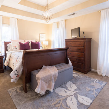
With this layout you'd think we expanded the space. No. I simply changed the layout, added long drapes to add visual height. Also I used a white matisse drape to reflect the light for a bright and airy feel while the texture added interest so white wouldn't appear so plain. There's no doubt the gold accents reflect the new modern vibe. And last but not least changing the hardware on the existing chest of drawers and night stands made an impeccable impact on the style but not the budget.
Find the right local pro for your project
 Klopf Architecture
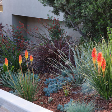
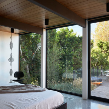
Set on a narrow hillside lot overlooking the San Francisco Bay in Point Richmond, California, Bay Heirloom is a Mid-Century Modern family home restored, modernized and adapted for contemporary living. Oriented south-southwest toward the Marin Headlands, with views of the Golden Gate Bridge, the residence captures shifting Bay light throughout the day, from fog-muted mornings to vivid, glowing sunsets.
The home was built by Karlyn Neel’s grandfather, the owner of the construction company Flo-Crete, one of the Bay Area’s early concrete pumping firms. Flo-Crete completed the foundation and structural concrete work, with family photographs documenting the original cinderblock walls and pours. The firm also contributed to major regional infrastructure projects, including the Transbay BART tube and Candlestick Park, situating the house within a broader legacy of Bay Area construction. Growing up, Neel spent considerable time in the home, developing an early appreciation for mid-century modern principles. Instead of parting with this family heirloom, she purchased the home from her grandfather’s estate.
While her grandfather continued to live in the Point Richmond house, Neel purchased a Mid-Century Modern residence in Palm Desert. In contrast to the Bay Area’s cool temperatures, salt air, and persistent winds, the desert home is shaped by heat and sun and requires a different material response. A substantial renovation she led there emphasized thermal performance, filtered light, and restrained detailing. The experience later informed the restoration of her Bay Area family home.
What began as a modest Mid-Century Modern update expanded when decades of exposure to marine conditions revealed leaks and significant structural and seismic deficiencies. Neel was determined to honor her grandfather’s perseverance and without hesitation pivoted to a much more intensive project. Addressing these challenges required close coordination between Neel, Klopf Architecture and Kasten Builders, with architectural restraint and construction precision guiding each intervention. Rather than alter the home’s defining features, the project focused on reinforcing the structure from within. Discreet beams were embedded along the rear facade and in an upstairs wall, strengthening the building while maximizing the wall of glass facing the Bay and opening the wall between the kitchen and the living space. These structural interventions allowed the space to open fully to the Bay without visual interruption, with the kitchen repositioned as the social and functional core of an open, continuous living space. The building envelope was updated using weather- and corrosion-resistant materials appropriate to the marine environment.
The house unfolds vertically from the street, beginning with a modest garage level and workshop, with the main living spaces located below. Original slate flooring at the entry was preserved, along with select furnishings and artwork collected by Neel’s grandfather, anchoring the restored interior in its past. A restrained palette of black accents and pale, natural finishes replaces darker wood tones, reinforcing openness and calm. A naturally illuminated stair connects to the lowest level, where a former basement was transformed into a guest suite and family room opening onto a deck. From there, steps lead directly to a small concrete boat ramp at the water’s edge.
Throughout the project, decisions were guided by continuity rather than transformation for its own sake. Lessons drawn from both desert and coastal climates informed a material strategy rooted in performance and restraint. Bay Heirloom stands as a measured evolution of a family house, structurally renewed and carefully modernized, grounded in the discipline and care that first shaped it.
Klopf Architecture Project Team: John Klopf, AIA, Angela Todorova and Fernanda Bernardes
Landscape Architect: Huettl Landscape Architecture
General Contractor: Kasten Builders
Photography: ©2025 Mariko Reed
Year Completed: 2022
Location: Point Richmond, CA
 Klopf Architecture
Malibu Glass Box House by Klopf Architecture
Following the devastating Woolsey Fire of 2018, the site in Malibu offered a unique opportunity to rebuild not just a home, but a new architectural composition that highlighted the property’s potential while navigating strict fire-rebuild codes in the area. Designed by Klopf Architecture, this project embraced a set of limitations and translated them into an architectural asset.
The city’s fire-rebuild process required the new structure to remain close to the original footprint, size and bulk, a constraint that ultimately clarified the architectural direction. Perched near the front of a long, narrow lot, the new home frames and overlooks a private, park-like rear expanse, an uncommon luxury especially in this part of Malibu .
Without a fixed program, the design process allowed for a different kind of creative focus allowing Klopf Architecture the opportunity to explore how a modernist home could best respond to this site. The team approached the project not with a list of requirements, but with a question: How might a modernist live here? What spatial qualities would inspire calm, connection, and a sense of wonder in this setting? The process became less about problem-solving and more about architectural storytelling—letting the site, the light, and the principles of modern design guide the form and flow of the home.
The response emerged in the form of a glass-box pavilion, an open, Mid-Century Modern inspired living, dining, and kitchen space that floats at the edge of the property’s natural descent. Connected to the more enclosed, private areas of the home by a glass-walled hallway, the living pavilion becomes a distinct centerpiece of the design. It opens on all four sides to the landscape with decks and patios on the flanks, an internal garden and water feature to the north, and a dramatic unguarded view of the expansive backyard and ocean horizon to the south.
Because of the mandated footprint, careful planning was required to ensure every space could still engage with light, landscape, or both. Strategic voids in the form of atriums and courtyards allow daylight to filter deep into the home’s core, while offering moments of surprise and retreat. These design gestures allow natural light to filter deep into the interior, creating a sense of brightness and openness throughout the day. At the same time, they expand the perceptual boundaries between inside and out, making the home feel more expansive while anchoring its connection to the surrounding landscape.
The siting of the house is what gives it its unique character. Rather than receding into the backyard like the neighboring homes, the house holds a slight prominence. From the central living pavilion, stepping down into the landscape feels more like entering a secluded park where a separate existing accessory structure, trail, and recreational areas await. The home’s modest street presence gives way to this unfolding drama of space, view, and nature.
Fire-resilient materials and assemblies are integrated seamlessly throughout including triple-pane glazing, under-slab and roof insulation, and locally sourced fire-rated cladding ensure the house not only meets Calfornia’s rigorous wildland-urban interface (WUI) standards, but feels effortlessly aligned with them. While technical decisions like fire-hardening and mechanical systems presented some construction challenges, particularly around the cantilevered glass box, the team found a functional compromise that preserved the integrity of the design.
Inside, a restrained palette and exposed post and beam design celebrate the ethos of mid-century modernism. A central circulation spine extends from the entry to the rear glass wall, offering a continuous visual link from street to ocean. Spaces such as the library and office, though more intimate in scale, are never cut off from nature as each opens to its own unique courtyard or garden view.
Though born out of a strict regulatory framework and developed without a specific client, the rebuild design unfolded with remarkable clarity. Grounded in site logic, refined by limitations and an emphasis on timeless spatial relationships – light, proportion, and a strong connection to nature, the resulting design feels both effortless and uplifting. The home lives lightly on the land, opens generously to its surroundings, and strikes a careful balance between privacy, openness, and calm. For Klopf Architecture, it stands as a compelling case study in how site, code, and circumstantial constraints can inspire enduring, modernist architecture. With years of experience reimagining mid-century modern design for how people live today, the firm took the project’s limitations as an opportunity. The result is a home shaped by open, flowing spaces, strong indoor-outdoor connections, and a calm, clear sense of structure. It’s a good reminder that even with strict constraints, there’s still room for architecture to breathe—and for modernism to keep moving forward.
Klopf Architecture project team: Geoff Campen, John Klopf, AIA, and Sherry Tan
Structural Engineer: ZFA
Contractor: Maison D’Artiste
Photography: ©2025 Mariko Reed
Year Completed: 2023
 C2 | Studio Landscape Architecture
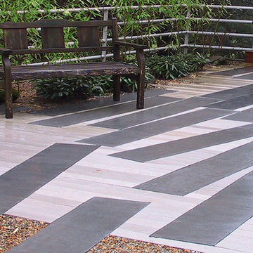
The concept for this project was to reveal the sensation of an active, living landscape in flux and echo the vitality and energy of the wetland that comprises much of this rural site. A mosaic of shifting concrete slabs, set in a field of limestone bands and chip seal, flows through screens of bamboo, set in motion by the slightest breeze. The implied motion of the ground plane blurs the boundary where the terrace and parking court meet, serving the dual purpose of expanded entertaining area or overflow parking during large gatherings. The clipped formal hedge that folds around the house and delineates the lawn stands in stark opposition to the unrestrained hemlock forest that envelops the property, heightening the contrast between the two. The shifting planes of the boardwalk entrance connects these volumes, defining the primary visual and functional axes of the site.
Scott Carman
 Albert, Righter & Tittmann Architects, Inc.
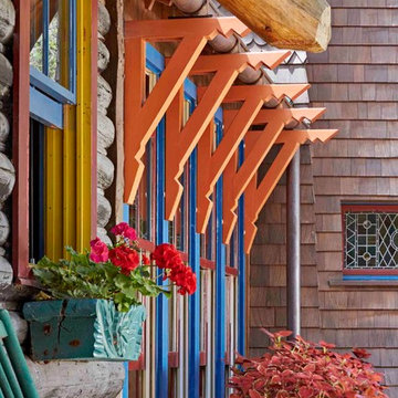
Adirondack Camp is a spirited interpretation of the local vernacular. Our clients had bought and extensively renovated a small old log cabin on a lake in the Adirondacks a couple of years before coming to us to help them expand the program with three additional bedrooms and bathrooms so that their whole family could be there together.
The addition we designed took the form of a tower, with one bedroom and bathroom on each floor, connected to the old cabin by a hyphen which serves as the new entry. The tower is visually a vertical foil to the more horizontal cabin and gives the master bedroom on the top floor a lovely view through the pine trees to the lake. One inspiration for the tower was the old fire towers that patrol the Adirondack mountaintops. The tower was also a practical response to a limited area for expansion.
Photography by Robert Benson


 Klopf Architecture
Malibu Glass Box House by Klopf Architecture
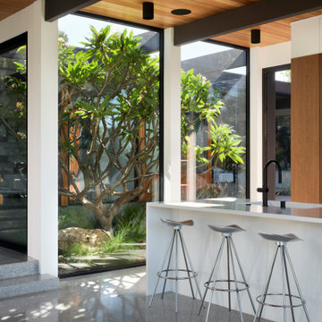
Following the devastating Woolsey Fire of 2018, the site in Malibu offered a unique opportunity to rebuild not just a home, but a new architectural composition that highlighted the property’s potential while navigating strict fire-rebuild codes in the area. Designed by Klopf Architecture, this project embraced a set of limitations and translated them into an architectural asset.
The city’s fire-rebuild process required the new structure to remain close to the original footprint, size and bulk, a constraint that ultimately clarified the architectural direction. Perched near the front of a long, narrow lot, the new home frames and overlooks a private, park-like rear expanse, an uncommon luxury especially in this part of Malibu .
Without a fixed program, the design process allowed for a different kind of creative focus allowing Klopf Architecture the opportunity to explore how a modernist home could best respond to this site. The team approached the project not with a list of requirements, but with a question: How might a modernist live here? What spatial qualities would inspire calm, connection, and a sense of wonder in this setting? The process became less about problem-solving and more about architectural storytelling—letting the site, the light, and the principles of modern design guide the form and flow of the home.
The response emerged in the form of a glass-box pavilion, an open, Mid-Century Modern inspired living, dining, and kitchen space that floats at the edge of the property’s natural descent. Connected to the more enclosed, private areas of the home by a glass-walled hallway, the living pavilion becomes a distinct centerpiece of the design. It opens on all four sides to the landscape with decks and patios on the flanks, an internal garden and water feature to the north, and a dramatic unguarded view of the expansive backyard and ocean horizon to the south.
Because of the mandated footprint, careful planning was required to ensure every space could still engage with light, landscape, or both. Strategic voids in the form of atriums and courtyards allow daylight to filter deep into the home’s core, while offering moments of surprise and retreat. These design gestures allow natural light to filter deep into the interior, creating a sense of brightness and openness throughout the day. At the same time, they expand the perceptual boundaries between inside and out, making the home feel more expansive while anchoring its connection to the surrounding landscape.
The siting of the house is what gives it its unique character. Rather than receding into the backyard like the neighboring homes, the house holds a slight prominence. From the central living pavilion, stepping down into the landscape feels more like entering a secluded park where a separate existing accessory structure, trail, and recreational areas await. The home’s modest street presence gives way to this unfolding drama of space, view, and nature.
Fire-resilient materials and assemblies are integrated seamlessly throughout including triple-pane glazing, under-slab and roof insulation, and locally sourced fire-rated cladding ensure the house not only meets Calfornia’s rigorous wildland-urban interface (WUI) standards, but feels effortlessly aligned with them. While technical decisions like fire-hardening and mechanical systems presented some construction challenges, particularly around the cantilevered glass box, the team found a functional compromise that preserved the integrity of the design.
Inside, a restrained palette and exposed post and beam design celebrate the ethos of mid-century modernism. A central circulation spine extends from the entry to the rear glass wall, offering a continuous visual link from street to ocean. Spaces such as the library and office, though more intimate in scale, are never cut off from nature as each opens to its own unique courtyard or garden view.
Though born out of a strict regulatory framework and developed without a specific client, the rebuild design unfolded with remarkable clarity. Grounded in site logic, refined by limitations and an emphasis on timeless spatial relationships – light, proportion, and a strong connection to nature, the resulting design feels both effortless and uplifting. The home lives lightly on the land, opens generously to its surroundings, and strikes a careful balance between privacy, openness, and calm. For Klopf Architecture, it stands as a compelling case study in how site, code, and circumstantial constraints can inspire enduring, modernist architecture. With years of experience reimagining mid-century modern design for how people live today, the firm took the project’s limitations as an opportunity. The result is a home shaped by open, flowing spaces, strong indoor-outdoor connections, and a calm, clear sense of structure. It’s a good reminder that even with strict constraints, there’s still room for architecture to breathe—and for modernism to keep moving forward.
Klopf Architecture project team: Geoff Campen, John Klopf, AIA, and Sherry Tan
Structural Engineer: ZFA
Contractor: Maison D’Artiste
Photography: ©2025 Mariko Reed
Year Completed: 2023
 Sandra Hambley
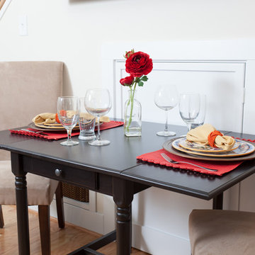
We were recently contacted by a local realtor to assist with staging a condo that had been on the market since April. The condo located on Franklin St. in Old Town Alexandria, is in a building that had recently been converted from commercial to residential and needed staging to help potential buyers visualize the space as a home. We were happy to help! level of the condo is approximately 350 square feet so we selected furnishings that would maximize space and demonstrate how homeowners could use it wisely. Decor and You DC supplied everything: furniture, lighting, artwork, rugs, accessories, and bedding. There was no yard in the front of the unit, but we were able to create a small court yard area with a cozy seating area for two. The condo looks great now and we think it won’t be long before it sells!
 Kitchen Magic
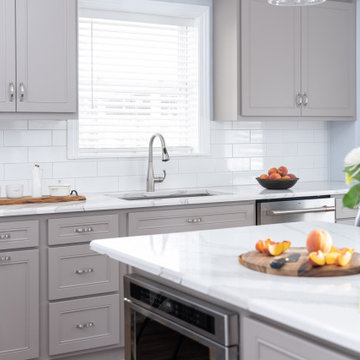
Oak wood cabinets went against the grain for this homeowner. Previously, the former kitchen yielded a yawn-worthy amount of neutral sub-par wood grains. Now, the new remodel is enveloped in warm, inviting taupe hues. Going from woodgrain to flat color instantly infuses a clean, fresh palette. The combination of flat color in a warm tone offers the same warmth of wood.
From traditional to a modern minimalist sensibility, the homeowners refaced existing cabinets in Prestige Statesman Beaded Edge style doors are accented with satin nickel hardware. Additionally, the homeowners knew refacing was an excellent choice. Refacing offers a quicker solution to transform sturdy existing cabinetry to a brand-new effect.
As for the countertops, Cambria Quartz in Brittanicca brings a fresh, rich effect with a simple cream swirl to coordinate perfectly with the stone-hued cabinetry. A round over edge brings a minimalistic look to make a designer statement. The Brittanicca pattern in engineered quartz suggests the look of marble yet offers significantly more durability and antimicrobial properties.
Meanwhile, a solution for the underused space over the kitchen radiator was needed, adding that the area now serves as a highly functional pantry. The custom pantry was the "icing on the cake," particularly with glass front doors, to create a focal point. In all, the design choice also works to expand the kitchen visually.
 Michael Nash Design, Build & Homes
2011 CHRYSALIS AWARD WINNER, ADDITION $100,000-$250,000
The owners of this small rambler in Arlington were tired of living in cramped quarters. The home’s kitchen was only 8’ x 11’ and they wanted to add a family room. Because the home is built on a slab, with no basement, the decision was made to expand out into the backyard.
Their contractor, Michael Nash Design, Build & Homes, proposed an addition to back of the home, which would also be built on a slab to match the existing elevation. To make room, they had to remove the home’s original patio and then remove the 30’ wall running across the back of the home.
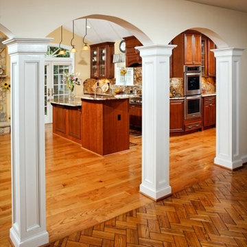
In their place, a new 16’x32’ addition was built with high cathedral ceilings, skylights and French doors topped with arched transoms. An archway and decorative columns were put in place to connect the old and new areas.
The new kitchen starts in the old kitchen area and wraps its way into the new addition, ending with a large two-tier island and prep sink topped with exotic granite. The main sink is in the corner of the old kitchen, easily accessible from both ends of the work area.
Beautiful custom-made cabinets include a wooden range hood and floor-to-ceiling pantry with wine rack. Stainless steel Energy Star appliances include a professional-quality gas cooktop and double wall ovens.
The kitchen flows into the new family room via an open concept design. A beautiful floor-to-ceiling natural stone fire place located in the middle of the back wall serves as a visual separation for the space. A round window is uniquely embedded in the stone work near the ceiling.
Wide plank oak flooring runs the length of the room, providing a uniform look throughout the space. Opposite the kitchen is the home’s new family room, with comfortable leather seating and plenty of windows to brighten up the space. A new stone patio off the kitchen provides the finishing touch to this remodel. In the end, the project provided the homeowners with the space they wanted and plenty of amenities to make family time or entertaining guests a pleasure.
 RoomService 360
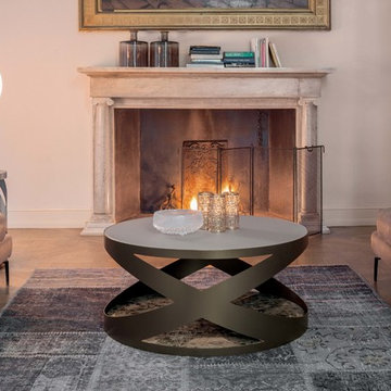
Founded in 1975 by Gianni Tonin, the Italian modern furniture company Tonin Casa has long been viewed by European designers as one of the best interior design firms in the business, but it is only within the last five years that the company expanded their market outside Italy. As an authorized dealer of Tonin Casa contemporary furnishings, room service 360° is able to offer an extensive line of Tonin Casa designs.
Tonin Casa furniture features a wide range of distinctive styles to ensure the right selection for any contemporary home. The room service 360° collection includes a broad array of chairs, nightstands, consoles, television stands, dining tables, coffee tables and mirrors. Quality materials, including an extensive use of tempered glass, mark Tonin Casa furnishings with style and sophistication.
Tonin Casa modern furniture combines style and function by merging modern technology with the Italian tradition of innovative style and quality craftsmanship. Each piece complements homes styled in the modern style, yet each piece offers visual style on its own as well, with imaginative designs that are sure to add a note of distinction to any contemporary home.
 Murphy Bros. Design | Build | Remodel
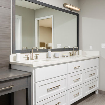
The homeowner also wanted a dressing table added on to the new custom 2-sink vanity for expanded functionality. All the surfaces were upgraded—from quartz countertops to ceramic tile flooring. Murphy Bros. Designer, Cherie Poissant, worked closely with our Murphy Bros. Paint & Fine Finishers. to achieve a custom stained finish that allows the rift sawn oak grain to show, yet visually making a focal point of white contrast to highlight the artful freestanding tub against the darker wall tile.
“It was a floor to ceiling transformation of two very important spaces for this homeowner whom had waited many years to see these rooms transformed,” summarized Poissant.

Sponsored
Columbus, OH

Snider & Metcalf Interior Design, LTD
Leading Interior Designers in Columbus, Ohio & Ponte Vedra, Florida
 Morpurgo Architects
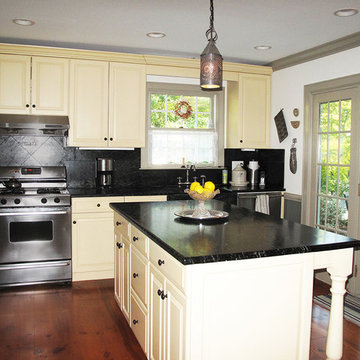
The owners of this former one-story ranch house had clipped a newspaper article featuring Morpurgo Architects’ receipt of the coveted State and County Historic Preservation Awards. As they read the article, they knew that they had found the firm with the expertise to turn their ranch into a Dutch Colonial two-story home with sweeping roof lines. It was their family’s opportunity to return to their roots that lie in the early history of the Dutch settlements in Bergen County.
We designed renovations that reconfigured and expanded the first floor. The relocated entrance, centered on the new stone masonry front facade that replicates the rope grouting of the 1800’s, opens onto a vestibule that provides access to the new kitchen, dining, living, and family rooms. The new second floor roof sweeps and dormers add interior visual interest to the bedroom and bathroom.
Our clients tell us that neighbors frequently stop by to admire their distinctive home, unique among the nearby ranch houses. They feel that they have the best of both worlds, living in a house that has the look of a historic home and includes authentic features such as wide plank floors, square-cut nails, bulls-eye glass, Dutch doors, strap hinges and latches, while enjoying all the modern amenities of today’s homes.
 Modern Outdoor
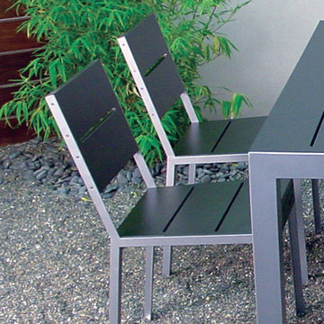
Casual yet elegant, the Etra Collection by Modern Outdoor offers a modern aesthetic that is constructed for outdoor use while being suitable for indoor settings. Etra’s visual inspiration is derived from its architectural-based frame system. Designed using structural angle steel that is mitered and ground, a clean and seamless surface gives Etra its pure appeal.
Frame Options:
• 304 stainless steel that is brushed and electropolished
• marine-grade 316 stainless steel that is brushed and electropolished for use within one mile of salt air, available for an upcharge
• powder coated carbon steel in our standard silver finish
• custom powder coat colors, available for an upcharge
Surface Options:
• sustainably harvested ipe – a beautiful South American hardwood that is three times as dense as teak — naturally resistant to rot, insects, UV exposure, ice, salt, abrasion and splintering – all without the need for toxic chemicals — considered a 25+ year wood
• marine-grade polyboard – a UV stabilized high-density polyethylene material that is non-corrosive and chip resistant – available in six colors for expanded design choices
Fabric Options:
• six standard colors of 100% solution dyed acrylic treated for outdoor use are offered
• custom fabrics and COM service are also available
Cushion Options:
• our standard foam cushions are made from outdoor appropriate high-resiliency (HR) foam
• for clients that prefer less maintenance, a flow-through foam that allows water and moisture to escape the cushion is also available for an upcharge
Etra is a full-breadth line with dining, bar height, lounge, cafe, patio and pool setting pieces included. The pieces are readily customizable for individual client needs.
 Modern Outdoor
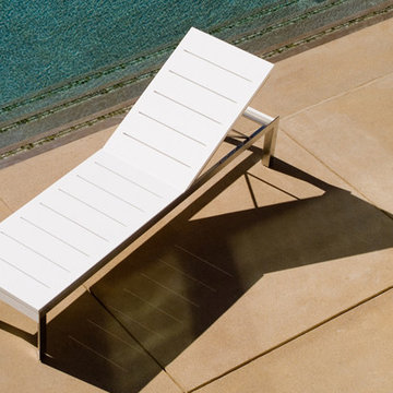
Casual yet elegant, the Etra Collection by Modern Outdoor offers a modern aesthetic that is constructed for outdoor use while being suitable for indoor settings. Etra’s visual inspiration is derived from its architectural-based frame system. Designed using structural angle steel that is mitered and ground, a clean and seamless surface gives Etra its pure appeal.
Frame Options:
• 304 stainless steel that is brushed and electropolished
• marine-grade 316 stainless steel that is brushed and electropolished for use within one mile of salt air, available for an upcharge
• powder coated carbon steel in our standard silver finish
• custom powder coat colors, available for an upcharge
Surface Options:
• sustainably harvested ipe – a beautiful South American hardwood that is three times as dense as teak — naturally resistant to rot, insects, UV exposure, ice, salt, abrasion and splintering – all without the need for toxic chemicals — considered a 25+ year wood
• marine-grade polyboard – a UV stabilized high-density polyethylene material that is non-corrosive and chip resistant – available in six colors for expanded design choices
Fabric Options:
• six standard colors of 100% solution dyed acrylic treated for outdoor use are offered
• custom fabrics and COM service are also available
Cushion Options:
• our standard foam cushions are made from outdoor appropriate high-resiliency (HR) foam
• for clients that prefer less maintenance, a flow-through foam that allows water and moisture to escape the cushion is also available for an upcharge
Etra is a full-breadth line with dining, bar height, lounge, cafe, patio and pool setting pieces included. The pieces are readily customizable for individual client needs.
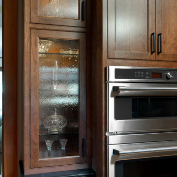 Crystal Kitchen + Bath
The goal for this 1939 Tudor-style story-and-a-half home was to create a kitchen that offered the conveniences, storage, and performance of a modern workspace while preserving the warmth, craftsmanship, and vintage charm that made the home special. The client, an avid home cook, wanted the room to feel as though it had always belonged to the house, with thoughtful upgrades that respected the original architecture rather than competing with it. Just as important, she needed a more efficient layout with enough storage for small appliances, so everyday cooking would no longer require carrying items up from the lower level.
Several existing conditions shaped the design approach. The kitchen retained original, amber-stained birch woodwork that the client wished to keep, and the compact footprint was interrupted by six doorways and two windows, none of which were to be moved, altered, or replaced. A previous flooring update had left the door casings undercut too short, creating visible gaps where the casing met the floor. The existing vintage 40-inch range also lacked proper ventilation, yet the client wished to accommodate a refrigerator, dishwasher, cooktop, double ovens, built-in microwave, and effective venting above the cooktop into the new kitchen layout.
To honor the original millwork, beaded inset-style cherry cabinetry was selected in a soft, hand-rubbed finish that will deepen over time and develop a natural patina. Charcoal-gray soapstone countertops complement the cabinetry while reinforcing the historic character of the home with an organic, timeworn texture. The former breakfast nook was transformed into a butler’s pantry, adding valuable base cabinet storage and expanded work surfaces for frequently used small appliances. Also in the butler’s pantry, a single upper cabinet was paired with open shelves to give an open, airy feeling while adding character and practical storage. A classic single-bowl apron-front workstation sink contributes both period-appropriate character and practical prep and cleanup function.
Because the home’s openings were such a defining feature, the design worked within the existing architecture instead of altering it. Custom plinth blocks were created for each doorway to extend the original casing gracefully down to the new natural red oak flooring, resolving the earlier construction issue while adding a detail that feels authentic to the age of the house. Despite the number of door and window openings, the new layout provides a significantly more functional, built-in kitchen with an improved work triangle for serious cooking.
Appliance placement was carefully planned to deliver the requested performance without overwhelming the small room. Three cooking functions (double ovens & microwave) were consolidated into one location with a GE Café double oven featuring Advantium Technology, while the client’s compact 31-inch refrigerator was reused to preserve space. A sleek 30-inch induction cooktop provides efficient cooking, and a Vent-A-Hood ARS ductless vent hood supplies needed ventilation without requiring a duct run to the exterior.
The finish palette balances richness, texture, and historical sensitivity. A deeply textured navy backsplash tile adds depth and dramatic shadow play against the soapstone, while wallpaper in the back entry echoes the tile’s geometric pattern to visually connect the adjoining spaces. Oil-rubbed bronze cabinet hardware and light fixtures enhance the warmth of the cherry cabinetry and complete the antique-inspired feel.
Lighting was layered to make the compact kitchen brighter, more useful, and more inviting. Vintage-style semi-flush ceiling fixtures establish the overall tone, while dimmable puck lights highlight select areas and undercabinet task lighting keeps work surfaces well illuminated.
The completed kitchen now feels both highly functional and deeply rooted in the home’s history. Rich cherry cabinetry, velvety soapstone, natural red oak flooring, navy tile, bronze accents, and carefully preserved birch trim work together to create a warm, cohesive space that celebrates timeless craftsmanship. By increasing storage, improving workflow, integrating modern appliances, and respecting the Tudor home’s original character, the design achieves the client’s vision: a kitchen that feels personal, practical, historically appropriate, and as though it has always been there.



 Infinite Home
Our clients wanted this room to feel inviting and practical. By replacing the carpet with the same hardwood floors found in the rest of the home, we were able to create a sense of warmth and continuity. The fireplace mantel was painted Benjamin Moore Swiss Coffee, giving it new life as a focal point, while the built-in cabinetry was updated to reflect the cabinets in the kitchen. We refreshed the walls, trim, and millwork with a fresh coat of paint, instantly brightening the room and creating a clean, cohesive backdrop.
We started by designing a spacious, glass-enclosed shower finished in a
porcelain marble-style tile and accented with modern brushed brass fixtures and a built-in niche for everyday convenience. While our clients loved having a double vanity, they also wanted a little more breathing room to get ready. To create that separation, we utilized an unused area of the bathroom—relocating the toilet into its own private enclosure and expanding the vanity wall for a more open layout.
The warm wood base of the vanity now adds an inviting, organic touch, while the Kichler Aviv wall sconces add sleek visual interest to the room. Now their bathroom feels calm, refreshing, and timeless.
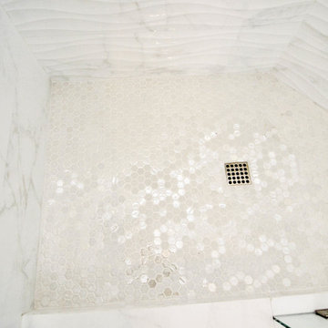
 La Costa Cabinets & Design
A classic marble white and marble motif play beautifully off the weathered engineered wood flooring in the guest bathroom renovation. A walk in shower replaced the unused tub, and the frameless glass shower door and tiled wainscoting make this small space seem much larger than its footprint. A wall hung toilet and toe kick lighting expands the floor visually, allowing for the small tiled in window to truly brighten this small space. Marble countertops compliment the marbled sculpted large format Porcelanosa wall tile, and satin nickel fixtures pop against the white background. Truly a retreat!
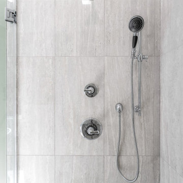
 Croes Renovations
A white 66" freestanding tub takes up less physical and visual space than the previous built-in tub and allowed for an expanded shower. The original layout had the sinks on opposite sides of the room. Joining the sinks in a single vanity over 8' allowed the space for a huge linen closet. Custom wainscoting keeps the traditional feel of the rest of the home
110