
Search results for "Vital tools" in Home Design Ideas
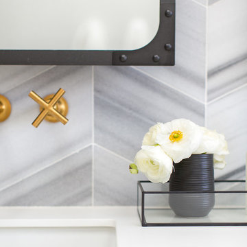
 Lindye Galloway Interiors
Marisa Vitale Photography
www.marisavitale.com
Large cottage master gray tile and ceramic tile white floor drop-in bathtub photo in Los Angeles with recessed-panel cabinets, gray cabinets and white walls
Large cottage master gray tile and ceramic tile white floor drop-in bathtub photo in Los Angeles with recessed-panel cabinets, gray cabinets and white walls
 CRES Builders Corp.
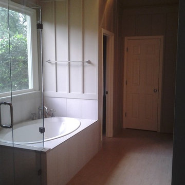
This customer was referred to us by a local real estate agent who was familiar with our work and trusted us to deliver an amazing finished product.
Initially, the customer was interested in doing a simple face lift on their master bath; however, their focus shifted during the design phase and they decided to go with a complete master bath remodel.
To help with the design process, the customer came to us with a design they discovered on Houzz.com, the use of which we fully encourage for all of our customers because it serves as a great tool to help homeowners settle upon the perfect style and theme.
Once a final design was chosen, we created several rough draft estimates to fine-tune the scope of the project and began the process of getting the necessary materials on site, which plays a vital role in avoiding delays. Once all of the materials arrived, we began work on the three-week remodel.
In the end, this particular customer wanted an elegant and simple, yet functional and clean line master bathroom - something modern with a sense of traditional class. Upon completion, the finished product was not only stylish, but incredibly beautiful, leaving the customer extremely happy with our work.
 CRES Builders Corp.
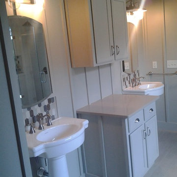
This customer was referred to us by a local real estate agent who was familiar with our work and trusted us to deliver an amazing finished product.
Initially, the customer was interested in doing a simple face lift on their master bath; however, their focus shifted during the design phase and they decided to go with a complete master bath remodel.
To help with the design process, the customer came to us with a design they discovered on Houzz.com, the use of which we fully encourage for all of our customers because it serves as a great tool to help homeowners settle upon the perfect style and theme.
Once a final design was chosen, we created several rough draft estimates to fine-tune the scope of the project and began the process of getting the necessary materials on site, which plays a vital role in avoiding delays. Once all of the materials arrived, we began work on the three-week remodel.
In the end, this particular customer wanted an elegant and simple, yet functional and clean line master bathroom - something modern with a sense of traditional class. Upon completion, the finished product was not only stylish, but incredibly beautiful, leaving the customer extremely happy with our work.
Find the right local pro for your project
 CRES Builders Corp.
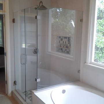
This customer was referred to us by a local real estate agent who was familiar with our work and trusted us to deliver an amazing finished product.
Initially, the customer was interested in doing a simple face lift on their master bath; however, their focus shifted during the design phase and they decided to go with a complete master bath remodel.
To help with the design process, the customer came to us with a design they discovered on Houzz.com, the use of which we fully encourage for all of our customers because it serves as a great tool to help homeowners settle upon the perfect style and theme.
Once a final design was chosen, we created several rough draft estimates to fine-tune the scope of the project and began the process of getting the necessary materials on site, which plays a vital role in avoiding delays. Once all of the materials arrived, we began work on the three-week remodel.
In the end, this particular customer wanted an elegant and simple, yet functional and clean line master bathroom - something modern with a sense of traditional class. Upon completion, the finished product was not only stylish, but incredibly beautiful, leaving the customer extremely happy with our work.
 HU-702316300
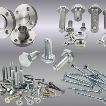
Pipex.ai is a leading B2B Marketplace built to support global industries with trusted sourcing. We connect buyers with verified suppliers of Fasteners, Indian IS Fasteners, Screw, Bolts, and Flanges. These essential components play a key role in construction, automotive, oil & gas, and machinery. Through our platform, industries benefit from a smooth B2B Service that makes procurement faster, cost-effective, and reliable across multiple industrial applications.
Fasteners are widely used for joining structures and machinery, while Indian IS Fasteners meet strict national standards for quality and strength. Screw types are available for precision assembly in tools, furniture, and equipment. Strong Bolts are critical for heavy-duty projects like bridges and manufacturing plants, while Flanges ensure safe pipeline connections in oil, gas, and water industries. These products are vital for strength, durability, and efficiency in operations.
From high-strength Fasteners and Bolts to standardized Indian IS Fasteners, versatile Screw, and durable Flanges, our B2B Business helps companies source the right solutions with ease. We ensure quality, verified suppliers, and dependable delivery. Providing industries with reliable products and efficient B2B Service is how our company helps you achieve growth and success in competitive markets.
 highland
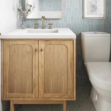
Renovating a bathroom is one of the most rewarding home improvement projects you can undertake. It adds immediate value to your property and elevates your daily routine. However, designing the perfect space requires balancing aesthetics with practical utility. At the heart of this balance is the vanity — it is the functional hub where you get ready each morning, a vital storage unit, and the visual centerpiece of the room.
To ensure you make the right investment, here is an in-depth look at choosing a bathroom vanity that blends style, longevity, and everyday functionality.
1. Assessing the Layout and Space Constraints
Before you fall in love with a specific design or finish, you must determine what your bathroom can physically handle. Scale is everything. A vanity that is too large disrupts traffic flow, while one that is too small gets lost visually and lacks adequate storage.
The next major step is determining the scale of your plumbing fixtures. Understanding how to choose a bathroom sink and vanity setup comes down to a simple choice: single or double sinks. Your choice will depend on who uses the bathroom and the overall footprint of the space.
Single Sink Vanities
Typically ranging from 20 to 48 inches (50–120 cm) in width, single vanities are the ideal choice for powder rooms, guest bathrooms, or small master suites. For very compact spaces, you can find narrower options starting around 16 inches (40 cm). The major advantage of a single-sink layout is that it provides more usable countertop space for cosmetics, toiletries, and decorative items. If you want to skip the guesswork and invest in a premium, beautifully handcrafted fixture, explore the luxury collections at Willow Bath and Vanity. From elegant single vanities to spacious double setups, their masterfully built furniture combines solid wood construction with elite styling to transform any bathroom into a spa-like retreat.
Double Sink Vanities
Usually starting at 48 inches (120 cm) and extending up to 72 inches (180 cm) or more, double vanities are a lifesaver for shared master bathrooms. They allow two people to get ready simultaneously without fighting for sink space. Keep in mind that a double vanity naturally reduces both cabinet storage space and countertop real estate since a second sink basin and plumbing lines take up substantial interior room.
Sink Types to Consider
The countertop is the workhorse of the bathroom. It regularly comes into contact with running water, toothpaste, soapy residue, and high-heat styling tools. Knowing how to choose a bathroom vanity top requires evaluating how much maintenance you are willing to perform against the look you want to achieve. Material Pros Cons Maintenance Level Quartz Highly durable, non-porous, stain and scratch-resistant. Offers the look of stone without the hassle. Premium pricing; can show seams on very large custom layouts. Low (No sealing required) Marble Timeless, elegant, and luxurious. Every slab features a completely unique veining pattern. Porous; prone to scratching, etching from acids, and water stains. Requires careful daily use. High (Requires regular sealing) Granite Naturally strong, heat-resistant, and chemically stable. Unique earthy patterns. Porous; can chip if subjected to heavy impacts. Medium (Requires occasional sealing) When coordinating your countertop, ensure it complements your bathroom’s floor tiles, shower surround, and plumbing hardware to maintain visual harmony.
4. Selecting the Core Vanity Style and Finish
Once the functional components are locked in, you can focus on the architectural style of the vanity base. The base dictates the design theme of the entire room.
Conclusion
Choosing the perfect vanity is a step-by-step process that combines precise measurements with your personal design taste. By taking careful measurements, choosing between a single- or double-sink setup, and picking a durable counter material like quartz or granite, you can transform your bathroom into a beautiful, organized retreat. Prioritize high-quality materials and smart craftsmanship, and your new vanity will look spectacular and serve your household reliably for years to come.
1. Assessing the Layout and Space Constraints
Before you fall in love with a specific design or finish, you must determine what your bathroom can physically handle. Scale is everything. A vanity that is too large disrupts traffic flow, while one that is too small gets lost visually and lacks adequate storage.
- Take Precise Measurements: measure the available width, depth, and height. Remember to account for surrounding fixtures.
- Check Clearance Zones: ensure there is enough clearance for the bathroom door to swing open, for shower glass doors to clear the vanity, and for drawers and cabinet doors to extend fully without hitting the toilet or walls.
-
Locate Existing Plumbing: moving pipes can significantly increase renovation costs. If you want a seamless installation, look for a vanity configuration that aligns easily with your current plumbing setup.
The next major step is determining the scale of your plumbing fixtures. Understanding how to choose a bathroom sink and vanity setup comes down to a simple choice: single or double sinks. Your choice will depend on who uses the bathroom and the overall footprint of the space.
Single Sink Vanities
Typically ranging from 20 to 48 inches (50–120 cm) in width, single vanities are the ideal choice for powder rooms, guest bathrooms, or small master suites. For very compact spaces, you can find narrower options starting around 16 inches (40 cm). The major advantage of a single-sink layout is that it provides more usable countertop space for cosmetics, toiletries, and decorative items. If you want to skip the guesswork and invest in a premium, beautifully handcrafted fixture, explore the luxury collections at Willow Bath and Vanity. From elegant single vanities to spacious double setups, their masterfully built furniture combines solid wood construction with elite styling to transform any bathroom into a spa-like retreat.
Double Sink Vanities
Usually starting at 48 inches (120 cm) and extending up to 72 inches (180 cm) or more, double vanities are a lifesaver for shared master bathrooms. They allow two people to get ready simultaneously without fighting for sink space. Keep in mind that a double vanity naturally reduces both cabinet storage space and countertop real estate since a second sink basin and plumbing lines take up substantial interior room.
Sink Types to Consider
- Undermount: installed beneath the counter for a smooth, seamless surface that is incredibly easy to wipe down.
- Vessel: sits atop the counter like a decorative bowl. It makes a bold style statement but raises the overall height of the counter surface.
- Drop-In: features a lip that rests on the counter cutout. It is easier to install, but its edges can catch dirt.
-
The countertop is the workhorse of the bathroom. It regularly comes into contact with running water, toothpaste, soapy residue, and high-heat styling tools. Knowing how to choose a bathroom vanity top requires evaluating how much maintenance you are willing to perform against the look you want to achieve. Material Pros Cons Maintenance Level Quartz Highly durable, non-porous, stain and scratch-resistant. Offers the look of stone without the hassle. Premium pricing; can show seams on very large custom layouts. Low (No sealing required) Marble Timeless, elegant, and luxurious. Every slab features a completely unique veining pattern. Porous; prone to scratching, etching from acids, and water stains. Requires careful daily use. High (Requires regular sealing) Granite Naturally strong, heat-resistant, and chemically stable. Unique earthy patterns. Porous; can chip if subjected to heavy impacts. Medium (Requires occasional sealing) When coordinating your countertop, ensure it complements your bathroom’s floor tiles, shower surround, and plumbing hardware to maintain visual harmony.
4. Selecting the Core Vanity Style and Finish
Once the functional components are locked in, you can focus on the architectural style of the vanity base. The base dictates the design theme of the entire room.
- Freestanding vanities: sit directly on the floor, supported by legs or a solid kickboard base. This is a traditional, stable configuration that offers the maximum hidden cabinet and drawer storage space.
- Wall-Mounted (Floating) vanities: anchored directly onto the wall studs, leaving the floor underneath completely clear. Floating vanities are staples of modern, minimalist design. They create an illusion of space, making small rooms look larger, and make cleaning the bathroom floor incredibly easy.
- Console vanities: feature an open shelving design supported by a metal or wood frame. It offers a light, airy look reminiscent of a boutique hotel, though it sacrifices hidden storage.
Conclusion
Choosing the perfect vanity is a step-by-step process that combines precise measurements with your personal design taste. By taking careful measurements, choosing between a single- or double-sink setup, and picking a durable counter material like quartz or granite, you can transform your bathroom into a beautiful, organized retreat. Prioritize high-quality materials and smart craftsmanship, and your new vanity will look spectacular and serve your household reliably for years to come.
 katherine
Office Workstations and Cubicles: The Unsung Heroes of Efficient Team Environments
In today's fast-paced business world, the hum of productivity is the sweetest sound an office can produce. But what fuels this symphony of efficiency?
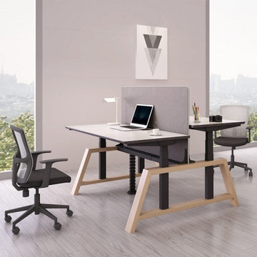
While leadership and strategy are crucial, the physical environment in which a team operates plays a role that is just as vital. The debate between open-plan offices and traditional cubicles has raged for years, yet the truth is that a well-designed space incorporating both office workstations cubicles can be the key to unlocking a team's full potential. This isn't just about furniture; it's about creating a habitat for success.
The Evolution of the Workspace: Beyond the Beige Box
Gone are the days of monotonous rows of identical, soul-crushing cubicles. Modern office design has embraced a more nuanced understanding of worker needs. The contemporary workstation is a far cry from its predecessors, offering flexibility, ergonomic support, and a nod to aesthetic appeal. This evolution recognizes that a one-size-fits-all approach stifles creativity and productivity.
Fostering Focus in a Sea of Collaboration
While collaboration is a cornerstone of modern business, the need for individual, focused work remains paramount. This is where the modern cubicle shines. It provides a sanctuary from the constant distractions of a completely open office, allowing employees to delve deep into tasks that require concentration. This dedicated space minimizes interruptions, leading to higher quality work and reduced stress levels.
The Power of Personalization and Ownership
Giving employees a degree of control over their immediate environment can have a profound impact on morale and engagement. Modern workstations and cubicles that allow for personalization be it through adjustable shelving, pinboards for personal items, or even the choice of chair foster a sense of ownership. This small act of empowerment can translate into a greater sense of belonging and commitment to the organization.
Ergonomics: The Foundation of Employee Well-being and Productivity
A comfortable employee is a productive employee. Ergonomics is not a luxury; it's a fundamental necessity in any office environment. Poorly designed workstations can lead to a host of musculoskeletal issues, from back pain to carpal tunnel syndrome, resulting in increased absenteeism and decreased efficiency. Investing in ergonomic chairs, adjustable-height desks, and properly positioned monitors is an investment in the long-term health and performance of your team.
Designing for Synergy: The Strategic office layout design
The arrangement of workstations and cubicles is as important as the furniture itself. A strategic office layout design can facilitate seamless communication and collaboration while still providing pockets of privacy for focused work. This involves creating "neighborhoods" for different teams, placing collaborative zones in central, easily accessible areas, and ensuring that high-traffic pathways don't cut through quiet work zones.
Breaking Down Barriers with Hybrid Designs
The most effective office environments often feature a hybrid approach. This might involve clusters of cubicles for focused work, interspersed with open, collaborative "huddle spaces" equipped with whiteboards and comfortable seating. This variety allows employees to choose the environment that best suits the task at hand, offering the best of both worlds.
The Role of Acoustics in a Thriving Workplace
Noise is one of the biggest complaints in open-plan offices. Well-designed cubicles with sound-dampening panels can significantly mitigate this issue. Furthermore, incorporating acoustic solutions throughout the office, such as sound-absorbing materials on walls and ceilings, can create a more pleasant and productive auditory environment for everyone.
Integrating Technology for a Seamless Workflow
In the digital age, technology is the lifeblood of any business. Modern office workstations are designed with this in mind, featuring integrated power and data ports, cable management systems, and ample space for multiple monitors. This seamless integration of technology ensures that employees have the tools they need to work efficiently and without frustration.
Choosing the Right Partner for Your Office Environment
The task of outfitting an office can be daunting. Partnering with a knowledgeable and reputable Meet&Co commercial furniture supplier is crucial to creating an environment that is both functional and inspiring. A good supplier will not only offer a wide range of high-quality products but will also provide expert advice on space planning and ergonomic best practices, ensuring that your investment yields the best possible return.
The Future of the Office: Flexibility and Adaptability
The world of work is constantly evolving, and office design must evolve with it. The future lies in creating flexible and adaptable spaces that can be easily reconfigured to meet the changing needs of a business. Modular furniture and movable partitions are key components of this future-proof approach, allowing organizations to scale and adapt without the need for costly and disruptive renovations.
Conclusion: A Strategic Investment in Your Greatest Asset
Ultimately, the design of your office is a direct reflection of your company's culture and values. By investing in high-quality, ergonomic, and well-designed office workstations and cubicles, you are sending a clear message to your employees: their well-being and productivity matter. This strategic investment in your physical workspace is, in fact, an investment in your most valuable asset your people. The result is a more engaged, efficient, and innovative team, ready to tackle the challenges of tomorrow.

Sponsored
Delaware, OH

Buckeye Basements, Inc.
Central Ohio's Basement Finishing ExpertsBest Of Houzz '13-'21
 Arin Carlyle
"Maximize Your Space:
The Upstreman Black BR321 Mini Fridge
I'm a college student living in a tiny dorm room, struggling to keep my snacks, beverages, and leftovers fresh. My regular trips to the communal kitchen fridge are time-consuming and frustrating. I often discover my snacks mysteriously disappearing.
This was the exact situation I found myself in before investing in the Upstreman BR321 Mini Fridge. It was a game-changer for me in more ways than one.
One scorching summer, my friends and I hosted a movie night in my dorm room. We brought our snacks and even ice cream. Given the limited space, I doubted one appliance could handle it all. Still, with a capacity of 3.2 cubic feet, the Upstreman BR321 Mini Fridge exceeded my expectations.
As we stocked the fridge with beverages, the efficient single-door and adjustable thermostat stood out, cooling our drinks to varying preferences seamlessly. It ran quietly during our movie night, its soft 38 dB hum lost amid our enjoyment, unlike the disruptive communal fridge. It operates smoothly on 115 volts.
The freezer impressed us further by keeping the ice cream firm, complementing the ready ice cubes from the included tray. The Upstreman BR321 Mini Fridge proved excellent for storing frozen delights.
Discovering the Upstreman BR321 Mini Fridge's full capabilities was enlightening. Its crisper drawer extended the freshness of my produce, and the removable shelves made for intelligent storage. This fridge became an indispensable time and money saver in my dorm.
The included accessories, like the defrost tool, and responsive customer service added convenience. Outshining other models, it integrated into my college life effortlessly, keeping my food and drinks ideally chilled.
Pros:
1. At 17.4" deep, 33.1" wide, and 18.7" high, this space-saving, single-door design is ideal for snug spaces.
2. Customizable thermostat for personalized cooling.
3. Silent operation that doesn't disrupt your peace.
4. A crisper drawer and removable shelves for organized storage.
5. Comprehensive package with valuable accessories and reliable customer service.
6. Weighing just 39.7 pounds, this item is easily portable.
Cons:
1. None to mention, it exceeded all my expectations.
Conclusion:
The Upstreman BR321 Mini Fridge is a stellar choice for anyone needing a compact, reliable appliance. As a student, it exceeded my expectations, proving itself daily. At around $137.9, it is budget-friendly.
—----------------------------
"Chill in Style:
The Upstreman Black FR-17 Fridge with Freezer
One evening, Dad came home looking troubled. Over dinner, he shared how his office fridge was failing, struggling to keep things cold. He was fed up with its poor performance, which only added to the stresses of his workday. It was clear that a replacement was overdue.
I fondly recall how my trusty Upstreman BR321 became my dorm's cooling hero. I suggested to Dad, "It's time tlack FR-17 model. Confident in the brand's quality, it would be an excellent choice for his office needs.
old replace the old fridge in the office."
Based on my positive experience with the Upstreman BR321, I suggested to my father that he consider the Upstreman B
Sleek and space-efficient, the Upstreman 1.7 Cu.ft Mini Fridge shines in compactness and practicality. At 18.9" x 17.7" x 19.3", it tucks into small spaces easily, an excellent addition to dorms, offices, or bedrooms. The design includes a reversible door, maximizing convenience in snug layouts.
Its cooling prowess is adjustable between 33.8°F and 46.4°F, and it comes with a nifty freezer compartment for keeping edibles ice-cold. Operating at a whisper-quiet 38dB, it ensures a tranquil atmosphere.
Energy consumption is impressively low, about 0.5 kWh per day, using an eco-conscious R600a refrigerant. Upstreman backs this model with a one-year warranty, making the FR17 an intelligent, stress-free choice.
Pros:
1. Compact (18.9" x 17.7" x 19.3") - Fits well in tight spaces.
2. Adjustable thermostat (33.8°F to 46.4°F) - Suits varied storage needs.
3. Quiet (38dB) - Ensures a peaceful environment.
4. Energy-efficient - Only 0.5 kWh daily usage.
5. Eco-friendly - Uses R600a refrigerant, better for the planet.
Cons:
1. Requires manual defrosting, adding to maintenance tasks.
2. It offers minimal freezer space, which is unsuitable for more extensive storage needs.
Conclusion:
Dad's office space is complete with the Upstreman Black FR-17, offering a silent, energy-efficient cooling solution that's both space-saving and perfect for his daily needs, ensuring fresh snacks and drinks are always within reach.
—-----------------------------------------
"Chill in Compact Luxury:
Upstreman's Sleek 3.2 Cu.Ft Double Door Mini Fridge- BD-321"
Nestled amidst our salon's vibrant bustle and the rhythmic snip of scissors, the Upstreman BD321 Mini Double Door Fridge stands as a beacon of excellent efficiency. This sleek, space-conscious appliance, chosen by my mother for its style and functionality, ensures drinks and beauty products are refreshingly cold.
Its well-designed compartments, a 2.2 Cu.Ft cooler alongside a 1 Cu.Ft freezer, maintain our essentials at prime temperatures, from crisp face masks to frosty beverages. The adjustable thermostat and soft LED interior lighting cater to our after-hours operations. At the same time, the versatile shelving accommodates various product sizes.
Costing mere cents to run daily and operating in hushed tones, it's the salon's silent workhorse. With its energy-smart design and customizable options, the Upstreman Mini Double Door Fridge isn't just an appliance—it's a vital part of our daily routine, earning my recommendation for anyone searching for a stylish, reliable mini fridge for personal or professional spaces.
Pros:
1. Compact yet spacious with a 3.2 cubic feet capacity, perfect for small living spaces.
2. Offers five temperature settings and a constant -0.4 F freezer for precise cooling.
3. Features a crisper drawer and removable shelves to keep produce fresh.
4. Quiet (38 dB) operation and energy-efficient, costing roughly $0.1 daily.
5. Customizable with accessories like an ice tray and reversible doors for user convenience.
Cons:
1. Requires manual defrosting, a potential hassle for the time-strapped.
2. The 1 Cu.Ft freezer compartment may be too small for bulk freezing needs.
Conclusion:
My salon's service quality has soared with the Upstreman Mini Double Door Fridge —beverages stay chilled, products remain fresh, and the silent operation keeps the ambiance serene.
 Fabco Sanctuary
The architect and designer Guy Derwent was approached by his client with a clear and compelling brief: to completely transform a grand Victorian terrace house they were planning to renovate. The client envisioned something far beyond a standard renovation – this was to be a bold and dramatic reimagining of a family home that could grow with them over time.
With the property having remained largely untouched for more than fifty years, the architects saw an opportunity to unlock its potential and deliver a contemporary design that would contrast beautifully with its Victorian heritage.
The existing layout consisted of a series of small, disconnected rooms to the rear of the house. To respond to the client’s need for openness and flexibility, the architect proposed a radical restructuring of the ground floor:
The rear rooms were completely removed
Suspended timber floors were lowered by up to two metres to align with the garden
Two bold extensions were added
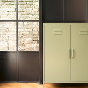
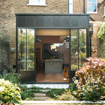
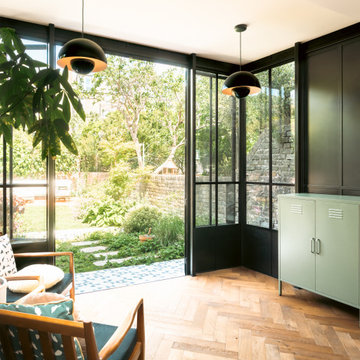
The first extension filled in the side return with a London stock brick facade and a glazed roof, while the second – a striking black steel and glass pavilion was glazed on three sides and placed along the garden elevation.
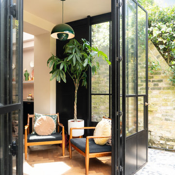
This new pavilion redefined the building’s relationship with the garden. Its steel-framed glazing created a seamless dialogue between interior and exterior, offering a sense of immersion in the surrounding landscape.
At the heart of the plan sits a dramatic, five-metre-tall dining space that acts as a transition from the original entrance hall into the new addition. A large, circular cast-glass window, framed in steel, provides a visual and spatial link between old and new, allowing light and movement to travel through the depth of the home.
Throughout the project, a series of black metal elements were introduced as sculptural interventions – each marking moments of transformation within the house. These included the bespoke steel framed circular window, a custom metal staircase, a cylindrical support column, and the striking steel and glass garden pavilion. Together, they formed a coherent architectural language that underscored the project’s bold intent.
Our steel windows and doors played a vital role in delivering the project’s vision. The architects chose steel for its refined sight lines and distinctive material character, which helped bridge the gap between the historical context of the building and the bold new additions.
The black steel frames provided a crisp contrast to the pale London stock brick and added definition to the glazed pavilion, reinforcing the sense of architectural precision. In particular, the fine steel profiles of the garden room allowed the extension to feel both lightweight and immersive, blurring the boundary between the house and its garden.
The architect drew inspiration from the Bauhaus Movement, particularly the work of Walter Gropius, whose approach to functional beauty and industrial materials informed the design of the garden pavilion.
Here, our glazing system was used not just for transparency, but as an expressive architectural element. The carefully proportioned panels help to conceal the roof thickness and reinforce the pavilion’s industrial yet abstract character – a deliberate nod to product design and modernist detailing.
Sustainability was an important factor in the selection of materials. Our steel systems, made from 99% recycled content and 100% recyclable, aligned with the project’s broader environmental goals.
The architects noted that this commitment to material longevity and circularity was central to their decision to use steel. The durability and recyclability of the windows and doors ensured the project met both aesthetic and ethical criteria.
This London terrace house now stands as a celebration of contrast – between heritage and innovation, solidity and transparency, tradition and transformation. Our steel windows and doors were not simply components; they were essential tools in crafting a home that is as bold and expressive as it is functional.
The result is a home designed for modern family life, where light, space, and materiality come together in perfect harmony.
 Fabco Sanctuary
The architect and designer Guy Derwent was approached by his client with a clear and compelling brief: to completely transform a grand Victorian terrace house they were planning to renovate. The client envisioned something far beyond a standard renovation – this was to be a bold and dramatic reimagining of a family home that could grow with them over time.
With the property having remained largely untouched for more than fifty years, the architects saw an opportunity to unlock its potential and deliver a contemporary design that would contrast beautifully with its Victorian heritage.
The existing layout consisted of a series of small, disconnected rooms to the rear of the house. To respond to the client’s need for openness and flexibility, the architect proposed a radical restructuring of the ground floor:
The rear rooms were completely removed
Suspended timber floors were lowered by up to two metres to align with the garden
Two bold extensions were added
The first extension filled in the side return with a London stock brick facade and a glazed roof, while the second – a striking black steel and glass pavilion was glazed on three sides and placed along the garden elevation.
This new pavilion redefined the building’s relationship with the garden. Its steel-framed glazing created a seamless dialogue between interior and exterior, offering a sense of immersion in the surrounding landscape.
At the heart of the plan sits a dramatic, five-metre-tall dining space that acts as a transition from the original entrance hall into the new addition. A large, circular cast-glass window, framed in steel, provides a visual and spatial link between old and new, allowing light and movement to travel through the depth of the home.
Throughout the project, a series of black metal elements were introduced as sculptural interventions – each marking moments of transformation within the house. These included the bespoke steel framed circular window, a custom metal staircase, a cylindrical support column, and the striking steel and glass garden pavilion. Together, they formed a coherent architectural language that underscored the project’s bold intent.
Our steel windows and doors played a vital role in delivering the project’s vision. The architects chose steel for its refined sight lines and distinctive material character, which helped bridge the gap between the historical context of the building and the bold new additions.
The black steel frames provided a crisp contrast to the pale London stock brick and added definition to the glazed pavilion, reinforcing the sense of architectural precision. In particular, the fine steel profiles of the garden room allowed the extension to feel both lightweight and immersive, blurring the boundary between the house and its garden.
The architect drew inspiration from the Bauhaus Movement, particularly the work of Walter Gropius, whose approach to functional beauty and industrial materials informed the design of the garden pavilion.
Here, our glazing system was used not just for transparency, but as an expressive architectural element. The carefully proportioned panels help to conceal the roof thickness and reinforce the pavilion’s industrial yet abstract character – a deliberate nod to product design and modernist detailing.
Sustainability was an important factor in the selection of materials. Our steel systems, made from 99% recycled content and 100% recyclable, aligned with the project’s broader environmental goals.
The architects noted that this commitment to material longevity and circularity was central to their decision to use steel. The durability and recyclability of the windows and doors ensured the project met both aesthetic and ethical criteria.
This London terrace house now stands as a celebration of contrast – between heritage and innovation, solidity and transparency, tradition and transformation. Our steel windows and doors were not simply components; they were essential tools in crafting a home that is as bold and expressive as it is functional.
The result is a home designed for modern family life, where light, space, and materiality come together in perfect harmony.
 Fabco Sanctuary
The architect and designer Guy Derwent was approached by his client with a clear and compelling brief: to completely transform a grand Victorian terrace house they were planning to renovate. The client envisioned something far beyond a standard renovation – this was to be a bold and dramatic reimagining of a family home that could grow with them over time.
With the property having remained largely untouched for more than fifty years, the architects saw an opportunity to unlock its potential and deliver a contemporary design that would contrast beautifully with its Victorian heritage.
The existing layout consisted of a series of small, disconnected rooms to the rear of the house. To respond to the client’s need for openness and flexibility, the architect proposed a radical restructuring of the ground floor:
The rear rooms were completely removed
Suspended timber floors were lowered by up to two metres to align with the garden
Two bold extensions were added
The first extension filled in the side return with a London stock brick facade and a glazed roof, while the second – a striking black steel and glass pavilion was glazed on three sides and placed along the garden elevation.
This new pavilion redefined the building’s relationship with the garden. Its steel-framed glazing created a seamless dialogue between interior and exterior, offering a sense of immersion in the surrounding landscape.
At the heart of the plan sits a dramatic, five-metre-tall dining space that acts as a transition from the original entrance hall into the new addition. A large, circular cast-glass window, framed in steel, provides a visual and spatial link between old and new, allowing light and movement to travel through the depth of the home.
Throughout the project, a series of black metal elements were introduced as sculptural interventions – each marking moments of transformation within the house. These included the bespoke steel framed circular window, a custom metal staircase, a cylindrical support column, and the striking steel and glass garden pavilion. Together, they formed a coherent architectural language that underscored the project’s bold intent.
Our steel windows and doors played a vital role in delivering the project’s vision. The architects chose steel for its refined sight lines and distinctive material character, which helped bridge the gap between the historical context of the building and the bold new additions.
The black steel frames provided a crisp contrast to the pale London stock brick and added definition to the glazed pavilion, reinforcing the sense of architectural precision. In particular, the fine steel profiles of the garden room allowed the extension to feel both lightweight and immersive, blurring the boundary between the house and its garden.
The architect drew inspiration from the Bauhaus Movement, particularly the work of Walter Gropius, whose approach to functional beauty and industrial materials informed the design of the garden pavilion.
Here, our glazing system was used not just for transparency, but as an expressive architectural element. The carefully proportioned panels help to conceal the roof thickness and reinforce the pavilion’s industrial yet abstract character – a deliberate nod to product design and modernist detailing.
Sustainability was an important factor in the selection of materials. Our steel systems, made from 99% recycled content and 100% recyclable, aligned with the project’s broader environmental goals.
The architects noted that this commitment to material longevity and circularity was central to their decision to use steel. The durability and recyclability of the windows and doors ensured the project met both aesthetic and ethical criteria.
This London terrace house now stands as a celebration of contrast – between heritage and innovation, solidity and transparency, tradition and transformation. Our steel windows and doors were not simply components; they were essential tools in crafting a home that is as bold and expressive as it is functional.
The result is a home designed for modern family life, where light, space, and materiality come together in perfect harmony.
 Fabco Sanctuary
The architect and designer Guy Derwent was approached by his client with a clear and compelling brief: to completely transform a grand Victorian terrace house they were planning to renovate. The client envisioned something far beyond a standard renovation – this was to be a bold and dramatic reimagining of a family home that could grow with them over time.
With the property having remained largely untouched for more than fifty years, the architects saw an opportunity to unlock its potential and deliver a contemporary design that would contrast beautifully with its Victorian heritage.
The existing layout consisted of a series of small, disconnected rooms to the rear of the house. To respond to the client’s need for openness and flexibility, the architect proposed a radical restructuring of the ground floor:
The rear rooms were completely removed
Suspended timber floors were lowered by up to two metres to align with the garden
Two bold extensions were added
The first extension filled in the side return with a London stock brick facade and a glazed roof, while the second – a striking black steel and glass pavilion was glazed on three sides and placed along the garden elevation.
This new pavilion redefined the building’s relationship with the garden. Its steel-framed glazing created a seamless dialogue between interior and exterior, offering a sense of immersion in the surrounding landscape.
At the heart of the plan sits a dramatic, five-metre-tall dining space that acts as a transition from the original entrance hall into the new addition. A large, circular cast-glass window, framed in steel, provides a visual and spatial link between old and new, allowing light and movement to travel through the depth of the home.
Throughout the project, a series of black metal elements were introduced as sculptural interventions – each marking moments of transformation within the house. These included the bespoke steel framed circular window, a custom metal staircase, a cylindrical support column, and the striking steel and glass garden pavilion. Together, they formed a coherent architectural language that underscored the project’s bold intent.
Our steel windows and doors played a vital role in delivering the project’s vision. The architects chose steel for its refined sight lines and distinctive material character, which helped bridge the gap between the historical context of the building and the bold new additions.
The black steel frames provided a crisp contrast to the pale London stock brick and added definition to the glazed pavilion, reinforcing the sense of architectural precision. In particular, the fine steel profiles of the garden room allowed the extension to feel both lightweight and immersive, blurring the boundary between the house and its garden.
The architect drew inspiration from the Bauhaus Movement, particularly the work of Walter Gropius, whose approach to functional beauty and industrial materials informed the design of the garden pavilion.
Here, our glazing system was used not just for transparency, but as an expressive architectural element. The carefully proportioned panels help to conceal the roof thickness and reinforce the pavilion’s industrial yet abstract character – a deliberate nod to product design and modernist detailing.
Sustainability was an important factor in the selection of materials. Our steel systems, made from 99% recycled content and 100% recyclable, aligned with the project’s broader environmental goals.
The architects noted that this commitment to material longevity and circularity was central to their decision to use steel. The durability and recyclability of the windows and doors ensured the project met both aesthetic and ethical criteria.
This London terrace house now stands as a celebration of contrast – between heritage and innovation, solidity and transparency, tradition and transformation. Our steel windows and doors were not simply components; they were essential tools in crafting a home that is as bold and expressive as it is functional.
The result is a home designed for modern family life, where light, space, and materiality come together in perfect harmony.
 Fabco Sanctuary
The architect and designer Guy Derwent was approached by his client with a clear and compelling brief: to completely transform a grand Victorian terrace house they were planning to renovate. The client envisioned something far beyond a standard renovation – this was to be a bold and dramatic reimagining of a family home that could grow with them over time.
With the property having remained largely untouched for more than fifty years, the architects saw an opportunity to unlock its potential and deliver a contemporary design that would contrast beautifully with its Victorian heritage.
The existing layout consisted of a series of small, disconnected rooms to the rear of the house. To respond to the client’s need for openness and flexibility, the architect proposed a radical restructuring of the ground floor:
The rear rooms were completely removed
Suspended timber floors were lowered by up to two metres to align with the garden
Two bold extensions were added
The first extension filled in the side return with a London stock brick facade and a glazed roof, while the second – a striking black steel and glass pavilion was glazed on three sides and placed along the garden elevation.
This new pavilion redefined the building’s relationship with the garden. Its steel-framed glazing created a seamless dialogue between interior and exterior, offering a sense of immersion in the surrounding landscape.
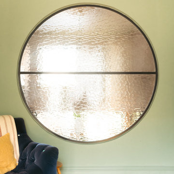
At the heart of the plan sits a dramatic, five-metre-tall dining space that acts as a transition from the original entrance hall into the new addition. A large, circular cast-glass window, framed in steel, provides a visual and spatial link between old and new, allowing light and movement to travel through the depth of the home.
Throughout the project, a series of black metal elements were introduced as sculptural interventions – each marking moments of transformation within the house. These included the bespoke steel framed circular window, a custom metal staircase, a cylindrical support column, and the striking steel and glass garden pavilion. Together, they formed a coherent architectural language that underscored the project’s bold intent.
Our steel windows and doors played a vital role in delivering the project’s vision. The architects chose steel for its refined sight lines and distinctive material character, which helped bridge the gap between the historical context of the building and the bold new additions.
The black steel frames provided a crisp contrast to the pale London stock brick and added definition to the glazed pavilion, reinforcing the sense of architectural precision. In particular, the fine steel profiles of the garden room allowed the extension to feel both lightweight and immersive, blurring the boundary between the house and its garden.
The architect drew inspiration from the Bauhaus Movement, particularly the work of Walter Gropius, whose approach to functional beauty and industrial materials informed the design of the garden pavilion.
Here, our glazing system was used not just for transparency, but as an expressive architectural element. The carefully proportioned panels help to conceal the roof thickness and reinforce the pavilion’s industrial yet abstract character – a deliberate nod to product design and modernist detailing.
Sustainability was an important factor in the selection of materials. Our steel systems, made from 99% recycled content and 100% recyclable, aligned with the project’s broader environmental goals.
The architects noted that this commitment to material longevity and circularity was central to their decision to use steel. The durability and recyclability of the windows and doors ensured the project met both aesthetic and ethical criteria.
This London terrace house now stands as a celebration of contrast – between heritage and innovation, solidity and transparency, tradition and transformation. Our steel windows and doors were not simply components; they were essential tools in crafting a home that is as bold and expressive as it is functional.
The result is a home designed for modern family life, where light, space, and materiality come together in perfect harmony.
2