
Search results for "Worth considerations" in Home Design Ideas
 Own Your Reno
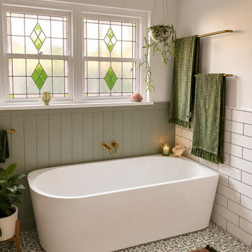
A complete bathroom transformation that combines the character of the original home with a fresh, contemporary bathroom designed for modern everyday living.
The original bathroom was dated and visually busy, with an inset corner spa bath, dark timber double vanity, framed shower enclosure and decorative black-and-white tiling. While the bathroom needed a complete update, the beautiful original stained-glass windows were a feature worth preserving.
The new design completely reimagines the space while allowing those windows to remain part of the room's character.
A freestanding bath now sits beneath the original stained-glass windows, creating a striking focal point. Soft sage-green wall detailing, patterned floor tiles and brushed brass fixtures introduce colour and personality while complementing the home's existing features.
The old timber vanity was replaced with a streamlined wall-hung double vanity featuring fluted timber cabinetry, twin vessel basins and wall-mounted brass tapware. A large curved illuminated mirror adds softness and light while helping the bathroom feel considerably more spacious.
The enclosed shower was transformed into an open walk-in shower with a frameless glass panel, rainfall shower and practical tiled ledge for everyday products.
Rather than removing every trace of the home's original character, the renovation was designed around what was worth keeping. The stained-glass windows became part of the new colour palette and helped influence a bathroom that feels fresh and contemporary without looking disconnected from the home around it.
Design concept: Laura Faulkner / Own Your Reno
Photography: Laura Faulkner
Renovation: AJM Bathroom Renovations
 Own Your Reno
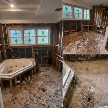
A complete bathroom transformation that combines the character of the original home with a fresh, contemporary bathroom designed for modern everyday living.
The original bathroom was dated and visually busy, with an inset corner spa bath, dark timber double vanity, framed shower enclosure and decorative black-and-white tiling. While the bathroom needed a complete update, the beautiful original stained-glass windows were a feature worth preserving.
The new design completely reimagines the space while allowing those windows to remain part of the room's character.
A freestanding bath now sits beneath the original stained-glass windows, creating a striking focal point. Soft sage-green wall detailing, patterned floor tiles and brushed brass fixtures introduce colour and personality while complementing the home's existing features.
The old timber vanity was replaced with a streamlined wall-hung double vanity featuring fluted timber cabinetry, twin vessel basins and wall-mounted brass tapware. A large curved illuminated mirror adds softness and light while helping the bathroom feel considerably more spacious.
The enclosed shower was transformed into an open walk-in shower with a frameless glass panel, rainfall shower and practical tiled ledge for everyday products.
Rather than removing every trace of the home's original character, the renovation was designed around what was worth keeping. The stained-glass windows became part of the new colour palette and helped influence a bathroom that feels fresh and contemporary without looking disconnected from the home around it.
Design concept: Laura Faulkner / Own Your Reno
Photography: Laura Faulkner
Renovation: AJM Bathroom Renovations
 Own Your Reno
A complete bathroom transformation that combines the character of the original home with a fresh, contemporary bathroom designed for modern everyday living.
The original bathroom was dated and visually busy, with an inset corner spa bath, dark timber double vanity, framed shower enclosure and decorative black-and-white tiling. While the bathroom needed a complete update, the beautiful original stained-glass windows were a feature worth preserving.
The new design completely reimagines the space while allowing those windows to remain part of the room's character.
A freestanding bath now sits beneath the original stained-glass windows, creating a striking focal point. Soft sage-green wall detailing, patterned floor tiles and brushed brass fixtures introduce colour and personality while complementing the home's existing features.
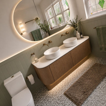
The old timber vanity was replaced with a streamlined wall-hung double vanity featuring fluted timber cabinetry, twin vessel basins and wall-mounted brass tapware. A large curved illuminated mirror adds softness and light while helping the bathroom feel considerably more spacious.
The enclosed shower was transformed into an open walk-in shower with a frameless glass panel, rainfall shower and practical tiled ledge for everyday products.
Rather than removing every trace of the home's original character, the renovation was designed around what was worth keeping. The stained-glass windows became part of the new colour palette and helped influence a bathroom that feels fresh and contemporary without looking disconnected from the home around it.
Design concept: Laura Faulkner / Own Your Reno
Photography: Laura Faulkner
Renovation: AJM Bathroom Renovations
Find the right local pro for your project
 Own Your Reno
A complete bathroom transformation that combines the character of the original home with a fresh, contemporary bathroom designed for modern everyday living.
The original bathroom was dated and visually busy, with an inset corner spa bath, dark timber double vanity, framed shower enclosure and decorative black-and-white tiling. While the bathroom needed a complete update, the beautiful original stained-glass windows were a feature worth preserving.
The new design completely reimagines the space while allowing those windows to remain part of the room's character.
A freestanding bath now sits beneath the original stained-glass windows, creating a striking focal point. Soft sage-green wall detailing, patterned floor tiles and brushed brass fixtures introduce colour and personality while complementing the home's existing features.
The old timber vanity was replaced with a streamlined wall-hung double vanity featuring fluted timber cabinetry, twin vessel basins and wall-mounted brass tapware. A large curved illuminated mirror adds softness and light while helping the bathroom feel considerably more spacious.
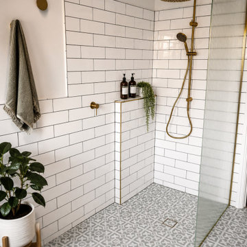
The enclosed shower was transformed into an open walk-in shower with a frameless glass panel, rainfall shower and practical tiled ledge for everyday products.
Rather than removing every trace of the home's original character, the renovation was designed around what was worth keeping. The stained-glass windows became part of the new colour palette and helped influence a bathroom that feels fresh and contemporary without looking disconnected from the home around it.
Design concept: Laura Faulkner / Own Your Reno
Photography: Laura Faulkner
Renovation: AJM Bathroom Renovations
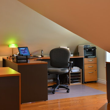
 Way-Mar Inc.
Based on her experience with several renovation projects, the owner reflects that “renovations always take longer and cost more than what you first think. That’s just the reality of renovations. You’re going to find stuff along the way. You learn to prepare for that. Having said that, there weren’t really any surprises with this project.”
She also appreciates the collaborative approach that Way-Mar brings to a project. “Way-Mar always gives options and explains the differences - taking into consideration your personal preferences and priorities.”
Early on with this home, the owners worked with different contractors and got several quotes to help choose the best company. She says they learned the “hard way” that not all contractors are the same.
A few times it looked like a good job was done on the surface but things were done poorly or incorrectly and had to be redone. The couple feels fortunate to have connected with Way-Mar early on.“Way-Mar stands out in their commitment to customer service and quality. That’s worth a lot.
We have built up a lot of trust over the years so we are never concerned that we are getting ripped off or if the work will be done right. I feel they always offer a fair price and we get excellent value for our money.”
“We’ve built a good long-term relationship so they know us pretty well. Way-Mar makes suggestions based on what they think is most suitable for us. We’re always happy with the results.”
photo: jeff brubacher
 Brett Hardy Landscapes Ltd
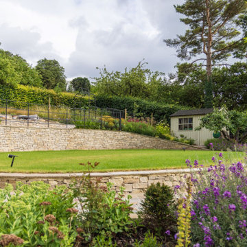
Our clients came to us looking for a complete country-style garden design and landscape build.
Their existing garden was an open space dominated by a sloping lawn, a feature summerhouse in the top corner and a shed for storage. There were two raised beds for growing home produce and some small trees in the existing garden.
They wanted design inspiration to create a feature path to the summerhouse. It must be easy to mow the lawns and have considered planting in the beds. They didn’t want anything high maintenance to look after.
Our clients wanted a crisp and clean formal feel to the country-style garden design, and we knew they enjoyed their Yew Topiary balls. Our other consideration for the brief was that they wanted some privacy from neighbours.
Our garden designer took up the challenge and worked with the client to create their garden. Before we started, we surveyed the space in detail as we do before we start any project.
After discussing their needs and desires, we knew they needed to create a feature landscaped pathway to the destination summerhouse with an adjoined gorgeous seating area.
Among this, it was essential to create a level lawn area that was flat and trouble-free and fill the planting areas with perennials and shrubs in the customer’s preferred colours of white, blue and purple.
Brett came along and presented me with a very professional and beautiful design to turn my unloved outdoor space into something to be proud of. I had to wait for the transformation, but once it was underway, it soon became clear that it had been worth it. The lads were hard-working and polite and left me with a lovely new feature.
A flat oval lawn on the mid-level was integral to the design and surrounded by a sweeping curved pathway leading to the summerhouse. The sett cobbled path takes you up and around to the top seating area.
landscape country style garden design
A GARDEN PARADISE
To the back of the oval lawn is a spectacular feature stone retaining topped wall finished with country-style estate-style fencing for safety and effect.
On the highest level by the summerhouse, there is a spacious seating terrace to relax.
Head through the arch of black galvanised steel, where you will find several raised beds for vegetables and fruit crops. This added to their established apple tree collection. Then we planted some espalier fruit tree screens to define the garden’s zones. This abundant growing area is surrounded by wildflower meadow planting to attract wildlife and pollinators.
For privacy, there are trees strategically planted on the boundaries to provide effective green screening.
Descending from the lawn, you will find stepping stones to take you down to the shed. Here you will find a delightfully secluded seating spot.
The area closest to the house has stepped levels of planted banks. They are filled with easy-to-care-for shrubs and perennial planting that will return year after year. The roses and lavender fill the air with a glorious scent as you pass them.
We are proud to have been involved in this thrilling country-style garden project from start to finish.
 Home Advertising
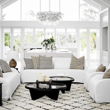
A Hampton style sofa has become a necessity in home decor as people become more familiar with the Hampton interior style. Hampton style sofas are a good choice for timeless design if you are replacing or buying a new one. When you are uncertain of what you want, buying a sofa can seem challenging. If you're trying to select La maison hampton furniture for one of your home's most important rooms, you have a lot to take into account. It maust suit your taste and function.
Couches require thought and consideration. It is important that you choose a style and a color that goes well with your living area, along with a durable material that meets your needs. The front door must also be able to accommodate the rug. So, don't forget to familiarize yourself with the different sizes, fillings, and textures before creating your budget. You don't have to spend a lot of money on a new sofa, but while there are some places where you can save money, there are others where you should invest.
First, Let's Talk about the Vibe of sofa style
First and foremost, you should consider the style of your sofa. Choose a sofa whose style fits the current theme of your home. It may seem very obvious, but many people simply buy whatever suits their fancy, and unfortunately, the style of the room is a lot of the time different from what suits their fancy.
If the rug or the art above the sofa don't go together, it might not work in the room. It's imperative to get the look right before adding the rest of these elements. Make sure you consider how you wish the room to feel when you're in it. If you're looking for something more colorful, or you have a particular style in mind, such as mid-century (then googling 'Hampton style sofas' will prove valuable). A sofa that looks great but is super-comfy might end up looking completely out of place if you skip this step.
Next, We will Discuss Functionality of sofas
It is important to consider what you will be doing with the sofa. Although I am convinced that the answer is "to sit on", we need to dig deeper. Can you, for instance, sit down for drinks in this formal sitting room when company comes over? Do you watch television in this room every day? There is a rumpus room upstairs for the kids to interact with their friends and eat and drink on it? There might be Hampton style sofas in the guest room.
For your convenience, I have compiled a full list of Hampton style sofas here. Depending on the situation, each sofa style needs to be different. Typically, formal couches tend to be less comfortable. They're usually more rigid and upright. Couches for watching TV should be cushier; they should be comfortable. We know that many teens are not concerned about Hampton style sofas maintenance, so kids zones need sofas that are able to withstand more wear and tear. This is something high schools should teach.
This story shows you the importance of not skipping this important ‘how will it be used? At this point, you should have an idea of how you'll use the Hampton style sofas. Consider, for instance, a sofa with a bold color and a formal feel for your living room. If you want a couch with a relaxed feel, choose a neutral shade with a cushy feel.
Dimensions of an ideal hamptons style sofa
Before you buy a Hampton style sofa, you must measure the size of your current living room. You will probably not fit it if you don't do this. A large one will either overwhelm the room and leave no room for a coffee table, or a small one will look dwarfed in comparison. When a pandemic strikes, scale is everything.
You should be able to fit the sofa into the room comfortably without it feeling too large or small. Measure the width of your La maison hampton furniture style sofas first with a tape measure. Consider if you'd like side tables beside your sofa. In that case, you would need to measure the width of either side of your sofa and add around 50cm to either side (most decent side tables have a width of about 50cm).
In addition to measuring Hampton style sofas depth, you should also measure the width. There are some sofas that can be as deep as a metre (from the front of the sofa cushion to its back). Since your sofa will need an allowance of 50cm from the edge of the coffee table to the front of the sofa, and a minimum of 50cm on the other side of the coffee table, you might want to measure your current coffee table to ensure it matches.
Another Important Factor is Height
In an open-plan living room, this element is particularly important if your sofa crosses the space. When you have a sectional sofa, for example, one of the ends will likely cut across the room, so the back should be low so your eye can still pass over the back.
One of the top 10 living room design mistakes I make is to place tall-backed Hampton style sofas across the room, a mistake that really cramps the style of the whole space. It happens way too often.
Although the height won't be a major issue if the sofa is backed up against a wall, it is still worth considering the size of the art you want to hang above it. If you want neck support whilst watching TV, a low-back sofa might not be for you. My neck tends to become less and less flexible as I get older. It's a sad fact, but true nonetheless. If you find yourself in the same situation, you should consider high-back Hampton style sofas.
Sofa Cushions: How Low are They?
Many people don't think about this dimension when purchasing a sofa online, especially if they're doing so for the first time. If you're road-testing the sofa in-store, you'll know if it's too low for you right away, but an online purchase is something else. Low-profile sofas have a seat height of 40 cm or less. The sofa's 60cm seat height will make it much more difficult to get up and out of it. The importance of this factor increases as we age or if we have mobility problems.
The seat you're sitting in should allow you to stand up comfortably, without feeling like you need assistance. Additionally, the height of your coffee table should not be higher than the seat cushions on the sofa, because the table should never be higher than the seat cushions on the sofa. They should never be higher than each other. Make sure you take notes!
What Else is There in the Room?
A good idea when choosing a sofa is to consider what other elements will be in the room. For a well-designed, elegantly-resolved living room, you'll need a sofa, rug, coffee table, side table/s, lamp, TV unit, and wall art. The room will not feel right if you buy a massive sectional sofa that takes up the entire room and leaves no space for a coffee table or side tables.
You should measure out your sofa, keeping in mind that the other pieces La maison hampton furniture and decor will also need to fit into the space. All pieces of furniture need to have enough space to breathe. It's best not to have all the furniture crammed into the point where sitting down means hitting your legs or feet against pieces. You probably now understand that choosing a couch is more about the couch itself than with how to choose it. So think of the big picture whenever you choose something.
Two Two-Seaters, or a Sectional Sofa?
People often have to wrestle with the question of whether they should buy two sofas or one sectional when figuring out how to choose a sofa. Sectionals are usually preferable to two separate two-seater sofas. However, the corner piece is rarely occupied anyway. Often, the corner piece of a sectional is so tiny that it is impossible for a person to sit there comfortably. Therefore, think about whether you actually need this over getting two x two-seater sofas and arranging them into an L-shape.
If you don't have a large living room, you might prefer 2 x two-seater sofas instead. Sectional sofas are best for larger rooms. With the visual break of all that fabric dominating the corner, it will do the room a world of good. Furthermore, you can use the space between your sofas to put a side table so you can place drinks, or a table lamp, there.
You may want to consider getting 1 x two-seater sofa and an armchair instead, if you have a really small living room. Even though you want to seat as many people as possible, you should let the room determine how many people the sofa can accommodate.
A Guide to Picking the Right Material
The material of the sofa is obviously very important when it comes to picking out the right one. The best advice I can offer is to consider who will use the sofa and how that will impact maintenance.
Leather sofas are easier to clean than fabric ones when kids or pets are present. Leather has the disadvantage of retaining heat in the winter and being cold in the summer. Cushions work well with leather sofas, but velvet ones work better with leather sofas. Leather will show up claw marks more easily on some pets (like my cats).
It is true that fabric sofas are softer and cozier, but they can also be more difficult to clean. Having a slipcover sofa is a godsend if you have pets or toddlers, but they're not too easy to maintain.
You should consider how much patience you have to keep the sofa clean and who uses it. That will make it easier to decide what material to use. I work with a sofa supplier who has bomb-proof fabric that is so easy to clean that you can literally serve dinner right onto the cushions without making an utter mess.
Sponsored
Columbus, OH
Transforming Spaces in Columbus

Daniel Home
Premier Interior Design Team Transforming Spaces in Franklin Co, Ohio
 Troico
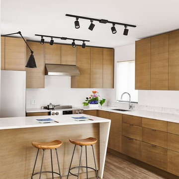
This tired apartment was purchased by a traditional Japanese family with the intent of turning it into the ultimate minimalist retreat. Inspired by their home land, they envisioned a home with clean lines, a natural colour palette and a calming aura.
Opening up the wall between the galley kitchen and the living room to create a larger space was imperative. Structural considerations were budgeted for to remove the wall in this low rise wood frame building. Allocating part of the budget to complete this look proved well worth the investment as the finished space gives the kitchen an open and airy feeling that was desired. The kitchen was expanded along the prior living room wall. Simplistic colours of whites, creams and wood tones were used to achieve the desired look.
Flair was added with sculptural light fixtures and geometric accents. The island was lit with a side mounted fixture, and the waterfall island that was purposely cut on an angle to add an interesting depth to the otherwise clean lines. Vinyl flooring in a wood tone was used to achieve a classic wood floor look while maintaining durability.
European appliances were chosen to keep the modern, clean lines in place. A microwave was placed in the lower island in order to ensure that it was relatively hidden. The kitchen backsplash was mixed to provide further depth and dimension. A 4 inch splash matching the countertops was run on the sink wall to keep with the minimalist feel, while a bolder patterned large format tile in all white was used to create texture on the stove wall and provide adequate coverage while cooking on the range. Thin profile edge pull handles were strategically placed to be functional but unimposing.
 safe ZOnea
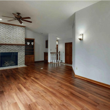
Flooring needs vary widely depending on the space. A homeowner seeking beautiful floors for their living room has different priorities than a business owner outfitting a commercial space. Yet in both cases, the right flooring well chosen and well installed makes an enormous difference. This guide looks at hardwood flooring for homes and flooring for commercial spaces, including the increasingly popular option of engineered hardwood, and what those in the Chicago area should know about each.
The enduring appeal of hardwood
Hardwood flooring has an enduring appeal that few other materials can match. It brings warmth, beauty, and a sense of quality to a home, complementing a wide range of styles from traditional to modern. Hardwood floors add character and elegance to a space, and they're often seen as a desirable feature that can enhance a home's appeal and value. For many homeowners, hardwood represents the ideal flooring choice.
Part of hardwood's appeal is its longevity. Quality hardwood floors, properly cared for, can last for decades, and they can often be refinished over time to restore their appearance, extending their life even further. This durability makes hardwood a worthwhile long-term investment. Combined with its timeless beauty, this longevity explains why hardwood remains so popular despite the many flooring options available. Homeowners seeking this classic look often invest in quality hardwood flooring chicago for their homes. Understanding the enduring appeal of hardwood helps homeowners appreciate why it remains a favorite and consider it for their spaces.
Flooring for commercial spaces
Commercial spaces have their own distinct flooring needs, quite different from those of a typical home. A commercial environment whether an office, retail space, restaurant, or other business often sees high traffic, heavy use, and demands that residential flooring might not withstand. Commercial flooring must be durable, functional, and appropriate for the specific business and its needs, while also contributing to the space's appearance and atmosphere.
Choosing flooring for a commercial space involves considering factors like durability, maintenance requirements, safety, appearance, and suitability for the particular use. The flooring in a commercial space affects not just its look but its functionality and the impression it makes on customers and clients. Because commercial spaces have demanding requirements, selecting appropriate, durable flooring and having it properly installed is especially important. Business owners in the Chicago area often work with professionals for their commercial flooring chicago needs. Understanding that commercial spaces have distinct flooring needs helps business owners make appropriate choices for their spaces.
The rise of engineered hardwood
For those who love the look of hardwood but want added versatility, engineered hardwood has become an increasingly popular option. Engineered hardwood features a real wood surface layer over a constructed core, offering the beauty of hardwood with some practical advantages. It provides the appearance of traditional hardwood while offering enhanced stability and versatility in certain applications.
Engineered hardwood's construction gives it greater dimensional stability than solid hardwood in some respects, which can make it suitable for a wider range of applications and conditions. This versatility, combined with the authentic wood appearance, makes engineered hardwood an appealing option for many homeowners and even some commercial applications. It offers a way to enjoy the beauty of hardwood in situations where solid hardwood might be less ideal. Homeowners considering this option often explore engineered hardwood flooring Chicago for their spaces. Understanding the rise of engineered hardwood helps people consider whether it offers the right combination of beauty and practicality for their needs.
Matching flooring to the space and use
Whether for a home or a commercial space, matching flooring to the specific space and its use is key to a good result. Different spaces and uses have different requirements, and the ideal flooring for one situation may be unsuitable for another. A residential living room, a busy commercial space, and an area exposed to particular conditions all call for flooring suited to their needs.
This is why understanding the demands of a space is so important in choosing flooring. Factors like the level of traffic, the type of use, exposure to moisture or other conditions, maintenance considerations, and the desired appearance all factor into the choice. Matching the flooring to these factors ensures a result that performs well and looks good over time. For commercial spaces in particular, the demands can be significant, making appropriate flooring choices essential. Understanding the importance of matching flooring to the space and its use helps both homeowners and business owners make choices that serve their needs well and provide lasting satisfaction.
The value of quality installation
For any flooring project, whether residential or commercial, quality installation is essential. Even the best flooring won't perform or look its best if it's not installed properly. Proper installation ensures the flooring is laid correctly, looks its best, and lasts as it should, standing up to the demands placed on it. This is especially important in commercial settings, where flooring endures heavy use.
Different flooring types have their own installation requirements, and skilled installers know how to handle each properly, from preparing the space to executing the correct techniques. Quality installation involves attention to the details that make the difference between a lasting, attractive result and a disappointing one. Given the investment that flooring represents and, for businesses, its impact on operations and impressions ensuring quality installation is well worth it. Understanding the value of quality installation helps homeowners and business owners recognize why the choice of who does the work matters as much as the flooring itself.
Making the right choice
Ultimately, making the right flooring choice whether for a home or a business involves understanding the options, considering the specific needs of the space, and ensuring quality installation. Hardwood offers timeless beauty for homes, commercial flooring meets the demanding needs of business spaces, and engineered hardwood provides a versatile option combining beauty and practicality. The right choice depends on the particular space, use, and goals.
Taking the time to understand the options and match them to the specific situation, rather than making a hasty choice, pays off in the quality and longevity of the result. Flooring is a significant investment that shapes a space for years, so getting it right matters. Whether outfitting a home or a commercial space, thoughtful choices and quality installation lead to results that look good, perform well, and provide lasting value. Understanding how to make the right choice empowers homeowners and business owners to achieve flooring results they'll be happy with for years to come.
The bottom line
Flooring needs vary widely between residential and commercial spaces, and understanding the options helps in making the right choice for each. Hardwood offers timeless beauty and longevity for homes, commercial flooring meets the demanding requirements of business spaces, and engineered hardwood provides a versatile option combining the beauty of wood with practical advantages. Matching flooring to the specific space and use, and ensuring quality installation, are essential to a good result in any setting. By understanding these options and priorities, those in the Chicago area can make flooring choices that serve their spaces well and provide lasting satisfaction. Whether the goal is timeless beauty at home or durable performance in a demanding commercial setting, thoughtful choices paired with quality installation deliver results that last.
 Klopf Architecture
Built for the Bluff, A Sea Ranch Home is Remade from the Inside Out
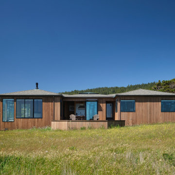
The house had always been grounded, on an ocean bluff at The Sea Ranch. It sits unencumbered, adjacent to one of the most dramatic stretches of the Sonoma coast with protected commons meadow to the east, uninterrupted Pacific views to the west, and a bluff trail running alongside. What it lacked was the feeling of home, one that could hold up its own against the natural landscape.
The owners are entrepreneurs with deep involvement across tech, real estate, and development and they know how things are built. The Sea Ranch house had been in their lives for years, a second residence and a place for family to gather. Built for a different time, it felt more compromising than comfortable. Sitting in a closed off nook, the kitchen fit one cook at a time and turned its back on the rest of the house. The entry was dim and compressed, divided by a structural column that presented itself at exactly the wrong moment. The primary suite was small relative to the view outside it. A large rear bedroom sat behind a lowered ceiling with a bathroom that had never been added. The house was certainly worth the trouble of doing it right.
What followed was not one project but four, each with its own design challenge, each addressed over a period of time.
Where the House Meets the Ocean
The most complex piece of the project, in both structural and spatial terms, was the kitchen expansion. The existing room was a single-person galley squeezed in as an afterthought with no meaningful connection to the dining room, the living space, or the deck outside. To make it useful for a family that cooks and gathers, it needed to grow outward into an existing patio and flow into the rooms around it.
A big challenge was the roofline. Several planes at different pitches and angles converged directly where additional volume was needed. A new form had to join that geometry without reading as a correction. The solution found the simplest possible connection between the existing angles, a roofline that from outside the structure, appears entirely original. From the bluff trail where the addition is visible, there is no discernible seam.
Inside, the kitchen is now open to the living and dining rooms without interruption. A large sliding glass door connects the space onto the rear deck. The deck itself was expanded and oriented so that the body of the house shields it from the coastal wind which is a common consideration that determines whether outdoor space at The Sea Ranch actually gets used. The result is a room that works for large family gatherings where no one feels cutoff, and one that makes the boundary between being inside and outside easy to ignore.
Welcoming Light
A structural column stood at the convergence of eight distinct roof planes in the entry. It was load-bearing, but it was also the reason the entry had always felt like a hallway rather than a welcoming arrival.
With the structural engineer, a custom steel connector was designed to receive beams from six separate directions, redistributing the load through a single new continuous beam. The column was surgically removed. Three triangular skylights were then cut into the roof above, their shapes drawn from the
existing geometry of the planes around them. The entry is now bright and open. The skylights feel native to the structure because they follow the logic already present in the roof.
Two Suites, Two Views
At opposite ends of the house, the two bedroom suites were each reconfigured, and each found a different way to introduce more of the landscape into the room.
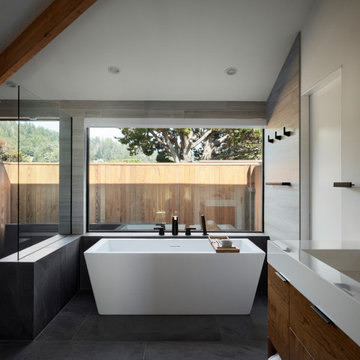
An addition to the primary suite extended the structure outward to create a wraparound plan with a loop from the bedroom through bath and closet that had not been possible before. The expansion opened a slot view from the tub and shower toward the ocean. The view is precise and private. The ocean view is present and deliberate.
The rear bedroom absorbed an adjacent storage room to transform it into a full second suite with a vaulted ceiling, a large bathroom with a tub, a shower, and a sauna. A private fenced garden courtyard sits just beyond the glass bringing the outdoors inside. The tub was placed so that, looking past the courtyard and through the bedroom beyond, the ocean is visible at the far end. It is a long view and it makes the room feel larger and more settled than its footprint would suggest.
Glass on Four Sides, Fire at the Center
The main living and gathering room had always been caught between two competing facts: glass on four sides meant exceptional views but at The Sea Ranch, it also meant a cold room. A 360-degree cylindrical fireplace was added at the center on a raised stone base, providing radiant heat in every direction and giving the room a focal point around which a group naturally orients itself, whether that means two people at the end of the day or the whole family after dinner.
Owners Who Picked Up the Tools
The owner was not a passive client. they came with construction knowledge, specific ideas, and the desire to be an active part of the process, a dynamic that other architects may had found difficult, which Klopf Architecture accepted as an asset. They took it upon themselves to complete some of the work during construction, including the installation of a new radiant heating system beneath the floors.
The radiant system added to the older and less-desirable forced-air setup. At The Sea Ranch, that change matters as the house sits close enough to the ocean and moving air competes with the sound of it, where radiant heat does not. Solar panels were added to the roof as part of the new system. Insulation was upgraded throughout the walls, roof, and crawl space. The house that had always had the right setting now holds warmth the way a house on the bluff should.
They were also deeply involved in the design and selections throughout, and the finished house reflects both of them in ways that are specific rather than generic. The process took longer and moved through more iterations than a more arms-length relationship might have allowed. The result is more defined and personal because of it.
The Landscape Holds Priority
Every exterior decision was shaped by The Sea Ranch Design Standards, which require that buildings defer to the landscape around them rather than compete with it. Because this house sits on the bluff and is visible from the public trail, the additions faced a close review. Existing materials were matched. Geometries were resolved. The additions had to become indistinguishable from the original building.
From the trail, the house reads exactly as it always has — low, cedar-clad, secondary to the meadow and the water. The setting holds priority. Inside, the house has been remade.
Klopf Architecture Project Team: Geoff Campen and Trenton Jewett
Contractor: Shawn Bettega Construction
Photography: ©2025 Mariko Reed
Year Completed: 2023
Location: The Sea Ranch, CA
 Orange County Deck Co.
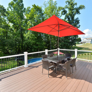
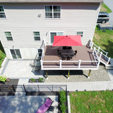
This project was full outdoor living environment, what some would call a “staycation” backyard. A hybrid pool had been installed the previous year but now the living and entertaining spaces needed to be constructed. Consisting of a deck, two patio spaces with walkways connecting all, a couple retaining walls, fencing, landscaping and a new sliding door. The retaining walls were needed to allow for the patio space around to pool. The patio space was divided into two sections, one the wet zone by the pool and the second being the handout zone. This also allowed for a smaller area of fence with a clean transition. The deck constructed using Azek building products provided the style they wanted without having to worry about maintenance. With the elevation being over 8 feet off the ground, the staircase was given careful consideration. It was put on the side that had the grade in its favor to cut down on the size and to not impede on the usable living areas. Traffic flow and usable space should always be considered when designing your space. Now to get a better view of their beautiful backyard we changed their existing single 3 ft. hinged door for a new 6 ft sliding unit. This type of change does involve some structural modification but well worth it. It gave them the sight line they wanted, allows more natural light and has less impact on the living space as the door now slides.
We had a great time constructing this space and love knowing they will be enjoying their home life with family and friends. What could we build in your backyard?
 Pro-Painting & Drywall, Inc.
Pro-Painting & Drywall, Inc.
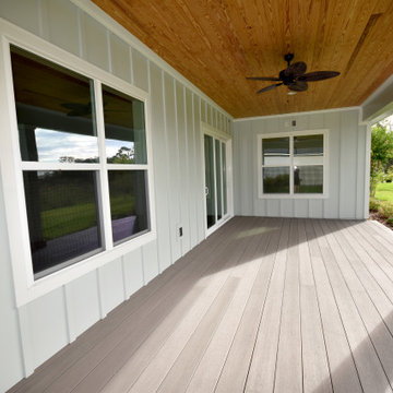
Exterior House Painting
The outside of the house is commonly ignored when thinking of new house improvement undertakings, with the emphasis usually falling on substantial interior jobs such as a brand new kitchen or bathroom. A simple painting of the outside of your home can offer considerable, enduring upgrades for your home’s worth, its functionality and its all-round looks and identity.
Give us a call 904-731-6471
 Kitchen Solvers of the Gulf Coast
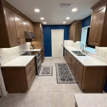
This lovely homeowner had a large, unique kitchen she wanted beautifully transformed — while still maintaining the warm wood tones that flow throughout her home.
After careful consideration, she selected cabinetry from our Kitchen Solvers Classic Collection in the rich Cashew stain. It took several weeks of thoughtful decision-making to ensure it was the perfect choice — and the result was absolutely worth it. The warm cabinetry brings depth and character while keeping the cohesive feel she loved.
She explored several countertop options, and the moment she paired Travella Quartz with her cabinets, she knew she had found the perfect match. The combination created a soft, elegant balance that elevates the entire space.
To maintain a seamless look, we incorporated custom panels to fully conceal her Sub-Zero refrigerator. She also designed custom shelving heights to beautifully display her treasured china and favorite kitchen pieces — adding both function and personality to the space.
She was an absolute pleasure to work with — thoughtful, detailed, and clear in expressing her vision. The finished kitchen is a complete success, and she is thrilled with the stunning result.
Sponsored
Columbus, OH
Transforming Spaces in Columbus
Daniel Home
Premier Interior Design Team Transforming Spaces in Franklin Co, Ohio
 Orange County Deck Co.
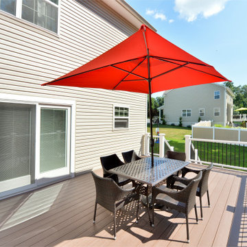
This project was full outdoor living environment, what some would call a “staycation” backyard. A hybrid pool had been installed the previous year but now the living and entertaining spaces needed to be constructed. Consisting of a deck, two patio spaces with walkways connecting all, a couple retaining walls, fencing, landscaping and a new sliding door. The retaining walls were needed to allow for the patio space around to pool. The patio space was divided into two sections, one the wet zone by the pool and the second being the handout zone. This also allowed for a smaller area of fence with a clean transition. The deck constructed using Azek building products provided the style they wanted without having to worry about maintenance. With the elevation being over 8 feet off the ground, the staircase was given careful consideration. It was put on the side that had the grade in its favor to cut down on the size and to not impede on the usable living areas. Traffic flow and usable space should always be considered when designing your space. Now to get a better view of their beautiful backyard we changed their existing single 3 ft. hinged door for a new 6 ft sliding unit. This type of change does involve some structural modification but well worth it. It gave them the sight line they wanted, allows more natural light and has less impact on the living space as the door now slides.
We had a great time constructing this space and love knowing they will be enjoying their home life with family and friends. What could we build in your backyard?
 Orange County Deck Co.
This project was full outdoor living environment, what some would call a “staycation” backyard. A hybrid pool had been installed the previous year but now the living and entertaining spaces needed to be constructed. Consisting of a deck, two patio spaces with walkways connecting all, a couple retaining walls, fencing, landscaping and a new sliding door. The retaining walls were needed to allow for the patio space around to pool. The patio space was divided into two sections, one the wet zone by the pool and the second being the handout zone. This also allowed for a smaller area of fence with a clean transition. The deck constructed using Azek building products provided the style they wanted without having to worry about maintenance. With the elevation being over 8 feet off the ground, the staircase was given careful consideration. It was put on the side that had the grade in its favor to cut down on the size and to not impede on the usable living areas. Traffic flow and usable space should always be considered when designing your space. Now to get a better view of their beautiful backyard we changed their existing single 3 ft. hinged door for a new 6 ft sliding unit. This type of change does involve some structural modification but well worth it. It gave them the sight line they wanted, allows more natural light and has less impact on the living space as the door now slides.
We had a great time constructing this space and love knowing they will be enjoying their home life with family and friends. What could we build in your backyard?
 Klopf Architecture
Built for the Bluff, A Sea Ranch Home is Remade from the Inside Out
The house had always been grounded, on an ocean bluff at The Sea Ranch. It sits unencumbered, adjacent to one of the most dramatic stretches of the Sonoma coast with protected commons meadow to the east, uninterrupted Pacific views to the west, and a bluff trail running alongside. What it lacked was the feeling of home, one that could hold up its own against the natural landscape.
The owners are entrepreneurs with deep involvement across tech, real estate, and development and they know how things are built. The Sea Ranch house had been in their lives for years, a second residence and a place for family to gather. Built for a different time, it felt more compromising than comfortable. Sitting in a closed off nook, the kitchen fit one cook at a time and turned its back on the rest of the house. The entry was dim and compressed, divided by a structural column that presented itself at exactly the wrong moment. The primary suite was small relative to the view outside it. A large rear bedroom sat behind a lowered ceiling with a bathroom that had never been added. The house was certainly worth the trouble of doing it right.
What followed was not one project but four, each with its own design challenge, each addressed over a period of time.
Where the House Meets the Ocean
The most complex piece of the project, in both structural and spatial terms, was the kitchen expansion. The existing room was a single-person galley squeezed in as an afterthought with no meaningful connection to the dining room, the living space, or the deck outside. To make it useful for a family that cooks and gathers, it needed to grow outward into an existing patio and flow into the rooms around it.
A big challenge was the roofline. Several planes at different pitches and angles converged directly where additional volume was needed. A new form had to join that geometry without reading as a correction. The solution found the simplest possible connection between the existing angles, a roofline that from outside the structure, appears entirely original. From the bluff trail where the addition is visible, there is no discernible seam.
Inside, the kitchen is now open to the living and dining rooms without interruption. A large sliding glass door connects the space onto the rear deck. The deck itself was expanded and oriented so that the body of the house shields it from the coastal wind which is a common consideration that determines whether outdoor space at The Sea Ranch actually gets used. The result is a room that works for large family gatherings where no one feels cutoff, and one that makes the boundary between being inside and outside easy to ignore.
Welcoming Light
A structural column stood at the convergence of eight distinct roof planes in the entry. It was load-bearing, but it was also the reason the entry had always felt like a hallway rather than a welcoming arrival.
With the structural engineer, a custom steel connector was designed to receive beams from six separate directions, redistributing the load through a single new continuous beam. The column was surgically removed. Three triangular skylights were then cut into the roof above, their shapes drawn from the
existing geometry of the planes around them. The entry is now bright and open. The skylights feel native to the structure because they follow the logic already present in the roof.
Two Suites, Two Views
At opposite ends of the house, the two bedroom suites were each reconfigured, and each found a different way to introduce more of the landscape into the room.
An addition to the primary suite extended the structure outward to create a wraparound plan with a loop from the bedroom through bath and closet that had not been possible before. The expansion opened a slot view from the tub and shower toward the ocean. The view is precise and private. The ocean view is present and deliberate.
The rear bedroom absorbed an adjacent storage room to transform it into a full second suite with a vaulted ceiling, a large bathroom with a tub, a shower, and a sauna. A private fenced garden courtyard sits just beyond the glass bringing the outdoors inside. The tub was placed so that, looking past the courtyard and through the bedroom beyond, the ocean is visible at the far end. It is a long view and it makes the room feel larger and more settled than its footprint would suggest.
Glass on Four Sides, Fire at the Center
The main living and gathering room had always been caught between two competing facts: glass on four sides meant exceptional views but at The Sea Ranch, it also meant a cold room. A 360-degree cylindrical fireplace was added at the center on a raised stone base, providing radiant heat in every direction and giving the room a focal point around which a group naturally orients itself, whether that means two people at the end of the day or the whole family after dinner.
Owners Who Picked Up the Tools
The owner was not a passive client. they came with construction knowledge, specific ideas, and the desire to be an active part of the process, a dynamic that other architects may had found difficult, which Klopf Architecture accepted as an asset. They took it upon themselves to complete some of the work during construction, including the installation of a new radiant heating system beneath the floors.
The radiant system added to the older and less-desirable forced-air setup. At The Sea Ranch, that change matters as the house sits close enough to the ocean and moving air competes with the sound of it, where radiant heat does not. Solar panels were added to the roof as part of the new system. Insulation was upgraded throughout the walls, roof, and crawl space. The house that had always had the right setting now holds warmth the way a house on the bluff should.
They were also deeply involved in the design and selections throughout, and the finished house reflects both of them in ways that are specific rather than generic. The process took longer and moved through more iterations than a more arms-length relationship might have allowed. The result is more defined and personal because of it.
The Landscape Holds Priority
Every exterior decision was shaped by The Sea Ranch Design Standards, which require that buildings defer to the landscape around them rather than compete with it. Because this house sits on the bluff and is visible from the public trail, the additions faced a close review. Existing materials were matched. Geometries were resolved. The additions had to become indistinguishable from the original building.
From the trail, the house reads exactly as it always has — low, cedar-clad, secondary to the meadow and the water. The setting holds priority. Inside, the house has been remade.
Klopf Architecture Project Team: Geoff Campen and Trenton Jewett
Contractor: Shawn Bettega Construction
Photography: ©2025 Mariko Reed
Year Completed: 2023
Location: The Sea Ranch, CA
 User
UserA complete home kitchen renovation in Inglewood, comprises elements like space management, layout design, accessory addition, functionality enhancement and storage space creation. When all these aspects are taken into consideration, it is a place worth spending hours. Contact Sunshine Remodelers at (877) 798-8385.
Kitchen Remodeling Contractors in Inglewood, CA - https://www.sunshineremodelers.com/
Sponsored
Columbus, OH
Transforming Spaces in Columbus
Daniel Home
Premier Interior Design Team Transforming Spaces in Franklin Co, Ohio
 Klopf Architecture
Built for the Bluff, A Sea Ranch Home is Remade from the Inside Out
The house had always been grounded, on an ocean bluff at The Sea Ranch. It sits unencumbered, adjacent to one of the most dramatic stretches of the Sonoma coast with protected commons meadow to the east, uninterrupted Pacific views to the west, and a bluff trail running alongside. What it lacked was the feeling of home, one that could hold up its own against the natural landscape.
The owners are entrepreneurs with deep involvement across tech, real estate, and development and they know how things are built. The Sea Ranch house had been in their lives for years, a second residence and a place for family to gather. Built for a different time, it felt more compromising than comfortable. Sitting in a closed off nook, the kitchen fit one cook at a time and turned its back on the rest of the house. The entry was dim and compressed, divided by a structural column that presented itself at exactly the wrong moment. The primary suite was small relative to the view outside it. A large rear bedroom sat behind a lowered ceiling with a bathroom that had never been added. The house was certainly worth the trouble of doing it right.
What followed was not one project but four, each with its own design challenge, each addressed over a period of time.
Where the House Meets the Ocean
The most complex piece of the project, in both structural and spatial terms, was the kitchen expansion. The existing room was a single-person galley squeezed in as an afterthought with no meaningful connection to the dining room, the living space, or the deck outside. To make it useful for a family that cooks and gathers, it needed to grow outward into an existing patio and flow into the rooms around it.
A big challenge was the roofline. Several planes at different pitches and angles converged directly where additional volume was needed. A new form had to join that geometry without reading as a correction. The solution found the simplest possible connection between the existing angles, a roofline that from outside the structure, appears entirely original. From the bluff trail where the addition is visible, there is no discernible seam.
Inside, the kitchen is now open to the living and dining rooms without interruption. A large sliding glass door connects the space onto the rear deck. The deck itself was expanded and oriented so that the body of the house shields it from the coastal wind which is a common consideration that determines whether outdoor space at The Sea Ranch actually gets used. The result is a room that works for large family gatherings where no one feels cutoff, and one that makes the boundary between being inside and outside easy to ignore.
Welcoming Light
A structural column stood at the convergence of eight distinct roof planes in the entry. It was load-bearing, but it was also the reason the entry had always felt like a hallway rather than a welcoming arrival.
With the structural engineer, a custom steel connector was designed to receive beams from six separate directions, redistributing the load through a single new continuous beam. The column was surgically removed. Three triangular skylights were then cut into the roof above, their shapes drawn from the
existing geometry of the planes around them. The entry is now bright and open. The skylights feel native to the structure because they follow the logic already present in the roof.
Two Suites, Two Views
At opposite ends of the house, the two bedroom suites were each reconfigured, and each found a different way to introduce more of the landscape into the room.
An addition to the primary suite extended the structure outward to create a wraparound plan with a loop from the bedroom through bath and closet that had not been possible before. The expansion opened a slot view from the tub and shower toward the ocean. The view is precise and private. The ocean view is present and deliberate.
The rear bedroom absorbed an adjacent storage room to transform it into a full second suite with a vaulted ceiling, a large bathroom with a tub, a shower, and a sauna. A private fenced garden courtyard sits just beyond the glass bringing the outdoors inside. The tub was placed so that, looking past the courtyard and through the bedroom beyond, the ocean is visible at the far end. It is a long view and it makes the room feel larger and more settled than its footprint would suggest.
Glass on Four Sides, Fire at the Center
The main living and gathering room had always been caught between two competing facts: glass on four sides meant exceptional views but at The Sea Ranch, it also meant a cold room. A 360-degree cylindrical fireplace was added at the center on a raised stone base, providing radiant heat in every direction and giving the room a focal point around which a group naturally orients itself, whether that means two people at the end of the day or the whole family after dinner.
Owners Who Picked Up the Tools
The owner was not a passive client. they came with construction knowledge, specific ideas, and the desire to be an active part of the process, a dynamic that other architects may had found difficult, which Klopf Architecture accepted as an asset. They took it upon themselves to complete some of the work during construction, including the installation of a new radiant heating system beneath the floors.
The radiant system added to the older and less-desirable forced-air setup. At The Sea Ranch, that change matters as the house sits close enough to the ocean and moving air competes with the sound of it, where radiant heat does not. Solar panels were added to the roof as part of the new system. Insulation was upgraded throughout the walls, roof, and crawl space. The house that had always had the right setting now holds warmth the way a house on the bluff should.
They were also deeply involved in the design and selections throughout, and the finished house reflects both of them in ways that are specific rather than generic. The process took longer and moved through more iterations than a more arms-length relationship might have allowed. The result is more defined and personal because of it.
The Landscape Holds Priority
Every exterior decision was shaped by The Sea Ranch Design Standards, which require that buildings defer to the landscape around them rather than compete with it. Because this house sits on the bluff and is visible from the public trail, the additions faced a close review. Existing materials were matched. Geometries were resolved. The additions had to become indistinguishable from the original building.
From the trail, the house reads exactly as it always has — low, cedar-clad, secondary to the meadow and the water. The setting holds priority. Inside, the house has been remade.
Klopf Architecture Project Team: Geoff Campen and Trenton Jewett
Contractor: Shawn Bettega Construction
Photography: ©2025 Mariko Reed
Year Completed: 2023
Location: The Sea Ranch, CA
 smartSPACE - Home Theatre and Automation
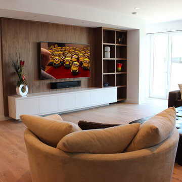
Basement Media room.
Piano black soundbar floating below the television adds interest and excellent sound.
Lights, blinds, tv and security are all controlled from your iPhone/iPad, Android device.
 The ARTEC Group, Inc.
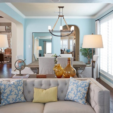
A fun vibrant project for an amazing family in Fort Worth. The brief was to create a bright and cohesive color scheme for the whole house for a young family of 5.
Attention to detail, traffic patterns and the optimal use of space were all taken into consideration here. The end result was a gorgeous home that could be enjoyed by all members of the family and also by their guests when entertaining.
6