
Search results for "Your own originally" in Home Design Ideas
 Flavin Architects
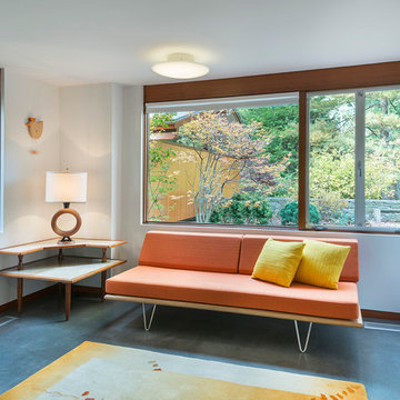
This house west of Boston was originally designed in 1958 by the great New England modernist, Henry Hoover. He built his own modern home in Lincoln in 1937, the year before the German émigré Walter Gropius built his own world famous house only a few miles away. By the time this 1958 house was built, Hoover had matured as an architect; sensitively adapting the house to the land and incorporating the clients wish to recreate the indoor-outdoor vibe of their previous home in Hawaii.
The house is beautifully nestled into its site. The slope of the roof perfectly matches the natural slope of the land. The levels of the house delicately step down the hill avoiding the granite ledge below. The entry stairs also follow the natural grade to an entry hall that is on a mid level between the upper main public rooms and bedrooms below. The living spaces feature a south- facing shed roof that brings the sun deep in to the home. Collaborating closely with the homeowner and general contractor, we freshened up the house by adding radiant heat under the new purple/green natural cleft slate floor. The original interior and exterior Douglas fir walls were stripped and refinished.
Photo by: Nat Rea Photography
 Allen Construction
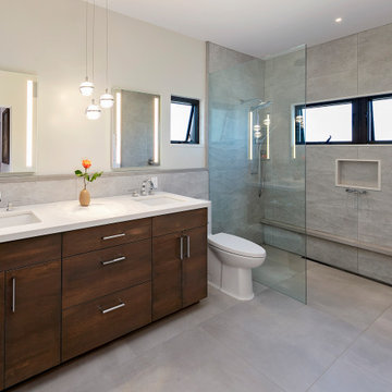
The original house was demolished to make way for a two-story house on the sloping lot, with an accessory dwelling unit below. The upper level of the house, at street level, has three bedrooms, a kitchen and living room. The “great room” opens onto an ocean-view deck through two large pocket doors. The master bedroom can look through the living room to the same view. The owners, acting as their own interior designers, incorporated lots of color with wallpaper accent walls in each bedroom, and brilliant tiles in the bathrooms, kitchen, and at the fireplace tiles in the bathrooms, kitchen, and at the fireplace.
Architect: Thompson Naylor Architects
Photographs: Jim Bartsch Photographer
 Susan Yeley Homes
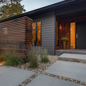
This gem of a house was built in the 1950s, when its neighborhood undoubtedly felt remote. The university footprint has expanded in the 70 years since, however, and today this home sits on prime real estate—easy biking and reasonable walking distance to campus.
When it went up for sale in 2017, it was largely unaltered. Our clients purchased it to renovate and resell, and while we all knew we'd need to add square footage to make it profitable, we also wanted to respect the neighborhood and the house’s own history. Swedes have a word that means “just the right amount”: lagom. It is a guiding philosophy for us at SYH, and especially applied in this renovation. Part of the soul of this house was about living in just the right amount of space. Super sizing wasn’t a thing in 1950s America. So, the solution emerged: keep the original rectangle, but add an L off the back.
With no owner to design with and for, SYH created a layout to appeal to the masses. All public spaces are the back of the home--the new addition that extends into the property’s expansive backyard. A den and four smallish bedrooms are atypically located in the front of the house, in the original 1500 square feet. Lagom is behind that choice: conserve space in the rooms where you spend most of your time with your eyes shut. Put money and square footage toward the spaces in which you mostly have your eyes open.
In the studio, we started calling this project the Mullet Ranch—business up front, party in the back. The front has a sleek but quiet effect, mimicking its original low-profile architecture street-side. It’s very Hoosier of us to keep appearances modest, we think. But get around to the back, and surprise! lofted ceilings and walls of windows. Gorgeous.
Find the right local pro for your project
 Nar Design Group
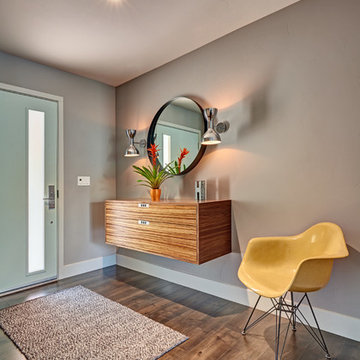
This client grew up in this 1950’s family home and has now become owner in his adult life. Designing and remodeling this childhood home that the client was very bonded and familiar with was a tall order. This modern twist of original mid-century style combined with an eclectic fusion of modern day materials and concepts fills the room with a powerful presence while maintaining its clean lined austerity and elegance. The kitchen was part of a grander complete home re-design and remodel.
A modern version of a mid-century His and Hers grand master bathroom was created to include all the amenities and nothing left behind! This bathroom has so much noticeable and hidden “POW” that commands its peaceful spa feeling with a lot of attitude. Maintaining ultra-clean lines yet delivering ample design interest at every detail, This bathroom is eclectically a one of a kind luxury statement.
The concept in the laundry room was to create a simple, easy to use and clean space with ample storage and a place removed from the central part of the home to house the necessity of the cats and their litter box needs. There was no need for glamour in the laundry room yet we were able to create a simple highly utilitarian space.
If there is one room in the home that requires frequent visitors to thoroughly enjoy with a huge element of surprise, it’s the powder room! This is a room where you know that eventually, every guest will visit. Knowing this, we created a bold statement with layers of intrigue that would leave ample room for fun conversation with your guests upon their prolonged exit. We kept the lights dim here for that intriguing experience of crafted elegance and created ambiance. The walls of peeling metallic rust are the welcoming gesture to a powder room experience of defiance and elegant mystical complexity.
It's a lucky house guest indeed who gets to stay in this newly remodeled home. This on-suite bathroom allows them their own space and privacy. Both Bedroom and Bathroom offer plenty of storage for an extended stay. Rift White Oak cabinets and sleek Silestone counters make a lovely combination in the bathroom while the bedroom showcases textured white cabinets with a dark walnut wrap.
Photo credit: Fred Donham of PhotographerLink
 Susan Yeley Homes
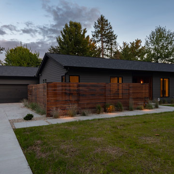
This gem of a house was built in the 1950s, when its neighborhood undoubtedly felt remote. The university footprint has expanded in the 70 years since, however, and today this home sits on prime real estate—easy biking and reasonable walking distance to campus.
When it went up for sale in 2017, it was largely unaltered. Our clients purchased it to renovate and resell, and while we all knew we'd need to add square footage to make it profitable, we also wanted to respect the neighborhood and the house’s own history. Swedes have a word that means “just the right amount”: lagom. It is a guiding philosophy for us at SYH, and especially applied in this renovation. Part of the soul of this house was about living in just the right amount of space. Super sizing wasn’t a thing in 1950s America. So, the solution emerged: keep the original rectangle, but add an L off the back.
With no owner to design with and for, SYH created a layout to appeal to the masses. All public spaces are the back of the home--the new addition that extends into the property’s expansive backyard. A den and four smallish bedrooms are atypically located in the front of the house, in the original 1500 square feet. Lagom is behind that choice: conserve space in the rooms where you spend most of your time with your eyes shut. Put money and square footage toward the spaces in which you mostly have your eyes open.
In the studio, we started calling this project the Mullet Ranch—business up front, party in the back. The front has a sleek but quiet effect, mimicking its original low-profile architecture street-side. It’s very Hoosier of us to keep appearances modest, we think. But get around to the back, and surprise! lofted ceilings and walls of windows. Gorgeous.

 FineLine Kitchens, Inc.
Hi everyone, I'm Sarah and Ogun we are here with fine line kitchens. So we are a couple working together. I do the interior design and remodeling of the space material selection meeting with the clients. And I handled operations outside, you know meaning all the construction work that is taking place the inside. The houses that we work in. I handle all the aspects of the construction, so today's project is very special. We're in Vienna and the client had a very big family. It's a family of seven that lives here. So we had a few aspects that we needed to keep in mind while designing this one. Having everybody be able to sit on the island. So we wanted plenty of seating all the way around. We didn't want anybody standing or anything like that. So what we did is we maximize the space. The center island is the biggest part of the kitchen. We use a natural stone to kind of give it a beautiful texture versus quartz. It's kind of standard white or kind of fabricated, so I wanted something very natural. We did this because I took my inspiration from the outside, so the inspiration if you look at the view right in front of me is there are so many greens there's a lot of brass accents and I wanted to bring this. Into this kitchen while designing it for my clients. She is very warm very. She wanted a very homey, comfy kind of look for the kitchen. So that's what we did today. As you can see, the cabinets are sage green, very light, so I still think it's a neutral, but it's a lighter color that again brings the outside in and we combine that with the oak right behind me so it's a slightly warm oak. It's not very dark. It's not very light. It's a medium brown and the same color went on the island. To kind of tie these two in and the backsplash, my favorite part is where you can see a little bit of design. It is, in my opinion still classic, but includes a pattern so the outside part is as we said in the beginning, is handled by my husband. I'd like him to speak a little bit about that. Thanks, Sarah, I want to talk to you guys a little bit about the construction part of this project. Originally this kitchen was located mostly in this area. They had their stove there sing. It was more of a peninsula layout in Sarah's and the customer vision they wanted. They wanted to get rid of the peninsula and they want to be able to have a huge island that can at least sit seven people because they're familiar with seven. So we wanted to make sure that we can achieve this design and bring it to life so that they can be happy with this layout. Some of the challenges we had, the house, the home being, you know, old home. There were a lot of you know the older electrical and plumbing that had to be replaced. We had to relocate the stove from here to this area. Over here we had put a nice foot fan that we had to relocate all the ductwork and the plumbing. Was being on the peninsula area. We had to relocate it to the center islands. So we achieved all this and kind of like bring it to bring in this kitchen up to date it looks beautiful. That's true, so yes, the old layout did not function for my clients because everything was kind of gathered on one side of the kitchen. So there was like a peninsula right there. So the end of this island kind of continued straight. And that was just the L shape. Kind of where everything was and there used to be another big table here, so they were using only kind of half of the space. So like I said at the beginning, our vision was to kind of feed everybody at the island, create some symmetry. 'cause I love that. So as you can see behind me, this is kind of the focal point symmetrical. Everything is kind of even we wanted to also panel the fridge here so it mimics the pantry and another size. So when you're looking at it, it is bringing again that symmetry back again. I hope you enjoyed this kitchen and this video and I'll see you soon. So how do you think this project turned out? It's nice. I like the color. I think it turned out nice. It's kind of like a little bit different color than what we always do. So I realize. Are you giving me a little bit of credit here that I did something different? Are you proud? I'm so proud of you. Other than that I like it. That they have kind of like a two sink. So if this was our kitchen, if we ever like you can have your own. I can have mine if we ever get into a fight then this can be like my own kitchen. Why are we gonna bring in a fight right now? So I'm cooking anyway. You're grilling most of the time, So what are you even talking about? My kitchen? That's my kitchen. You can just take the small sink. That's fine. It's always good to have your own space right there, so anyways. Thank you guys for watching. We hope to see you soon and if you have any questions please click the link below. It'll lead you to our website, house, YouTube and all of the social media is so nice to have you guys. We'll see you soon. Thanks bye bye-bye.
 Envision Web
Stuart Wade, Envision Virtual Tours, Inc.
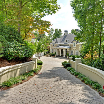
Envision Virtual Tours and High Resolution Photography is your best choice to find just what you are looking for in the Lake Burton Area . Knowing the areas and resources of Lake Burton is our specialty
Lake Burton is a 2,775 acre man-made lake with 62 miles of shoreline located in the northeastern corner of Georgia in Rabun County. It is the first lake in a five-lake series called the Tallulah River Watershed that follows the original course of the Tallulah River. The series of lakes starts with Lake Burton as the northernmost lake followed by Lake Seed, Lake Rabun, Lake Tallulah Falls and the eastern arm of Lake Tugalo (the western arm is formed by the Chattooga River. The lakes are owned and operated by the Georgia Power Company to generate hydroelectric energy for Georgia's largest city, Atlanta. At one time these lakes were the largest producers of electricity in the state of Georgia. Now, they only provide peak power supply.
The lake was built in a deep valley located along a 10 mile section of the Tallulah River. The Lake Burton Dam was closed on December 22, 1919 and the lake started to fill. The dam is a gravity concrete dam, with a height of 128 feet and a span of 1,100 feet. The spillway is equipped with eight gates 22 feet wide by 6.6 feet high. The total capacity at an elevation of 1,866.6 feet is 108,000 acre-ft, of which 106,000 acre-ft is usable storage. The generating capacity of the dam is 6,120 kilowatts (two units).Lake Burton is the highest Georgia Power lake in Georgia.
Lake Burton gets its named from the town of Burton, which was the second largest town in Rabun County with a population of approximately 200 but now lies below the lake's surface. The town (and the lake) was named after local prominent citizen Jeremiah Burton and was situated along the road from Clayton, Georgia to the Nacoochee Valley. Andrew Jackson Ritchie served as the postmaster for the area for several years. Gold was first discovered in Rabun County where Dicks Creek and the Tallulah River come together and was the reason for the town's founding in the early 1800s.
The Lake Burton Fish Hatchery and Moccasin Creek State Park are located on the western side of the lake. Lake Burton is home to several species of fish, including Spotted Bass, Largemouth Bass, White Bass, Black Crappie, Bluegill, Redear Sunfish, White Catfish, Walleye, Brown Trout, Rainbow Trout, and Yellow Perch.
The residents of Lake Burton are a mix of permanent residents and seasonal vacationers who together make-up the Lake Burton Civic Association, a local organization who goal is to maintain the lake through volunteer clean-ups and other such events. Let a Lake Burton resident and expert show you the way
The Lake Burton Civic Association is an active homeowners association for residents of the Lake Burton area and sponsors many events throughout the year such as:
burton, custom, envision, georgia, lake, mountain, nc, north, photography, web, western, Lake Burton, Lake Rabun, Seed Lake,Virtual Tours.

Sponsored
Columbus, OH

Hope Restoration & General Contracting
Columbus Design-Build, Kitchen & Bath Remodeling, Historic Renovations
 Chris Rossetti at Main Line Kitchen Design
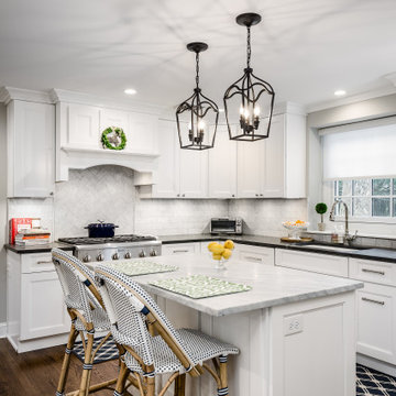
Main Line Kitchen Design’s unique business model allows our customers to work with the most experienced designers and get the most competitive kitchen cabinet pricing.
How does Main Line Kitchen Design offer the best designs along with the most competitive kitchen cabinet pricing? We are a more modern and cost effective business model. We are a kitchen cabinet dealer and design team that carries the highest quality kitchen cabinetry, is experienced, convenient, and reasonable priced. Our five award winning designers work by appointment only, with pre-qualified customers, and only on complete kitchen renovations.
Our designers are some of the most experienced and award winning kitchen designers in the Delaware Valley. We design with and sell 8 nationally distributed cabinet lines. Cabinet pricing is slightly less than major home centers for semi-custom cabinet lines, and significantly less than traditional showrooms for custom cabinet lines.
After discussing your kitchen on the phone, first appointments always take place in your home, where we discuss and measure your kitchen. Subsequent appointments usually take place in one of our offices and selection centers where our customers consider and modify 3D designs on flat screen TV’s. We can also bring sample doors and finishes to your home and make design changes on our laptops in 20-20 CAD with you, in your own kitchen.
Call today! We can estimate your kitchen project from soup to nuts in a 15 minute phone call and you can find out why we get the best reviews on the internet. We look forward to working with you.
As our company tag line says:
“The world of kitchen design is changing…”
 Will Wick
Modern Living Room
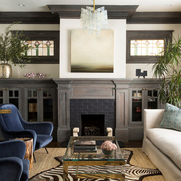
Inspiration for a transitional formal and enclosed dark wood floor living room remodel in San Francisco with white walls, a brick fireplace and a standard fireplace
Inspiration for a transitional formal and enclosed dark wood floor living room remodel in San Francisco with white walls, a brick fireplace and a standard fireplace

 TKS Design Group
Download our free ebook, Creating the Ideal Kitchen. DOWNLOAD NOW
For many, extra time at home during COVID left them wanting more from their homes. Whether you realized the shortcomings of your space or simply wanted to combat boredom, a well-designed and functional home was no longer a want, it became a need. Tina found herself wanting more from her Old Irving Park home and reached out to The Kitchen Studio about adding function to her kitchen to make the most of the available real estate.
At the end of the day, there is nothing better than returning home to a bright and happy space you love. And this kitchen wasn’t that for Tina. Dark and dated, with a palette from the past and features that didn’t make the most of the available square footage, this remodel required vision and a fresh approach to the space. Lead designer, Stephanie Cole’s main design goal was better flow, while adding greater functionality with organized storage, accessible open shelving, and an overall sense of cohesion with the adjoining family room.
The original kitchen featured a large pizza oven, which was rarely used, yet its footprint limited storage space. The nearby pantry had become a catch-all, lacking the organization needed in the home. The initial plan was to keep the pizza oven, but eventually Tina realized she preferred the design possibilities that came from removing this cumbersome feature, with the goal of adding function throughout the upgraded and elevated space. Eliminating the pantry added square footage and length to the kitchen for greater function and more storage. This redesigned space reflects how she lives and uses her home, as well as her love for entertaining.
The kitchen features a classic, clean, and timeless palette. White cabinetry, with brass and bronze finishes, contrasts with rich wood flooring, and lets the large, deep blue island in Woodland’s custom color Harbor – a neutral, yet statement color – draw your eye.
The kitchen was the main priority. In addition to updating and elevating this space, Tina wanted to maximize what her home had to offer. From moving the location of the patio door and eliminating a window to removing an existing closet in the mudroom and the cluttered pantry, the kitchen footprint grew. Once the floorplan was set, it was time to bring cohesion to her home, creating connection between the kitchen and surrounding spaces.
The color palette carries into the mudroom, where we added beautiful new cabinetry, practical bench seating, and accessible hooks, perfect for guests and everyday living. The nearby bar continues the aesthetic, with stunning Carrara marble subway tile, hints of brass and bronze, and a design that further captures the vibe of the kitchen.
Every home has its unique design challenges. But with a fresh perspective and a bit of creativity, there is always a way to give the client exactly what they want [and need]. In this particular kitchen, the existing soffits and high slanted ceilings added a layer of complexity to the lighting layout and upper perimeter cabinets.
While a space needs to look good, it also needs to function well. This meant making the most of the height of the room and accounting for the varied ceiling features, while also giving Tina everything she wanted and more. Pendants and task lighting paired with an abundance of natural light amplify the bright aesthetic. The cabinetry layout and design compliments the soffits with subtle profile details that bring everything together. The tile selections add visual interest, drawing the eye to the focal area above the range. Glass-doored cabinets further customize the space and give the illusion of even more height within the room.
While her family may be grown and out of the house, Tina was focused on adding function without sacrificing a stunning aesthetic and dreamy finishes that make the kitchen the gathering place of any home. It was time to love her kitchen again, and if you’re wondering what she loves most, it’s the niche with glass door cabinetry and open shelving for display paired with the marble mosaic backsplash over the range and complimenting hood. Each of these features is a stunning point of interest within the kitchen – both brag-worthy additions to a perimeter layout that previously felt limited and lacking.
Whether your remodel is the result of special needs in your home or simply the excitement of focusing your energy on creating a fun new aesthetic, we are here for it. We love a good challenge because there is always a way to make a space better – adding function and beauty simultaneously.
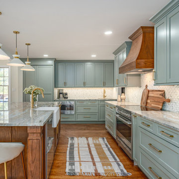 FineLine Kitchens, Inc.
Hi everyone, I'm Sarah and Ogun we are here with fine line kitchens. So we are a couple working together. I do the interior design and remodeling of the space material selection meeting with the clients. And I handled operations outside, you know meaning all the construction work that is taking place the inside. The houses that we work in. I handle all the aspects of the construction, so today's project is very special. We're in Vienna and the client had a very big family. It's a family of seven that lives here. So we had a few aspects that we needed to keep in mind while designing this one. Having everybody be able to sit on the island. So we wanted plenty of seating all the way around. We didn't want anybody standing or anything like that. So what we did is we maximize the space. The center island is the biggest part of the kitchen. We use a natural stone to kind of give it a beautiful texture versus quartz. It's kind of standard white or kind of fabricated, so I wanted something very natural. We did this because I took my inspiration from the outside, so the inspiration if you look at the view right in front of me is there are so many greens there's a lot of brass accents and I wanted to bring this. Into this kitchen while designing it for my clients. She is very warm very. She wanted a very homey, comfy kind of look for the kitchen. So that's what we did today. As you can see, the cabinets are sage green, very light, so I still think it's a neutral, but it's a lighter color that again brings the outside in and we combine that with the oak right behind me so it's a slightly warm oak. It's not very dark. It's not very light. It's a medium brown and the same color went on the island. To kind of tie these two in and the backsplash, my favorite part is where you can see a little bit of design. It is, in my opinion still classic, but includes a pattern so the outside part is as we said in the beginning, is handled by my husband. I'd like him to speak a little bit about that. Thanks, Sarah, I want to talk to you guys a little bit about the construction part of this project. Originally this kitchen was located mostly in this area. They had their stove there sing. It was more of a peninsula layout in Sarah's and the customer vision they wanted. They wanted to get rid of the peninsula and they want to be able to have a huge island that can at least sit seven people because they're familiar with seven. So we wanted to make sure that we can achieve this design and bring it to life so that they can be happy with this layout. Some of the challenges we had, the house, the home being, you know, old home. There were a lot of you know the older electrical and plumbing that had to be replaced. We had to relocate the stove from here to this area. Over here we had put a nice foot fan that we had to relocate all the ductwork and the plumbing. Was being on the peninsula area. We had to relocate it to the center islands. So we achieved all this and kind of like bring it to bring in this kitchen up to date it looks beautiful. That's true, so yes, the old layout did not function for my clients because everything was kind of gathered on one side of the kitchen. So there was like a peninsula right there. So the end of this island kind of continued straight. And that was just the L shape. Kind of where everything was and there used to be another big table here, so they were using only kind of half of the space. So like I said at the beginning, our vision was to kind of feed everybody at the island, create some symmetry. 'cause I love that. So as you can see behind me, this is kind of the focal point symmetrical. Everything is kind of even we wanted to also panel the fridge here so it mimics the pantry and another size. So when you're looking at it, it is bringing again that symmetry back again. I hope you enjoyed this kitchen and this video and I'll see you soon. So how do you think this project turned out? It's nice. I like the color. I think it turned out nice. It's kind of like a little bit different color than what we always do. So I realize. Are you giving me a little bit of credit here that I did something different? Are you proud? I'm so proud of you. Other than that I like it. That they have kind of like a two sink. So if this was our kitchen, if we ever like you can have your own. I can have mine if we ever get into a fight then this can be like my own kitchen. Why are we gonna bring in a fight right now? So I'm cooking anyway. You're grilling most of the time, So what are you even talking about? My kitchen? That's my kitchen. You can just take the small sink. That's fine. It's always good to have your own space right there, so anyways. Thank you guys for watching. We hope to see you soon and if you have any questions please click the link below. It'll lead you to our website, house, YouTube and all of the social media is so nice to have you guys. We'll see you soon. Thanks bye bye-bye.
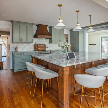 FineLine Kitchens, Inc.
Hi everyone, I'm Sarah and Ogun we are here with fine line kitchens. So we are a couple working together. I do the interior design and remodeling of the space material selection meeting with the clients. And I handled operations outside, you know meaning all the construction work that is taking place the inside. The houses that we work in. I handle all the aspects of the construction, so today's project is very special. We're in Vienna and the client had a very big family. It's a family of seven that lives here. So we had a few aspects that we needed to keep in mind while designing this one. Having everybody be able to sit on the island. So we wanted plenty of seating all the way around. We didn't want anybody standing or anything like that. So what we did is we maximize the space. The center island is the biggest part of the kitchen. We use a natural stone to kind of give it a beautiful texture versus quartz. It's kind of standard white or kind of fabricated, so I wanted something very natural. We did this because I took my inspiration from the outside, so the inspiration if you look at the view right in front of me is there are so many greens there's a lot of brass accents and I wanted to bring this. Into this kitchen while designing it for my clients. She is very warm very. She wanted a very homey, comfy kind of look for the kitchen. So that's what we did today. As you can see, the cabinets are sage green, very light, so I still think it's a neutral, but it's a lighter color that again brings the outside in and we combine that with the oak right behind me so it's a slightly warm oak. It's not very dark. It's not very light. It's a medium brown and the same color went on the island. To kind of tie these two in and the backsplash, my favorite part is where you can see a little bit of design. It is, in my opinion still classic, but includes a pattern so the outside part is as we said in the beginning, is handled by my husband. I'd like him to speak a little bit about that. Thanks, Sarah, I want to talk to you guys a little bit about the construction part of this project. Originally this kitchen was located mostly in this area. They had their stove there sing. It was more of a peninsula layout in Sarah's and the customer vision they wanted. They wanted to get rid of the peninsula and they want to be able to have a huge island that can at least sit seven people because they're familiar with seven. So we wanted to make sure that we can achieve this design and bring it to life so that they can be happy with this layout. Some of the challenges we had, the house, the home being, you know, old home. There were a lot of you know the older electrical and plumbing that had to be replaced. We had to relocate the stove from here to this area. Over here we had put a nice foot fan that we had to relocate all the ductwork and the plumbing. Was being on the peninsula area. We had to relocate it to the center islands. So we achieved all this and kind of like bring it to bring in this kitchen up to date it looks beautiful. That's true, so yes, the old layout did not function for my clients because everything was kind of gathered on one side of the kitchen. So there was like a peninsula right there. So the end of this island kind of continued straight. And that was just the L shape. Kind of where everything was and there used to be another big table here, so they were using only kind of half of the space. So like I said at the beginning, our vision was to kind of feed everybody at the island, create some symmetry. 'cause I love that. So as you can see behind me, this is kind of the focal point symmetrical. Everything is kind of even we wanted to also panel the fridge here so it mimics the pantry and another size. So when you're looking at it, it is bringing again that symmetry back again. I hope you enjoyed this kitchen and this video and I'll see you soon. So how do you think this project turned out? It's nice. I like the color. I think it turned out nice. It's kind of like a little bit different color than what we always do. So I realize. Are you giving me a little bit of credit here that I did something different? Are you proud? I'm so proud of you. Other than that I like it. That they have kind of like a two sink. So if this was our kitchen, if we ever like you can have your own. I can have mine if we ever get into a fight then this can be like my own kitchen. Why are we gonna bring in a fight right now? So I'm cooking anyway. You're grilling most of the time, So what are you even talking about? My kitchen? That's my kitchen. You can just take the small sink. That's fine. It's always good to have your own space right there, so anyways. Thank you guys for watching. We hope to see you soon and if you have any questions please click the link below. It'll lead you to our website, house, YouTube and all of the social media is so nice to have you guys. We'll see you soon. Thanks bye bye-bye.
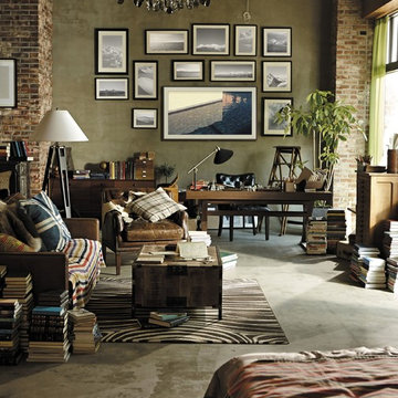
 Samsung Electronics America - Lifestyle TV
The Frame is as much a work of art as it is a TV. With revolutionary Art Mode, it transforms from a stunning 4K TV with HDR to beautiful, lifelike art that fits seamlessly into your home and decor.
The Frame brings gallery experience into your home with over one hundred original works of art. You can also add to your collection by purchasing or subscribing to the Art Store or even upload your own images for infinite personalization options.
With the power of 4K UHD, The Frame produces outstanding picture quality alongside state of the art design, delivering content that looks as good as the TV you’re watching it on.

Sponsored
Sunbury, OH

J.Holderby - Renovations
Franklin County's Leading General Contractors - 2X Best of Houzz!
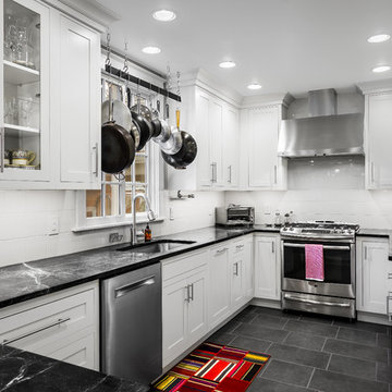
 Main Line Kitchen Design
The best kitchen showroom in your area is closer than you think. The four designers there are some of the most experienced award winning kitchen designers in the Delaware Valley. They design in and sell 6 national cabinet lines. And their pricing for cabinetry is slightly less than at home centers in apples to apples comparisons. Where is this kitchen showroom and how come you don’t remember seeing it when it is so close by? It’s in your own home!
Main Line Kitchen Design brings all the same samples you select from when you travel to other showrooms to your home. We make design changes on our laptops in 20-20 CAD with you present usually in the very kitchen being renovated. Understanding what designs will look like and how sample kitchen cabinets, doors, and finishes will look in your home is easy when you are standing in the very room being renovated. Design changes can be emailed to you to print out and discuss with friends and family if you choose. Best of all our design time is free since it is incorporated into the very competitive pricing of your cabinetry when you purchase a kitchen from Main Line Kitchen Design.
Finally there is a kitchen business model and design team that carries the highest quality cabinetry, is experienced, convenient, and reasonably priced. Call us today and find out why we get the best reviews on the internet or Google us and check. We look forward to working with you.
As our company tag line says:
“The world of kitchen design is changing…”
 TKS Design Group
Download our free ebook, Creating the Ideal Kitchen. DOWNLOAD NOW
For many, extra time at home during COVID left them wanting more from their homes. Whether you realized the shortcomings of your space or simply wanted to combat boredom, a well-designed and functional home was no longer a want, it became a need. Tina found herself wanting more from her Old Irving Park home and reached out to The Kitchen Studio about adding function to her kitchen to make the most of the available real estate.
At the end of the day, there is nothing better than returning home to a bright and happy space you love. And this kitchen wasn’t that for Tina. Dark and dated, with a palette from the past and features that didn’t make the most of the available square footage, this remodel required vision and a fresh approach to the space. Lead designer, Stephanie Cole’s main design goal was better flow, while adding greater functionality with organized storage, accessible open shelving, and an overall sense of cohesion with the adjoining family room.
The original kitchen featured a large pizza oven, which was rarely used, yet its footprint limited storage space. The nearby pantry had become a catch-all, lacking the organization needed in the home. The initial plan was to keep the pizza oven, but eventually Tina realized she preferred the design possibilities that came from removing this cumbersome feature, with the goal of adding function throughout the upgraded and elevated space. Eliminating the pantry added square footage and length to the kitchen for greater function and more storage. This redesigned space reflects how she lives and uses her home, as well as her love for entertaining.
The kitchen features a classic, clean, and timeless palette. White cabinetry, with brass and bronze finishes, contrasts with rich wood flooring, and lets the large, deep blue island in Woodland’s custom color Harbor – a neutral, yet statement color – draw your eye.
The kitchen was the main priority. In addition to updating and elevating this space, Tina wanted to maximize what her home had to offer. From moving the location of the patio door and eliminating a window to removing an existing closet in the mudroom and the cluttered pantry, the kitchen footprint grew. Once the floorplan was set, it was time to bring cohesion to her home, creating connection between the kitchen and surrounding spaces.
The color palette carries into the mudroom, where we added beautiful new cabinetry, practical bench seating, and accessible hooks, perfect for guests and everyday living. The nearby bar continues the aesthetic, with stunning Carrara marble subway tile, hints of brass and bronze, and a design that further captures the vibe of the kitchen.
Every home has its unique design challenges. But with a fresh perspective and a bit of creativity, there is always a way to give the client exactly what they want [and need]. In this particular kitchen, the existing soffits and high slanted ceilings added a layer of complexity to the lighting layout and upper perimeter cabinets.
While a space needs to look good, it also needs to function well. This meant making the most of the height of the room and accounting for the varied ceiling features, while also giving Tina everything she wanted and more. Pendants and task lighting paired with an abundance of natural light amplify the bright aesthetic. The cabinetry layout and design compliments the soffits with subtle profile details that bring everything together. The tile selections add visual interest, drawing the eye to the focal area above the range. Glass-doored cabinets further customize the space and give the illusion of even more height within the room.
While her family may be grown and out of the house, Tina was focused on adding function without sacrificing a stunning aesthetic and dreamy finishes that make the kitchen the gathering place of any home. It was time to love her kitchen again, and if you’re wondering what she loves most, it’s the niche with glass door cabinetry and open shelving for display paired with the marble mosaic backsplash over the range and complimenting hood. Each of these features is a stunning point of interest within the kitchen – both brag-worthy additions to a perimeter layout that previously felt limited and lacking.
Whether your remodel is the result of special needs in your home or simply the excitement of focusing your energy on creating a fun new aesthetic, we are here for it. We love a good challenge because there is always a way to make a space better – adding function and beauty simultaneously.
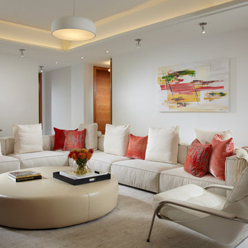
 J Design Group - Interior Designers Miami - Modern
Projects by J Design Group, Your friendly Interior designers firm in Miami, FL. at your service.
AVENTURA MAGAZINE selected our client’s luxury 5000 Sf ocean front apartment in Miami Beach, to publish it in their issue and they Said:
Story by Linda Marx, Photography by Daniel Newcomb
Light & Bright
New York snowbirds redesigned their Miami Beach apartment to take advantage of the tropical lifestyle.
New York snowbirds redesigned their Miami Beach apartment to take advantage of the tropical lifestyle.
WHEN INTERIOR DESIGNER JENNIFER CORREDOR was asked to recreate a four-bedroom, six-bath condominium at The Bath Club in Miami Beach, she seized the opportunity to open the rooms and better utilize the vast ocean views.
In five months last year, the designer transformed a dark and closed 5,000-square-foot unit located on a high floor into a series of sweeping waterfront spaces and updated the well located apartment into a light and airy retreat for a sports-loving family of five.
“They come down from New York every other weekend and wanted to make their waterfront home a series of grand open spaces,” says Jennifer Corrredor, of the J. Design Group in Miami, a firm specializing in modern and contemporary interiors. “Since many of the rooms face the ocean, it made sense to open and lighten up the home, taking advantage of the awesome views of the sea and the bay.”
The designer used 40 x 40 all white tile throughout the apartment as a clean base. This way, her sophisticated use of color would stand out and bring the outdoors in.
The close-knit family members—two parents and three boys in college—like to do things together. But there were situations to overcome in the process of modernizing and opening the space. When Jennifer Corredor was briefed on their desires, nothing seemed too daunting. The confident designer was ready to delve in. For example, she fixed an area at the front door
that was curved. “The wood was concave so I straightened it out,” she explains of a request from the clients. “It was an obstacle that I overcame as part of what I do in a redesign. I don’t consider it a difficult challenge. Improving what I see is part of the process.”
She also tackled the kitchen with gusto by demolishing a wall. The kitchen had formerly been enclosed, which was a waste of space and poor use of available waterfront ambience. To create a grand space linking the kitchen to the living room and dining room area, something had to go. Once the wall was yesterday’s news, she relocated the refrigerator and freezer (two separate appliances) to the other side of the room. This change was a natural functionality in the new open space. “By tearing out the wall, the family has a better view of the kitchen from the living and dining rooms,” says Jennifer Corredor, who also made it easier to walk in and out of one area and into the other. “The views of the larger public space and the surrounding water are breathtaking.
Opening it up changed everything.”
They clients can now see the kitchen from the living and dining areas, and at the same time, dwell in an airy and open space instead of feeling stuck in a dark enclosed series of rooms. In fact, the high-top bar stools that Jennifer Corredor selected for the kitchen can be twirled around to use for watching TV in the living room.
In keeping with the theme of moving seamlessly from one room to the other, Corredor designed a subtle wall of glass in the living room along with lots of comfortable seating. This way, all family members feel at ease while relaxing, talking, or watching sporting events on the large flat screen television. “For this room, I wanted more open space, light and a supreme airy feeling,” she says. “With the glass design making a statement, it quickly became the star of the show.”…….
….. To add texture and depth, Jennifer Corredor custom created wood doors here, and in other areas of the home. They provide a nice contrast to the open Florida tropical feel. “I added character to the openness by using exotic cherry wood,” she says. “I repeated this throughout the home and it works well.”
Known for capturing the client’s vision while adding her own innovative twists, Jennifer Corredor lightened the family room, giving it a contemporary and modern edge with colorful art and matching throw pillows on the sofas. She added a large beige leather ottoman as the center coffee table in the room. This round piece was punctuated with a bold-toned flowering plant atop. It effortlessly matches the pillows and colors of the contemporary canvas.
Jennifer Corredor also gutted all of the bathrooms, resulting in a major redesign of the master. She jettisoned the whirlpool and created the dazzling illusion of a floating tub. From an area where there were two toilets, she eliminated one to make a grand rectangular shower, which became an overall showpiece. The master bath went from being just a functional water closet to a sophisticated spa-like space. “The client said I was ‘delicious’ after seeing the change,” laughed Jennifer Corredor, who emphasized that her clients love their part-time life
in South Florida more each time they come down. Even when the husband has to work from their Miami Beach digs, he is surrounded by tropical beauty. For instance, there are times when the master bedroom must double as the husband’s home office.
The room had to be large enough to accommodate a working space for this purpose. So Jennifer Corredor placed an appropriate table near the window and across from the king-size bed. “No blocking of the amazing water view was necessary,” she says. “I kept an open space with a lot of white so It functions well and the work space fits right in.” She repeated the bold modern art in the
room as well as in the guest bedroom, which also has a workspace for the sons when they are home from school and need to study.
The designer is still happy and glowing with the results of her toil in this apartment. She gets a “spiritual feeling” when she walks inside. “It is so peaceful and serene, with subtle hints of explosive statements,” she says. “The entire space is open, yet anchored by the warmth of the exotic woods.” The client wrote Jennifer Corredor a letter at the end of the project congratulating her on a
job well done. She revealed that owning a Miami Beach home was her husband’s dream 30 years ago. “Now we have a quality perfect yet practical home,” she wrote to the designer. “You solved the challenges, and the end
result far exceeds our expectations. We love it.”
Thanks for your interest in our Contemporary Interior Design projects and if you have any question please do not hesitate to ask us.
http://www.JDesignGroup.com
305.444.4611
Modern Interior designer Miami. Contemporary
Miami
Miami Interior Designers
Miami Interior Designer
Interior Designers Miami
Interior Designer Miami
Modern Interior Designers
Modern Interior Designer
Modern interior decorators
Modern interior decorator
Contemporary Interior Designers
Contemporary Interior Designer
Interior design decorators
Interior design decorator
Interior Decoration and Design
Black Interior Designers
Black Interior Designer
Interior designer
Interior designers
Interior design decorators
Interior design decorator
Home interior designers
Home interior designer
Interior design companies
Interior decorators
Interior decorator
Decorators
Decorator
Miami Decorators
Miami Decorator
Decorators Miami
Decorator Miami
Interior Design Firm
Interior Design Firms
Interior Designer Firm
Interior Designer Firms
Interior design
Interior designs
home decorators
Interior decorating Miami
Best Interior Designers.
225 Malaga Ave.
Coral Gable, FL 33134
http://www.JDesignGroup.com
305.444.4611
 HAUS | Architecture For Modern Lifestyles
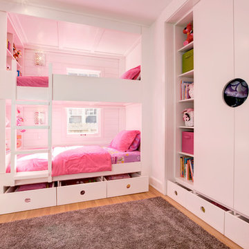
Custom Bunk Beds integrate storage cubbies within and roller-drawers beneath. Original storage closet to right opened-up to create full-integrated millwork closet system to match with bunks - Architect: HAUS | Architecture - Construction: WERK | Build - Photo: HAUS | Architecture

Sponsored
Delaware, OH

Buckeye Basements, Inc.
Central Ohio's Basement Finishing ExpertsBest Of Houzz '13-'21

 Thyme & Place Design LLC
When my client had to move from her company office to work at home, she set up in the dining room. Despite her best efforts, this was not the long-term solution she was looking for. My client realized she needed a dedicated space not on the main floor of the home. On one hand, having your office space right next to the kitchen is handy. On the other hand, it made separating work and home life was not that easy.
The house was a ranch. In essence, the basement would run entire length of the home. As we came down the steps, we entered a time capsule. The house was built in the 1950’s. The walls were covered with original knotty pine paneling. There was a wood burning fireplace and considering this was a basement, high ceilings. In addition, there was everything her family could not store at their own homes. As we wound though the space, I though “wow this has potential”, Eventually, after walking through the laundry room we came to a small nicely lit room. This would be the office.
My client looked at me and asked what I thought. Undoubtedly, I said, this can be a great workspace, but do you really want to walk through this basement and laundry to get here? Without reservation, my client said where do we start?
Once the design was in place, we started the renovation. The knotty pine paneling had to go. Specifically, to add some insulation and control the dampness and humidity. The laundry room wall was relocated to create a hallway to the office.
At the far end of the room, we designated a workout zone. Weights, mats, exercise bike and television are at the ready for morning or afternoon workouts. The space can be concealed by a folding screen for party time. Doors to an old closet under the stairs were relocated to the workout area for hidden storage. Now we had nice wall for a beautiful console and mirror for storage and serving during parties.
In order to add architectural details, we covered the old ugly support columns with simple recessed millwork panels. This detail created a visual division between the bar area and the seating area in front of the fireplace. The old red brick on the fireplace surround was replaced with stack stone. A mantle was made from reclaimed wood. Additional reclaimed wood floating shelves left and right of the fireplace provides decorative display while maintaining a rustic element balancing the copper end table and leather swivel rocker.
We found an amazing rug which tied all of the colors together further defining the gathering space. Russet and burnt orange became the accent color unifying each space. With a bit of whimsy, a rather unusual light fixture which looks like roots from a tree growing through the ceiling is a conversation piece.
The office space is quite and removed from the main part of the basement. There is a desk large enough for multiple screens, a small bookcase holding office supplies and a comfortable chair for conference calls. Because working from home requires many online meetings, we added a shiplap wall painted in Hale Navy to contrast with the orange fabric on the chair. We finished the décor with a painting from my client’s father. This is the background online visitors will see.
The last and best part of the renovation is the beautiful bar. My client is an avid collector of wine. She already had the EuroCave refrigerator, so I incorporated it into the design. The cabinets are painted Temptation Grey from Benjamin Moore. The counter tops are my favorite hard working quartzite Brown Fantasy. The backsplash is a combination of rustic wood and old tin ceiling like porcelain tiles. Together with the textures of the reclaimed wood and hide poofs balanced against the smooth finish of the cabinets, we created a comfortable luxury for relaxing.
There is ample storage for bottles, cans, glasses, and anything else you can think of for a great party. In addition to the wine storage, we incorporated a beverage refrigerator, an ice maker, and a sink. Floating shelves with integrated lighting illuminate the back bar. The raised height of the front bar provides the perfect wine tasting and paring spot. I especially love the pendant lights which look like wine glasses.
Finally, I selected carpet for the stairs and office. It is perfect for noise reduction. Meanwhile for the overall flooring, I specifically selected a high-performance vinyl plank floor. We often use this product as it is perfect to install on a concrete floor. It is soft to walk on, easy to clean and does not reduce the overall height of the space.
 Ancient Surfaces
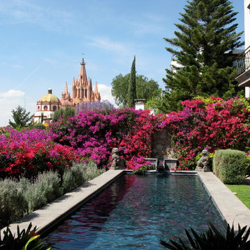
Product: Authentic Limestone for Exterior Living Spaces.
Ancient Surfaces
Contacts: (212) 461-0245
Email: Sales@ancientsurfaces.com
Website: www.AncientSurfaces.com
The design of external living spaces is known as the 'Al Fresco' design style as it is called in Italian. 'Al Fresco' translates into 'the open' or 'the cool/fresh exterior'. Customizing a fully functional outdoor kitchen, pizza oven, BBQ, fireplace or Jacuzzi pool spa all out of old reclaimed Mediterranean stone pieces is no easy task and shouldn’t be created out of the lowest common denominator of building materials such as concrete, Indian slates or Turkish travertine.
The one thing you can bet the farmhouse on is that when the entire process unravels and when your outdoor living space materializes from the architects rendering to real life, you will be guaranteed a true Mediterranean living experience if your choice of construction material was as authentic and possible to the Southern Mediterranean regions.
We believe that the coziness of your surroundings brought about by the creative usage of our antique stone elements will only amplify that authenticity.
whether you are enjoying a relaxing time soaking the sun inside one of our Jacuzzi spa stone fountains or sharing unforgettable memories with family and friends while baking your own pizzas in one of our outdoor BBQ pizza ovens, our stone designs will always evoke in most a feeling of euphoria and exultation that one only gets while being on vacation is some exotic European island surrounded with the pristine beauty of indigenous nature and ancient architecture...
 Abda Custom Window Fashions
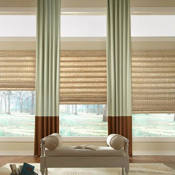
These seamed draperies are a great solution for two story windows. Adding fabric softens the space and having the second color on the bottom balances out the tall ceilings.
Layer the draperies with the woven wood roman shades for a gorgeous look.
**UPDATE** We also work with clients all over the country! Our virtual designers have experience as local and long distance design consultants. Our designers offer professional fabric and design recommendations, free estimates and have a great ability to communicate via email or phone to help conceptualize the project and see it through to the final stages. Fabric samples are mailed directly to you and we also provide easy installation guides.
For clients out of the Indiana area, we now have a professionally trained interior designer! Our "virtual designer" can help you with your project and ship your custom items directly to you at a fraction of the cost without compromising on quality! Let our design specialists help you today!
We're very excited to announce that we were featured on HOUZZ! Click the link below to check out the article!
http://www.houzz.com/ideabooks/30722151/list/design-workshop-shutters-all-grown-up
Abda Window fashions of Indianapolis has custom curtains, drapes, valances, cornices, pillows and hardware in a variety of fabrics and finishes. Curtains and drapes are great alone or paired with a hard window treatment for the ultimate fashion statement. All of our curtains, drapes, valances, cornices and pillows are custom-made from our own workroom. We also make custom bedding and upholstery. We have a huge selection of fabrics that will match any style.
Our custom, affordable draperies, curtains and sheers are now available to anyone in the US. We make them in our own workroom and ship them anywhere in the US! Talk with our professional design specialists and let them help you transform your home! It’s simple and easy. This is a great solution for persons who live out of state or are too busy for a traditional home consultation. With our great reviews, solid company and company values- you know that you’re home is in great hands!
We also have ready-made curtains and bedding available too! And don’t forget our custom hardware! You can also check out our houzz.com store for great window fashion products, including our exclusive bendable rods!
To see our new line, contact Talitha at 317-273-8343 or email: talitha@abdawindowfashions.com or check out our houzz.com store!
For our local customers we offer, FREE In-home consultation or showroom appointment to meet your lifestyle and design needs. At Abda, we have the perfect blend of high-end and affordable solutions for every style and budget. Affordable doesn’t mean cheap! We pride ourselves on quality products with excellent service. We’re so confident of our products that we give our customers more than the manufacturers guarantee!
We give our customers an additional 2 year warranty on top of the manufacturers guarantee!
At Abda, you will find knowledgeable staff that will turn your visions into a reality. Stop in our showroom or schedule a Free In-home consultation today! We know you will be happy with the results but don’t take our word for it, check out what some of our customers say about us on Houzz and Angie’s List!
http://www.angieslist.com/companylist/us/in/indianapolis/abda-inc-custom-window-fashions-reviews-60394.htm?cid=ssabadge
Why Choose Us?
We have been in business since November 1998 and started in the window covering business by cleaning & repairing blinds. This gave us a unique perspective from most window covering dealers. We have always considered how well products hold up and which manufacturers stand behind their products the best. We let our clients know the benefits of more expensive products and give honest feedback. We take pride in showing alternative products to fit all budgets.
Our great testimonials on Angie’s List, Houzz.com and referrals have helped our company grow without the need for “conventional” advertising. Abda means ‘servant’. At Abda, we approach every customer with a servant’s attitude. This philosophy has helped our customers feel confident in their purchases and well-taken care of. Our number one focus is customer service and we believe in putting the customer’s needs first. We offer our clients an additional 2 year warranty on top of the manufacturer’s warranty and want each and every client to be completely happy with their purchase. We’ve been awarded the prestigious 2013 Angie’s List Super Service Award, an honor bestowed annually on approximately 5 percent of all the businesses rated on the nation’s leading provider of consumer reviews. We’ve grown over the years and have added more team members to our company and we’re very excited at the direction our company is going.
Check out our website for more information: www.abdawindowfashions.com
Below is a list of styles and types of curtains and draperies that we can help you with. No worries if you do not find what you’re looking for below! Since we have our own workroom, the sky is the limit. There’s no project too small or large! Our design specialists are great at helping you with window treatment ideas. Stop in our showroom or call today for a FREE in-home consultation. If you’re out of state, no problem! We’re now making our custom treatments and shipping them to you!
Call today (317-273-8343) for more information or email:
talitha@abdawindowfashions.com
Some of the styles and types:
Modern curtains & draperies,
Contemporary curtains & draperies,
Traditional curtains & draperies,
Transitional curtains & draperies,
Beach Style curtains & draperies,
Asian Style curtains & draperies,
Eclectic curtains & draperies,
Midcentury curtains & draperies,
Mediterranean curtains & draperies,
Farmhouse Style curtains & draperies
Kitchen curtains,
Living room curtains,
Dining room curtians,
Master Bedroom curtains,
Nursery curtains,
Children’s room curtains,
Guest bedroom curtains,
Areas that we serve for installation for curtains & draperies are listed below. (But we ship to anywhere in the US!) If you don’t see your city on the list, just give us a call and we will see what we can do.
Indianapolis curtains and draperies & surrounding areas,
Carmel curtains and draperies & surrounding areas,
Zionsville curtains and draperies & surrounding areas
Westfield curtains and draperies & surrounding areas,
Avon curtains and draperies & surrounding areas,
Greenwood curtains and draperies & surrounding areas,
1