Software
Houzz Logo Print
jen046

Counter Stool Upholstery

12 years ago
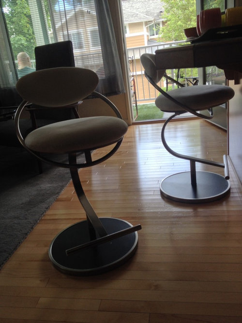
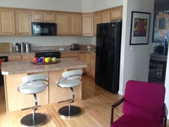
I just purchased two vintage '80s (yes, I said "vintage" along with "'80s") counter stools to be placed at the island that divides my kitchen from my lounge. I plan to have them reupholstered as I find the color and fabric boooorrrrrriiing. I've narrowed it down to two colors of a Knoll fabric...electric blue and chartreuse. The fabric is slightly shinny/metallic, vinyl-looking (but it's not vinyl, and it's a little stretchy). Both give off a futuristic Jetsons vibe...very '80s as well.

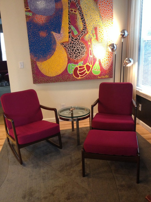
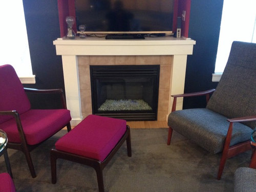
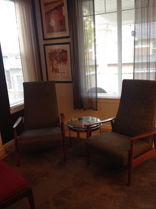
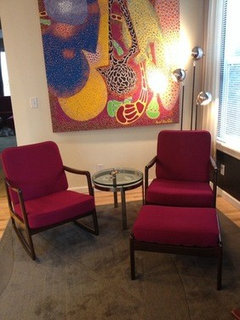
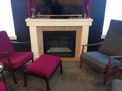
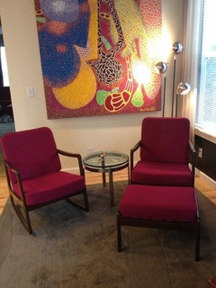
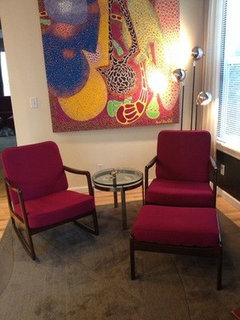
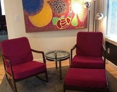
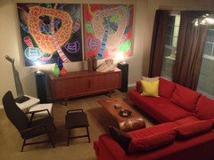
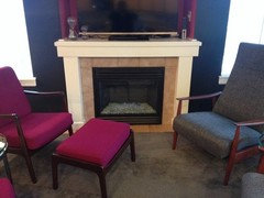
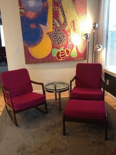
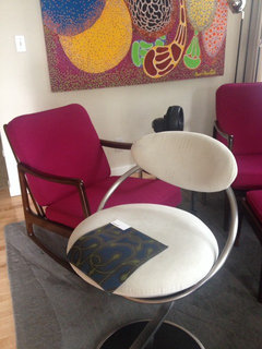
As many of you know, I have a style I like to call "Danish Modern on Acid." I love color, color, color! My kitchen will get a full facelift, but not for awhile. I just finished working on my lounge for now (fireplace makeover and new curtains will come in due course). I'm keying off the lounge colors, particularly those in the large painting.

I'm leaning toward one of them. I'm curious what you all would choose if you were me.
Electric blue
Chartreuse

Comments (64)

  • 12 years ago
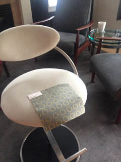
    LB, I liked the Maharam Peacock as well. I'm a little concerned about a print for the stools as my artwork is very patterned. When I re-do my kitchen I will most likely remove the upper cabinets along the long wall and hang more art there (probably two large, colorful canvases I have sitting in storage). Not competing with the artwork is the reason I went so neutral on the rug in the lounge.

    Am I not thinking about it correctly? Heaven forbid that the space become boring!
  • 12 years ago
    Depo, Go Seahawks! Go Sounders! Kidding. Here in Seattle we love our green and blue together! I'm just not sure I want it together on my stools.
  • PRO
    12 years ago
    I really like the idea of a metallic or sheen to the fabric.
  • PRO
    12 years ago
    last modified: 12 years ago
    Jen, I definitely would not be afraid to use a print for the stools. The art and stools are not very near each other. Prints are so much more interesting and exciting and add a personality and life to the space.

    In addition, the art is a much larger scale print and the fabric is much smaller scale. Good balance without focal fighting for attention.
  • 12 years ago
    Let's look at some groups of pics.
  • 12 years ago
    More.
  • 12 years ago
    More.
  • PRO
    12 years ago
    Some more ideas
  • PRO
    12 years ago
    Hey Ann, I copied you. :)
  • 12 years ago
    I voted for chartreuse, but I'm kind of loving the two blues (the solid and LB's suggestion), as well as the Hoffman magenta.
  • 12 years ago
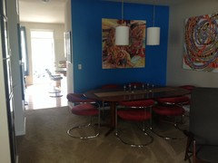
    The other factor is that the stools are immediately seen from the living room and dining room as you enter the house.
  • 12 years ago
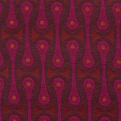
    I happen to have a sample of the Hoffman Magenta from before.
  • PRO
    12 years ago
    last modified: 12 years ago
    Jen, glad you posted more pics. Can you post pics of all the rooms that are open to each other - (stool area and others) from a distance to see their relationship to each other. OMG - your art is great!

    I'm still liking a print fabric so far from what I can see.
  • 12 years ago
    last modified: 12 years ago
    I love that Jen (the Hoffman magenta)!
  • 12 years ago
    Ann and LB, that's really helpful to see them in vignettes like that. I also like the geometric print (first Maharam print I posted). I think I'll order a few Maharam samples.

    Thanks for the encouragement about using prints, LB.

    On the Magenata, do you think it's too much pink? In my living room the sectional is red, but on the orange side. Then you move to the dining room chairs, which are red, but slightly on the raspberry side. Then you move into the lounge where the two magenta chairs are.
  • PRO
    12 years ago
    A pic where the stools are and other open rooms near them from a distance would help more.
  • PRO
    12 years ago
    You have used many colors in many rooms very successfully. Kudos to you !!!!
  • 12 years ago
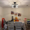
    Here is a pic taken from the lounge into the kitchen. Ignore my boring kitchen as other than the basic layout, in a year it will all be different. To the right you can see where the lounge and kitchen connect to the dining room and living room.

    I hope that is helpful. Thanks for the awesome help!
  • 12 years ago
    Thanks, LB. I just try to do what I like and my hubby will tolerate.
  • PRO
    12 years ago
    last modified: 12 years ago
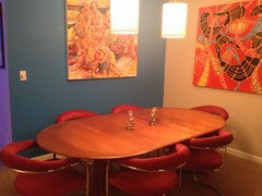
    Just a note, in the dining room, I would line up the left art on a horizontal, center to center of the right art. Means lowering the left art. Positioned with equal space above and below the art on the right. from horizontal center line.
  • PRO
    12 years ago
    last modified: 12 years ago
    Very nice ......I would go blue print fabric stools. Too much magenta. Cool off the magenta of the other chairs with a cooler color for the stools. Nice contrast.
  • PRO
    12 years ago
    Amazing that hubby is that okay with so many brights, but he trusts and sees that it really looks great!
  • 12 years ago
    It looks like the stools to be recovered are closest to the magenta chairs, right? I also think you've done an amazing job with the pink/orange/red combos and they aren't fighting at all - they're wonderful!
  • 12 years ago
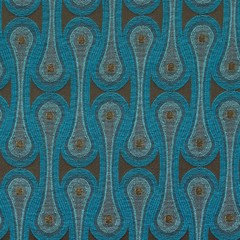
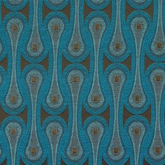
    The Hoffman blue (the one LB suggested) is an absolutely fantastic fabric!!!
  • 12 years ago
    Ann, that's correct. The stools are about four feet away from the first magenta chair (the Ole Wanscher rocker).

    To give you an idea of what my current leaning is on the kitchen remodel, I am thinking of almost white on white. White quartz countertops, very light gray with a little cream and a wood texture cabinets only on the bottom, except there will be a wall for the refrigerator and pantry on the current refrigerator wall. I will probably restain the hardwood floors a rich walnut color.

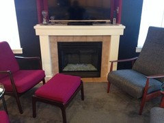
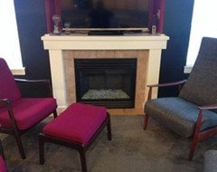
    Also, the fireplace will get a very simple stone makeover. I'll have to figure out the drapes, but they will probably be a textured beige/gray. All walls in the kitchen and lounge will be bright white.

    Here is the inspiration for the cabinets.

    http://houzz.com/photos/1076697
  • 12 years ago
  • 12 years ago
  • 12 years ago
    I thought these two had possibilities and I wanted to try them with the room pics.
  • 12 years ago
    Oh, I like both of those! What a fantastic selection of fabrics they carry!!! I'm glad to know about them.
  • 12 years ago
    These two are my new favorites:)
  • 12 years ago
    LB, on you suggestion re hanging paintings in dining room: That photo with the orange painting on the right is actually old. The one earlier on in the post with the white-background painting on the right is current. The two paintings are now hung at the same level. Previously I was just being lazy because the orange painting didn't have a wire, so I hung it from the stretcher bars. I actually kind of liked the discordant hanging heights. But, alas, the paintings are back to normal.

    With so much art I try to move things around and swap things out every now and then, but sometimes I get lazy about changing the nail locations. Also, sometimes it's fun to yank people's OCD chains! The passive aggressive in me comes out to play from time to time.
  • PRO
    12 years ago
    Stools. I would either go with gray and white fabric with small touch of another color. With bowls, vases in chartreuse, magenta or ?? on some few large items on the countertop in the kitchen. Monochromatic in the kitchen with accessory pops of color.

    Or .... contrast with cool tone stool fabric for the kitchen. Then add that color with some of your warm colors on the kitchen counter top.

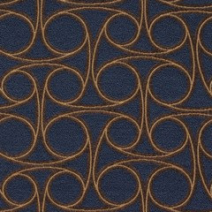
    I think the blue connected circle fabric is a tone that is too navy rather than a brighter blue. I'm not sure but on the chaise it appeared navy. I'd like a brighter blue.
  • 12 years ago
    Thanks for putting those together, Ann. I'll order samples of both of them, and probably the others as well. You never can tell until you see the fabrics in person, in the room.

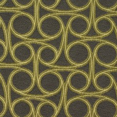
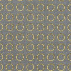
    I really like the gray with yellow circles. I've been wanting to bring lemon-yellow into the room...like the yellow spot overlay on the blue figure (second from the right) in the painting.

    I like the idea of a primarily white kitchen so I can change it in a blink with accessories, etc. Not the I change things a lot, but I like that I could without spending much...if anything. White is the kitchen equivalent of the little black dress.
  • 12 years ago
    I really like the gray with yellow circles too! I like the way the pattern repeats the circles in the art and love the bright yellow on the neutral background. The bright yellow is terrific with the reds/oranges/pinks and the blues!
  • 12 years ago
    Hi Jen- stopping by to vote. I voted for the blue, but now I see that prints are taking over. I really love the chartreuse but think they will get dirty easily, a print probably would be the best for a barstool;)
  • 12 years ago
    I ordered five print samples from Maharam. Will look again at Knoll to see if I should order more samples. In the abstract, I love the gray with the yellow circles.
  • 12 years ago
    I've had the fabric samples for two weeks now, but life has been too distracting!

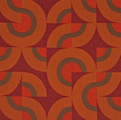
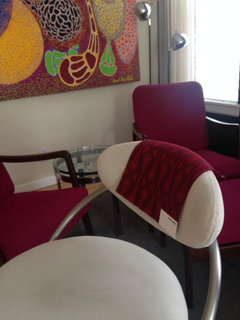
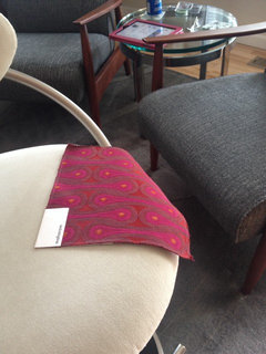
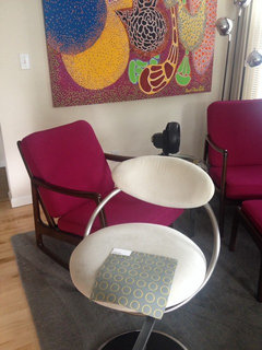
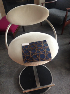
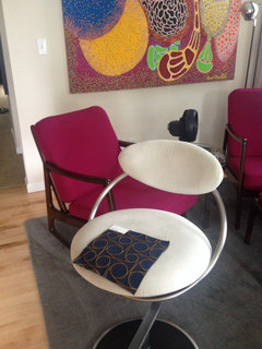
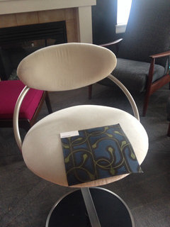
    Here are photos of the "Repeat Dot Ring", "Reel", and "Meander" in order. My husband and I have a favorite. What do you all think?
  • 12 years ago
    Here is Reel.
  • 12 years ago
    And, finally, Meander.
  • 12 years ago
    Repeat Dot Ring, followed by Reel. Not crazy about Meander.
  • PRO
    12 years ago
    Blue it is!
  • 12 years ago
    Michael, as sometimes happens, we moved on from the original choices. We are now looking at the three prints just above.

    I think I can eliminate Meander.
  • 12 years ago
    My choice would be *Reel*;)
  • PRO
    12 years ago
    I like 'reel'. I like the scale and the higher contrast between the two colors and the chair silver finish.
  • 12 years ago
    Reel is the one hubby and I like too. I think to dot is too close to the finish of the stool, plus there isn't a lot of pop there.