Software
Houzz Logo Print
mick50

HELP! 50 shades of gray paint dilemma!

12 years ago
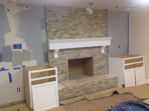
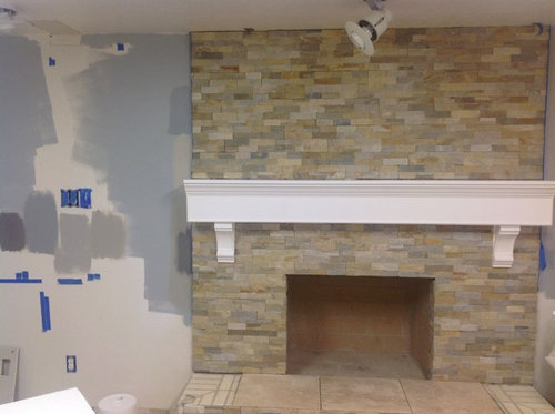
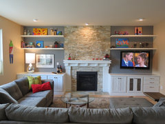
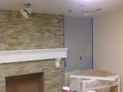
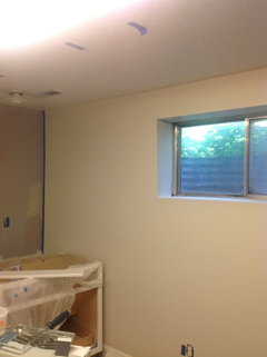
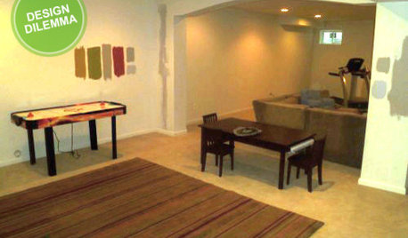
We are refinishing our basement family room. I used the attached photo for inspiration. Stone is Cronin desert gold, same as the inspiration room. White base cabinets and white countertops will fill both sides. Still debating whether or not to do shelves. The walls are Kwall Howell Baby's Breath, kind of an antique white. I don't want to go quite as dark as the inspiration room because it's a dark basement with one deep, ugly window. We are also replacing the fluorescent lights!

I know the mantel is large. Please do not suggest changing it. My hubby built it and I already got him to cut it down by about 1/4th! At great risk to my 35 year marriage.

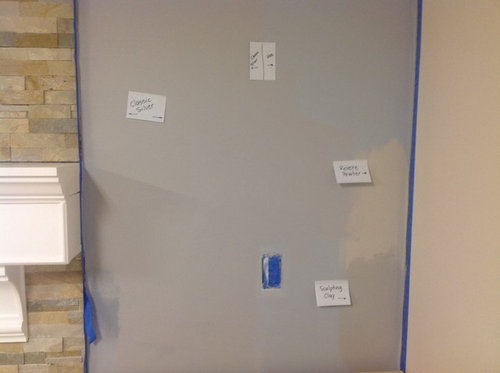
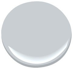
The dilemma is this,: what would be a good shade of gray for the walls next to the fireplace? The inspiration room has BM Cinder, which looks much darker in my basement. (See samples). The blue background was a failed color mixing experiment. I don't want wedgewood blue! I want gray-gray. There are a million shades of gray!

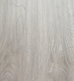
I also need to get flooring installed. Need to go inexpensive... Thinking a goldish tan Berber or a lighter laminate. Upstairs has espresso stained wide plank hardwood.

Comments (40)

  • 12 years ago
    Here's the inspiration room....
    Fireplace · More Info
  • 12 years ago
    HI -- Love where your going with this room . Try "Ashmead grey " DC-08 by BM . For the flooring look into - vinyl planks in a weathered grey . Looks like wood but is perfect for basements . Then you could have an area rug or Flor carpet tiles --- they are wonderful.
    mick50 thanked lefty47
  • 12 years ago
    Is ashmead gray similar to revere pewter? (On labeled pic, it's the second swatch from top, left of stone.) On my screen it appears to be a fairly light tannish gray. That would probably blend well with the other walls and the stone, but not offer much contrast. I was thinking a bit darker gray to add some contrast.
  • 12 years ago
    Take a gray from firepl. Benjamin Moore has nice ones. Only way to tell in yr light put it on your wall first. Go a gray laminate on Floors wide plank.
    mick50 thanked Nancy Travisinteriors
  • 12 years ago
    Thanks, Nancy. Good advice. As you can see from the third picture, I've been trying samples next to the fireplace, but everything seems too blue or tan. There are so many different grays in the stone...finding the "right" one is the trick. I haven't found it yet! I could follow my husband's advice--"just get plain gray." Lol.
  • 12 years ago
    I like the one on the very far right underneath the light switch.
    mick50 thanked Melissa Freeman
  • 12 years ago
    It might be the existing blue wall is throwing off some of the colour choices, making some of the greys look more blue/grey. I agree on grey laminate for floor.
    mick50 thanked MarleneM
  • 12 years ago
    Yes, it would probably help to prime it all white again and paint poster boards to hold up next to the stone.
  • PRO
    12 years ago
    last modified: 12 years ago
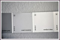
    Try BM Sweet innocence and have you considered a lighter, grayed tone in a laminate?

    Crystaline · More Info

    Desert Gold Polished Marble Skirting Baseboard Molding Millwork Trim · More Info
    mick50 thanked JudyG Designs
  • PRO
    12 years ago
    last modified: 12 years ago
    Maybe the blue cast in your paint is also caused by the lighting you have right now. With a dark basement like this, the light source is going to affect the color a lot.
    mick50 thanked Linya, Inc.
  • 12 years ago
    True grays always read blue. The inspiration room had a blue sofa so they were trying to repeat that and help tie it in. For you, I LOVE JudyG's idea about a laminate or vinyl in a driftwood tone - you would add / retain a lot of light that way. If you consider it, wait until you get the floor picked out to decide - make sure it references that . .tone / works well with what you select.
    I'm seeing some warm grays in that stone, so if it were my wall, I would test bm gray horse . . http://www.benjaminmoore.com/en-us/paint-color/grayhorse
    mick50 thanked libradesigneye
  • 12 years ago
    The gray walls in the inspiration room are Benjamin Moore Cinder, which is the darkest charcoal paint splotch on my sample wall. Their sectional is Macy's Elliot in a dark gray, not blue. But you are so correct... it all definitely reads blue! Here's my concern with gray flooring... If I get a gray sofa and have gray accent walls, won't gray floors be too much gray? I could do a goldish taupe microfiber or brown leather sectional. But you are also correct in that it will be easier to match paint to flooring than the other way around!
  • 12 years ago
    In the first picture, I like the third one from the top....it doesn't seem to have a name but I think it is a lovely warm grey.
    mick50 thanked Melissa E
  • 12 years ago
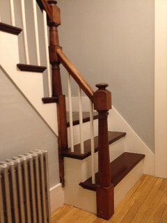
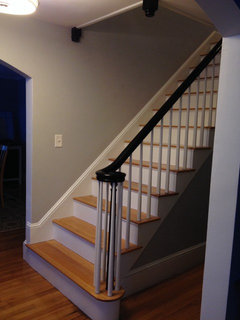
    We used BM Stonington Gray in the hallway/stairway in both our homes since it is a grey gray. Coventry Gray is the next darker. We used that in the living room for a grey neutral backdrop for our bright decorative elements.
    mick50 thanked tialoco
  • 12 years ago
    howellmsue - Do you mean the one that is just left of the mantel? It is in a shadow, so it's hard to see, but it is Sculpting Clay, same as the one labeled in the pic with post-its. Left side of fireplace, 4 labeled colors in a row, last one on the right. You're the second one to vote for it and I believe it is very similar to the one on the stairway posted by tialoco.
  • 12 years ago
    Tialoco-- (crazy aunt? - haha!) I'm liking that Stonington Gray. I'm going to look that one up!
  • PRO
    12 years ago
    Actually if I were to vote, I like the dark color of the cinder:)) I always love deep colors in darker spaces. Since it's already small, deep colors just make it warmer. That's just me though.
    mick50 thanked Linya, Inc.
  • 12 years ago
    I think the reason Cinder works so well in the inspiration room is because it just acts as a backdrop for the beautiful stone and white woodwork. Makes everything else just pop out. So maybe I should try it.
  • 12 years ago
    I also like the cinder. Pick in a gray is so difficult! We recently used BM Pashmina which no one ever talks about. It is a nice gray that is slightly greige. Might look nice with your fireplace since there is some warmth to your stone. Good luck!
    mick50 thanked Rambling Rach
  • 12 years ago
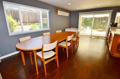
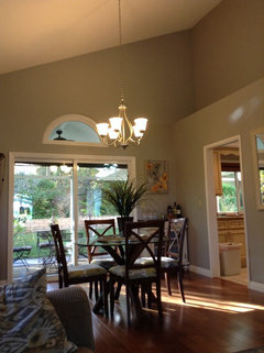
    If a basement, the 'whale gray' from BM is probably too dark, but it worked well for me. But I have a lot of natural light in this room. It does sort of change depending upon how the light is, and I like that. subtle blue undertone in darker areas. would certainly set off the fireplace brick -- it's a bout a 50-50 between white and black - so good for other colors
    mick50 thanked samsamyd
  • PRO
    12 years ago
    If you are going with a goldish Berber rug then you should make sure your gray has yellow in it. I'm an artist and I'm familiar with colors. If you choose a gray that is made from purple and yellow, then your walls will compliment your rug. You're right! There are so many grays! Good luck!
    mick50 thanked Nancy Kempf Fine Art
  • PRO
    12 years ago
    last modified: 12 years ago
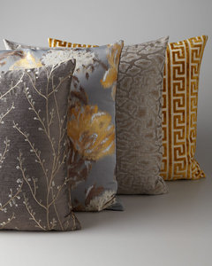
    No, I don't think it would be too much gray. Let's say the floors and the walls are the same tone and the sofa is darker. Add great throw pillows which incorporate all the colors from the Cronin gold...I think it would look beautiful.

    Gray & Gold Pillow Group · More Info


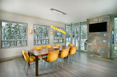
    Buckhead Client's Ski Retreat - Dining Room · More Info
    mick50 thanked JudyG Designs
  • 12 years ago
    Gray that has a blue tone is not going to mesh with the stone, which is lovely (sympathies on the mantel, but it is well-done and makes a statement). In your 3rd photo, I like the last 2 of the four colors in the middle of the photo, or the 3rd down beside the stone -- a more taupey, less gray tone will flow with the stone. It's unclear if you're painting the entire basement room (I haven't read all the posts) this color, or just this wall. Good luck!
    mick50 thanked inkwitch
  • 12 years ago
    No, the rest of the basement is Kwall Howell Baby's Breath, which you can barely see on the far right. Looks like a very pale version of Revere Pewter.
  • 12 years ago
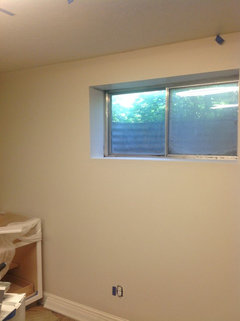
    You can see the off-white wall color and one little window in this picture. Colors vary from pic to pic because of the harsh fluorescent lights, which will get replaced eventually. Project #432 on hubby's to-do list!
  • 12 years ago
    My painter wanted to use Dunn Edwards paint. Went there, picking a gray paint was difficult. With their professional help...went with Gray Pearl. It was perfect and we love it in our living room
  • 12 years ago
    Wait. That picture doesn't help. Here's another couple...
  • 12 years ago
    Grays are depressing and dull. Go off white slightly natural beige to bring out the browns. But keep it light and cheerful, yet warm and welcoming.. furniture and accessories can add splashes of color and can be changed seasonally to match your mood or going trend?
    mick50 thanked User
  • 12 years ago
    If you're sticking with the "tan" for all the other walls, a blue-gray will not flow, especially seeing the FP stone. You may like gray and really want to use it somewhere, but a less blue-gray tone will work better.
    mick50 thanked inkwitch
  • PRO
    12 years ago
    Right now, my favorite grays: Gray Owl (Benjamin Moore), and Pavillion Gray (Farrow and Ball)
    mick50 thanked The Feathered Nest Ltd.
  • 12 years ago
    Beige is boring. Stick with a TRUE gray. Go to the color samples, blues will be one end, greens on the other. From there go to the middle colors and you will end up in the gray.
    mick50 thanked Gail Lester
  • 12 years ago
    Consider going greige - not beige/not gray but might work really well with the FP.
    https://www.houzz.com/magazine/going-greige-tips-for-choosing-this-all-around-neutral-stsetivw-vs~577375
    mick50 thanked decoenthusiaste
  • 12 years ago
    I was going to suggest the same thing about painting over your samples with the white and painting sample boards, one separate for each color and tacking them up one at a time. It does make a difference. Good luck & patience! You'll find it.
    mick50 thanked flyr4fun
  • 12 years ago
    Greige is beautiful. I wonder if they are afraid of color because it is a basement
  • 12 years ago
    decoenthusiaste -- thanks for the Going Greige Ideabook. That was very helpful. I read the one on picking grays, too. I do believe my Baby's Breath (rest of the walls) is a very pale greige. When I put Revere Pewter, which is a classic greige, next to it, the baby's breath looks like a lighter version of that color. However, I am reluctant to put Revere Pewter as the accent around the stone. Seems like it would be blah. I want contrast.
  • 12 years ago
    The basement is already very dark. It only has a few small windows and a low ceiling. Yes, I am reluctant to use a darker color overall. Plus, I just painted the entire basement in Baby's Breath! I would consider changing it if I weren't outside painting the new Hardie plank siding! ugh. I WILL paint the sides of the fireplace downstairs back to white because the bad blue is throwing everything off. When I get a chance, I'll pick up some foam core and paint big sample boards.
  • 12 years ago
    Thanks for everyone's help. I really appreciate it.
  • 12 years ago
    Samsamyd -- I really like your Whale Gray with the color of your wood dining set and floors, which is similar to the stone on my fireplace. Absolutely beautiful. I'll pick up a sample.
  • 10 years ago

    I haven't read the above comments, but your fireplace mantle is too strong a white. Also, I would recommend that you take in a brick from your fireplace to the paint store. Choose the brick color you think you'd like to duplicate in paint, a color you'd like to see more of.

Sponsored
Wannemacher Interiors
Average rating: 5 out of 5 stars26 Reviews
Customized Award-Winning Interior Design Solutions in Franklin Cnty OH