

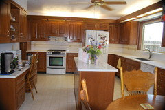
new kitchen update
12 years ago
last modified: 12 years ago
Featured Answer
Sort by:Oldest
Comments (11)
- 12 years ago
Related Professionals
Rome Interior Designers & Decorators · Leominster Interior Designers & Decorators · Bemidji Interior Designers & Decorators · Santa Maria Interior Designers & Decorators · Las Vegas Interior Designers & Decorators · Billings Interior Designers & Decorators · Salt Lake City Interior Designers & Decorators · Minneapolis Architects & Building Designers · Scranton Architects & Building Designers · Oshkosh Architects & Building Designers · Leamington Architects & Building Designers · Philadelphia Kitchen & Bathroom Designers · Cedar Rapids Kitchen & Bathroom Designers · Winona Kitchen & Bathroom Designers · Stockton Kitchen & Bathroom Designers- 12 years ago
- 12 years ago
- 12 years ago




Related Stories

KITCHEN DESIGNTap Into 8 Easy Kitchen Sink Updates
Send dishwashing drudgery down the drain with these ideas for revitalizing the area around your kitchen sink
Full Story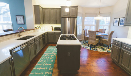
BEFORE AND AFTERSGray Cabinets Update a Texas Kitchen
Julie Shannon spent 3 years planning her kitchen update, choosing a gray palette and finding the materials for a transitional style
Full Story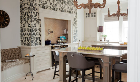
KITCHEN DESIGNKitchen of the Week: Updated French Country Style Centered on a Stove
What to do when you've got a beautiful Lacanche range? Make it the star of your kitchen renovation, for starters
Full Story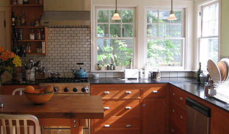
KITCHEN DESIGNKitchen of the Week: A Warm and Eco-Friendly Update
A Seattle Couple Remodels Their 1920s Kitchen With Reclaimed and Salvaged Materials
Full Story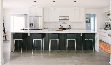
WHITE KITCHENSBefore and After: Modern Update Blasts a '70s Kitchen Out of the Past
A massive island and a neutral color palette turn a retro kitchen into a modern space full of function and storage
Full Story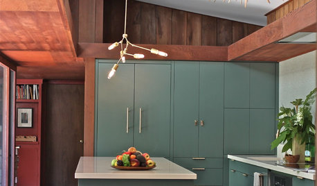
KITCHEN DESIGNKitchen of the Week: Modern Update for a Midcentury Gem
A kitchen remodel keeps the original redwood paneling and concrete floors but improves functionality and style
Full Story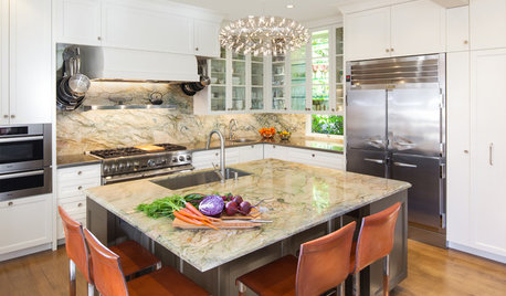
KITCHEN DESIGNKitchen of the Week: Elegant Updates for a Serious Cook
High-end appliances and finishes, and a more open layout, give a home chef in California everything she needs
Full Story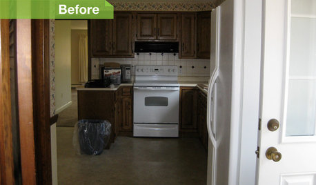
KITCHEN DESIGN6 Kitchens, 6 DIY Updates
Get inspired to give your own kitchen a fresh look with ideas from these affordable, do-it-yourself fixes
Full Story
KITCHEN DESIGN11 Ways to Update Your Kitchen Without a Sledgehammer
Give your kitchen a new look by making small improvements that have big impact
Full Story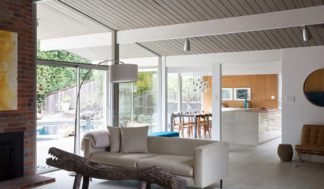
MODERN HOMESHouzz Tour: Updating an Eichler While Preserving Its Spirit
Architects and builders keep this home’s integrity intact while remodeling the kitchen, creating a master suite and adding energy efficiency
Full Story



Washington Marble Works