Software
Houzz Logo Print
koodomob

Help with colors for new build

14 years ago
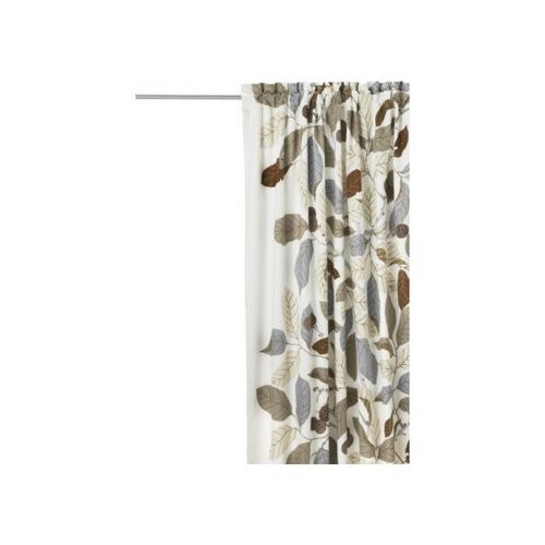
Hi,

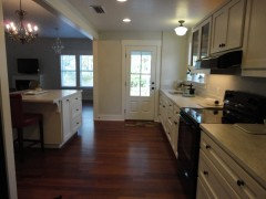
We are building a new house and I am lost with paint colors! I'm thinking in the hallway I would like a light gray and in the kitchen a darker gray. The kitchen and family room are open concept though so I'm not sure if it would be too dark (in the kitchen we are having white shaker cabinets with darker gray granite countertops).

In the separate living room I would prefer a shade of blue. I'm also trying to figure out a colour for the powder room.

I purchased Ikea Stockholm curtains attached for the kitchen/family room and hope to use these as a jumping off point.

I live in an area where we have limited paint selection but we do have Benjamin Moore.

I would appreciate any thoughts you have! I'm hoping once I narrow down the main floor I can go from there!

Comments (18)

  • 14 years ago
    Hmmm, I'm going to suggest that you check out this site.
    There are a few matches that I think might interest you. Namely Cameo White, Kingsport Grey, Barista, and Silver Spring. I would love to see samples of your finishes to be more helpful, but this might point you in the right direction. Good luck!
    http://www.benjaminmoore.com/en-us/for-your-home/pottery-barn-paint-colors
  • 14 years ago
    I just panted my dining room Storm by Benjamin Moore in the matte finish. Use matte, which is a washable flat or flat. Any finish with sheen reflects light, which both reflects light and shows any imperfection in the wall. Storm is a medium tone and furnishings shine against it. Love the panels you picked out.

    Good luck!
  • 14 years ago
    I have these drapes as well in our family room which is open to our kitchen. We used Benjamin Moore Puritan Grey on an accent wall and Bennington Grey on all other walls. These colors look great with these drapes! Hope this helps!
  • 14 years ago
    Try Edgecomb Gray with Revere Pewter.
  • 14 years ago
    I like BM thunder AF-685 it is a brown-gray would look great with the curtains.
  • 14 years ago
    It's a good idea to start with a fabric or upholstery color and match the paint to it. I got very custom paint colors and am having a hard time finding fabric that works well.
  • 14 years ago
    I think the dark gray on your kitchen walls will be stunning with the white cabinets. You didn't mention a back splash. I'd throw in sparkle with glass mosaic tiles incorporating the white of the cabinets and the gray of your counters.
    Benjamin Moore website: Wythe Blue. They painted this blue with a gray crown molding in a dining room. This will give you an idea how your gray kitchen and blue living area will work together.
    When I chose paint colors I took several variations of the color cards and checked them against the counters and floors. I made sure they worked together and with the other surfaces. I checked them at night, in the morning, and afternoon. Then waited a week and checked to see if I still liked them together. A friend of mine bought samples and painted wide stripes side by side of her choices before making her final selection.
    For the powder room you might try the brown in the curtains. White towels and brushed nickel fixtures to lighten it up.
    I hope you'll let us know you're final choices.
  • 14 years ago
    Be sure and at least check out BM Horizen and titanium. They are light greys and I used them in my new home and they look good and are soothing and serene.
  • 14 years ago
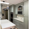
    Here is a photo of the titanium.
  • 14 years ago
    Clearly you love your drapes and the colors in them are lovely. but unless you want a monochromatic palette I think you need to step away from using all the same colors already in the pattern. I would move into other colors from nature & let the idea of the drapes (i.e. the leaves) guide your selections. Look at muted shades of green (moss), yellow (umber), orange (sienna) and blue (slate).

    I think for cohesion sake you should use one color as the primary choice in each room but add touches of the remaining colors so that the rooms have a through line and relate to each other. You can do that with pillows, frames, books, planters, etc.
  • 14 years ago
    I note you've already decided on shades of gray, but if a deep rich taupe is a possibility, we just used Sherwin Williams "latte" and we love it. Very neutral, but has interest and goes with everything we own. Just a thought. Coeur d'Alene Jane :)
  • 14 years ago
    In the kitchen, make the ceiling a lighter shade of the gray...when using white cabinetry, also use white crown moulding, it will make the room come together---it's a wow factor!
    I like to use flat paint, in a kitchen,(ie, if you use the Mr Clean's white sponges, they take the shine off the paint.)*esp if you have kids or grandkids. (Teen-agers touch the walls more often the younger kids!) LOL
  • 14 years ago
    I can't see the exact shading of the colors of the drapes online but I saw them and just painted an extra bedroom a GORGEOUS shade of gray with a hint of green. I matched to a comforter and have had SO many compliments. I love it so much I could just sit in that room all day! The color is by Olympic, sold at Lowes : Silver Threads. But I had it mixed to Glidden Duo eggshell paint, which by the way is excellent. [you can mix it to Benjamin Moore as well. all paint companies will mix others colors] http://www.olympic.com/Home/Search?q=silver%20threads
    If you want to stick more to what appears to be a bluer tone in your drapes [excuse me I am blind - lol] you should check into the same color range but with a bluer tint. Mine leans on the green side but still looks great with the blue accents I incorporated.
    I also bought color for an accent wall as well but don't want to mess with perfection. LOL. The room I have it in gets a lot of sunlight and the color is awake and bright by day but at night it turns into a great muted mood tone. This color is so pretty it will make you want to go out and buy new curtains if it doesn't already match them! LOL Best of luck with your search! Hope this helped. :)
  • 14 years ago
    I have used a color in my last THREE homes called SPICED VINEGAR. It's actually a Pittsburgh Paint color but you can get a sample and color match at BM. It has a slight gold tone, VERY subtle, and acts as a fabulous backdrop to any and every color I have accented with. I even have my Real Estate agent using it on his home.
  • 14 years ago
    I have these drapes. They are in my dining room next to tan paint called gobi desert and in my office next to chocolate brown. Both look great. My iPad won't let me attach the pictures, if you post your email I can send them to you.
  • PRO
    14 years ago
    Are you sure about blue in the living room? Do you want people to go to sleep, or do you want stimulating conversations? Even one of your grays would be better, although I recommend a warm color.
  • 14 years ago
    Thank you for all the great ideas! I'm in the process of choosing the kitchen countertops so once that has been selected I'll be using these tips and suggestions.