Software
Houzz Logo Print
agill87

Living room kitchen combo arrangement

11 years ago
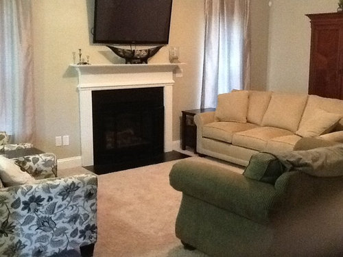
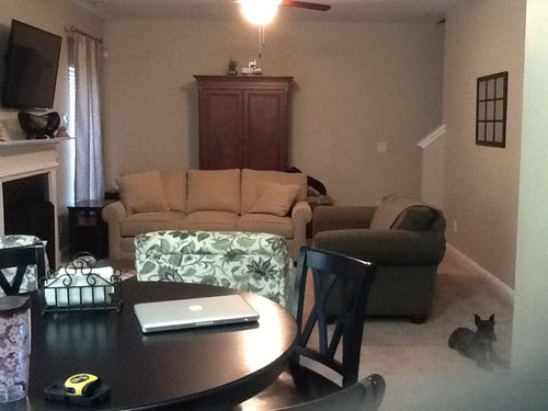
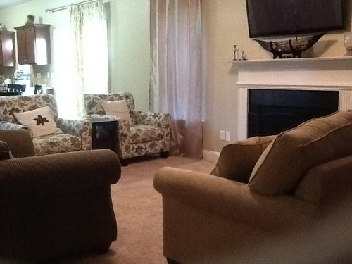
I posted a few days ago for accessory help and was given furniture rearrangement ideas. I've been trying different arrangements. What are your thoughts and ideas? I planned to get rid of the love seat, but now I'm liking the cozy feel it adds.

Comments (164)

  • 11 years ago
    @ Merrigay- Thanks! I think it feels more comfortable this way. The armoire is valuable storage space, so I do like it!
  • 11 years ago
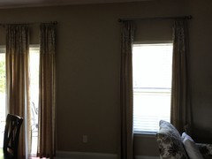
    Sandy G.- I love the curtains, they are just a bit darker than the walls and that trim at the top is a nice added detail! I'm relieved to have that figured out.
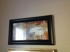
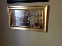
    The mirror on the other hand, it is beautiful when I look at it on it's own but when I look at the pictures of it in the room, I'm thinking it may have to go back to the store. It just doesn't seem to look right in the space. I'm thinking I may need to do a little something different. I'm used to mirrors and sconces, simple, straight lines, dark frames. But, maybe the collage of mirrors in light, shimmery colors would be a nice new touch. In fact I wonder if I could incorporate a few family photos and small art pieces into the mix of mirrors. Maybe that's a better way to go, personalize this space and give it more impact.
  • PRO
    11 years ago
    That's what it is all about. Make this gathering room all about you and your family! Try whatever comes to mind - the best way to make decisions.

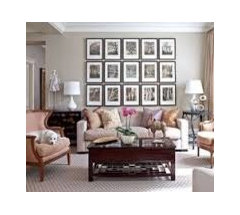
    If it helps you shop your house or the marketplace, you have a light sofa and dark TV and firebox opposite. You could think about the area over the sofa in a 50/50 way. 50% darks with 50% lights. Very approximate and not set in the sand. This would pull both values up onto the wall and not overwhelm it with too many darks or make it look too light weight with too many light values.
  • PRO
    11 years ago
    More -
  • PRO
    11 years ago
    last modified: 11 years ago
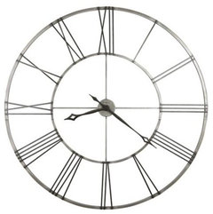
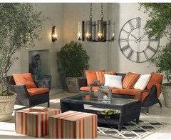
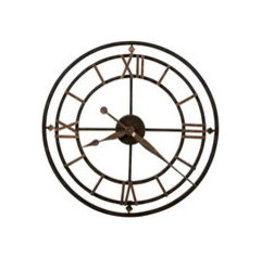
    And more . . . Maybe a big clock? These are from Howard Miller and I have worked with this brand and these clocks in particular.. The 49" clock ships in 2 halves and is not heavy.

    The 49" diameter clock is super. google Howard Miller, "Stockton" for details. $289 + free ship. This size might work to fill the wall when combined with the pair of lamps.

    The lower clock is also Howard Miller, is 21 1/8" diameter, CHM2222, was $200, now $140 + free ship. this size could be part of a gallery wall with your mirror. . . . .

    There are some knock offs out there for qpprox. $50 so some phishing might save you some cash.

    Becausse these clocks are basically open, they would let your stenciled wall show through and not hide it.
  • 11 years ago
    Thanks for all the info Sandy! I love the open back on the clocks! If I do 50% dark and 50% light should I keep them in similar shades? Like keep all the light colors gold or silver and darks all black? Or would it look ok if I mixed bronzes, black, gold, silver, maybe whites?
  • 11 years ago
    Another question. Sandy mentioned sight lines and their importance. For example the art was not to go above the top of the armoire. Does this apply to every wall in the room? Or on the sofa wall can the photos, art and other items go higher? Is there a rule as to where the stopping points should be?
  • PRO
    11 years ago
    Let's see. If you decide to use the 49" clock, that is all you might need for that wall + the lamps. This clock is huge but, since it is so open, feels delicate and that would be nice on your stenciled wall. It is also dark so the shapes of the metal would contrast nicely with the light wall.

    If you are considering the small, 21" clock, you would be adding it to your mirror along with family photos, I am guessing. Black frames on the photos and on your mirror seem a little heavy-handed for this wall. Dark metalics or woods like what your armoire is built from would be better.

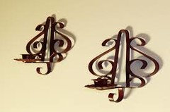
    My worst rooms are those where I can tell that someone tried too hard when it wasn't necessary. It is much better to under-do than to end up with over-kill! Hit that happy medium and it takes trial and error to get the right colors and orientation that sing. Bottom line - the clock and mirror need to be siblings that get along on the wall. If they don't, the gallery will never be quite right. You could also add an object to this grouping that is metal and open/lacy, like a big key or sconce, etc. in a bronze or antique brass. This would mirror the clock's openness because the mirror and photo frames are solid. I hope this makes sense!

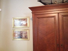
    Sight lines. This applied to the armoire wall and positioning the armoire on it's wall so that when you look at the room from the kitchen, the armoire is centered between the chairs and the sofa. It would be off kilter if the armoire was close to the stairway or window. After that is settled, the artwork should be hung relative to the armoire, not the TV or fireplace or what is going on over the sofa. After placement of the armoire is right, that wall as it's own entity. Of course you take into consideration the rest of the space while working here, but the priority is that this wall works on it's own.

    The sofa wall uses the same principle. You want the grouping over and around the sofa to be complete on it's own, but work with the other 2 walls. Of course you can hang things higher than the artwork on the armoire wall - because the boat is up top and extends the armoire wall higher. Same for the TV wall. This wall is complete too.

    The top lines of everything can be an interesting design detail. The boat gives that wall an interesting topper. The TV wall is very lineal, and the sofa wall will have it's own top line. These things work to make spaces interesting across every design style.

    You have worked in this space in a nice progression - ending up with the most potentially complicated wall. Everything you have decided in here will help you with this one.
  • PRO
    11 years ago
    last modified: 11 years ago
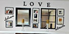
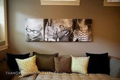
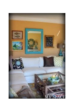
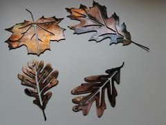
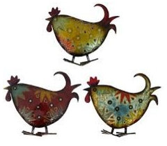
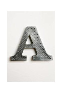
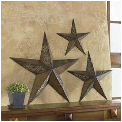
    If you decide to do a gallery wall, here are some things you can intersperse between the clock, mirror, and photos. Notice that these things are not round or rectangular, because changing the shape of things is interesting. They are mottled metal. Of course, you can do a gallery wall with everything rectangular or everything circular.
  • PRO
    11 years ago
    And more!
  • 11 years ago
    Wow! That's great! Thanks Sandy! I have some wonderful framed photos I had planned to display up the stairwell. But, you have given me so many options here and I really like the thought of having some of these photos displayed where we can see them better. I love the leaves above and the "&." This wall will take a bit of time to plan and gather, thank you for your guidance.
  • PRO
    11 years ago
    It would be fun to shop your home! You seem to have everything right there! I'm sure you are headed down a beautiful path! Patience, patience . . .
  • 11 years ago
    Sandy G Would using my original frame (maybe painting it a lighter color) work? Something like this is what I have, but I will have to reframe a few pictures to do this. Or were you thinking I should stick with the round mirror?
  • 11 years ago
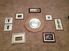
    This is a 22 inch circle which could be a clock or mirror. Anything larger pushed the display beyond the length of the sofa.
  • PRO
    11 years ago
    last modified: 11 years ago
    Either the mirror you made or something round can be worked into a gallery. The pieces that make up the grouping need to be closer to the center object so that the group reads as one unit.

    The silhouettes in the bottom pix are facing the right way - leading your eye into the center. The oriental characters are a very nice touch - a little bit unexpected.

    The frames do not have to match all the time - it is personal preference. Matching frames is an easier way to go but unmatched frames work too. The small ceramic bowls placed side by side resemble eyes so they could be hung one above the other.

    The footprint of this group probably should be wider than it is tall, to span the sofa. You would need to find more pix or objects to make a larger footprint. However, if you are planning on adding to this gallery, you need to figure out how to leave room in there for it/them. This is one way that gallery walls can get uneven - it is part of the organic nature of some of the arrangements. Just about anything goes if it is within your comfort level.
  • 11 years ago
    @ Sandy G- Thanks for the info! I read that wall gallery's should not extend beyond the length of the sofa, so I was trying to keep it narrow. But it sounds like I can extend it out to the ends or possibly beyond? Wonderful news because I have some very old photos of relatives I'd like to display as well.

    I'm glad you commented on the oriental piece, because I was thinking of taking that one out. We had it made several years ago, when we lived in Japan.

    This will definitely take much more thought. I wanted to find a good starting point before I begin looking for frames. I really like how the round mirrors in the two pictures posted above add interest and contrast to the mix. I also like the way the top right picture has the larger art above with three smaller pieces below,
    interesting and unusual.

    Thank you so much for sharing the picture ideas and your knowledge!
  • PRO
    11 years ago
    last modified: 11 years ago
    You are welcomed!

    You are so lucky to have some vintage photos! Every gallery wall is unique and does not fall into the cookie cutter category.

    It will take some playing around with. You can certainly go across the sofa back and end the group a foot or so on each end and the bottom of the lowest piece[s] could be about 6" above the sofa. Pack it in - notice how close some of the frames are together in the pix above. You can vary that too - with some frames/objects 1" away from the one next door to 2"-3" away - gallery walls are so flexible. Try using your round paper pattern while working, and see if that is what you want.

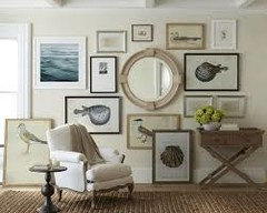
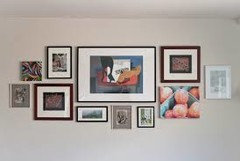
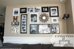
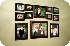
    In each of the examples there is a subtle thread in them.
    #1. Round shapes
    #2. Color
    #3. Black, white and gold
    #4. Black frames on each b/w print

    These small things help to balance the grouping as well as make it cohesive. Nothing really overtakes the group and this is the goal.
  • 11 years ago
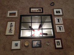
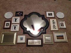
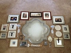
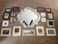
    I pulled this 30" mirror from my foyer to see how it might look. I was concerned the similar shape to the stencil would be wrong on the wall. But it's lines are nice for adding pics around it.

    The white plates are just there to give me a visual of how it'd look to put round objects there, like a clock, or letter or whatever. With this arrangement the gallery leaves about 4 inches of free space on either end of the sofa. I would have to repaint the mirror, which I planned to do anyhow. Also reframe photos.
  • 11 years ago
    I personally like that the frame replicates the pattern on the wall. IF you feel the frame color is too harsh for the wall, I might suggest you consider spray painting in something like silver.
  • PRO
    11 years ago
    last modified: 11 years ago
    You are getting so close! The tighter grouping is fab and will be great on the wall! The size of the group seems to be fine. It will cover the space above the sofa and feel full. Also, the mix you have re: finishes is casual but totally working. Interesting without being over the top crazy.

    The mirror is wonderful and I agree with you and tiparks, it would work in better if it was painted a metallic. The shape is right on. The other piece that is a little too heavy is the small black one in the upper left and it might be fine with a light matt. I still see "eyes" with the white plates. The circular shape is great but not across from each other. Maybe use one.

    I feel that the mirror needs something above it. Do you have anything else that could go above the mirror?
  • 11 years ago
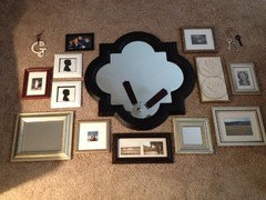
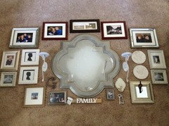
    It's so much fun digging through my things to find objects! I found the "G" and then I have the super dollar bin find, the keys! Also my children's handprints, maybe I can frame those in place of the oriental sign. Hmmm, I couldn't find anything for above...yet. I have a couple boxes of yard sale stuff, something fun may be in there. Or I could get a multi-picture frame for those really old photos. I would like to display those photos someplace.
  • 11 years ago
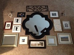
    I found this candle sconce, my hubby can grind the candle holders off and I can paint metallic. But I wonder if the object above the mirror needs to be a bit smaller.
  • PRO
    11 years ago
    last modified: 11 years ago
    Still closer! You are doing a nice job of spacing items!

    Would it be possible to put the silver keys together on a little chain and hang them from the sconce? String a black velvet ribbon through the black key hole - a knot or bow at the top of the ribbon and find a place to hang it - even over the small mirror, attach it to the back and let it flop over to the front or fill a small void by hanging it on the wall.

    If you would like to use the sconce, it might work to use the grille too somewhere on the opposite side of the group.

    The "G" is adorable and might work to fill in one of the small spaces. It could also be sprayed [gray] and mounted on a plaque you paint from the craft shop [we have a Michael's here that carries them ].

    Love the hand prints! So personal and special. It would be great to include them. Also love the oriental characters.

    For across the top, I agree that the grille might make the grouping too high and is also too ornate and distracts from the mirror. Maybe try placing a small rectangular 4" x 6" pix in each of the top corners of the mirror. This would leave the very top of the mirror needing something - maybe the "G"?

    I am wondering about the square mirror in the lower left. It seems a little big. If you swap it out for one or more of your vintage photos, that might work a little better. This arrangement is "bottom weighted" now, and that is fine. But if you want something over the top of the mirror, you cold think about raising the bottom line - take out the doublet pix.
    Or, you could leave the top and bottom of the mirror empty.

    Editing is so important with galleries - you don't have to use everything but you want it full. You also do not want to put hundreds of holes in your beautiful wall!

    Remember that I do not know which of these things are precious to you so you will have to forgive me if I suggest you not use an item that means a lot to you . . .
  • 11 years ago
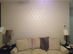
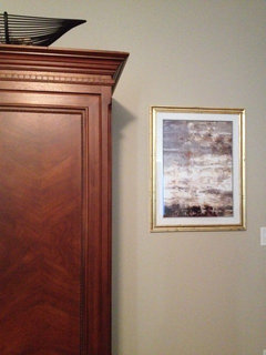
    So here is the latest. A slight variation with the top 8x10's. I painted the mirror, but I don't like it so I'm going to use silver leaf. I think that will look better. I will probably leaf the two 8x10's at the top as well. While this arrangement won't leave room for the old photos I think I will do the empty wall (photo #3) between the living room and kitchen with a couple ledge shelves and some old photos.
  • 11 years ago
    In my opinion a large painting would look more elegant than gallery wall( like the example I posted on Oct. 03) .I am afraid you will clutter that nice wall that you have right now .
  • PRO
    11 years ago
    last modified: 11 years ago
    Your panels look wonderful!

    Love the idea of hanging your vintage photos between the windows opposite the gallery wall. I know it is important for you to enjoy all of the pix daily.

    Closer still!

    Here are some tweeks to try. The lower right corner by the keys, feels a little weak compared to the left lower . A little bit larger frame on the right side would fill it in.

    The arrangement also feels top heavy now. Switch the long, narrow pix with the "family" plaque and see how that looks. Bottom heavy is no problem. Top heavy is not as good - balance wise.

    Then. add some candles to your sconces, which could be toned down/aged a little bit - and I 'm sure you know that. Candles would fill in above the sconces. Maybe a cream color and use them!

    Lightening the mirror frame was a good idea. It now blends in with everything else, including the wall finish.
    agill87 thanked Sandy G. ltd.
  • 11 years ago
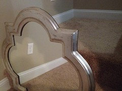
    @ sondramartina, I understand and agree that the gallery wall may be a bit cluttered. I'm not a fan of large art pieces, or maybe I have not seen one that really appeals to me. I love the abstracts, but when I've seen large paintings that I have considered for this space, after a few days consideration, I don't think I'd want to look at it every day. For this reason, I had the large, rectangular mirror on the wall. Simple, yet not big enough. I considered lightening the mirror frame and putting it on a ledge shelf with photos, but thought part of the problem was the mirror's shape, too many square and rectangular wall objects in this room. Whew! So, this is how I got to the current mirror idea. I will take your suggestions into consideration. Thank you!
  • 11 years ago
    @ Sandy G. I will try some more tweaking with your ideas. It's like a giant puzzle! And if you read my post above, it's starting to feel cluttered. I think this mirror's shape makes it hard to fit objects around and this is making the puzzle more complicated! I do have plans to paint some things, the sconces are on that list. I have no trouble finding frames and photos I love, but arranging them is a chore! I'm starting to think building that shelf would be easier! :)
  • PRO
    11 years ago
    Well, I feel like a football coach in the locker room at 1/2 time and the game is all tied up! You are so close and one good way to put a gallery wall together is to try several arrangements - which you are so patient with.

    Maybe you could go back to the pix below that I posted a while back. It is simpler and uses only pix around the mirror. This mirror gives a nod to your stenciling and works on this wall. So, try editing out the objects and concentrate on using only pix. Gallery walls are challenging, to be sure - even the simplest gatherings take some trial and error.

    Maybe going straighter out the sides with nothing above or below would make a better display - minus the keys, small mirror, etc. Some gallery walls are messy, casual and work well. Your taste might be reflected in a more structured one?
  • PRO
    11 years ago
    Or this?
  • 11 years ago
    last modified: 11 years ago
    Sandy, you are doing such a fine job as the gallery wall coach! It is soooo tough to do that online when you just want to reach right through the commputer screen and tweak. And agill87, you are doing such a great job with trying all the suggestions and letting your own eye guide you. Gallery walls are so wonderful in a room and you have just the right wall for one, so hang in there and all your work and special items will make you soooo happy each and every day!
  • PRO
    11 years ago
    You got that right! Galleries are tough! The payoff is close and that wall is going to sing.

    agill87, I know you would like to finish this room yesterday, but why not put everything under the sofa - out of sight - for a spell. Come back to it with renewed energy! Sometimes good ideas cannot be forced into compliance and the reason needs to be figured out. You said that it is getting too busy - huge clue there. It means you need to simplify - that's all! Good job!
  • 11 years ago
    Thanks abbyjean and Sandy G! Sandy, you must've read my mind. I actually did put it away earlier and thought I'd better give myself a couple days off from the gallery wall. Thanks so much for the encouragement!
  • PRO
    11 years ago
    I like the sofa facing the fireplace...use the to matching chairs on each side...then remove the other chair. I like the idea of changing the style of the upholstered sofa to be a little more interesting and yes a cocktail table and remvoe the ottomans...
    agill87 thanked Interior Affairs -- Vickie Daeley
  • 11 years ago
    I took a break from the gallery wall and had some fun gilding frames. I love how it turned out! The gold in the artwork really pops now! And a little sneak peek at the mirror redo. ;)
  • 11 years ago
    Before and after.
  • 11 years ago
    You have been busy and having fun at the same time. YAY for you! You can do your own DIY blog on gilding now!!!
  • PRO
    11 years ago
    Been wondering how this project was coming along! Your makeovers are out of this world and look like a million bucks! Completely different from the "before"! Love it with your stenciled wall finish. . .

    They all look so much lighter and, add so much to the paintings - pulling out the golds in them. The fact that you enjoyed doing this shows - - Congratulations on a creative job well done!
  • 11 years ago
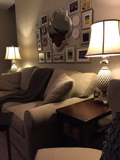
    Here it is, I've painted and gilded frames and took out the extra "stuff." Finally, it feels well balanced!
  • PRO
    11 years ago
    Good for you! I know it takes a while to get the arrangement just right! This will look just great on your wall and give you a chance to enjoy all of the photos every day! Very fun and very you. That's what is important for sure!
  • 11 years ago
    Here is the gallery wall. Sandy G. - you had mentioned the "eyes" when when I placed the handprints across from each other. Since the silhouettes are different from the handprints, do those look ok across from each other? The silhouette frames may be swapped for the original square ones but everything else I am happy with. I also found the pineapple lamps last weekend and loved them! They are 33" so they fit great, and the glaze is beautiful.
  • 11 years ago
    Look at that! Just look at that! YOU DID IT! GREAT JOB!!! Made it a home instantly!
  • 11 years ago
    Thank you so much abbyjean! You have been so supportive, you're a wonderful cheerleader! I was about to give up on this wall, but your kind words inspired me to keep trying! :)
  • 11 years ago
    last modified: 11 years ago
    You and Sandy make a great team and I know I speak for Sandy when I say how FUN it is to 'work' with posters that try things and listen and are truly here to make their homes.....THEM!.
  • PRO
    11 years ago
    WOW! Just WOW! Amazing grouping! You have just designed a wonderful example of a gallery - more often than not these are unsuccessful and a bear to put together! You took care of the "eye ball" challenge! Didn't know if I should mention it or not, but am glad I did now.

    Remember that this installation is flexible so you can change things out going forward. Life hands us amazing things all the time and sometimes we like to remember those special times and people daily. That is what is so great about this treatment.

    Your pineapple lamps are adorable / beautiful / perfect! The height is just right as well as the circumference of the shade. It's funny how the right thing appears sooner or later. . .

    I hope you are as pleased with this whole wall as we are and will enjoy it for a long, long time.

    Thank you so much for posting on Houzz! It was a joy to coach you along and end up with this stunning wall - sofa, gallery and lamps plus the other things you worked on.
  • 11 years ago
    @ Sandy G. THANK YOU! I'm very pleased with the wall, in fact I was settling down to read and paused to enjoy looking at all the pictures of my precious family! Words cannot express my gratitude for all of your help making this space comfortable, beautiful and meaningful! I love it and my family does too!
  • PRO
    11 years ago
    Now, that's what we love to hear! So glad I was a part of the "transformation"! Being retired from design, Houzz gives me a chance to participate in something worth while and to give back in a small way.

    Have a grand holiday season in your beautiful home!
    agill87 thanked Sandy G. ltd.
  • 11 years ago
    Your room looks wonderful !
    agill87 thanked condomary
  • PRO
    9 years ago
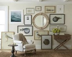
    It does look cozy, maybe a sectional could help with the amount of items in the room.

    Charles Neal

    http://www.charlesneal.com

  • 9 years ago
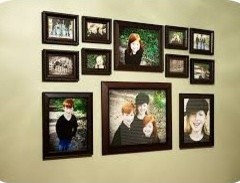
    Happening quite a bit today......2014 post making it back to the top.


Sponsored
Virginia Kitchen & Bath
Average rating: 4.9 out of 5 stars157 Reviews
Virginia's Award Winning One Stop Kitchen & Bath Remodeling Resource