Software
Houzz Logo Print
mtravis1

Living room design

11 years ago
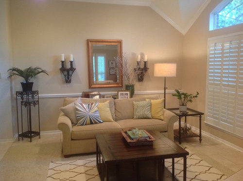
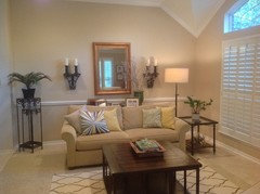
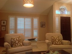
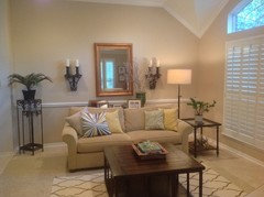
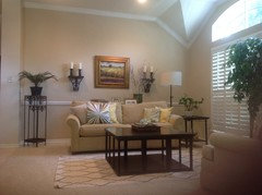
I need to know what to do behind the sofa? Is the mirror too small at 32x 43 in? Should I keep a mirror or get a large 40x40 art piece? The sofa table length is 48 in. Should I get a longer table ?
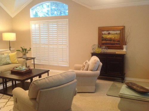
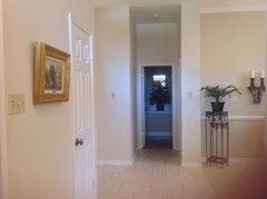
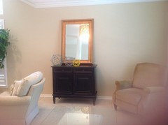
Any advice for the adjacent wall with the cabinet?

Comments (51)

  • 11 years ago
    Wait, I see you already have a glass top table. That could be moved over by the window for two chairs facing each other.
  • 11 years ago
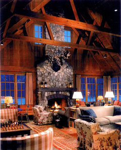
    Tough to see, but like this table (with the chess set) with two chairs.
    [houzz=
    lakeside resort · More Info
    ]
  • 11 years ago
    I appreciate your advice. The chair in the corner is out the door. It is just occupying the space for now. I like the idea of moving the glass table over and placing two chairs there.
  • 11 years ago
    Pretty space. I might try turning mirror longways or get something bigger to draw eye up to take advantage of that lovely high ceiling....
  • PRO
    11 years ago
    This is one beautiful room! Nicely done so far!

    It feels like everything is on the wall to the left in your first pic. The sofa is hiding the console and you have a lot of room in this space to move it. There is not a view of this console so all I can say is that it should be long enough to be under the sconces, The are beautiful, chunky, and that wall needs them.

    I see an entrance into this space to the left in this same pic. Make the view for that entrance more welcoming by turning the rug 90 degrees and placing the sofa in front of the shutters - pulled forward some, away from them.

    Add the chairs, one on each side of the sofa at the short ends of the rug.

    The other end of the room could be pumped up some. I do not know the story behind the lonely chair in the corner, but it either needs a mate or should be moved out. Place a pair of slipper chairs there in a subtle print or stripe. The cabinet is small for that wall where it is now, off center.

    Once you move the sofa, add end tables and lamps, then pull this cabinet closer to the window. The objects on top of this cabinet feel like they are ready to fall off, so layer 1/2 of them in front of the painting.

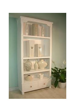
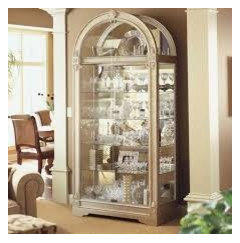
    You also might consider replacing this cabinet with something taller, like a bookcase or curio cabinet. Something tall that would add a different height - - furniture in here now is basically the same height-wise. You could also hang a huge piece of art on that wall.
  • 11 years ago
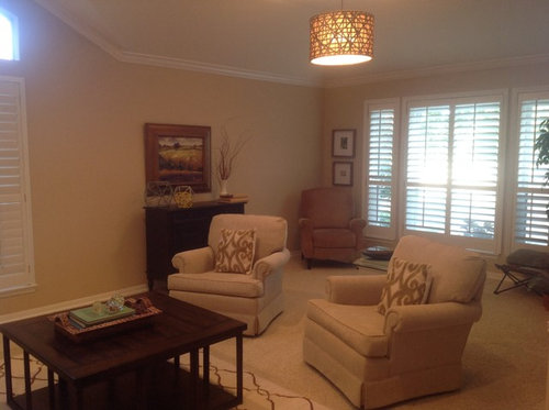
    As for other side of room, the two chairs seem to float all alone...no table between them to anchor them or for people to place drinks,etc. you might want some color too....pillows,accessories etc. I'll let the pros give you advice on cabinet......
  • PRO
    11 years ago
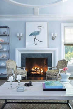
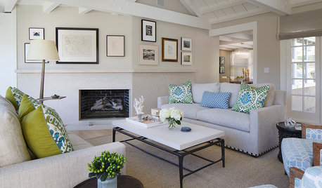
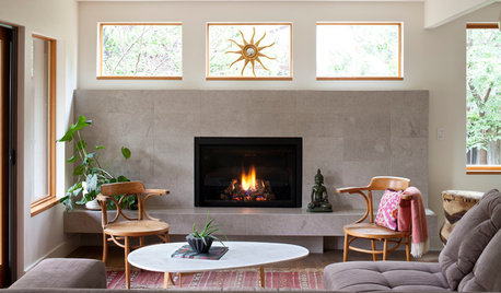
    Something like this.
  • 11 years ago
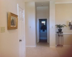
    Wow I appreciate your advice. From 1 st. pic left side of room opens to short hallway to kitchen but not visible to this room. Still think better to face that direction?
  • PRO
    11 years ago
    last modified: 11 years ago
    I understand that you are working on a monochromatic scheme, but some color and pattern is missing. You could use an exclamation point above the console though. A little punch of something.

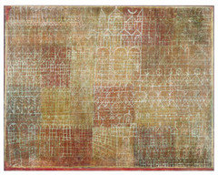
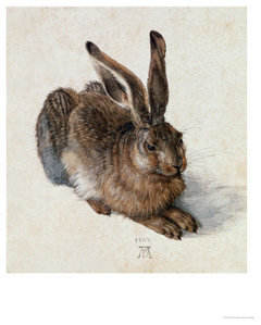
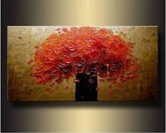
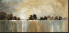
    Think about hanging a painting in place of the mirror. A painting with a large image because of the scale of the wall. A painting with hints of lux color that can be pulled around the room.

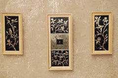
    Notice that there are hits of black/brown in these examples. This is so that they relate to the sconces and make this group hang together. The 4th pic is obviously a shocker, but do not rule something like this out.
  • PRO
    11 years ago
    last modified: 11 years ago
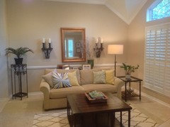
    Your wall - to help you visualize a change. The best way to achieve these luscious colors is to find pillows in silk or velvet. Both add a yummy texture to the space as well as unmatched color that has incredible depth.

    You do have darks throughout the room in your tables, so you could add some of the darks to the sofa in pillows.
  • PRO
    11 years ago
    If you really want a mirror, a bigger one would look better. Don't discount other ideas: a tapestry, a wood panel or large picture could also work.
  • 11 years ago
    I once stayed in a place like this that was dark, because of all the trees outside the windows. I removed every dark thing I could, put the tie backs up high to uncover the windows more and replaced or covered up the dark stuff with off-white and used more reflective pieces opposite window. I could believe how much better the mood was in there.

    The large sconces make the mirror appear too small. I would get the large painting for that spot. I cannot see whether the table is behind the sofa or next to the wall. Since there are no lamps on it, I would move it to the durrent mirror wall.. Leaving the mirror and sconces there depends on the table size. Personally, I would get rid of the sconces. They are too bulky and heavy looking and not in keeping with the rest of your decor. Or you could trick the eye by painting them or gilding them to appear lighter in visual weight.

    The cabinet: leave the art and objects as is. Again, remove books and vase. Buy a very large pale turquoise floor vase or paint one, plus longer more substantive bamboo poles from Per I to make more of a presence next to the cabinet.

    I would spray paint the yellow/gold color of your pillow on the plant stand and put it in front of the window near where the soon to be purged recliner sits.

    You can tell I am trying to lighten this dark room, give it some character and cheer it up by infusing it with a bit more color, so I would add a yellow/gold or turquoise table runner on the CT and add some pretty reflective bowls or vases in the midst of all that darkness. Put some beautiful turquoise glass to the table going in front of the window. I would also like the cabinet (Sandy G. ltd. photo) on the turquoise wall with turq & white vases in place of the cab, but you might lose too much storage. The other shelf unit is beautiful, but too formal and heavy looking for your space.

    I am an artist and instructor and believe interior design is like art, it is best to balance with similar: colors, textures, shapes, finishes and visual weight around the room unless you intentionally do something different to make it stand out..
  • 11 years ago
    I think your living room looks beautiful as is, nice job!!
  • 11 years ago
    Many great suggestions! I appreciate the help. I do like abstract art. But stay in blue / brown tones only ? what about green/ brown tones?If I do the large art over the sofa , the sconces will have to come down because it may be too much. And I guess the console table behind the sofa is not high or long enough. I did not really think that through.

    Do I have to put a lamp on a console table?
  • 11 years ago
    I also like the mirror idea. Saw one in Ballard Designs same width as mine but taller. So it brings your eye up.
  • 11 years ago
    No lamp needed on the console table. Floor lamp looks very nice as is.
  • PRO
    11 years ago
    last modified: 11 years ago
    If you want to leave the sofa facing as it is, center the rug on the windows. Move the console table and put it on another wall. It is hidden now. Could you post a view of the hallway wall, please? Looking for wall space.

    Move your chairs up to the rug, facing the sofa and put a small table between them and a pair of tables with lamps on either side of the sofa. The sconce/mirror group might be fine there behind the sofa or it could tag along with the console table [if the console is long enough to span the distance below the sconce arrangement ].

    Without having the pleasure of being in the space, sometimes I get off on tangents that might not work for you for whatever reason - I suppose that is ok too. You have such a lovely space and one that reflects your taste so well! I have to be careful so I don't become a bully! Yikes!
  • 11 years ago
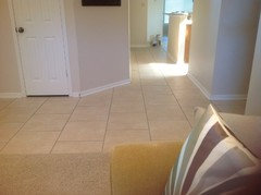
    I am standing in the entry taking pic left of sofa wall. A wall is to the left then short hallway to kitchen .
  • 11 years ago
    Have you tried switching the art above the chest with the mirror between the sconces? I think the proportions would be better.
  • 11 years ago
    Interesting but seems like it is not tall enough to me.
  • 11 years ago
    You haven't actually provided a photo of the piece behind the sofa or of the entire wall right of the corner chair and opposite the sofa.May we see all of the space to be of more help?
  • 11 years ago
    Here is the other wall. Pic is taken from the sofa. This side of the room is a little darker and it is early evening. Chair in the left corner is out the door.
  • 11 years ago
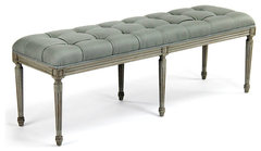
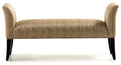
    I'm having issues with that white glass-topped pedestal thing just floating out in the middle of the floor. Hope it leaves with the corner chair and you put an upholstered bench under that window. I'd also consider flanking the window with the sconces in stead of the pictures. The bit of wall perpendicular to the window could use a pair of stacked art pieces, but they need more color and interest than any of the three at the windows now
    Louis Tufted Bench, Natural Oak With Natural Linen · More Info

    Jessica Charles Locke Bench, Light Cherry Finish, Harbin Toast Fabric · More Info
  • 11 years ago
    Yes that is a good suggestion. I appreciate your help.
  • 11 years ago
    Like the bench idea too!
  • 11 years ago
    Benches are a neglected decor item that can really add a great touch and be useful!
  • 11 years ago
    Add a sizable bench?
  • 11 years ago
    And move the glass table out too?
  • 11 years ago
    Take the glass table out and the bench should be as long as the center window of the three shuttered portions.
  • 11 years ago
    Does anybody have any suggestions for which kind of large image art piece I should use over the sofa?
  • 11 years ago
    Try turning the widest part of the coffee table parallel to the sofa. Do you want more color in the room ?
  • 11 years ago
    What are your thoughts? I am okay with color?
  • 11 years ago
    last modified: 11 years ago
    Colors are fine - a great neutral space. Consider this article regarding your drum light. Did you ever try switching the mirror and large framed piece? I think the proportions would work better with the two pieces beneath them. Remember 5-5-75. A hanging piece should be no more than 75% of the width of the furniture beneath it, bottom frame 5" above it, and if hanging alone, then center point 5' above the floor. This "rule" works in most cases.
    http://thedecorologist.com/how-to-hang-a-drum-shade
  • 11 years ago
    My immediate reaction when looking at the pics of your beautiful space is that it is missing some depth and dimension. I would do one thing. Replace the rug with a larger, graphic
    pattern rug with some depth of color- to visually anchor the room. Everything should more easily fall into place from there. It will no longer feel like there are so many missing elements.
    The rug color could be in your mono look such as latte, taupe, espresso or for a pop of interest you could play further off of, use a striking favorite mid-tone color. Maybe some window panels....
  • 11 years ago
    I will try switching and see what is looks like. I will center the cabinet on the wall too.
  • PRO
    11 years ago
    last modified: 11 years ago
    You have so many options for artwork. Do you want to preserve the monochromatic, light and airy feel in this room or are you ok with adding color. Both schemes are lovely and classic. It just depends on what you want to live with. It would help you move forward if you knew which direction you wanted to go. Of course, artwork can always be changed out for a different look down the road.

    It is interesting how art impacts a space - -- big time!
  • PRO
    11 years ago
    last modified: 11 years ago
    Are the sconces and plant stand in the corner a set? Could they be brought together on a small wall in here?

    Or the sconces would also be terrific flanking something like the horse portrait. Monochromatic but bolder for the wall. This guy is making a statement and is able to hold up that big wall, actually the whole end of the room!

    The bouquet of red poppies would also work between the sconces but there is a lot of color in this piece. Also, the shape of the piece is right.

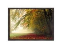
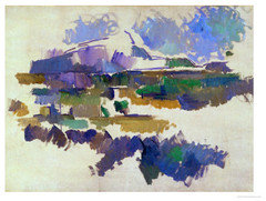
    Here is a totally different look using pastels. The sconces would also work well with the first painting below because of the darks in the landscape. Not so much with the second painting tho - too light weight for the heavier, dark sconces.

    The first painting is more in keeping with the room as it is now - soft palette.
  • PRO
    11 years ago
    last modified: 11 years ago
    And the room. Adding steel blue/gray to your camel, ivory, chocolate [tables].
  • 11 years ago
    I switched the art work from above the cabinet just to see what it would look like. I realize it is too small and placed too high, but I think art will look better here.
    I moved the mirror it is just leaning but it brings the eye up on this shorter wall. Maybe I need to add gold hardware?
  • 11 years ago
    Here are the pics!
  • PRO
    11 years ago
    last modified: 11 years ago
    A painting is going to look great on that end wall. Can you see the difference already? Maybe a canvas on a stretcher would work better because a frame is just another element that isn't needed with the sconces there. Also, a canvas is a little more transitional. The painting is too small, and you know that, so take some measurements and see what the optimal size is.

    Could you please post a pic of the console table? I know it is a pain to tear that area apart, so thank you for the effort! ! !

    Adding brass knobs to the cabinet under the mirror is a great idea. It will add some life to it.
    Also wondering how the console table would look on that wall since it is probably a little longer than the cabinet. . . . then turn the mirror horiz. and hang over the console table.

    You could place the cabinet on this wall - the one with the small painting.
  • PRO
    11 years ago
    last modified: 11 years ago
    This wall on the left side of pic.
  • 11 years ago
    last modified: 11 years ago
    Much improvement! If you move the sconces to flank the window opposite the sofa vignette, I think the art will be a wonderful focal point at that end of the room. Once you lower the drum chandelier as per the article I attached above, it will be doubled in the mirror and this room will look great. The only addition you might need would be a more substantial rug that provides a better visual anchor. Are the candle sticks built into the two "sconces?" Those really appear to be just shelves with candles set on top. If that is the case, I'd remove the candles to the chest and mirror vignette, and place a pair of decorative plates on the corbel-style shelves flanking the window.
  • 11 years ago
    I console is the same length as the 43 inch cabinet. It Is dated and only 29 inches tall. I would be ok buying a new console and placing either behind the sofa or cabinet wall.
    The art I now have hanging above the sofa is 33x 29 inches. I will go with a canvas painting in a color scheme you recommended but what about the size? I want to get it right .
  • 11 years ago
    Actually console I have is 49 inches wide.
    The two sconces from the top shelf are 55 in apart. If I keep them how close should art be to them.
    If I move the sconces then I would probably need at least 45 in wide art piece ?
  • PRO
    11 years ago
    last modified: 11 years ago
    Please do not buy a new console and hide it behind the sofa. If you feel you need a surface behind the sofa, install a simple shelf since it will be hidden.

    49" is a nice length for a console. 29" tall is shorter than the usual which is about 35" tall. Of course, there are exceptions.

    What do you mean by "dated"? Would it be possible to rehab this console? Paint it something fun? There are simple ways to raise the table up taller.

    If you would rather buy one, it could closely match your other tables or be completely different.

    Great news about a new painting! Leaving the sconces on the wall will depend upon the painting you choose. The amount of darks in the palette, for example. Measure the length of the back of your sofa and do a little math and figure out about what 3/4 of that measurement is. This is about the width your art should be - - - -at the widest. It should be about 6" above the sofa back - this is 1" higher than I usually recommend but I think the extra inch is needed in your case because the wall is high.

    Hang the sconces about 5"-6" away and centered on the side mid poiint of the painting. I cannot impress on you how approximate this is. You need to find an assistant who will stand and hold these things up while you stand back and take a look. Seriously!

    #1 pic is an example of an awful job...too far apart and not equal from side to side. They are crooked to boot! ARGH!

    #2 is ideal.
  • 11 years ago
    I think with a 49" console your art above it should be no wider than 36" and that is pretty large. I like the framed piece and think you need some of the gold bling provided by it and the mirror in this pretty neutral space. Get someone to hold the sconces by the window and see if you like them there. If you don't care for them there, then we can think differently about that wall they're on now and what needs to go on it.
  • 11 years ago
    Everything looks very nice and neutral. Maybe I don't get the layout, but what if the sofa was on the other wall. I think you should only use the sofa table if the sofa is floating. You could put the sofa where the chairs are now and use the table. Also, the plant stand and sconces are too big with the other pieces. The more I look at it this the more I feel this should not be your accent wall.
  • PRO
    11 years ago
    last modified: 11 years ago
    Hi mtravis1,
    A very soothing, soft-color space you have created in your living room, quite relaxing.
    If you decide to put a picture on the wall, we at Avalon Nature Photography have numerous photographs on ready-to-hang canvas that would compliment the gentle feeling you have created. In particular, a piece from our Barth Pond Series, “WINTER EVENING”.

    Barth Pond Series I : Winter Evening · More Info


    This piece will soon be available to buy on Houzz Product Shop, and is now available on our web site.
    http://avalonnaturephotography.com/product/series-barthpondi-winterevening/

    If your taste moves towards keeping the neutral soft monochromatic color scheme - which is soothing and wonderful (can always be accented seasonally with fresh flowers and/or accent pillows) - sunsets may be a beautiful fit
    there is also SUNSET I
    Sunset Canvas Art Natural Sunset Photography · More Info


    This piece will soon be available to buy on Houzz Product Shop, and is now available on our web site.
    http://avalonnaturephotography.com/product/sunset-photography2/

    and if ocean beach scenes appeal SEASCAPE I
    Ocean Beach Fine Art Photography on Canvas · More Info


    This piece will soon be available to buy on Houzz Product Shop, and is now available on our web site.
    http://avalonnaturephotography.com/product/seascape1/

    Any of these images would compliment your relaxing neutral color scheme, while adding an understated touch of soft color. My work is natural nature as it is. No photo-enhancement to the images. Bringing the beauty of nature inside.

    All of our artwork is created with the highest quality canvas and printed with archival inks. Each piece is gallery-wrapped with a color I select from the image, creating a smooth transition from the artwork to the wall. And has a formal classic elegance with a 1.5” side panel wrap depth.

    You can see more work
    http://avalonnaturephotography.com
    and soon in our Houzz Product Shop

    All the Best,
    Curtis