Software
Houzz Logo Print
blovebug

Family Room paint help

11 years ago
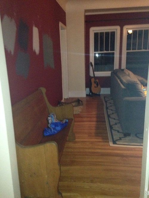
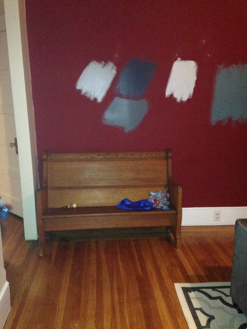
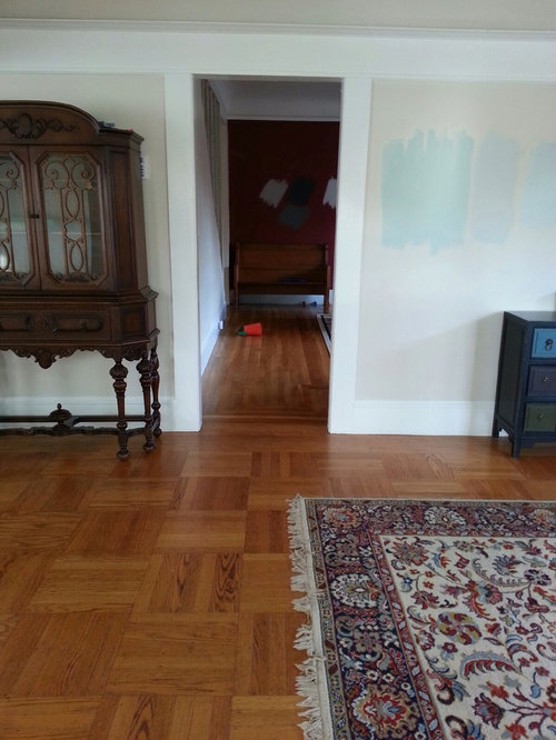
I am trying to come up with a paint palette for my home, and specifically the family room. My living room and dining room adjoin and I just painted the dining room wythe blue. I was thinking of light grey in the living room leading into dark grey in the family room. Suggestions?

Comments (276)

  • 11 years ago
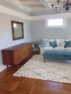
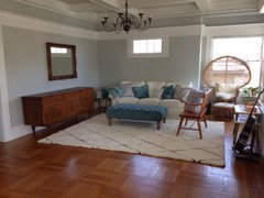
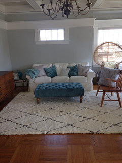
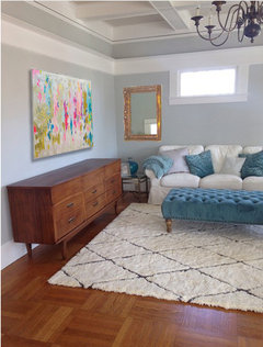
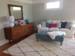
    Thank you! Yes, I LOVE the new credenza. The rug is great too but I can't help but think it's too "cream" and I have a lot of white so it really pops off as cream. I think once I get a new sofa cover, that will help. There's a beige cover which is still very light and only $49 at Ikea. And of course, there's the dark gray which I'm hesitant about because it's soooo dark. Wish there was more of a medium gray or a pretty indigo or something. What do you think between the light beige and dark gray? I have my eye on a couple of large scale abstract art canvases on Etsy but need to save up- for over the credenza. The little table in the corner is a craigslist find and it's cute but a little short. We'll see where it ends up. I also wish the ottoman was a brighter color. You can really see the difference when it's posted along with the turquoise/teal pottery in the background. The ottoman is sort of a dull gray-teal. So. New sofa cover, new art work, and possibly a new coffee table and some chairs at some point :) Still lots to do! Yes, I will post a new thread very soon and keep you updated so I don't lose touch! Thank you!
  • 11 years ago

    Do you imagine you will still want a white cover for the sofa? I ask because I "believe" you could dye that one (check the tag but I think they are 100% cotton which is totally dye-able) the color you want, more of light to medium gray? I have the other beige ones you are considering and they are closer to a cream/ivory shade. Great value and with a little one, a spare is so nice to have! I have another older cover for my loveseat in a darker blue denim (indigo) which I sourced from ebay. You can sometimes find discountinued colors/prints there. They don't offer it any more at Ikea (why Ikea? why?) I've been washing it, trying to get it to fade to more of a washed jean look ... but sadly, found that the dye lots on the arms were different than the dye lot of the materials used on the body. Arrrgh. If money was no object, there are places that offer custom slipcover choices for the Ektorps.

    http://www.bemz.com/en-us/product-page/product/sofa-covers/id/ekt3-c/ektorp/

    Not to mention sellers on Etsy too.


    Maybe take the ottoman and find a place for it in the family room or even sell it if it isn't working for you? Would the color work better in FR?

    Oh do post some links to the abstracts you are considering/saving for on Etsy. I would love to see them. I paint, so I recently went to Ross and bought a large "canvas" (poor Marilyn Monroe, soon be covered in acrylics) to use for an abstract I'm planning (ends up being cheaper than buying a new canvas at the art store, some even include a frame). I have too many projects like that in the works. Big ideas, not enough time or energy. LOL. But you might want to try a DIY abstract yourself that way? Could be fun.

    Maybe, if you can find a companion glass/metal piece, you could use them in a pair for more volume?

    I still think the mirror would be great with a a bit of gilding added to the frame. Everyone I know who does this loves "Rub and Buff" I work with a jewelry designer and it works great on many of her things.

    Take a daylight pic when you can and I can insert the beige Ektorp and or the Gray one they have in stock, just to see.
    :-)

    blovebug thanked lessismoore
  • 11 years ago
    Awesome, will post a pic tomorrow since I am off work. I have heard of rub n buff. I'll have to try that. Love a gold, glam look. I'm going to use this photo as my inspiration. I love the mix of French with Mid-Century. I can't imagine adding all mid century stuff so I'm trying to think outside the box.
    http://stylebyemilyhenderson.com/blog/1-credenza-4-ways-upper-east-side-mid-century/

    Which is way I was thinking of the etsy art. But I want just one big piece. Here's the one I'm loving right now although there are many to choose from so I may change my mind.
    https://www.etsy.com/listing/209214254/abstract-art-large-canvas-painting?ref=favs_view_10

    For chairs, I'm loving this option from world market: http://www.worldmarket.com/product/laurent+floral+lorna+chair.do?&from=fn

    There is also a dining chair option in the same fabric so I need to decide what size will work in my space. I love the black/cream and pop of pink and green.

    Re the sofa I did imagine having white at first and I considered dying the white one but I am just not certain I could make it come out the right color and evenly. It's a scary thought indeed. :) I also looked up those other cover options you suggest. So, I'm trying to decide what to do. At $150 a pop, the dark grey seems expensive however, the light beige may blend in too much with the rug. Someday... I may save up for one of these beauties. I'd take any of them, really. But I love the tufted options... I am trying to consider the future when selecting my chairs ;) Since this is a room that is only used on occasion, I think I can get away with not having a washable cover, especially if I opt for a medium color choice.

    http://www.anthropologie.com/anthro/search/search.jsp?searchPhrase=settee#/
  • 11 years ago

    The abstract, with the gold leaf ... totally perfect for the look. So ... "happy" looking!

    Love the credenza look you chose for your inspiration. Just perfect harmonies there. Her blog is just fun, fun, fun! Love what she did with all of them, but that swan lamp and the chair ... wow, serendipity there.

    And the chair - How great would that look with a B/W pattern pillow (and one in pink somewhere too).

    So, whatever did happen to the old green tufted sofa you started with?

    Looking forward to the new photos and hope I can stick some of your new "picks" in there too, like the art, the chair, and either a gray or beige sofa. Why move furniture when I have so much fun doing the photoshop thing :-)


  • 11 years ago
    Hope these are bright enough
  • 11 years ago

    Yes, that abstract is great! I would love to see how your Marilyn project turns out :) Maybe I will be inspired to try one myself.

    I adore Emily. I like how she makes style so attainable (will with certain products anyway) You definitely still need an eye and some personal style haha :) That swan lamp is to die for. I'm currently on the hunt for something similar although it's not an easy thing to accomplish. If I get impatient enough I may just go with the white lamp she uses often- I think it's from Target and more of an MCM look. The chair from world market is so cute! I went and sat on it this weekend and I love it. Although with the abstract picture and the chair I think I'd be moving away from teal/blues and into using pink as my main accent color- a very dangerous zone. Although I love it, I do live with a male and I'd like for him to feel like a dude when he's sitting in the room without having pink frillies pushed in his face at every turn :) We love music and he has a lot of cool records so I'm going to put a little record player on credenza and hopefully use this room as a entertaining/music listening, etc. room. Since the formal dining is on the other side it will work well that way.

    I ended up selling the old green monster for a fraction of what I paid. Although she was beautiful, she was not toddler friendly at all. It showed every slobber and milk drip and would not clean up. I attribute this to old fabric from the 60's/70's. I think we have much better options now a days. Also, it was over 90" long which just dominated the room. The scale was all wrong.


  • 11 years ago

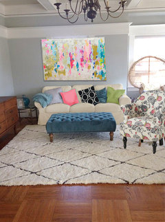
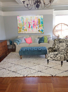
    Well, I think these will give you an idea? I hope.


    I didn't really have room to place the painting you are looking at in the right position (over credenza) and the chair ...
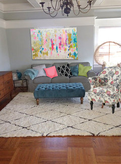
    With that chair, I like the gray sofa. But otherwise, the more ivory slipcover totally works too. Definitely think you need a bold B/W pillow in here :-) whichever way you decide. Styling that credenza will be so much fun! Love the abstract in here. Save up for that one for sure!
    And, I would still like to see those brass floor lamps. Looking great.

  • 11 years ago

    One more


  • 11 years ago

    WOW! I may need that abstract. It looks amazing. And actually not TOO feminine. I think I may be able to pull it off. I actually like the beige cover. Still keeps things nice and bright and plays well with the rug. I'm liking it!!!!! I know we've gone over this but what do you think of the couch in the location it's currently in? I can maybe put two chairs opposite? Also, do you have a recommendation for an affordable brass floor lamp? I saw they have some at Ikea but they are predominantly white with gold accents.

  • 11 years ago

    My only concern on the beige cover is the chair, is the background white or beige too? With the gray cover it didn't matter. The abstract is just perfection, especially with the gold leaf in it. Lamps plus one:

    Macy's

    Target too!

    blovebug thanked lessismoore
  • 11 years ago

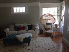
    I'd say the background on the chair is more of a cream. It's definitely not bright white. But do you think all this cream will conflict with all my white trim? Those lamps are nice but of course I love the one you had inserted into a previous pic. It was a tear drop shape brass head with more of a three dimensional arm. Once I nail down my configuration/ layout, I can think more about lamps. It depends on how much space I have in that corner and where the sofa is located. I would also like one or two lamps on the credenza so I need to make sure there aren't too many lamps over at that end.

  • 11 years ago

    When I look back at the rendering where sofa is more beige-cream and with the chair and rug (all having varying shades of "cream:) is, the moldings are, as they are, white, and with the white of the abstract there ... doesn't seem too heavy on either side. If you accessorize with more pure white, say for the base of a table lamp on the credenza, or in a b/w pillow, I think it all blends pretty well.
    That floor lamp that I originally used ... Yikes. I'd never would have used it if I'd seen the price! I think this one is both as attractive and much, much more affordable:

    http://www.lampsplus.com/products/robert-abbey-kinetic-antique-brass-pharmacy-floor-lamp__61361.html.

    Where the sofa ends up ... If you do get the abstract, the only place I could see it would be on the wall where the credenza is now, so either over credenza, or you could put it over the sofa there too. The credenza could go on the little window wall; which would make a good base for a gallery display, which that wall wants :-) If that was the case, I'd then have chairs facing sofa with their back to the windows and maybe that cute little glass brass table between them? I'd do the brass floor lamp in "the corner" and have just one lamp on the credenza, on the far right. But ultimately, there is just the one place for the abstract so that actually simplifies things a bit.

    blovebug thanked lessismoore
  • 11 years ago

    I think you're right. I was thinking the same thing. I could even place two lamps on each side of the credenza that would flank the window and that would really balance things. I love the idea of a gallery wall there too. I'm trying to figure out how to please that window. She's stubborn. I knew that lamp was pricey cause I've been online shopping for one for some time now and have looked through all those lamps plus options. Urban outfitters also has this little darling: http://www.urbanoutfitters.com/urban/catalog/productdetail.jsp?id=32243073&parentid=A-LIGHTING-FLOOR#/


    But size will matter and I need to figure out how much of a corner I have there once I select the furniture arrangement. Maybe one of those arching lamps would be pretty too. The lamps plus one you selected is beautiful but ouch $300. I may be able to get away with that white ikea lamp I think it's around $100. Guess I need to get moving this weekend and try out some new configurations!

  • 11 years ago

    I just layed it out with my little pieces of furniture that I cut out of paper and if I center the sofa, about 12" of the sofa arm covers the credenza. So, I wouldn't be able to open those drawers as there would only be about 2" between the sofa arm and the credenza. Hope that makes sense. The other option is to move the sofa towards the door to the family room but then the sofa would not be centered on the wall which means the abstract would not be centered on the wall. I have the same problem either way. You'll notice in the pics with the current arrangement I pushed the sofa over towards the right so its not centered on the wall or centered below the window. Ugh. I hate lack of symmetry but I don't know that I can swing it any other way in this case. I know I need to open up another dialogue about this but I would like to take some more pics of different configurations first. I did start this thread a while back but only got one response: [https://www.houzz.com/discussions/living-room-arrangement-dsvw-vd~1696202[(https://www.houzz.com/discussions/living-room-arrangement-dsvw-vd~1696202)


    And things have obviously changed now.


  • 11 years ago

    I think I understand. If you center sofa and center credenza on those adjoining walls, and you center credenza ... the sofa will overlap the credenza. Right? Arrrgh. You need to get a saw now and take a 12 inch. piece out of the center of the credenza, and glue it back to the right size (just kidding!!!!).

    I had liked how the sofa seemed (working just from renderings) to work with its back facing the dining room and one chair at the little window wall and another facing the wall where the abstract will go. That would free the credenza to go either spot without making it smaller :-)

    Or ... if moving the sofa to either backing the DR or the LR windows does not work for you, my best suggestion would be credenza off center on little window wall. Why? Because you can still create a lot of balance there, even with the credenza off center, by staggering your stylings on and near the credenza and with a gallery wall behind and incorporating the little window (which you are going to have to work with anyway you arrange things). Thoughts?


  • 11 years ago

    On a new dilemma: I think you will need a catchier title, something with either "Help" or "Desperate" in the title. Like "Help! Beautiful mcm credenza doesn't fit anywhere! Need a layout genie asap!" and a good pic of the credenza followed by some current room pix. :-)

    blovebug thanked lessismoore
  • PRO
    11 years ago

    An elegatn French Grey could be a nice solution.

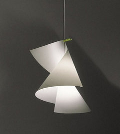
    A comfortable, bright and funny shape for suspension light also i suggest.


    http://eu.farrow-ball.com/french-gray/colours/farrow-ball/fcp-product/100018


    http://www.ingo-maurer.com/it/prodotti/willydilly


  • 11 years ago

    haha! I have to admit I secretly knew this would be the case with size. I had to make a call. Either a pewney (sp?) little credenza that didn't fill up enough of the wall or a larger statement piece and since I saw this one for the right price, I jumped. Decision made. I figured I do have a couple of options either way. I have been thinking of facing the sofa to the non-window wall... i.e. back of the sofa to the windows. I could even put a little table behind the sofa to accessorize a bit but I'm gonna have to try it out. Thanks for the suggestions :) Will try a new post soon.

  • 11 years ago
  • 11 years ago

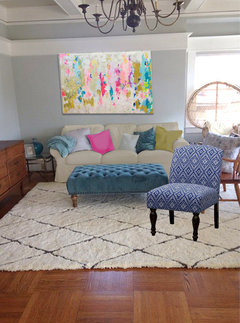
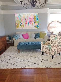
    Tough one. For me, I have a problem with mixing indigo blues with turquoise blues. I like the legs on first one, or the shape of the third. If you want to go more true blue, ala navy, indigo, etc. I would want to eliminate the turquoise to teals and that creates too many problems (like re painting!) But that is just me. I'm sure others are totally good with those two colors together. For me, it would have to be in a super colorful scheme with white walls :-)
    Right now, I'm liking the chair with the black and white and the pink green accents. Or even something in just a black and white (cream?).

  • 11 years ago
    Ooooh, that's cute! But is the linen hard to clean? I was thinking navy since there are sure to be toddler blueberry fingers and chocolate kisses lurking nearby :)
  • 11 years ago
    Sorry missed your comment above at first. Yes maybe a black and white without the pink. Although I love it I have trouble committing to accent colors but maybe I can see if hubby likes it first
  • 11 years ago

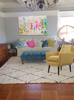
    Here is one with and older chair you'd liked and the yellow one I like.

  • 11 years ago

    Did not attach ... arrrgh.


  • 11 years ago
    Love the yellow!
  • 11 years ago

    Okay, to be fair with your first pick. It doesn't look that bad in the rendering, but ... It is that one sofa pillow that is "saving" it imo. The more blue gray one.


  • 11 years ago
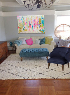
    Hmmm yeah see what your saying. Can you please try with the last all navy velvet one?
  • 11 years ago
    last modified: 11 years ago

    I really like the yellow one, it is a "mustard" so I think it has a nice green undertone that goes well with all the blue-greens. And the painting of course. Maybe get a throw (or two or three) to drape where you think the blueberries will end up? Besides, Murphy's law will have the blueberries on the rug or the cream colored sofa first.

  • 11 years ago

    Back in a minute with that.


  • 11 years ago
    last modified: 11 years ago

    Here it is

  • 11 years ago
    I was thinking if I do navy I could add some navy and white chevron pillows instead of black and white. I like the shape of the navy chair a lot. Seems to melt mid century with a feminine vibe. But the yellow adds warmth and light but I still worry about the fabric and it's a little pricey. Ah decisions.
  • 11 years ago

    Part of my issue is I just don't really like the idea of black with that ottoman. it's a dusty teal and I would not chose that color if I could do it over. Now a brighter turquoise with black- I could easily love. But, the dusty blue just doesn't go well with black in my opinion. But, I believe the stripe pillow covers are $5 at Ikea so it's not a huge investment to try out :)


  • 11 years ago

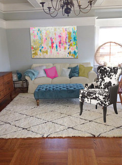
    Here are some others to confuse you more. One very conservative really (but a perfect match, without being matchy) and the other more "out there" - but I recall you like the hide through in one pic?


  • 11 years ago

    I do see what you mean about the dusty teal. Maybe just a cushion cover, or maybe more of a charcoal than black? Or relegate the ottoman to the den where it should harmonize with the grays?

    blovebug thanked lessismoore
  • 11 years ago

    Yes yes and yes. Thanks for the pictures. Sure does help not having to buy these chairs then take them back to the store just to see if I like them :)

  • 11 years ago

    You are welcome! I'll look around for a yellow one that's more durable and more in the $200 even category, or less. But, my "understanding" is that the slipper chairs, as cute and affordable as they are ... they are no fun to sit in for any length of time. And with arms, they always seem to cost more.

  • 11 years ago
    A couple of updates
  • 11 years ago

    Love your accessories, but just pare them down a little. Great lamp! Less is more.

    blovebug thanked njmomma
  • 11 years ago

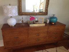
    I love the lamp/shade you got for the credenza styling!!!!!!! Wow. That is a beautiful credenza, it must please you every day, just to see it. All the styling on it look super. Just the Pinky flower and pinky pillow ... just those two things and looks perfect. Really, the whole thing room is looking great to me. Yes, you "still have the corner" but in time you will either get that lamp or find the perfect thing. "If" I were to do anything, I'd like to see a gold colored cushion on the sofa, maybe replacing the navy or one of the gray-ish ones down the line ... Are you still thinking of getting that painting? And I still want to gild your mirror. But really, I think you've done super duper here :-)

    blovebug thanked lessismoore
  • 11 years ago
    Thank you!! The perfect pillow combination is difficult to nail but a work in process. I have a patterned one on its way from etsy that hopefully will help tie the blues and pinks in together. And yes the credenza I my best friend :) I should gild the mirror in the mean time while I save for a painting! Thanks for reminding me!
  • 11 years ago

    I love the changes you are making. I love the pink! I think I would change sides (big chair and side table) and turn the big chair more in a diagonal to face more the living room.

    blovebug thanked biamel18
  • 11 years ago
    That's a good idea biamel18 but the the fan back chair is disguising an ugly roof view. If I siwitch the Chair and end table you would surely see more roof but I can always try it!
  • 11 years ago
    Old post.
  • 11 years ago

    Hi Nancy - actually it's an "evolving" post :-)

    blovebug thanked lessismoore
  • 11 years ago

    What are your thoughts on this large print (Tulum), instead of the abstract. I thought I could do some smaller abstracts above/around the sofa. I'm obsessed with this whole post by Emily. I wasn't able to pinpoint the Tulum picture but it's in her dining room:


    http://stylebyemilyhenderson.com/blog/bris-house-makeover/


  • 11 years ago


    Contemporary Artwork · More Info


    I found this for sale on the houzz site :-) Pricing depends greatly on size I think ...
    Would you put this over credenza as a large? I personally like the abstract because it has a wider color range, this is more in your "blue" range and you have several blue things already. However, as part of a gallery at a smaller size ...

    blovebug thanked lessismoore
  • 11 years ago

    Excellent point. Thank you. I hadn't thought about that but I'd seriously be limiting my color palette.