Software
Houzz Logo Print
sandy_osborn

Grey carpeting

14 years ago
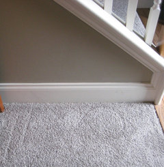
We just installed grey carpet in living room, stairs, and bedrooms after years of boring beige/tan. Walls are taupe and do not look well with the carpet. I think I made a huge mistake and scared to the point of losing sleep. Wanted to update the house while making the spaces more modern. I lamented over the color for weeks and now I am disheartened.

I know the wall color needs changing and wondering if that will be the beginning of making this work.

Comments (22)

  • PRO
    14 years ago
    Take a picture of your carpet and the taupe walls. Two colors can and will do battle if they are of equal value...this might be the problem. One needs to be dominate.
  • PRO
    14 years ago
    Did you end up using either the Woodcliff Lake or Sparrow, as shown in your Ideabook?
  • 14 years ago
    Woodcliff Lake and Sparrow are colors that I am considering after viewing photos....but I'm unsure. I'm so confused!

    It's very hard to show paint color in a photo now that I am taking them myself. I'm attaching two images of the current paint that needs to be changed. The color is what I call Khaki but my husband always refers to it as a green. Thanks for your help!
  • 14 years ago
    last modified: 14 years ago
    Believe it or not that is the same wall color taken at two different areas. Now I see why hubby and I see two different colors! Should the wall color have deeper grey tones to it?
  • 14 years ago
    Sandy...just to offer you some support....not really advice as I'm not a designer or colour expert....just someone who loves interior design so much that it is my obsession trawling through magazines and home stores! DO NOT WORRY!!....the carpet will work perfectly..it just needs the right colour combo to make you truely fall in love with it. You are probably so used to your old carpet, that the change is a bit of a shock at the moment. It can work and it will work. Don't be dishearened...sometimes all it takes is the perfect art work for example to bring the whole scheme together...or a stripe here or there to pull the colours.Good luck...there are so many wonderful people on here and with expert advice...they will not only give you great ideas but can save you a fortune by guiding you in the right direction.
  • 14 years ago
    Can you include a whole lot more photos of your rooms in general, furnishings, drapes, etc. Would you say that the gray carpet has a blue undertone and that your walls have a warm undertone?
  • 14 years ago
    I'm not so sure about the new carpet undertones...the fibers are a mix of grays/white. When I place some blues next to the carpet, it appears "dirty." The current wall color posted in my pic is warm, a bit of green/gold I would say. The furnishings are leaving...I intend to purchase either a gray or taupe sofa and debating what color I want to use to pop (red, Terra cotta, or green).
  • 14 years ago
    last modified: 14 years ago
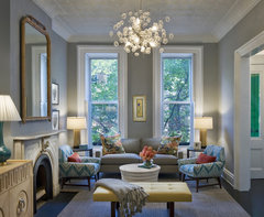
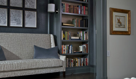
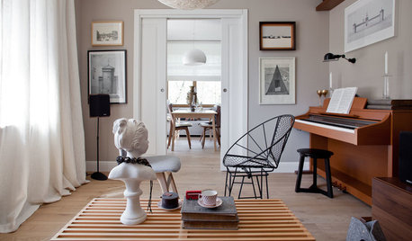
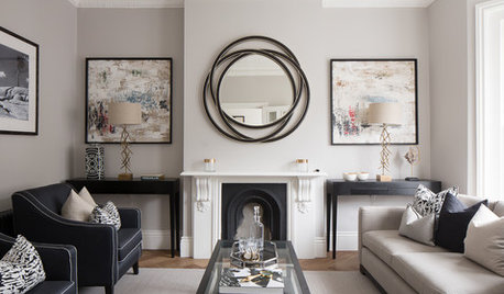
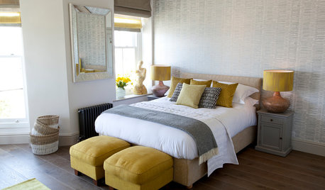
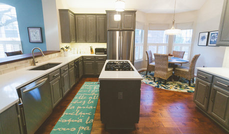
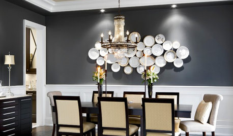
    Colors always deceive depending on the light the color(s) adjacent the undertones. Take your time. I'd re-paint. Buy large foam board / oak tag and paint that first & live with the color a while under all light conditions (artificial / natural) before you commit. I like carpet darker in tone and walls lighter. Lighter gray for walls. Be careful of the undertones. Stick to a gray sofa w same undertones. Here's an interesting article on the color gray and undertones. https://www.houzz.com/magazine/color-guide-how-to-work-with-charcoal-gray-stsetivw-vs~2530680


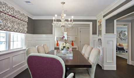
    Bergen Street Residence · More Info
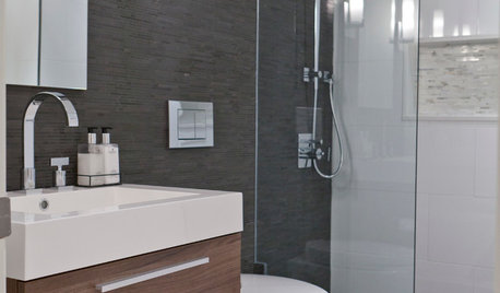
    Personal Home Tour · More Info
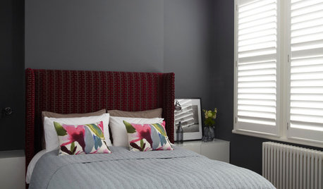
    Highfield Road Living Room · More Info
  • 14 years ago
    Since you plan on purchasing new sofa and other items, depending on where you shop (Ethan Allen, etc.), their staff are often trained to help you "pull in all together". Walk around the furniture store and talk to the different people, see if there is someone there you click wih.

    I think they also will make home visits. Or go in armed with photos, a carpet sample, etc.

    I like to walk around the shops to just check out the paint colors used, accessories, etc.
  • 14 years ago
    last modified: 14 years ago
    How odd. Those photos really show how much difference lighting makes. I think the photo on the right makes both your carpet and wall look beautiful, soft and taupey-gray and (to my eyes at least) well coordinated. The photo on the left makes the wall look just a bit too green and makes the carpet look darker and more of a steel gray than I suspect it actually is. I'd take a little time to adjust to the new carpet with your current wall color to see if it really is a problem or not. Then, if you decide it just isn't going to work, make sure whatever new color(s) you try out, you paint large samples on the walls in different rooms and lights to make sure any new color looks good in all contexts before you commit to it.

    I am notorious in our household for declaring that we've made a horrible mistake just because I haven't yet adjusted to a decorating change; after a week or so my eye adjusts and can assess the success of our decorating venture more objectively. My husband has learned to ignore anything I say during that initial period.
  • PRO
    14 years ago
    Feeny, that is too funny. Much like someone who puts hands over ears, closes eyes and says "la, la, la, la,la...can't hear you!".
  • PRO
    14 years ago
    last modified: 14 years ago
    Looking at your two pictures, I'd say the one (l.s.) was shot with some incandescent light near by and the other one near natural light? Gray can be a real "shape shifter". Depending on the lighting (and colors adjacent), every wall will present you with something new and different.
  • 14 years ago
    last modified: 14 years ago
    Exactly! When I look at the house from the right photo perspective, I'm not so upset. Photo was taken with the door open so there is a lot of natural light. The second is with less light and is more indicative of what bothers me. Although the room faces south and receives a ton of natural light, where there is less light/shadows it appears olive green and does not look well with carpet at all. I went to the furniture store last night almost in tears, the designer thought I was crazy about the carpet...he said this is the hottest color going. (Think he was trying to make me feel better) At any rate, we found a beautiful sofa I LOVE and fabric that is steely gray/blue. He picked out matching fabric which was all shades of gray which paired on the sofa gave the illusion of being steely blue. It was fascinating. Went to BM store and considering Sparrow (more warm), kendall charcoal (scares me) or their lighter counterparts, amherst gray and chlesea gray. I'm leaning toward sparrow because it has a more familiar undertone of brown/taupe. I'm at the point where I can't commit because I'm afraid of making a bigger disaster! Hubby thinks I have lost it. I really appreciate the words of comfort that change is sometimes hard.
  • 14 years ago
    I think we all see ourselves in you: which makes us laugh! So, don't lose sleep, don't be scared. Remember it is only paint!

    I remember trying to get my living room to way I wanted. I wanted a grungy green, color you would see in an old oil painting. First try: I had a designer pick my color. When painters took down the sheeting and left, I cried because I had ended up with "Crest Toothpaste"!

    Second try: I picked out the color, and the painter and the paint store made their own executive decision that I wouldn't like that shade and changed it!

    Final try: I went down and picked out a color called "Fool's fossil". It was my color! It worked! Still on the walls and still loving it.

    So, remember: just paint, get samples, you will get there! Oh, and a glass of wine doesn't hurt either!
  • 14 years ago
    Oh no! "Crest toothpaste" walls would make me cry too.
  • 14 years ago
    last modified: 14 years ago
    I completely agree that the paint color should be the final touch in your decorating agenda. But Sandy, I want to ask what was the original scope of your redecorating and modernizing plans? Had you always intended to buy new furniture (or recover old)? Or were you initially planning only to modernize the carpet? I'm worried that you are now redecorating in ways that are driven by your reaction to the carpet rather than as part of your initial plan. It isn't a problem at all to shop for new furniture (it's one of life's great pleasures, IMO), but I'm just hoping the furniture shopping isn't all reactive. If it is, then again I want to urge you to slow down and give yourself some time to adjust. Many people, like me, do not react well to change and do not adjust quickly to new visual combinations in familiar surroundings. So just take it slowly and percolate over your choices and your new carpet's effect before making big commitments to buying furniture or choosing new paint (unless, of course, this was in your plan all along).
  • 14 years ago
    PS: Just passing along: need to repaint our master bath, and I thought I had my color. That is, thought I had it until I read the name of the color: "Shaky Start"....
  • 14 years ago
    Feeny I agree completely, and the sofa was going as part of this redo. We bought a floor model in January (really cheap) to get over the hump until we committed to the carpet. At the time did not know what color carpeting we (I) would choose .....long story short....My whole decorating life...safe:brown, beige, gold, and various shades of green ---- I want change desperately, but change is hard for me as you can see. The decorater/designer at the furniture store showed me beautiful red sofas! Yes, they will match perfectly ....but I would NEVER buy a red sofa...too much for me, and I told him, while I want to live with the carpet I cannot buy a sofa just because of it. The sofa has to be something I love regardless of the carpet color, I don't intend to be in this house forever! Also I'm intrigued at the article on how to decorate with gray...."buy a gray sofa, you'll have it forever'..... Interesting! I'm so glad I posted here and you all understand!
  • 14 years ago
    Love the colour of your new carpet!! I agree with everyone about putting in place your new furniture before deciding on a wall colour. Love grey and taupe together. Have you looked at Benjamin Moore's CC-490 Smoky Taupe? It is quite neutral and goes very well in a grey/taupe decorating scheme.
  • 14 years ago
    I'm relieved that the sofa was part of the original plan, Sandy. That's fine. I just didn't want you to make reactive choices, and it sounds like you aren't. I love grays and other neutrals for major pieces of furniture. Pale to medium gray shades (green-grays, blue-grays, taupe-grays, putty-grays, brown-grays) have constituted my favorite color palette for many years, and basically my walls and furniture throughout the whole house are in these shades. (I also love charcoals, but use them sparingly) So I'm of course thrilled that this color is suddenly in fashion again, but I also feel that grays are neutral enough to be timeless. Gray sofas are great because you can have fun changing out different brighter colors of cushions and accessories as fashions change. That doesn't mean there is anything wrong with a red sofa, but it may indeed date faster than a more neutral colored solid with fun red cushions. I like buying larger pieces of furniture in solid colors that have some texture and variation in their weave rather than using textiles with a pattern, again because patterns date more quickly (plus I know myself well enough to know I just get bored with them over time). I save the fun patterns and brighter colors for area rugs and throw pillows and, of course, artwork.
    Anyway, that is more than you need to know about my design philosophy and love affair with grays, but I really am confident that in switching from your previous beige-brown-gold palette to a versatile set of gray shades, you'll have some beautiful new options for your home.
  • 14 years ago
    Love your design philosophy feeny. Recently renovated our home and chose a neutral palette of grey, taupe and off-white. At this point I havent't added any other colours and am concentrating more on textures. The beauty of this colour scheme is that it goes with almost anything and down the road I can add more colour without it looking odd.