

Need help with a transition color
14 years ago
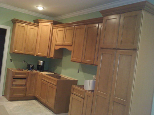
Featured Answer
Sort by:Oldest
Comments (18)
 14 years ago
Related Professionals
Hopkinsville Interior Designers & Decorators · Clovis Interior Designers & Decorators · Toms River Architects & Building Designers · Victoria Architects & Building Designers · Yakima Architects & Building Designers · Chatham Architects & Building Designers · Queens Architects & Building Designers · Atlanta Kitchen & Bathroom Designers · Kansas City Kitchen & Bathroom Designers · Georgetown Kitchen & Bathroom Designers · Killeen Kitchen & Bathroom Designers · Flint Kitchen & Bathroom Designers · Santa Maria Kitchen & Bathroom Designers · Fairbanks Kitchen & Bathroom Designers · Edmonton Kitchen & Bathroom Designers PRO14 years ago
 PRO14 years ago
- 14 years ago
- PRO14 years ago
- 14 years ago
- PRO14 years ago
- 14 years ago
 PRO14 years ago
- 14 years ago
- 14 years ago
- 14 years ago
- 14 years ago
- 14 years ago
- PRO14 years ago
- 14 years ago
- PRO14 years ago
Related Stories
STANDARD MEASUREMENTSThe Right Dimensions for Your Porch
Depth, width, proportion and detailing all contribute to the comfort and functionality of this transitional space
Full Story
LANDSCAPE DESIGNHow to Help Your Home Fit Into the Landscape
Use color, texture and shape to create a smooth transition from home to garden
Full Story
BATHROOM WORKBOOKStandard Dimensions and Measurements for a Primary Bath
Create a luxe bathroom that functions well with these key fixture dimensions and layout tips
Full Story
BATHROOM MAKEOVERSRoom of the Day: See the Bathroom That Helped a House Sell in a Day
Sophisticated but sensitive bathroom upgrades help a century-old house move fast on the market
Full Story
COLORPick-a-Paint Help: How to Create a Whole-House Color Palette
Don't be daunted. With these strategies, building a cohesive palette for your entire home is less difficult than it seems
Full Story
BATHROOM DESIGNKey Measurements to Help You Design a Powder Room
Clearances, codes and coordination are critical in small spaces such as a powder room. Here’s what you should know
Full Story
STORAGEDownsizing Help: Shelve Your Storage Woes
Look to built-in, freestanding and hanging shelves for all the display and storage space you need in your smaller home
Full Story
KITCHEN DESIGNKey Measurements for Your Kitchen Design
Get the ideal kitchen setup by understanding spatial relationships, dimensions and work zones
Full Story
STUDIOS AND WORKSHOPSYour Space Can Help You Get Down to Work. Here's How
Feed your creativity and reduce distractions with the right work surfaces, the right chair, and a good balance of sights and sounds
Full Story
DECORATING GUIDESThe Most Helpful Furniture Piece You May Ever Own
Use it as a table, a seat, a display space, a footrest ... and indoors or out. Meet the ever-versatile Chinese garden stool
Full Story




Chroma Design