Software
Houzz Logo Print
fabvikki

Fear of wall color commitment

14 years ago
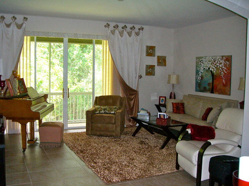
I had the drapes done before I bought the furniture. I also can't decide on a lighting fixture. I think I want something flush, contemporary and large scale.

Comments (42)

  • 14 years ago
    I found these examples for you: [houzz=
    5300 HR · More Info
    ] [houzz=
    French Country · More Info
    ] [houzz=
    Musical Chairs · More Info
    ]

    The first pic looks like a light yellow, The second a light beige, and the third a beautiful green that I think would be lovely in your room.
  • 14 years ago
    I think the pale turquoise color would be very pretty.
  • 14 years ago
    Try a charcoal gray color for walls. Enjoy!
    [houzz=
    J. Hirsch Interior Design Portfolio · More Info
    ][houzz=
    Living Room · More Info
    ][houzz=
    Asian Family Room · More Info
    ][houzz=
    Master Bedroom · More Info
    ][houzz=
    Country Chic Family and Media Room · More Info
    ]
  • 14 years ago
    Red, white, tan....nice color combo. Just use red for accent. Drapes could have a red print on tan. The picture can help bring in other colors if you want to trade out the red for aqua. Pretty much anything will go with the white and tan and black furniture. You have the perfect opportunity to change out colors with the seasons. How about a grey wall with a more blue undertone behind the sofa. Maybe not the entire wall, I would suggest framing it out about 1-2 ft from each side and pop the color in the middle area. Maybe even place a grid design over it in white. Just something modern to give the room some pizzaz. Lose everything but sofa, white chair, table and that vivid artwork and go from there! By removing the rest, it opens up new ideas for you easier.
  • 14 years ago
    I like your room as is. There is nothing wrong with it. I would not change a thing.
  • 14 years ago
    Go for color - you'll be happy. And worst case, you can go back to white. I would suggest a gray since it's so rich in a living room. A patterned rug with less pile would be great, too. Good luck!
  • 14 years ago
    I'd pick a soft blue or green and do the ceiling, too. The color on the walls will really set off your pieces, the dramatic draperies, and the flooring. It will look luxurious.
  • 14 years ago
    I don't think grey is the color to go with on the walls as there is too much beige in the room. Try a greige or maybe even the turquoise. The one other thing I noticed is that you decorated with red accents on the right side of the room and rose on the left. Perhaps change the piano bench on the left-hand side to introduce the red or turquoise. Also, I feel the 3 picture set should be hung lower and in a down row.
  • PRO
    14 years ago
    I think you should think about going with something a bit more transitional. You have too many pieces in here that are more traditional looking (the piano, piano stool and especially the draperies) to go with more modern. Your furniture is contemporary, but soft enough to fit into this "transitional" style. What kind of light fixture are you talking about, and where will it go?
  • 14 years ago
    I agree with mugsy. I love the golds/ bronze/ warm tones paired with the turguoise. Can you replace the rug?
  • 14 years ago
    Room is fine but the rug doesn't look like it belongs ..... Why not go with the curtain lining color on one wall?
  • 14 years ago
    An accent wall is a great way to bring in a little focus; your sofa wall would be a great place. Alternatively, if you don't want to add color, add texture by creating paneled walls or again just one wall as an accent but painted same color as others.
    another choice is to stencil all or one wall; another cheap and easy change.
    Either way I think you would enjoy the change up. Good luck and enjoy
    [houzz=
    Michelle Salz-Smith, ASID, CID · More Info
    ]
    [houzz=
    Hollywood Regency Living Room · More Info
    ]
    [houzz=
    Library Style Family Room · More Info
    ]
    [houzz=
    Traditional Dining Room · More Info
    ]
    [houzz=
    Stenciled Wall · More Info
    ]

    http://acreativemomma.blogspot.com/2011/05/stenciled-wall.html
  • 14 years ago
    last modified: 14 years ago
    I see mostly tan and white...don't go with gray...you should stay in the frame you have and remember your most expensive piece...the piano...I think Tan on the walls would enhance your drapes and go with your floor, furniture and make a warmer, cozy room. I don't think your furniture reflects contemp for your lighting...guess you could mix...but, maybe a traditional look would be the way to go with your beautiful piano and pieces already there. I think a nice rug to pull it all together...maybe in deep red, tans, ++
  • PRO
    14 years ago
    Hi- You definitely need to paint the walls a color; your draperies are beautiful, but totally lost against your white walls. My first instinct was to go blue, but red would probably be even better as it would be a terrific contrast to the outdoors. However, if you are afraid it's too bold, go with a lovely neutral paint with a bit of yelow/gold like Sherwin Williams Crisp Linen #6378 or Kilim Beige #6106. It's difficult to match paint from the computer, but these 2 colors will give you a starting point. Good luck!
    www.seabaughinteriors.com
  • 14 years ago
    What about recessed can lighting?
  • 14 years ago
    I see bronze/copper, also. My suggestion is Ben Moore 836 sea view.
  • 14 years ago
    I LOVE the artwork above the sofa. I would like to see you pull a color from that painting. How about the greenish color that is on the left side under the leaves next to the tree trunk. It isn't aqua but sort of what appears to be a sage/silvery green. If you can afford to replace the rug I think a solid black rug would look elegant in the space and not compete with other colors. A contemporary light like I have shown below could compliment the room. It's found at www.lightinguniverse.com
  • 14 years ago
    One more thing. Recover the piano seat in that lovely red you've used as an accent in the room. The current mauve color does not compliment the wood in the piano.
  • 14 years ago
    Another thought...can you reverse your drapes?
  • 14 years ago
    Soft robin's egg blue pulled out from the painting for your walls would be lovely.
  • 14 years ago
    If you're looking for a nice blue, I have Benjamin Moore Aura Paint in my house and love the Robin's Egg Blue - it's Palladian Blue HC-144. If you're room is East facing, go one shade darker to avoid the powder blue look: Wythe Blue HC-143. The Palladian works well in a west-facing space. Good luck!
  • 14 years ago
    just add 4 torchieres floor lamp in each corner of the room and watch it coming alive - keep smaller fixtures as accent light on furniture, piano etc.
  • PRO
    14 years ago
    I agree with many of Gina's ideas, thanks Gina. Pull colors from that wonderful art. I'd add soft turquoise cushions along with your existing red ones, soft muted turquoise-gray walls or at least one colored feature wall behind art. I love how the white chair, black/espresso wood coffee table & chair frame, and your art are working together. The piano & bench would be incredible painted black or espresso. The piano bench would look better with legs showing (not upholstered to the floor). I'd put the sage/silvery green into a shag area rug so the dark wood coffee table shows off. (Has anyone out there ever tried to bleach & re-dye an area rug or used paint to change the color? After all, fabric paint exists but I've never personally used it). If you trade the two chairs around, I think it would give the tan chair a better chance of working in the room...along with a soft turquoise or red throw instead of accent cushion. There are already enough red accents, so I wouldn't buy any more, I'd add a secondary accent color that's softer so they don't compete and still picks up colors in your art. Give the 3 small pictures a black frame or black edge and hang them vertically as already suggested. I think the drapes look unique & fun, so I'd keep them & make them work. Maybe some black edging or rope trim along just the center vertical edge??? That would help divert some attention away from the lining color that doesn't appear to coordinate with other colors in the room (other than the art). Is that ruffly fabric I'm seeing across the upper patio doors? Just showing some nice door moulding would look better. How does all that sound to you?
  • PRO
    14 years ago
    First thing I would do is exchange the position of the 2 large chairs, the brown one blends too much with the lining of the drapes. Remove the 3 small pictures, they are a visual distraction when the drapery is the star. Get a nice chandelier for the center and trade the lamps so that the larger one is on the window side of the sofa. I would probably make the wall color much deeper almost the color of the drapery lining or even darker. It would be really elegant. Buy some un-matched pillows, maybe in a metalic or brocade, but something that matches the feeling of the drapes. You might consider finding a different coffee table, or a base that is gilt or metal, you just didn't match your furniture selections to your drapery selection so you need to make the eclectic mix more purposeful by adding some more lux items.
  • 14 years ago
    last modified: 14 years ago
    Thanks so much for all the suggestions. I am going to paint the walls a color close to the carmel color in the drapes. I agree that my tables don't have the correct feel for the room. My two lamps are Candice Olson's and I love them. The shag rug has such a retro feel with metallic gold highlights. It warmed up the room as soon as I put it down. The rug is a consideration. I agree that the ottoman next to the piano should be changed. I saw the chandeliers Katherine suggested while I was searching. I attached two chandeliers that I am leaning towards.
  • PRO
    14 years ago
    There appears to be green just outside your window and at the top of your draperies. I suggest you repeat that color. I suggest you use the same color on the ceiling unless you install a crown moulding. Here are a couple of flush mounts that are contemporary; the first is by Jonathan Adler, the second Axis and the third by Circa. Hope this helps :)
  • 14 years ago
    your description of your rug makes sense now. It's difficult to see the detail in the photo. I can understand why it works now.
  • 14 years ago
    Fabvikki, love the chandelier you chose on the left!
  • 14 years ago
    JUST KISS IT!....Keep It Simple Sally! Don't go spending a ton of money.....eclectic style is a great trend. A grayish toned Turquoise that is more on the neutral side is a winner for wall paint. Keep the rug...keep everything but the red accents. Switch them to a variety of Turquoise/ sea green toned items and maybe some chrome/ silver to bring in your curtains. Go with at least 18x18 inch pillows, or buy covers for the ones you have. Etsy, has a really good selection. Don't shy away from fun patterns for pillow covers, and be sure to place similarly colored pillows in each chair/ on couch to bring everything together. And remember.....no picture frames on tables/ piano! :)
  • 14 years ago
    last modified: 14 years ago
    I love the red accents! If you paint the walls a warm olive green it will compliment that color, as red and green are opposite on the color wheel..

    Drop the wall hangings on the right of the windows down. The top one should be no higher than the top of the painting behind your sofa.

    Recover the ottoman that's in front of the piano in the same shade of red as the color in the painting...or buy a piano bench.

    The rug needs to go toward the piano. The ottoman/bench should be on it.

    The white chair needs to come to the other side of the room and face in toward the sofa or be turned toward the coffee table. With the furniture where it is the room appears to be tilting toward the right.

    Please post an updated photo when you finish the room.
  • 14 years ago
    I think I would use the turquoise color from the artwork but in a very pale shade as if a fog is rolling in. You could do a few shades darker on the lower portion of the walls and use the gradient style paint technique to make it much lighter as you work up toward the ceiling. Or you could do the opposite with the darker coloring on top. This would look awesome in your room! Good luck.
  • PRO
    14 years ago
    Of the 2 chandeliers you are looking at, I like the one on the left. It will last through decor changes. Here are some paint suggestions. BenMoore 1072 Sandune, 1093 French White, and 1107 Hilton Head cream. These are all in the warm golden brown but light and not really gold, just not reddish. You could also take a cue from your artwork and go with a pretty olive green such as Olive tint #519, Glade Green # 498
  • 14 years ago
    agree on the chandelier on the left
  • 14 years ago
    Hi fabvikki, please consider that chandeliers need to be hung at least 6'8" from the floor so that guests don't feel like they need to duck. Your ceiling height may not accommodate the fixtures you have in mind.
  • PRO
    14 years ago
    Do please measure the height of the ceiling and the height of the chandelier and allow the headroom. The best way to determine the size of the chandelier is to measure the width of the room x 2 for the maximum diameter of the chandelier. The height is determined by ceiling height minus 80". Be sure that the fixture can be hung at that distance. Many fixtures like the one on the left come in more than one size. Also, if you want the chandelier, just make sure a table is beneath it then you won't have to worry about head height. Look for pendants instead of chandeliers when you search. They are often slightly smaller and the length can be adjusted on most. http://www.lightingluxurystyle.com/98424.htm see The Vienna Full Spectrum 22" wide pendant and look at the width and height to see what I am talking about.
  • PRO
    14 years ago
    Vikki how about sending a couple of other photos of the room so that we can see the layout better. That will make advice easier to give.
  • PRO
    14 years ago
    Hello Victoria,

    Color selection can be an overwhelming part of any new home improvement project. With the array of color swatches in a store, it is hard to tell what palette truly reflects you. Start by looking at the clothes in your closet. When you dress, you choose colors that compliment and make you feel comfortable. You will begin to see the color patterns you are drawn to and enjoy to wear.

    Also, there are many color tools available to help you with this process. We offer a display tool that allows you to choose colors for your walls, ceilings, trim, and floors. You can visit the color visualizer here: http://www.masterchem.com/masterchem/v/index.jsp?vgnextoid=d72e8fb3e5c49210VgnVCM100000176310acRCRD

    Hope this helps your dilemma with color commitment!
  • 14 years ago
    fabvikki BCreative...if you paint the walls caramel I think you will be disappointed. The drapery lining, the rug and the chair are already that color. You will end up with everything looking the same. A complimentray color will provide contrast and spice.

    Something else I noticed are the candles you have on the piano. They would look great on the coffee table You should try some like these from Pottery Barn on top of the piano: http://www.potterybarn.com/products/turned-wood-pillar-holders/?pkey=ccandleholders

    I like the light fixture on the left. :-)
  • 14 years ago
    I agree with Janishill about the wall color. too monochromatic.
  • PRO
    14 years ago
    Agree with caramel walls making the room look far too monochromatic... like falling into a haystack in a barn already loaded up with hay! Muted grayed turquoise (like BM Raindance) would freshen up & complement the tan/caramel carpet/drapes/furniture. I'd like to see a close up of the 3 small art pieces next to drapes. Someone suggested losing them, but I'd like to get a closer look. From the existing photo it looks like the colors pick up on the larger art piece. Photos of the 2 other sides of the room would give us a more realistic perspective. You're getting an abundance of ideas here my dear!
  • 14 years ago
    Vikki...if you can dowload a couple of better pictures I will use a program to change the color of your walls then post the pictures for you. That way you will have a visual to help you decide.