Software
Houzz Logo Print
csh1956

Paint color to accent new cabinets

13 years ago
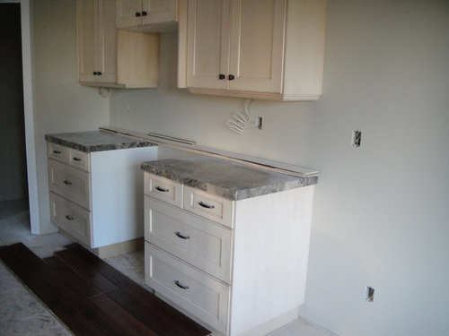
I have BM Bleeker Beige on the walls. The cabinets are Maple with a glazed finish (Buckhorn) and the island is dark (Chestnut) The hardwood is Trillion engineered in hand scrapped Kentucky Oak.
My question is, the paint seems to give the cabinets a "pink" look. If I changed only the walls they are on to a much darker shade would that help. I feel they are not visable enough. I want some punch. I was considering travertine for backsplash but I don't know if that will give them enough appeal. Suggestions?

Comments (22)

  • PRO
    13 years ago
    Yes, go with a taupe color on the wall and light travertine as backsplash...I can't see the counters color so well though...your floor is nice !
  • 13 years ago
    Hi
    could you snap another pic, close-up of the counter and cabinets? I'm not seeing pink, rather apricot and it's your cab color. need a closer photo---to give wall color... Thanks!
  • PRO
    13 years ago
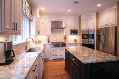
    I have seen this happen before. Here is an example of a kitchen we did, the cabinets are glazed even though they look white. I think you just need to bring home some tile samples and put some color on those walls, hard to suggest a color without more information. I love the dark floors!
  • 13 years ago
    check out Ben Moores travertine collection of paint colors for matching undertones
  • 13 years ago
    I like the idea of a travertine backsplash. I would paint the upper cabinets the same color as the bottom ones (white). Paint the walls in a nice tan color to pull it all together.
  • PRO
    13 years ago
    Everything depends on the small details: color of appliances, cabinets, handles, backsplash and the color of the island. I suggest you think about the knobs in the same color of equipment-cooker fridge, etc. Choose the color thinking about backsplsh color and material that you wants to the island-I suggest the darker shade of the same color of the cabinets or the color of the floor. Add powerful pendant light following the colours of the equipment.
  • PRO
    13 years ago
    Be careful with light colored travertines or tiles - might enhance the pink tone you are seeing. I'd go with a crisp gray on the walls, possibly suggest a Sherwin Williams Essential Gray.... or the next shade up (I don't have that swatch in front of me).. Or BenMoore coventry gray. That gray palate looks like it would work nicely with the cabinet tone. Are the cabinets professionally done? May consider having them toned with one more color....wont make them darker, but if done properly can neutralize the pink. if you are seeing pink and don't want to, at this point most things you do to the walls and backsplash may enhance that on accident!!! I do faux and have seen it happen!
  • 13 years ago
    BM Bleeker beige has a green undertone I think. Since this is across from red on the color wheel, it might emphasize any pink in the cabinet finish. I had pickled maple in my kitchen and I had to be very careful what I chose for wall paint. I think the previous poster's suggestion of gray (as long as you steer clear of a greenish gray) would be good. Travertine usually has a mix of pink and yellow goldish undertones.
  • 13 years ago
    On my monitor, the top cabinets look cream and the bottom cabinets look white. Getting white and cream to together is almost impossible. Surely you should sort this prob out first? Unless I have missed something.
  • 13 years ago
    The top and bottom cabinets are both the same color. Unfortuately our lighting isn't in until next week so they appear different in the picture I provided. When I take my crown moulding outside, it looks like clear maple. I'll look for paint with gray tones as you suggest. Thanks all!!! I'll keep you posted.
  • 13 years ago
    I had the same issue you have, as I think I have your exact cabinets.My granite counters have gray and mauve ish swirls, so I first went with a mauve on the walls. It was ok, but did bring out the pink in the cabinets. I then went with a gray on the walls, but didn't want a dark gray as the space is not huge. I think I used Stonington gray by BM. It looked washed out and didn't add anything. Recently I broke my mold of soft colors and went with a cranberry, and I love it.
    Good luck with whatever you choose.
  • 13 years ago
    last modified: 13 years ago
    Every white has undertones of other colors in it, your cabinet white has a bit of pink in it. Pink can be a nice undertone, it's warm and cheery and not medicinal looking as blue-whites can be. I think it is the pure white/gray undertone in the wall color that is bringing out the pink undertone in your cabinets because it contrasts. If you change the wall color to a darker but coordinating tone, you won't see the pink any more. I like Behr "classic taupe," it has a slight undertone of pink, which could blend nicely and make your cabinets appear white in contrast. You will want to get many paint chips and tape them up to the wall and observe them under different lighting conditions before you make a choice, though. Every color changes in different surroundings. Beware of colors that cast gloom if the room does not have good natural light. Blues and grays can make a dim room depressing and are more likely to call out the contrasting pink in your cabinets.
  • 13 years ago
    Totally agree with lisianthus! Look at taupe... SW 6036 or SW 6037... Gray-Blue-Green will only intensify the pink (apricot) undertone of the cabs.
    CheerS!
  • PRO
    13 years ago
    Before concentrating on paint colors, I would like to know what your backsplash detail is going to be?
    Is that purchased or yet to be determined. Could pull an accent color from that scheme, in a very faint tone. Also, if you could provide a better photo of your cabinetry tone and the counter-top surface, that too, would be helpful!
    Cheers!
    m.
  • 13 years ago
    yes, more picssssss
  • PRO
    13 years ago
    I would say take a drawer face to a paint store. Also take a large, white piece of paper. Our eyes "see" color by comparison. It could be that the paint isn't making the cabinets APPEAR pink, it could be that the glaze, over that wood species, simply DOES create a tint of pink! Or peach! Determine that first, by getting out of your environment and up against some pure white! Now add to that mix, the tile you will use for your backsplash if you're planning that. ( I am almost hoping it isn't purchased yet!) You may find that wall color in a soft pale grey with just a hint of green undertone, looks super with the cabinets! And any good paint store can custom mix to a fraction of a shade, and often has a color "expert" who will see the subtleties in all. And you will be right where you need to be, in the paint store!
    PS... Your counters appear to be in the mid grey family.... yes?
  • PRO
    13 years ago
    Walls are easier to change color compared to other items. I think what you have there looks great together.

    RenovateKate's Before & After Pictures · More Info
  • PRO
    13 years ago
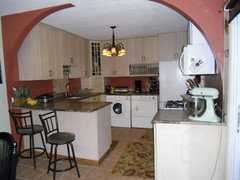
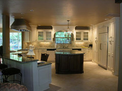
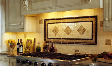
    If you want a monochromatic look, I like the backsplash in the kitchen Dytecture has posted. At least it has some interest because of the scale of the tile. I tend to think that the travertine will look OK, but it is also sort of a bland look all by itself. Check out some of the gorgeous tiles out there. Even if you want to stay with a monochromatic look, there are lines which will let you choose your own glaze mix. This can be beautiful in a mix of matte and gloss, dimensional and flat tiles. Sonoma Tilemakers has a line called Stellar

    http://www.sonomatilemakers.com/LineList.aspx?prod-line-id=6&line-list-id=25&IsLineList=True

    (go to this list, click on the PDF for the brochure and check out the Romboid tile - this can be done in a mix, as can others; the color palette is at the bottom) If you still like the travertine, consider doing an inset of other tile for interest

    http://www.sonomatilemakers.com/PhotoGallery.aspx?prod-line-id=1&IsPhotoGallery=True

    Before you paint, you should select the backsplash, whatever it will be so that the color coordinates and further sets off the tile.
  • PRO
    13 years ago
    Great thread!
  • 13 years ago
    Maple starts out with a pink undertone and ages yellow. You might want to check the door sample at the store to see what the aged color will be.
  • 13 years ago
    Base on what I see in the photo and your choice of travertine for the back splash I would say the color should be Coos Bay 19 - 31 Pratt & Lambert paint. all so when choosing the travertine it should be gold tone