

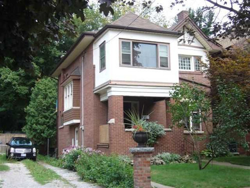
Need help with this boxy eye sore!
14 years ago
Featured Answer
Sort by:Oldest
Comments (13)
 14 years ago
Related Professionals
Kansas City Interior Designers & Decorators · Torrington Interior Designers & Decorators · Janesville Interior Designers & Decorators · Edmonton Interior Designers & Decorators · Jacksonville Architects & Building Designers · Bowling Green Architects & Building Designers · Greensboro Architects & Building Designers · Elk City Architects & Building Designers · Lufkin Architects & Building Designers · Plymouth Architects & Building Designers · Baltimore Kitchen & Bathroom Designers · Barnstable Kitchen & Bathroom Designers · Binghamton Kitchen & Bathroom Designers · Riverside Kitchen & Bathroom Designers · San Angelo Kitchen & Bathroom Designers PRO14 years ago
 14 years ago
 14 years ago
 14 years agolast modified: 14 years ago
 14 years ago
 PRO14 years ago
 14 years ago
 14 years ago
- 14 years ago
- 14 years ago
 PRO14 years ago
Related Stories
WORKING WITH PROS3 Reasons You Might Want a Designer's Help
See how a designer can turn your decorating and remodeling visions into reality, and how to collaborate best for a positive experience
Full Story
BATHROOM WORKBOOKStandard Dimensions and Measurements for a Primary Bath
Create a luxe bathroom that functions well with these key fixture dimensions and layout tips
Full Story
MOST POPULAR7 Ways Cats Help You Decorate
Furry felines add to our decor in so many ways. These just scratch the surface
Full Story
REMODELING GUIDES8 Tips to Help You Live in Harmony With Your Neighbors
Privacy and space can be hard to find in urban areas, but these ideas can make a difference
Full Story
UNIVERSAL DESIGNMy Houzz: Universal Design Helps an 8-Year-Old Feel at Home
An innovative sensory room, wide doors and hallways, and other thoughtful design moves make this Canadian home work for the whole family
Full Story
LANDSCAPE DESIGNNative Plants Help You Find Your Garden Style
Imagine the garden of your dreams designed with plants indigenous to your region
Full Story
GARDENING AND LANDSCAPINGGarden Design Essentials: Shape and Mass
From a curved rail to boxy terraces, shapes and masses give a landscape form, volume and interest
Full Story
KITCHEN DESIGNHow to Choose the Right Depth for Your Kitchen Sink
Avoid an achy back, a sore neck and messy countertops with a sink depth that works for you
Full Story
ADDITIONSRoom of the Day: New Kitchen-Living Area Gives Family Together Time
An airy add-on becomes the hub of family life in a formerly boxy Arts and Crafts-style home
Full Story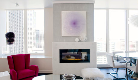
CONTEMPORARY HOMESHouzz Tour: Unboxing a San Francisco Condo
Feminine glam replaces boxy and boring in a remodeled luxury condominium with a view
Full StorySponsored

Leading Interior Designers in Columbus, Ohio & Ponte Vedra, Florida



houssaon