Software
Houzz Logo Print
weatherboy80

Where to stop tile backsplash?

16 years ago

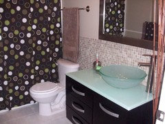
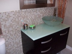
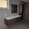
We just tiled (mosaic glass tile) a small backsplash behind our "modern" guest bathroom vanity (from end to end) and up to the mirror. However, we were wondering if it looks strange to simply stop at those points (see pictures below).

Should I have continued the tile all the way over to the tub and behind the toilet, effectively tiling that entire small wall to the height of the bottom of the mirror, or is okay to leave it just as a backsplash for the free floating vanity. Design thoughts?

Also, we were thinking of painting a different wall color as opposed to the lime green. Any thoughts there?

Thanks in advance!

Joe

Comments (20)

  • 16 years ago

    I love all the features in your bathroom. The vanity, faucet, sink are all gorgeous.
    My recommendation would be to tile the entire wall! Floor to ceiling. Glass mosaic looks fantastic when it covers an entire wall.
    Paint the other walls in the bathroom.

  • 16 years ago

    I think either works fine. They're just 2 different looks. Given the contemporary look of glass mosaic, there aren't really trim pieces to frame out the backsplash, so this looks tidy and clean.
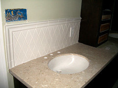
    With more traditional tile, you almost have to trim it out or it looks weird. Here's ours which just got installed a few days ago.

    Here is a link that might be useful: Our bungalow and kitchen remodel blog

  • 16 years ago

    love love love that bathroom! Great sink, counter and vanity - yummy!

    I think the tile looks good the way it is and you could keep it that way. It might look more finished if you found a pencil style trim that matches to frame it (might be tough to find a match with glass tile, I don't know.) It would be stunning tiled all the way to the tub if you can afford it.

    Can you share where you found the shower curtain? I looked all over for a cool curtain for DS's bathroom including online, and found one sort of similar to yours but not as cool.

  • 16 years ago

    The rough edge looks unfinished, and you should have "massaged" the tiles so that they didn't continue beyond the edge of the counter.

    I agree it looks odd as is. If you were just going to do a back splash, it should have been lower. As it is, tiling to that height along the entire wall would give it a more finished look. Get some trim for the top edge, and "massage" the tiles so you have no cuts.

  • 16 years ago

    I like the paint a lot as is, though!

  • 16 years ago

    Well, we ended up continuing the tile all the way over to the tub at the same height and painted the walls a more neutral brown to better blend everything together. I think it came out pretty well. What do you all think?

    BTW, the shower curtain came from Linen's and Things before they went out of business.

    Thanks to all for your suggestions!

  • 16 years ago

    Nice!

  • 16 years ago

    Very cool. Looks great.

  • 16 years ago

    That looks much better. I like your off center sink, especially since it creates more usable counter space than a centered sink.

  • 16 years ago

    Looks Awesome!! Great job

  • 16 years ago

    weatherboy80,

    Your "before" bathroom was very, very nice, but the tile and paint changes elevate the room to Simply Awesome! I'm bookmarking this thread so I can refer to your pics for reference and inspiration.

    Now that the paint color is no longer competing for attention in the room, I notice how well the mosaics complement your gorgeous counter top and vessel sink ~and~ how well the shower curtain coordinates with your vanity. I think carrying the tile all the way over to the tub makes the room feel larger, reinforcing the "one flowing space" effect of carrying the floor tile under your vanity. Great job. Was this a DIY project?

    We're finalizing renovation plans for our 5' x 9' hall bathroom, and we're going to use a 36" floating cabinet with offset sink too. Would you mind sharing details (brands and dimensions) about your accessories? Mirror, drawer pulls, vanity legs, and faucet.
    I'm looking at semi-recessed sinks, which seems to narrow my choice of faucets considerably! It also confuses me about placement of counter top height and bottom of the mirror.

    Thank you in advance, Joe!
    docdom

  • 16 years ago

    Although I don't usually think green works well for a wall color in a bathroom (people tend not to look their best in reflected greenish light), I thought your previous green walls provided a much more dramatic and modern look than the rather non-descript beige you've repainted.

    I wonder if you've considered continuing the tile all the way to the ceiling? That might give you a more unified look. After reading your initial posting, I was going to suggest continuing the tile backsplash to the ceiling from where you had it before (above the sink and running up behind the mirror), but alas, I came across your posting a little too late. Anyway, I just thought I'd add my two cents. I liked the previous bold use of color quite a lot.

  • 16 years ago

    Great remodel and like the "full" wall look. Paint is inexpensive compared to tile. You can always change it back if you want another change. Love the colors.

  • 16 years ago

    Although I love the green color in your first photo, I think the new color scheme makes the vanity and sink the focal point. The tile looks much better continued all the way over to.

    I am actually thinking of painting my bath a shade of green -- can you tell me the paint color? Thanks

  • 16 years ago

    Much better--so pretty now!

  • 16 years ago

    I agree with Mabel -- although the shade of green was young and fresh and complemented the shower curtain to a tee --- it competed with what should have been the focal point -- the countertop and sink. Now the focal point is the vanity and sink and countertop. The tile is more balanced with the vanity by continuing it on. Originally I had thought it might overwhelm the small space, but it doesn't......it looks great.

  • 16 years ago

    I too would have suggested running the mosaic in a column right up to the ceiling (and under the vanity on the wall where the legs are for continuity)for a more contemporary look, rather than going across the wall to the shower, but I was wrong. This looks great! Plus, the tile now protects the wall behind the towel from the inevitable drips that will happen while grabbing the towel off the bar. Only one suggestion for improvement...fold that towel in thirds! Looks great.

  • 16 years ago

    I liked the green.

  • 10 years ago

    Have you considered lowering the mirror a few inches, so it doesn't look like the mirror is resting on the backsplash?

Sponsored
Haus Studio
Average rating: 4.8 out of 5 stars28 Reviews
Franklin County's Preferred Custom Cabinetry & Design Studio