Software
Houzz Logo Print
archnista

final pics!!!!!!!!! bathroom

16 years ago

I recently completed a bathroom design for a friend and I would like HONEST feedback.....please let me know what you think! Thanks

I will post details in a follow up post!

{{gwi:1484928}}

{{gwi:1484929}}

{{gwi:1484930}}

{{gwi:1484931}}

{{gwi:1484932}}

{{gwi:1484933}}

This is what it looked like before

{{gwi:1484934}}

{{gwi:1484935}}

Comments (40)

  • 16 years ago

    DETAILS:

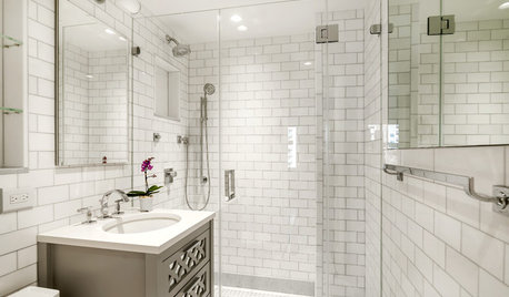
    Vanity: Kraftmaid wall cabinetry, installed as floating vanity
    Countertops: Exotic Granite
    Sink: Kohler's undermount
    Tub: Kohler's Tea for Two
    Toilet: Kohler's Escale toilet
    Faucets: Hansgrohe Massood Series
    Mirror: by Kohler
    Tile: 12x12 Marble and 1x1 Marble mosaic by Jeffrey Court
    Pendants: by Illuminating Experiences

  • 16 years ago

    WOW!! What a good friend you are. Looks GREAT! I like the rich colors and contrast. What wood and color is the Kraftmaid vanity?

  • 16 years ago

    Omigosh, what a difference! Beautiful. I especially love that faucet, but the rest of the bathroom is gorgeous, too. You must be thrilled every time you walk in there. Congratulations.

  • 16 years ago

    I love it...beautiful job...nice mix of materials and those shelves are really nice. GREAT JOB!!!!

  • 16 years ago

    Very, very nice. Our bathroom will have a similar layout, so this is good to see. I was considering having the sink to one side of the vanity, but it was recommended that we should center the sink. How do you (your friend?) like the location of the sink? Is the door swing ever a problem if someone is at the sink? I like the layout of the shelves very much. Though we will go for a wider mirror. The counter and the floor are beautiful. Thanks!

  • 16 years ago

    It was more important to her to have more unobstructed counter space. This is the guest bathroom that serves the three bedrooms (they have a masterbath en suite, and a powder room on the main level) so I dont think that there would be an issue of having multiple people in this bathroom at the same time, so the door swing isnt a problem for her and her husband And, its just the two of them living in the home.

    The cabinet finish was Kaffe

    We went with that mirror because having the sink closer to the wall limited the size we could have.

    Thanks so much for all the feedback!

  • 16 years ago

    That is really lovely! I particularly like the tile pattern in the tub area.
    My question is-- is that wood on the outside of the tub? if so- how does that work? I would be afraid of having it look very much less lovely after some use. (we are not gentle people)

  • 16 years ago

    This is beautiful! Would you mind commenting on the splash factor with the faucet and the shower? I have similar plans but without the tub and wonder about splashing. Additionally, I would love to steal the faucet idea if it is both lovely and practical. Great job!

  • 16 years ago

    Stunning. Looks like something you'd find at a luxury hotel. Do you do this for a living? Great job.

  • 16 years ago

    Very very nice! It has a "masculine" feel to me. I love the shelf for the towels over the toilet. That's a great feature for a guest bathroom.

    One question. Is the sink installed in the right direction? Most sinks I've seen have the holes for the overflow drain closer to the vanity edge so they aren't so easily seen. Just curious.

  • 16 years ago

    To answer your questions.....

    Yes, the sink is installed correctly per Kohler's specs. It is really a more traditional sink, as it is usually paired with a traditional suite in Kohler's advertisement, so I am wondering if showing those overflow holes adds to the "old worldness" that the sink design fits into. I selected it because the husband insisted on having overflow holes, while most of the more modern square sinks dont have them.

    As for the faucets, the tub spout can splash just a little if the wonder is turned on really high. But the sink faucet doesnt, becuase the water flow is very similar to Kohler's laminar flow, which allows the water to come out smoothely no matter how high you have the faucte turned on.

    And the material on the face of the tub is a laminate wood material that is typically installed on floors where you want the look of wood, but maybe cant have it. So, its great with water, but give the look of real wood to resemble that of the vanity wood. It is bascially adhered to cement board behind it, much like how you would install tile in wet locations.

    I dont really do this for a living right now....I am an Architecture student in m last year and I have had a few friends and referrals for a couple of bath and kitchen projects. I wanted to post them to get feedback becuase I seriously want to do this full time becuase I absolutely love it!

    If you guys like, I could add a few more of the bathrooms Ive done....my goal is to get as much feedback as possible to my strengths and weaknesses to improve my work.

    Thanks again!

  • 16 years ago

    The wall tile is actually just a 12x12 tile with bands of 1x1 mosaic inserted in between. The contractor actually SCORED the 12x12's to give the illusion of there being 3x12 pieces of tile in a parquet pattern! I originally designed it with the intent of him actually cutting the 12x12's into 3x12 pieces and then installed. But he was able to score them and save time....but he did fill the score lines with grout to protect from water!

  • 16 years ago

    Really breathtaking...my only intial thought was that it would have been nice to use that extra countertop as a makeup station. It could then be used both for extra counterspace and as a makeup vanity. Of course, you would lose the extra cabinets but in a guest bathroom, how much storage do you really need?

  • 16 years ago

    You've done a wonderful job in there. It's so many million times better than the before, I can't believe it. My favorite thing in the room are the "chunky" wood shelves. Just love them. And they work great with the vanity. Is there lighting underneath that vanity?

    If I had to pick a nit, the only thing I would say is that it feels like there a little too much pattern going on in the room. Between the very busy countertop, the (incredible) textured floor and the busy-ness created on the back wall of the bath tub, I think it's a lot to put in a small space. That said, everything else in the room is very calm, soothing and simple and so I think it's OK.

  • 16 years ago

    WOW! What a difference. LOVE IT. Excellent job. Did you make the shelves or buy them? Can you tell me how deep they are? They don't look very deep - but seem to hold the towels just fine. Are they full size towels? Again, GREAT JOB! :-)

  • 16 years ago

    Overall, very nice. I'd be delighted to have this bathroom as is.

    The only changes I would have made at the design phase (I would not change them now) would be to have either the granite vanity top or the tile floor. Both are nice, but I'd prefer one of the two to be less patterned, perhaps even a solid color. Also, I prefer a spigot over a waterfall faucet.

    Could you give a rough order of magnitude for the cost of this renovation? And, did it include new drywall and floor underlayment? We're currently planning the renovation of a similarly sized bathroom.

    TIA

  • 16 years ago

    Personally, I dont think there is not enough room for a makeup station. Although it is a guest bathroom for them, new homeowners, if they ever were to resale, would appreciate the storage.

    The shelves are just filler boxes with stock pieces inserted in the sections where there is a gap at the top. They are approx 8" to 10" deep.

    The product for this bathroom was about 15k, including the measure and install for the both the granite countertop and the frameless glass panel for the shower. But keep in mind, the faucets were Axor Hansgrohe (Hansgrohe's more expensive line), all the tile was marble, and even the pendants were not fairly cheap (I believe 400 each) I think the only thing really affordable item was the vanity cabinets. Im not sure about the labor costs, but I am assuming it was between 10k and 15k....this is in the Northern VA area, right outside of DC, so labor here is always more expensive.

  • 16 years ago

    Are the 12" x 12" tiles marble or a shell limestone (travertine)? They look like a Caspian Shell tile I saw recently at Daltile.

    TIA

  • 16 years ago

    Nice job, I always appreciate contemporary work. Since you are asking for comments and critiques here is one. I usually like custom vanities because you can get the layout and dimensions you want and, most importantly, because modern cabinets usually have slab doors, you get the grain to align across door and drawer fronts, whether you run the grain vertical or horizontal. You should make this clear to your cabinet maker. This simple feature really elevates the refinement of the job. Our first completed bath has a floating vanity in rift sawn white oak, natural finish, the second bath will have something dramatic such as zebrawood, also run horizontally. Pix will eventually get posted when I find my camera.

  • 16 years ago

    Hi there . . .

    We're looking at the 6' Tea for Two tub, but we can't find one in our area to sit in . . .

    So I have to ask . . . is it comfortable?

    Thanks!

  • 16 years ago

    The 12x12 tiles are a polished marble, well at least thats what they were listed under, not by Daltile, though.

    That is great that your custom cabinet maker is able to make the grain line up, but unfortunately these werent custom cabinets....they are store bought Kraftmaid. I ordered refrigerator depth wall cabinets and (2) 24" drawers and came up with this configuration. And like Kraftmaid, alot of stock or semi custom cabinetry lines (Omega, Embassy, Bertch, Legacy, etc) only offer vein alignment if the slab doors are a veneer. With the wood doors, they typically have the grain going horizontally on the drawer front and vertically on the door front and have battens on the back to help not to buckle, bend, and warp.

  • 16 years ago

    Love it! Had to call DH to tell him about the scored tile--what a clever idea.

  • 16 years ago

    rockymountaindad..

    I have not had the pleasure of actually taking a bath in the tub, so I havent sat in the tub for an extended period of time, but I sat in it briefly in the showroom and yes, it was extremely comfy to sit in.....I especially do like the slope of the tub, its not too extreme or too straight, its great for leaning back.

    I also like how the slope curve into the edge of the tub, so if you were to rest your head back, there is not "bump up" or "step up" where it would be uncomfortable on your neck.

    Thanks cat mom!

    Hope this helps!

  • 16 years ago

    Very pretty elements in the bath. Bathrooms are expensive aren't they 15K for a guest bath that small.

    Since you are truly asking for feedback and trying not to take things personally so you can get future work professionally - I'm going to have to firmly agree with another poster that while the countertops and wall/shower/floor tile are both seperately beautiful elements of the room - together in one room there is too much pattern. One should have been a solid/smaller pattern, different material/texture and the colors don't seem to relate to me at all. Just like mixing fabrics in the same room there are some challenges with pattern and scale when doing so.

    I am sure it is hard to guide the "clients" since they are your friends and they know you are not a pro yet. So, I saw that you used the explanation in another post when responding to criticism similar to this in a different bathroom project by saying that the friends/homeowners picked out ORB finish and funky placement locations for the bath faucet. Those were pretty obvious issues for me in that bathroom too and you got a little defensive when critized by a real estate pro on here.

    I understand that you didn't make all the decisions but, if you are going to use these projects in your professional portfolio, maybe you can get some feedback from some of the professional decorators/designers on this board on how to avoid attaching your reputation to these design issues while practicing and building a portfolio. Sure homeowners don't always listen to the designers and sometimes go another way but, I would think there is a way to firmly help them not make big mistakes especially ones like those corner tub fixtures that really could hurt someone in a serious way! YOu don't want to be known as the designer who killed the client when they were impaled by their tub fixture when they jumped out to answer the phone. LOL.

    Keep on posting and don't take things the wrong way from the posters here. If you ask for feedback (sometimes when you don't) on here you are going to get all types of opinions. Remember they are personal opinions and everyone is trying to be helpful whether you agree with them or not. Like me I tried to word this as gently as I could and spent 30 minutes of my day responding to help since you asked for feedback and I thought it would help.

    Post some more and good luck! what a great career path and oh to have friends with money they will let you spend decorating their houses.

  • 16 years ago

    Hi!
    Its got a great feel to it. I too love the pattern in the shower area. Very luxe.
    Can you provide the supplier or fabricator for the frameless shower screen and approximate cost?
    Also did that tea for two tub come with an intergral tile flange?
    Now for what I might suggest as opportunities for improvement.
    I don't love the countertop, the pattern is tough for me but what really bothers me most is the height of the backsplash, it just seems to add too much weight and seems unnecessary.

    I also really hate when electrical outlets become focal points... I make my guy move them either next to the light switch or to a spot where they are convenient, but the eye isn't immediately drawn to them. I know it sounds like a small thing, but for me they detract from the great style.

    Thanks so much for sharing your great style!

  • 16 years ago

    Very nice bathroom. There are a lot of very nice touched in it.
    If we are all being brutally honest, I'd have to agree about the counter/floor/tile combo. They are all very nice materials, yet there just may be too much busyness for a room that is meant to be a place to relax (hence the sweet tub).

    I did not notice the outlet at first glance, but now that it was mentioned, it does kind of stick out. Maybe they can put a free standing towel holder or tall lotion bottle in front to hide it a little. Maybe a darker color or faux paint for it would help.

  • 16 years ago

    My first impression was very favorable. After continued inspection, I agree that the counter/floor/cladding combo is too busy.

    The only other thing that bothers me is the partial glass wall on the tub. Am I seeing it correctly that it is fixed and it will act as a partial splash shield? If so, (here's the brutal part) I hate it. Why? Because it would be difficult to reach and clean the shower end of tub area, and I would have no faith that the shield would catch the whole splash. If I am not seeing it correctly, and it is a full sliding glass enclosure, I still hate it for the cleaning access reason.

    Please focus on the positive, and take the negative as a constructive comment!

  • 16 years ago

    Pamelah, thank you for you response. Yes, it just a piece of glass and not a sliding door. And youre right, it doesnt catch all the water. Its more of a European idea, where you shower out in the open (next to the toilet!) without anything, not even a shower curtain. I always explain this to clients and the few that dont mind having to clean up the extra water, love the idea of just having the "walk-in, open shower" even in a bath tub setting. I have a client that did a "walk in shower" with just a fixed panel near the showerhead and he mentioned friends of his remarking about the water, but his response what that he's traveled the world and stayed in the grandest of hotels, and he actually prefers the walk in shower!

    southerngalinnyc....thanks, I too love the tile pattern! The fabricator of the glass panel was Bel Pre Glassworks in Maryland. The cost was about 1200. It was starfire glass, not standard, and it has the permashield treatment.
    The backsplash is as high as it is becuase of the wall mounted faucet. We both prefered to have the faucet cut through a piece of the countertop than thru drywall. Sometimes, I've tiled that space as well.

    Thanks again!

  • 16 years ago

    I like it, a lot of thought went into the details.

    The only thing I don't like, and I have to say I actually despise them, is the glass half-panel on the tub. I travel to Europe quite often (just got back from Cairo today. I know, Cairo is "not" Europe) and those half-panels are just so ineffective at catching water.

    I'd say it's okay to use them if the floor was detailed as a wet room floor, waterproof membrane under the tile, the toilet flange sealed to the tiled surface, etc.

    But good lord, I always end up with a monstrous puddle that takes a couple of towels to soak up. And that's when I'm being careful!

    A big concern would be if the toilet isn't caulked to the tile, or the toilet flange isn't sealed to the tile underneath the toilet. I work in jurisdictions where it goes both ways, you're required to caulk, and you're required to not caulk.

    If the toilet is not caulked, I'd be very concerned with shower water pooling under the toilet and getting to the subfloor around the toilet flange. Again, it depends on how it's detailed.

    I like the underlighting on the floating vanity. I do add a diffuser panel to soften the light so you don't get the "spotlight" reflections off the gloss floor tiles that your photo shows. It gives a nicer, more diffuse glow. Put it on a dimmer, or add a second low-wattage circuit, and you have an excellent night light.

    It's hard to tell, but are the three cans in the shower centered off the shower head, or are they closer to the back tiled wall to wash the wall with light?

    Excellent use of odd numbers with regard to the horizontal mosaics in the shower; 1-3-5-3-1.

    Excellent thinking having the shower supply valves on the accessible or open end of the shower so the water can be turned on without having to do a big reach around past the glass panel.

    I like that the rows of floor tile line up with the wall tile on the back of the tub.

    I'm being hyper critical here, but I'm not sure if I like the movement or "large" pattern in the granite countertop. I like the color okay, but I think I'd have preferred something with a lesser, or finer pattern. Even getting close to no pattern at all or closer to monochromatic. The floor tile has a subtle pattern, I think the countertop is too overwhelming and wild when compared to, if I can put it this was, the more refined look of the floor tile.

    Again, I'm being nit-picky. Don't think that I don't appreciate your work, because you have things in there that show an excellent grasp of common sense design.

    Nice job.

  • 16 years ago

    Mongoct, totally understand the issue of the glass panel not catching all the water from the shower. To reply to some of your questions..

    Yes, there is cement board as well as a waterproof membrane underneath ALL the tile. The toilet is grouted and caulked to the floor tile.

    The lights under the vanity are on a dimmer, and actually they are their version of a nightlight!

    The three lights in the shower are centered on the width of the tub/shower...the polished marble just reflects so much light they appear to be closer to the wall.

    I am starting to see what everyone is talking about, when it comes to the combination of the busy granite and floor tile!!!!!

    Thanks again for you critiques....!

  • 16 years ago

    i did not read all the posts, I think the door knob should be a lever! I think the floor should incorporate the tiny listello in shower somehow. Nice job!

  • 16 years ago

    A lot of really beautiful decisions all around. I really like the whole room and it is beautiful, clean and contemporary. Beautiful use of tile, texture and pattern in the shower. I too noticed the wood grain direction on the cabinet but that is because I am looking for a carpenter now for very similar cabinet with "like furniture specs". I am trying to find someone that understands Danish furniture as a reference for clean lines and workmanship. I think more storage the better and I like the cabinet very much. Can I ask you, how did you hang it from the wall? I do have a side wall like you do. I understand your clients need to have a clean run of open counter. A new door handle would have been nice, cause the room is so nice. I think you did a great job and having grown up with an Architect I can see you have a great eye for detail. Good luck and please post your other photos, in doing my bathroom I am now kind of a freak for bathrooms, weird!

  • 16 years ago

    Very beautiful bathroom. I particularly like:

    --the lights over the tub/shower
    --the sink and faucet are fabulous
    --the clean lines and the opening up of the space

    Thank you for sharing these pictures!

  • 16 years ago

    My counter is actually like this in the house we are finishing this next week, can you please tell me where you go the shelves over the cabinet,, that looks great and would love to do it in our bath. thanks

  • 16 years ago

    jjaazzy....the contractor most likely installed extra wall studs, vertically and horizontally behind where the vanity would hang, both on the back wall and the side wall. He may have also purchased a metal horizontal floating cabinet mechanism (for the life of me I cant remember the name right now), where you attach one strip to the wall studs and attach the other to the vanity cabinets (after they have been screwed together side by side) and then the strip on the cabinet slips into the strip on the wall, then thats screwed into each other....very similar to the hanging mechanism used on IKEA cabinets (but I dont recommend theirs exactly).

    I said "he may have"... because in the drawings, I specified different techniques and those are typically the two I suggest, used in conjuction with each other, for this size vanity...no, I dont recommend this for an entire wall of kitchen cabinets...just had to say that just in case someone interprets it that way..LOL!

    The grain is the not continuous on all surfaces becuase these are stock cabinets, just moldified for this application and custom cabinets with the continuouse grain just didnt fit our budget, but would have been lovely!

    kimgill, those shelves are actually wall filler boxes from the cabinet company that were cut down to width, and then filled with filler stock with the opening was. Its hung from the wall by simply installed a wall stud horizontally, then the filler box (with its open back) is slipped over the stud and screwed together. Fairly easy install, since its only meant to hold light wait items such as towels, etc....heavier items will require more support.

    Thanks for all your responses!

  • 16 years ago

    It's easy for one to sit back and say you should have done this and should have done that but "I" fully understand that decisions are made to keep costs in check. I don't think anyone has bottomless pockets. With that said I am not conveying that it looks like corners were cut quite the opposite. The space turned out terrific and I know the homeowners are going to really get a lot of compliments showing it off. Keep up the good work.

  • 16 years ago

    Thank you very much!

  • 15 years ago

    why aren't the pics up anymore? :(

  • 15 years ago

    No pics? What a let down.

  • 15 years ago

    No fair -- I want to play!!

    Where are the pictures?