

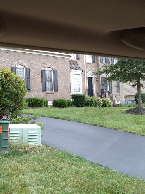
Does this brick go well with that shutter?
12 years ago
Sort by:Oldest
Comments (13)
Related Stories

INSIDE HOUZZHow Much Does a Remodel Cost, and How Long Does It Take?
The 2016 Houzz & Home survey asked 120,000 Houzzers about their renovation projects. Here’s what they said
Full Story
FEEL-GOOD HOMEDoes Your Home Make You Happy?
How to design an interior that speaks to your heart as well as your eyes
Full Story
REMODELING GUIDESBathroom Workbook: How Much Does a Bathroom Remodel Cost?
Learn what features to expect for $3,000 to $100,000-plus, to help you plan your bathroom remodel
Full Story
MOST POPULARWhen Does a House Become a Home?
Getting settled can take more than arranging all your stuff. Discover how to make a real connection with where you live
Full Story
FUN HOUZZDoes Your Home Have a Hidden Message?
If you have ever left or found a message during a construction project, we want to see it!
Full Story
ARCHITECTURERoots of Style: Does Your House Have a Medieval Heritage?
Look to the Middle Ages to find where your home's steeply pitched roof, gables and more began
Full Story
LANDSCAPE DESIGNDoes Your Landscape Need a Little ‘Cosmic Latte’?
Beige — the color of the universe — can be both building block and backdrop in a contemporary garden
Full Story
DECORATING GUIDESVintage Modern: What Does It Mean?
Objects With History Warm Up Clean Lines in Fresh, Eclectic Interiors
Full Story
WORKING WITH PROSGo Beyond the Basics When Interviewing Architects
Before you invest all that money and time, make sure you and your architect are well matched beyond the obvious levels
Full Story
COLORExterior Color of the Week: Go Navy!
It’s daring and dramatic, but also a neutral. And it looks fantastic on almost any home
Full Story
Sponsored
More Discussions

luckyme7Original Author
luckyme7Original Author
Related Professionals
Gulfport Architects & Building Designers · Cape Coral Design-Build Firms · Sheboygan Design-Build Firms · Roswell Design-Build Firms · Eureka Design-Build Firms · Scottsbluff Design-Build Firms · La Grande Design-Build Firms · Rock Springs Design-Build Firms · Dayton Home Builders · San Marcos Home Builders · Alexandria Home Builders · Fergus Falls Home Builders · Bakersfield Home Builders · Merced Home Builders · Eugene Home Builderscarsonheim
luckyme7Original Author
mrspete
worthy
mrspete
divine_serenity_gw
carsonheim
carsonheim
carsonheim
carsonheim
nepool