Software
Houzz Logo Print
cj47_gw

Question 1: How would you run this backsplash?

15 years ago
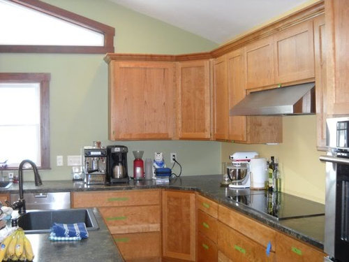
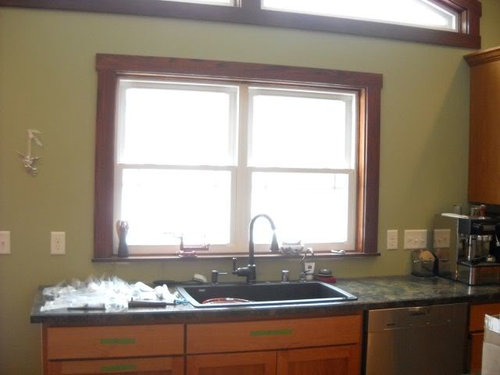
I have a backsplash picked out, I think. It's a simple subway tile in a deep beige with a crackle finish. I couldn't snap a picture of it, I had to return the sample. (If anyone thinks this is a mistake, feel free to chime in on alternatives). It's about the same color as the gold-brown in the countertop. The question is, how should I run it? The cooktop wall is easy--it'll be covered. But when you come around the corner and the cabinets stop, then what? Would you just extend the backsplash at cabinet height to the end of the run on that wall? Or drop it to window sill height? I'm hesitant to make it level with the cabinets because it would break up the open space on that wall. However, it might look odd to drop it down to windowsill height. I do want it behind the sink, for obvious reasons. What would y'all think?

Thanks,

Cj

Cooktop wall, shows how the cabs come around the corner and then stop under the trapezoid window.


The rest of the sink wall

Comments (17)

  • 15 years ago

    Oh my what a dilemma you have. Automatic reaction would be to leave it at cabinet height and then drop down to window sill height but then what do you do on the other side of the window - go back up to cabinet height to the end of the counter? But then I noticed all of your switches and all the cutouts that you would have to do so now I think maybe drop it down to window sill height at the end of the cabinets and run it across to the end of the counter.

  • 15 years ago

    That's tricky. Maybe some of the photoshop whizzes will come along and mock up some options. My thought is to actually raise the height of the BS around the sink: higher than the sill, higher than the bottom of the cabinet -- maybe around the mid-point of the window sashes. You could get outlet and switch plates that blend into the BS.

  • 15 years ago

    I would just do it all at cabinet height (Except obviously around the stove). It will keep a nice clean line and won't look funny at all in my opinion.

  • 15 years ago

    I would either do it cabinet height all the way around, or as jakabedy said, up to where the dividing rail is on the window sash.

    I think if you drop down to window sill height it will look a bit skimpy. It also gives you the opportunity to deemphasize some of the outlets.

  • 15 years ago

    Another option: Go up so it's even with that you run up under the hood and put a bullnose or trim piece on the top. So it looks like it's even around the kitchen with the windows and cabinets set into it. I had a similar dilemma, but worse, because I have no uppers on my window wall to gauge by, and I finally decided to do more tile on the wall rather than less. --But of course it's not done to show pics.

    I think it would look as expected (not at all odd) if you kept it at cabinet height.

  • 15 years ago

    I wold have it just below windowsill height until it reaches the cabinet line, then run it below the cabinets the rest of the way.

  • 15 years ago

    What is to the left of the window? Is there a doorway, a fridge, long wall? It would be easier to know where to stop, if your picture showed a little more wall to the left :)

  • 15 years ago

    I would extend the backsplash at cabinet height to the window, drop down to sill height under the window and continue at sill height to the end of the countertop.

    Be sure to use tile from a manufacturer that provides a bullnose edge along both the long as well as the short side of the tile so that you'll have a finished egde along the top row between the cabinets and the window as well as at the end of the countertop tile run. Not all manufacturers do this.

  • 15 years ago

    Lavender Lass, I'm sorry--to the left of that counter is about a foot more of wall and then the back door, which is full glass.

    I really like the green, and I like the open look of that wall. I'm hesitant to tile higher than the cabinet bottom--hence I'm considering dropping it to the windowsill after the cabinet run. I have pretty things that I'd like to hang in the wallspace around the window. BUT....I really don't want it to look skimpy, either. I've never had a nice backsplash before, so I want it to look good. I'll try and get a picture of the sample tile, believe it or not they only have ONE tile. LOL...hard to make a decision with that. I wonder if taping some paper on the wall for a visual might help.

    Thanks everyone.
    Cj

  • 15 years ago

    The folks who are saying drop it down to window sill height are making it too low. I have an odd-ball corner where it wasn't clear what to do with the backsplash, and my KD put in just enough tile to go above the switch plate.

    It's so nice at clean up time--hands reaching for switches in the kitchen are often dirty, and tile cleans so much easier than wall.

    Keep the backsplash at least a bit higher than those outlet and switch plates.

  • 15 years ago

    Cj- Thanks, that does provide a clearer picture.

    All things considered, I would keep the backsplash the same height, as under the upper cabinets, around the stove area. If you continue this around the window, it will look nice and keep the outlets easier to wash (as mentioned above).

    I think your kitchen is going to be beautiful! My mom has a green kitchen and she loves it :)

  • 15 years ago

    cj, I think you should run the tile at the bottom of the cabinet height all the way across. I would put a small trim tile on the top edge of it.

    cj, can I ask you what hood you got?

    Your kitchen looks great
    Corrie

  • 15 years ago

    This is what you should and should not do:

    1) Do not run it at cabinet height from the cabinets to the window. Its too much of a straight line. Also, when the tile is laid you have to make sure you have a full tile at that point. You need to wrap the tile up and around the end of the cabinet. See #2.

    2) At the end of the cabinet run DO extend the height of the tile by one or better yet two tiles ...Play around with this to see what looks good for you. Run this line right over to your windows. Cap it with some trim piece, either bullnose of a cap rail. This is a good place to put a little trim piece and then the cap rail.

  • 15 years ago

    I would suggest a thin contrasting bullnose trim piece in another color that is in your counter (or from your wall color). I'd drop it down to just under the switchplates/outlets.
    I'd make it a design feature rather than a problem you worked around. You could also use liner tile within it or even just as a frame behind your range in the same contrasting color.

  • 15 years ago

    This is a good example of what I mean. In this case, with the vintage canisters and color, and high contrast b&w, it looks old fashioned. Done with different color combos, it takes on another look entirely.

  • 15 years ago

    Dianalo, I love that look! I'm going to have to go back to the tile shop and poke around a bit more.

    Corrie22, thanks! My hood is a Vent a Hood.

    Lavender Lass, thanks. It's coming along. Can't WAIT to post full pictures of everything. Right now they're installing the hardware.

    Janet--dirty hands, that's a good point...

    Thanks to everyone for all of the opinions and suggestions--some of which I hadn't thought of! I need to think about this a bit more..and shop more, too. Just when I thought it was DONE!!

    Cj

  • 15 years ago

    I had the same thought as rhome410, tiling the window wall to match the height of the tile under the hood. I like the look of the window being "cradled" by the tile. dinalo's picture is jennifer garner's kitchen. It is beautiful!

    Here is a link that might be useful: jgarner53

Sponsored
Hope Restoration & General Contracting
Average rating: 4.7 out of 5 stars35 Reviews
Columbus Design-Build, Kitchen & Bath Remodeling, Historic Renovations