Software
Houzz Logo Print
pps7_gw

Dining room built ins layout....

16 years ago
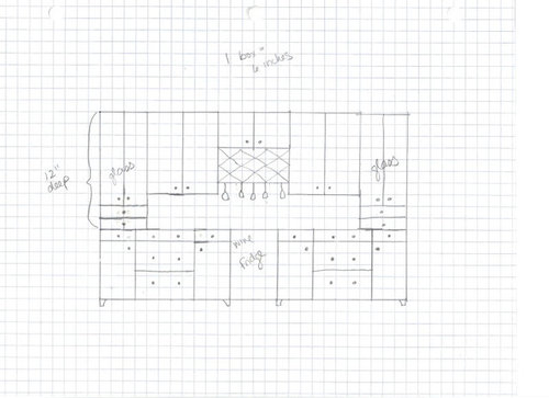
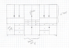
We have a wall of built-ins in our dining room. The space will serve as a butler's pantry. Trying to give it as much of a furniture look as possible. Any suggestions?

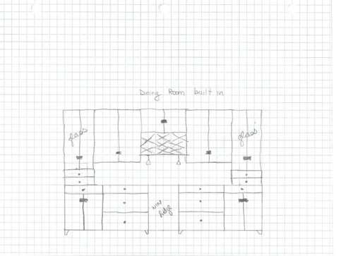
Here are the 2 options I have so far:

Option 1:

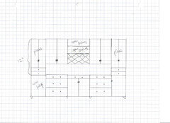
Option 2

Comments (12)

  • 16 years ago

    I like option 1 better, but if you want a real furniture look then maybe go for two asymmetrical pieces? Like take the two tall glass portions and put them together on top of one of the drawer bases and then have the lights over winefridge/winerack section be another piece? They don't have to physically be separate, but maybe draw on the people with 'hutch' sections in their kitchen cabinets where certain blocks of cabinets are grouped via depth, style, finish and height into what looks like a standalone hutch. That I think would give the most 'furniture' style look.

  • 16 years ago

    I think you need some more shapeliness for the furniture look. Are you using stock cabinets? Or custom?

    Putting your glass front cabinets together to form kind of a suggestions of a hutch would be good. The wine rack in the middle like that gives it too much of a look of a kitchen wall with hood. Do you need it for extra wine storage? Or was it for the variation? How about a tall, skinny wine holder, instead?

    In the first layout the small, counter level drawers that are wider than the lower cabinets throw the whole thing off balance. It's also odd in the second one, but at least with the double doors it's not top heavy. Are those drawers wider than the cabinets that are sitting on them?

    I agree with Brickton that a little asymmetry would help, unless you really really like mirror symmetries (some people do, though most people prefer more organic shapes). I think the wine fridge in the middle is jarring, especially if it's going to be glass front, rather than cabinetry. If it were offset, it would look a lot better.

  • 16 years ago

    I don't mind the wine storage as much as I mind the wine glasses hanging down -- i think of that as more of a bar look and I think you'll use it for a lot more than a bar. perhaps it will be a dinner buffet or a coffee and dessert buffet too. i think i would also put the glass in the 2 36" wall cabinets instead of the end ones. And since you'll have a wine fridge, how about just an open cabinet where the criss crosses are now...

  • 16 years ago

    I met with a designer yesterday over updating a similar wall of cabinetry in my LR. She suggested we end the run short of the side wall on each side. And use a crown that returned to the back wall. That those elements would achieve a "furniture look".

    She actually used that phrase, and here you ask the exact question. Go figure.

  • 16 years ago

    Thanks for the feedback. Something felt off- I just couldn't figure out what it was. I do want it somewhat symmetric. I am somewhat limited b/c these are stock cabinets. Here's what I've come up with:

    Option 3: (I can keep the wine rack or just have another open shelf)

  • 16 years ago

    Are all the upper cabinets 12" depth? How deep are the lower cabinets and what will you be using the open space in the middle for? I was going to do something like this and my designer suggested bringing the upper cabinets down to the counter top to get more storage space because he felt the counter was too deep. I will use the resulting 14" deep counter top for buffet serving. The doors will be split (and on touch latches) but the shelves behind them will be all adjustable. He split the doors so that when I had anything on the counters, I wouldn't have to remove it to open the top doors. I also plan on using one of the bottom cabinets to store my larger trays, boards, etc. vertically. I read on this site that is a good idea to measure what you plan to put inside them to make sure they are deep enough. That was a good piece of advice that saved be an "I wish I had" in the end. Also where are you planning lighting for this built in?

  • 16 years ago

    You may be able to enhance the furniture look by bumping out the three center sections by 3" (the countertop section and the uppers). Then you could put separate feet (maybe even counter corbels) on the front of that center section. It might be fun to mock up a design with different cabinetry for the center forward sections from the slightly recessed side sections. Perhaps also try plllog's idea for glass doors in the center and solid on the sides. That's a very big unit to look like one piece of furniture, but it's going to give you SO much storage!

  • 16 years ago

    What style are you thinking of?

    Something helpful might be to look at pictures AND MEASUREMENTS of pieces in the style you'd like to emulate. To me, the most successful furniture style pieces use furniture dimensions, not cabinet dimensions. They become architecture in the room and not something stuck on (not saying you're doing that). It'd be nice to see a room plan or photo of where this is going.

    Try to list some elements from the photos that you like - a thin molding around the base, an ogee routed on a kidney shaped top, sleek doors, line or materials, etc.

  • 16 years ago

    bmorepanic,

    sorry about the lack of details. This is kind of a spin off. I've linked the original thread below. The cabinets will be a medium brown stain in an inset shaker style. I will use ORB latches and plain knobs. I know I'm somewhat limited in that it's a long span. And b/c of our budget restrains and cabinet co restraints. I just want it to look nice- I know it's not going to be anything spectacular. I hope it's a nice entertaining space.

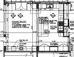
    Here's the floor plan.

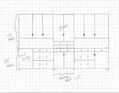
    smiling, I had the same thought. putting a piece in the middle with a 3" bump out.

    Here's what I came up:

    Option 4:

    Option 5: (center "hutch is bigger 48")

    Here is a link that might be useful: original thread

  • 16 years ago

    I like the proportions of option #3 the best so far, and I'm wondering how it would look if you tried this,
    1. Leave the far right and far left stacks as is, except change the glass doors there to solid shaker.
    2. Bump out each of the three center sections by 3", leaving a nice run of unbroken counter for serving and display.
    3. Try making the doors glass in the three center sections.
    4. Add bracket feet to frame the center.
    5. Try a very simple crown molding across the tops.

    It's just my individual taste and opinion, but I think with option #5 you might need to paint the center 48" hutch a different color to set it off properly. Again, just my own taste, but I think the 48" hutch is too small for the full length of wall there. It seems to llok better and function better to have a countertop in the center.

  • 15 years ago

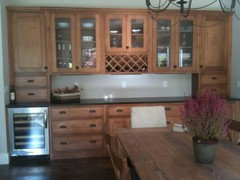
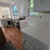
    I just wanted to say thanks to plllog and everyone else for helping he sort this out. Just last night DH was commenting that I did a good job designing the dining room built-ins and I have to give credit where credit is due. Here's the final product: