

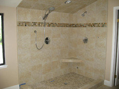
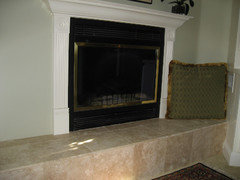
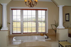
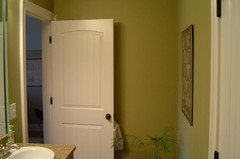
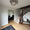
Paint Selection Gone Bad- Need Help. PICS
16 years ago
Featured Answer
Sort by:Oldest
Comments (7)
 16 years ago
 16 years ago
Related Professionals
Cincinnati Interior Designers & Decorators · Laredo Interior Designers & Decorators · Winona Interior Designers & Decorators · Oshkosh Interior Designers & Decorators · Yuba City Interior Designers & Decorators · Southaven Kitchen & Bathroom Designers · Portland Kitchen & Bathroom Designers · Superior Kitchen & Bathroom Designers · Yuma Kitchen & Bathroom Designers · Lubbock Kitchen & Bathroom Designers · Wichita Furniture & Accessories · Toms River Furniture & Accessories · North Adams Furniture & Accessories · Jackson Furniture & Accessories · Anchorage Furniture & Accessories- 16 years ago
- 16 years ago
- 16 years ago
- 16 years ago



Related Stories
MOST POPULARRethinking Beige in a World Gone Gray
Gray, the ‘it’ neutral of recent years, has left beige in the shade. But is it time to revisit this easy-on-the-eyes wall color?
Full Story
FUN HOUZZ31 True Tales of Remodeling Gone Wild
Drugs, sex, excess — the home design industry is rife with stories that will blow your mind, or at least leave you scratching your head
Full Story
HOUZZ TOURSMy Houzz: 1921 Portland Bungalow Gone Glam
Vintage cabinets, pastel colors and creative flair outfit a cozy jewelry and mixed-media artist’s home
Full Story
FUN HOUZZ12 Signs Your Coastal-Style Home May Have Gone Overboard
Accessories conjuring the beach often start innocently enough, but if you've framed your flip-flops, it may be time to reconsider
Full Story
COLORPick-a-Paint Help: How to Create a Whole-House Color Palette
Don't be daunted. With these strategies, building a cohesive palette for your entire home is less difficult than it seems
Full Story
COLORPick-a-Paint Help: How to Quit Procrastinating on Color Choice
If you're up to your ears in paint chips but no further to pinning down a hue, our new 3-part series is for you
Full Story
COLORPaint-Picking Help and Secrets From a Color Expert
Advice for wall and trim colors, what to always do before committing and the one paint feature you should completely ignore
Full Story
DECORATING GUIDESDecorate With Intention: Helping Your TV Blend In
Somewhere between hiding the tube in a cabinet and letting it rule the room are these 11 creative solutions
Full Story
HOUZZ TOURSMy Houzz: Saturated Colors Help a 1920s Fixer-Upper Flourish
Bright paint and cheerful patterns give this Spanish-style Los Angeles home a thriving new personality
Full Story
SELLING YOUR HOUSEHelp for Selling Your Home Faster — and Maybe for More
Prep your home properly before you put it on the market. Learn what tasks are worth the money and the best pros for the jobs
Full Story



linda8818