Software
Houzz Logo Print
grlwprls

Combination for Spring

13 years ago
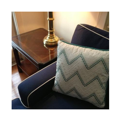
What is your feeling on this combination?

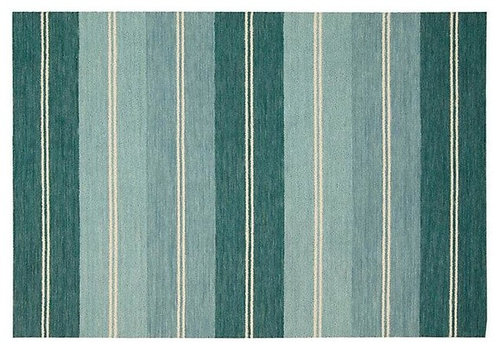
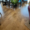
with this rug:

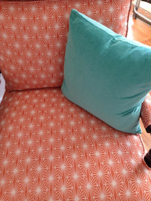
and this cotton velvet pillow on our orange side chairs:

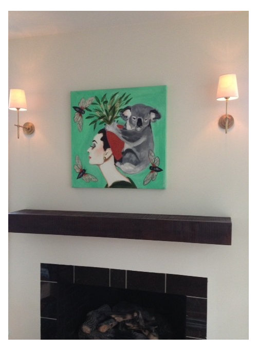
This piece of art is in another (adjoining) room. These teal colors actually *don't* match, but they do coordinate:

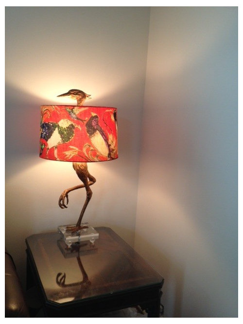
And this lamp is on one of the side tables:

I'm trying to plan the "spring switchover" to brighter, lighter accents. I may be rushing spring a tad, both from a calendar and a weather standpoint, as we have nasty wintery precipitation today.

I'm also trying to avoid a full-on reveal until I finish the initial accessorizing, etc. I'm looking for more of a gut reaction to the combinations.

This house, for whatever reason, has really pushed me out of my beige decorating habit. Our decorating style is "fresh traditional". My husband and I are super preppy and we wear brightly colored, but traditional clothes. We're trying to reflect our personal style in our home in a way we never have before.

Comments (25)

  • 13 years ago

    Wow, I love everything! Especially the first chair, in navy, with that gorgeous emerald (color of the year) pillow! Beautiful rug too! Your artwork featuring Audrey & a koala is very interesting! (Cute!) It all looks so fun, but very high quality at the same time.

  • 13 years ago

    I can always count on you, Stinky! ;-)

    I'm pretty excited about how well this house is coming together (after crying when the furniture was first delivered because I thought it looked crazy). The design center at Ethan Allen was certainly dubious about my choices. But the only thing I don't like is the metal and glass table the designer talked me into because the room *is* small and they really didn't have a petite coffee table that fit our space. I should have just bought a table somewhere else - it seems so clear now. Luckily, the table going to live outside the dining room with the outdoor furniture. The most expensive patio table *ever*! The return policy at EA is NOT the best. That's for sure.

  • 13 years ago

    You might find this segment with Lynda and Suzanne from H&H talking about 2013 trends helpful. It addresses fearless mixing and talks about how it is key to keep going with color and keeping equal weight. Starts at 3:00

    Here is a link that might be useful: House and Home

  • 13 years ago

    Thanks, caminnc. Helpful information. I need to start thinking about how to keep the color moving through my dining room. My foyer features some figurine lamps that belonged to my grandmother - they are bold, but in some ways, I've toned down the things around them because I was talked into it by a designer. Of course, his immediate reaction was to go all French Country with them...which explains his push toward washed colors and seagrass. Not really my vibe in this house. He didn't even like the hot pink tulips I had on the table with the lamps!

  • 13 years ago

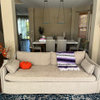
    This is where I am so far. Decorating for the life I have - dogs on the sofa, tween playing Wii - wanting something bright and inviting and not too precious so the child's friends (who tend to have *appalling* habits) can flop (and I do mean flop) on the sofa. Obviously, there are no accessories, the window treatments are the ones that came with the house....and the lighting is bad. Still not quite right. Tweaking. Arranging. Contemplating.

  • 13 years ago

    I like it all too, very much...!
    Can't wait for spring as well~

  • 13 years ago

    Until I saw the whole room I was going to say "No" on the rug, but mercy! That rug is beautiful, and I normally don't like striped rugs.

    All that's lacking is a little tangerine something on the coffee table.

    Good job!

  • 13 years ago

    Thanks for the positive feedback, everyone. Since we downsized from our many parlor-ed New Orleans houses, I really have to accept that the *only* living room has to be family friendly. I have even learned how to read and knit and whatever else while epic battles wage on the Wii. I did get my way about putting the TV into a cabinet. It helps with the "when the TV is off, it's *off*" feeling. And technically, this room is the dining room...so we have a drum shade chandelier to be installed. I also realize that if this were a dining room, I would not be having the "rug crisis" I am having. An 8x10 is the only size that fits in here, but then it breaks all the "legs on, legs off" rules - or it looks like a postage stamp. Eventually, I think I'll just have a custom remnant bound...but for now, I'm just overlooking my leg issue.

  • 13 years ago

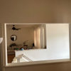
    Here's a more panoramic view of the room. It also gives you a little glimpse into the dining room where the fireplace is located. This room is really small. Barely 12x12, but with tons of doorways: the huge uncased opening, the two 15 lite doors, and the doorway into the kitchen. There were actually *two* doorways into the kitchen when we bought the house, but we closed one off.

    View from the dining room. The current living room is technically the dining room, hence the chandelier. We changed it out from a very scary modern thing and we have extra wire and the additional poles available to lower the fixture if someone wants to make this room back up as a dining room. There is also a pass through from the kitchen right outside the frame.

    View from the kitchen doorway. Yes, I'm breaking a rug rule. After shifting things around, I determined that it was better to have all the front chair legs on and the one sofa leg off. It was far more visually chaotic to have the rug where the chair legs were all over the place.

    View from the street. Apologies about the cheapy blind thingy on the left door but I was trying to minimize the glare. I still need a lamp for the table between the orange chairs. I also need them to finish trimming out the pass through that you can't see so I can finish up the first phase of this room!

    This was my original mood board for the first floor. It's interesting to see what worked and what didn't. For example, the orange rug...just too much orange. And the round rings chandelier - looked cheap, cheap, cheap in real life. And it really soured me from buying things from Shades of Light. I had to pay big bucks to return a very expensive fixture that did not look worth $900+ to my eye. And, made in China. We ended up with a Thomas O'Brien fixture over the dining room table.

    Now, onto the second layer - rehanging the art, getting window treatments, doo dads, etc. But generally, I'm pleased with how it's going. It's bright and cheerful. Generally welcoming. Works for my family and our needs. Is not beige or dirt colored. I did not want to have to live with a big brown sofa because I have dogs and a child. All the fabrics are either outdoor (Sunbrella) or Teflon treated, but they feel great.

  • 13 years ago

    You have the makings of a pretty room, grlwprls. It's going to be fun watching it evolve.

  • 13 years ago

    Absolutely love your room.

    The orange, teal and navy all work. You have taken some chances with color and it ties together beautifully.

    One of my favorite parts of the room is your greek key throw. It gives such visual interest !

  • 13 years ago

    Move the dark lamp from the sofa area to between the chairs! (Or use that dark shade between the chairs if the scale of the lamp isn't right?)

    I just love everything!

    That lamp is KILLER! What's it's story?

    This post was edited by shear_stupidity on Wed, Jan 30, 13 at 12:12

  • 13 years ago

    Shear,

    I suppose you mean The Crane? I got the lamp itself at a designer's consignment place here in Little Rock. It's...ummm...been a controversial piece. People either love it or hate it, but I come down on the love side. The shade is by an artist named Sarah Ashley Longshore; I lived around the corner from her studio in New Orleans. She is quite the character, larger than life really. While that shade is mass produced for Anthropologie, I have two originals paintings by her - you can see one over the fireplace in the dining room.

    The gigantic brass candlestick is actually a tad out of scale for where it is now, although generally, I love lamp! ;-) It would be even more gigantic poking up into the pass through to the under renovation kitchen. I am hoping that a shorter harp might help it in the corner. I need to get over to the lampshade shop one of these days.

    One thing I need to work on is window treatments. It seems to me that when people have plantation shutters (which is what I will be installing to limit my view of my very close neighbor) they don't have draperies - even just stationary panels. I need to look on Houzz and see what I can do. I don't love the idea of a big white square on my wall!

  • 13 years ago

    Your rug looks like one that I have been considering. Would you share the source?
    Also, I would love to know all the particulars about those orange chairs! I don't think I can use orange because of my DH's burgundy leather recliner, but the fabric is so gorgeous, Id like to find it in another color.

  • 13 years ago

    One of my friends has plantation shutters and full-length draperies on all of her windows. She doesn't ever open the shutters, except for washing the windows, just adjusts the louvers for the light level. I've never seen the draperies closed, but they could be.

  • 13 years ago

    I picked up the rug at One King's Lane; it's a Barclay Butera "Marlon" rug in Seaglass, but Neiman Marcus has it under something called "Villa Stripe." It comes in a navy and a rust/orange colorway as well.

    The orange fabric was in a book at Ethan Allen. It's called "Brandy Salmon" but don't ask me why! It also comes in a cream/spa blue colorway. I'm not sure who the actual manufacturer is, though. A lot of the fabrics at EA are actually Robert Allen's. This one on the chair is a heavy use, teflon treated. So far, so good standing up to the family.

    Thanks for all the positive feedback. When I ordered all these pieces at EA, the designer was a tad dubious about my choices. And so was I when they were delivered and plopped down in my space. Especially because the designer was concerned that the colors together would say "college sports team" and the reason we had picked out the blue and orange was...because of a college sports team :-). I don't think the result screams "We're University of Virginia fans!" though.

  • 13 years ago

    I like your color combo and your design philosophy. I agree with oakleyok and all the room needs for a magazine photo is a vase of orange flowers on the coffee table. Of course that wouldn't be a 'kid friendly' accessory but would look great in a pic!

    Love your lamp, it's a one of a kind quirky accessory which too many shy away from but that can make a room.

  • 13 years ago

    Very cool! Love the crane and rug, especially. More important, the dog likes it. ;)

  • 13 years ago

    I love it!

    I love the puppies too. Cockapoos?

    I know you love that crane, so do I. But, with this color combo going on, have you considered a different shade? I would love to see an orange one with a pattern on it. Just for fun.

    not necessarily this one, but just to show you what I sort of mean

  • 13 years ago

    I'm sorry, beekeeperswife... no offense intended:

    But grlwprls, don't you DARE change that shade!!!

  • 13 years ago

    Oddly, the shade *is* orange when the light is off, but it gets a tad red when it's on.

    Those dogs of mine are just spoiled rescued pound mutts, Bee. Poodle in them both, for sure, but what they got mixed with is anyone's guess.

  • 13 years ago

    oh well it all makes sense then! Of course keep it and ignore that suggestion if it is orange! And shear, no offense taken. But sometimes you just gotta try wild things!

    Here's my last remaining cockapoo, totally a ham when the camera comes out

    She looks like your babies in the pictures.

  • 13 years ago

    I had a beloved Cockerpoo for 18 years, he was apricot colored and a love and looked just like your baby..... they are the nicest dogs!

    Like the color scheme very much, with respect to the upholstered furniture and rug. I don't think the artwork looks right with the rest of the room, though. That said, esthetics are so intensely personal it almost doesn't matter why you want it / like it there as long as you do. If you are just trying to find a new home for an old favorite possession from a former house, however, I would advise to keep looking.

  • 13 years ago

    While i'm not a fan of the color in home decorating/furnishings(only clothing)I have to say I really like it cause it works so well with everything else you have going on in the room. ;o)

  • 13 years ago

    kswl, do you mean the painting in the dining room? Or the lampshade? Actually, almost all the artwork in this house was purchased for this house (because the people who bought my last New Orleans house bought most of my artwork as a condition of the sale). That said, I have several original paintings - any of which can go basically anywhere on the first floor (or anywhere else in the house, I imagine). Meaning, I'm still quite flexible about it all (although my husband really loves that Longshore with the koala over the fireplace...it looks *awesome* through the atrium doors as you approach the house).