Software
Houzz Logo Print
sweeby

Boring Mantle - Decorating Help Needed

16 years ago

I'm just not happy with my mantlescape, so I'm turning to the creative experts here for help.

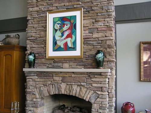
The mantle is about six feet across, about eight inches deep, and the stonework goes all the way up to a two-story ceiling.

My living room is definitely eclectic, with rustic bones and a mixture of accents. I'd like to keep that painting, but can change it if needed. There's another, slightly larger painting that I hang in the spring and summer.) As far as decorative accents, I have a bunch of pretty pieces (glass, silver, porcelain), though few of them are any larger than these two urns.

I think I need more stuff -- but what? And how much?

From a distance:

Closer up:

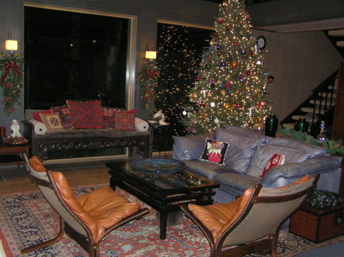
The rest of the room (at Christmas):

Comments (33)

  • 16 years ago

    Sorry I don't have any suggestions for your mantle, but I love your chairs. What are they called or where did you get them?

  • 16 years ago

    How about the round clock (now on the pretty chest) in the middle -- and the large red jar on the heart itself -- on the left-hand side. Then find some chunky red candles -- and add a trio (different heights) on the left-hand side of the mantle.

    Just for fun -- I'd LOVE to see a line (odd number) of red glass votives (with tiny white candles) along the length of the mantel .....

    Jan at Rosemary Cottage

  • 16 years ago

    Love your room and those chairs are fantastic! Sorry I can't help with the mantle. I was looking for ideas also.

  • 16 years ago

    This may not be what you want to hear but I say keep the painting (love it) and lose the urns. Period.

    The stone work is stunning, the painting is fabulous, the pieces on either side are a wonderful mix and the room in total is an intriguing blend of great pieces. You also have THE VIEW. It's enough. You don't need anything more.

  • 16 years ago

    I agree with dlm2000 - the picture and nothing more.

  • 16 years ago

    you could put something different in the middle, something round might be nice or just leave the picture, it is lovely too. Other than that I would leave it alone. I have the same thing as you and only have a sunburst on mine instead of a picture and that is all. Your fireplace is gorgeous.

  • 16 years ago

    The chairs are about 30 years old, bought from a Danish furniture store. They need a bit of reworking, but are fabulously comfortable... The last time I went into a Danish furniture store, I saw some like that, and they appear to have 'gone classic.'

    Here is a link that might be useful: Siesta Chair

  • 16 years ago

    I vote for simplistic, too. The stonework and the colorful artwork are enough! Those pure clean lines need no other decoration!

  • 16 years ago

    I'm hopeless with decorating mantles (will be posting my own here for suggestions) but wanted to say you have a beautiful fireplace!

  • 16 years ago

    Though the artwork is lovely, the white mat just jumps out at me and not in a good way. And the Oriental ginger jars just fall short of what I think your mantle needs.I would find something with more browns, gold and red in the canvas that picks up on the theme of your sofa throw pillows or the pottery on the armoire.

    I really like the red urn down on the side of the FP and I think 2 of those, or something similar, would be beautiful on your mantle.

    I think your FP is awesome; your outside view is spectacular! And I want your chairs!!!

  • 16 years ago

    I don't have any suggestions for your mantle - I seem to draw a blank with stone f/p's - but I love the chairs & absolutely lust after your leather couch. Roche-Bobois???

  • 16 years ago

    ok here goes. Move the urns closer to the painting- they are too far away. and that is it.I think with such wonderul accessories in the room, as well as a fantastic painting over the mantle, keep it simple. I think you have chosen well.

  • 16 years ago

    I'm with monoblair...i saw that red urn and thought "Why isn't it up there, it totally works with the art".

    The ginger jars are completely wrong...trash them :oP (and while you're at it, the big one by the fireplace...what five foot tall? It's ugly...send it to me) heh heh I have a place to hide it (like in a place of pride in the parlor LOL)

    Ok seriously, I love the funky red piece because it fits the funky art (and funky in a great way by the way). You need something not predictable.

    I originally thought some wonderful art glass, but with two seconds of thinking decided that's too delicate for your mantle...you need wonderful pottery...probably three pieces on each side, tall, fat, skinny, work with some different pieces in colors pulled from the pic (easier said than done but you asked). Even a gorgeous yellow ware bowl turned upside down would do better than the more formal urns you have there now.

    Mantles...they're driving me nuts right now. I have three very complex mantels and while they were lovely at christmas, they're bare now and it's driving me crazy...three levels of mantle call for thought...and you just used all of mine...dang it

    I don't lust after your chairs because I don't have room for them LOL (otherwise honey...I'd lust) but that large piece....yummy wonderful.

  • 16 years ago

    I'd like to see a pair of comtemporary blown glass vases, etc. They could be filled with something tall and organic.

    Here is a link that might be useful: Blown glass vase

  • 16 years ago

    Your mantle is beautiful. I'm not exactly sure what you should do with your mantle, but if I look at it, I can't imaging putting small stuff up there, like the little clock. Small stuff will blend in with the rocks. I think this is why the painting works, because it is BIG compared to the rocks.

    I think a really cool antique decorative rocking horse that was appropriately sized would look great sitting on that mantle alone.

    I agree with the others though, don't junk it up by adding lots of little stuff. You could keep the painting and add chunky tall black candlesticks with tall pillar candles grouped together on one or both sides--it would give the appearance of 1 item, not lots of little stuff.

    Here is a link that might be useful:

  • 16 years ago

    So nobody likes my green urns? They were my parents' favorite pieces. In fact my dad used to joke that if the house was on fire, he'd get the cloisonne urns and Mom could wake the kids. Oh well. Actually, I didn't like them there either -- just not the right spot for them. They're now on the little Oriental chest to the right with one of the Foo dogs.

    The large red vase can't fit on the mantle shelf because it's too wide. That shelf is only about 8" deep, which left a good 2" of the bottom hanging off the edge. But it does seem to look good on the lower section, so I moved it there and put up a simple horesehair pot and ivory box on one side, with the clock on the other. I do like this version better --

    So here's take #2 --

    In the past, I have put art glass up there, and I do have some vivid art glass pieces that could work, but right now, I've got them on top of my little low chests behind the sofa -- and I'm liking them there. When I change my artwork for spring, I'll probably regroup. (Unless you all have some great suggestions now.)

  • 16 years ago

    I like your green urns, I just don't like them on your mantle ... they look better on the chest. You have some really nice glass pieces.

    I like the red vase on the hearth ...

  • 16 years ago

    How would the art glass candlesticks look on the mantel? They might be too small scale, but they're definitely eye catching. You need something bold against all that stone. Rather than putting them symmetrically on either side, try putting them next to each other but elevating one, maybe on a stack of books, and perhaps putting the blue vase on the other side. I do have a hard time judging in the abstract, I need to see things to judge how I like them.

    You've done a nice job with the items on top of the armoire to the left of the fireplace.

    Mantles are fun, but hard to get just right. I'm going through the same thing with mine now in the post-holiday period.

  • 16 years ago

    LOL I like the green urns too, just not with the art and since the art fits, the urns have to go :) They work well with the foo dogs (I gave DH two for christmas...I just love them and want to make him collect LOL)

    I think what you have in try number two is better, but still not right. Too washed out against the brick. I have to stick with my original request for deep saturated color in pottery (though much of that glass does have the weight...but still I'm not in love with it against the rocks...almost too much contrast if that makes sense). Is the big urn in the mail yet? heh heh

  • 16 years ago

    great room, great stuff! I agree that you need something different than try #2. Hard to see how big the glass candleholders are, but I would try those, both on the left side with LARGE taper candles in them to give them more heft. Burn them a bit and let one burn down more so they aren't even. Then I'd look around for something like a box that is a totally different shape and not much smaller than a shoe box for the other side. You have so many interesting pieces, there must be something not in the picture that would be perfect. The vase furthest right on the chinese chest with the candleholders (not the beautiful matchy one, but the beautiful more squarish dark one)might work with the candleholders, but I can't really tell what color it is. Try it on the right side. If you think the candleholders work, then I'd move the red pot from where you have it now and leave the hearth clear. Maybe the red pot on the armoire (on the left) to carry some color over there.

    Second choice would be to put the red urn on the left side of the mantle and find something long and squarish (again maybe a box), not as big as a shoebox, but maybe longer for the right side. Not too close to the same size as the red urn.

    If you did the red urn on the left, I'd then switch the items on the top of the armoire so the larger piece was on the left. It is too close to the shape of the red pot to be right next to it and I think the scale would work well to have it further away from the red one.

    Whew! Must be fun to have so many great pieces to choose from!

  • 16 years ago

    OK -- I'm going to scour the house for other rugged ceramics type pieces and things that are a bit bolder. I like the simplicity of the horsehair pot and ivory box, but I agree they're a bit timid.

    I'll also try the tall blue vase and candlesticks -- but you realize that then leaves my short on my behind-the-sofa arrangement... There's one other art glass piece I want to try, but I'll have to pry it out of Hubby's office, and it may be too big.

  • 16 years ago

    I think one reason it looks bare to you, is that the mantle is big, the armoire is big, and the other side has a number of smaller items. The balance seems off. I don't think you need anything other than the painting and the red urn on the fireplace area, but I'd like to see something on the other side of the fireplace to balance the armoire. Doesn't need to be furniture, but a bigger plant? (Lots bigger, like a fishtail palm) Or a larger something on the wall?

    You have such cool stuff, and the architectural elements are so striking, that I don't think you need a lot of little things to dress this area up.

  • 16 years ago

    That's what's missing!

    Actually, I DO have a really large plant that goes there. And every so often, Hubby takes it outside to water and forgets to put it back. (Part of me suspects he doesn't really 'forget' because he complains of little leaves falling and dogs nosing in the dirt and possible bugs and that they dry out too fast this and that and etc.)

    Gotta get my plant back!

  • 16 years ago

    I put up another art glass piece on the right, one picture with a few other doo-dads and one without (sorry it's blurry) Better? or worse?

  • 16 years ago

    I definitely prefer the second photo, with more 'doo-dads'.

  • 16 years ago

    It doesn't work right now because the white matt on the picture is too stark for anything else in the room. Change that, and it'll work as is. Or you could add a funky mask or whatever....

  • 16 years ago

    Or try that white pot, you called it a horsehair pot (what is a horsehair pot?, sounds interesting), in place of the clock, keeping the other pots as is. The white may complement the white matt and be why you liked it there before.

    I love all your glass art. I started a collection but my first piece went crashing when one of the cats decided to see what was on the table. That ended that. But we took a vacation a few years ago where we all got to work with glass. It was very interesting and fun. For awhile DS wanted to be a gaffer.

  • 16 years ago

    I almost agree with barb, but I think the white pot isn't going to work well enough with the items you now have on the right (which I like better than earlier options). I think you almost need to have a little spot of white in that tall multicolored vase for the white pot to work. Hmm. But I don't like the clock on the left, either. Maybe keep it asymmetrical and have *nothing* on the left? The red pot on the lower left may help with the balance a bit if you had nothing on the left of the mantle.

    I feel your pain. My mantle drives me crazy too. In fact, you have inspired me to post a pic of mine and ask for feedback... maybe later this week.

  • 16 years ago

    I love that painting, but agree with a couple others that the white mat is too stark in that setting.

  • 16 years ago

    that was what it was the white mat.. i too concur..

    the fireplace is beautiful, can you tell me what the mantle and hearth are made of and it is an actual wood burning but how does no grate, glass or cover work when in use? it looks like concrete?

    our last house had wood burning and my pyromaniac husband had logs falling off grate past the hanging chain curtains and bumping open the glass doors to fall on the carpet in front of the hearth, no of course he liked a fire far to large.. but...

  • 16 years ago

    sweeby has the right idea by bringing the red up with the painting, but I say why don't you also bring the painting down with the mantle. It just looks a bit lonely there and it does not have to be centered. Bring something red or 2 closer to the painting. Definitely though I like that some red was brought up on the mantel.

  • 16 years ago

    Thanks for the additional suggestions --

    - So for those who say that the white mat is too stark (and I can see your point) What would you suggest instead?

    - Oopsie - Are you suggesting I rest the painting on the mantle?

    - Barb - I tried the light pot up there, but thought it just looked like pot-pot-pot... The clock was a different type and material, so it broke the pot-pot-pot thing -- though I agree it's not perfect. A 'horsehair pot' gets it's decoration from horesehair dribbled onto the hot pot straight out of the kiln. That's what gives it the smoky brown haze effect and ridged lines -- actual burned hores hair.

    - CrazyOne - The fireplace stone is cultured stone in the Chardonnay color, Southern Ledgestone pattern. The seat and mantle are natural limestone slabs. And while it's supposedly legal for wood-burning, we prefer the instant gratification of gas, so that's what we use. No glass or curtain -- but if I find exactly the right screen someday...

    Here is a link that might be useful: Horse Hair Pottery

  • 16 years ago

    Sweeby, thanks for the link. Beautiful stuff!

Sponsored
Wannemacher Interiors
Average rating: 5 out of 5 stars26 Reviews
Customized Award-Winning Interior Design Solutions in Franklin Cnty OH