Software
Houzz Logo Print
hoyamom_gw

Les - I made the changes! (pics - lots)

18 years ago
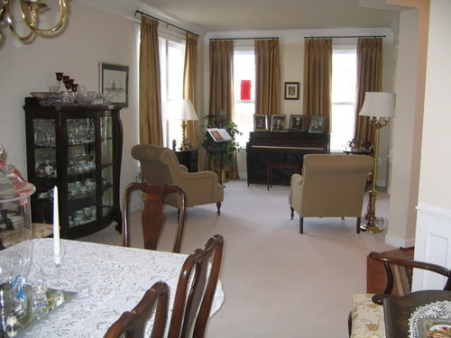
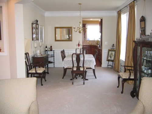
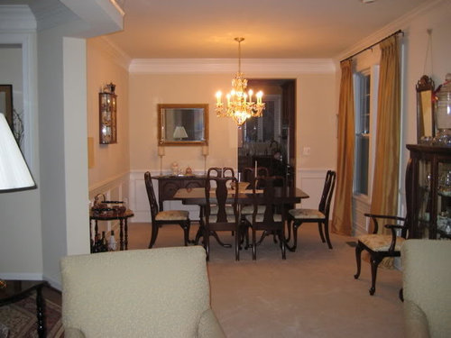
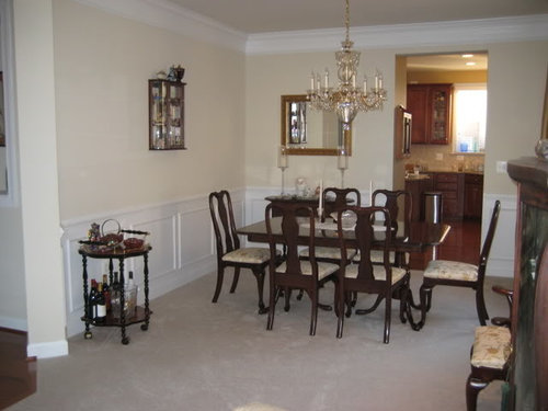
Hey Les - I thought I would let you know that I went ahead and made the changes that you suggested. I turned the dining room table and took down the pictures. The little glass cabinet and the mirrors will be removed once the painter gets here. The large cabinet would not fit along that wall bc the chair is in the way. I thought I would get a large picture to put on that wall instead.

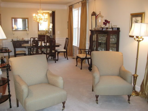
We also moved the corner table and put it next to the green chair in the living room side. I know the lamp on that triangular table is too large and will buy another one that will be smaller.

Squirrel - if you are reading this I would love it if you had time to photoshop the Edgewood Green in the dr/lr combo. I really think the green is too dark. The other color I have splotched is BM Desert Tan but I think it is too yellow.

I am really open to any color at this point but I do think it needs to go in both rooms.

The crystal chandelier came today so DH and I spent a couple hours putting it together and we love it! We did get the larger one and I think it looks great.

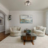
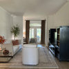
Here goes with the before and after picks!!

BEFORE

AFTER

THANKS!!

Comments (60)

  • 18 years ago

    Ohhh--I really like the 5th photo down--the silvery blue-grey: very nice!

  • 18 years ago

    My vote is for the second to last photo squirrel posted.

  • 18 years ago

    I like the 3rd and last one.

    Beautiful, Squirrel!!

  • 18 years ago

    Thank you thank you thank you soooo much Squirrel!!! This really helps!!!

    I can see that the EG doesn't look as bad as I thought it would AND I really do like those 5th and 6th photos with the blue/green? Is that what color those are? I like how the drapes pop out from those. I can see now that I have to stay away from the gold paint bc it just clashes.

    I am supposed to put EK Wheat in the hallway and Gustavian Grey in DH's library across from the livingroom and now I am having the same angst that Brutuses was having about the colors not flowing. Not sure if having the blue gray leading into the wheat leading into green would look ok. DD said even though she would not pick those colors she could see - sky, sand, and trees going on with those colors. Not sure that is what I was going for....

    Thanks for taking me in a new direction!

  • 18 years ago

    Yes those do have blue and green in them -- I realllly love something like that in there. And it's not as predictable as the green or gold. My favorites are definitely the ones others have pointed out, as well.

    You're welcome! (And I know you're just gonna do the EG, lol :)

  • 18 years ago

    No, if anything I will chicken out and do white - bc that is what DH wants......:(

    Did you use any particular color of blue-green?

    thanks again - I know your talents are in such demand. I loved what you did for valinsv. :)

  • 18 years ago

    I never use the pre-mixed colors :) I started with a Silver Sage-y type color and mixed from there. I'd think they would flow nicely into a neutral wheat color, but layout, etc., prevails.

    Some have found it helpful to print the pictures and check swatches from there. Looking at BM Classics, they look somewhere in the realm of:

    'Santorini Blue' (1634)
    'Wedgewood Gray' (HC-146)
    'Buxton Blue' (HC-149)
    "Paladian Blue' (HC-144)
    'Wythe Blue' (HC-143)
    'Rhine River' (689)
    'Mount Saint Anne' & 'Beach Glass' (1564)
    'Raindance' (1572)

  • 18 years ago

    I just went through my EK cards and found Clay and Ashen Green - both have a bluish tinge - at least they do in that room in the dark. I will have to see what they look like in the daylight. DH picked Sage but I think a blue green would look nice and blend in with the GG across the hall.
    Again, thanks - you are awesome!!

  • 18 years ago

    This 'Lichen' green? one looks promising, too, although I only have online swatches to look at -- which are usually quite different!

    You're lucky you can consult with her, and maybe she can adjust the sage or something for you, too.

    Do you start with sample pots? Keep us posted :)

    Here is a link that might be useful: Lichen

  • 18 years ago

    We just painted our living room BM Danville tan - it's "tan" (go figure) and it's got a little bit of a green undertone - I really like it. It might look nice in your space.

  • 18 years ago

    Droool.... Very nice!! Beautiful home! I'm anxious to see what color you go with!

  • 18 years ago

    It's a beautiful sunny day this morning but it is supposed to be overcast and rainy later today so it's a perfect day to check out my two contenders!

    Thanks again Squirrel for posting those colors for me. I even found a picture on the BM site that had gold drapes and dark furniture so I could play around with the colors. Some of them were too blue but I liked it when it went a little green. Do you remember what color Valinsv accent wall is? Maybe I am leaning toward that color bc I watched you transform her space so beautifully.

    I think I like the EK Ashen Green bc it has a blue tint to it. It's probably a "cool" color but that's ok. What is interesting is that near the right chair the lamp light is a Reveal bulb and the lamp next to the other chair is a normal bulb. It really makes a difference in what color the green chairs turn when the light is on!! The one of the left is really green and the right one you can see the blue in it. Bulbs do matter!! The chairs will look great with the Ashen Green under Reveal light!!

    Now - on to order a sample of Ashen Green and Clay!

  • 18 years ago

    Hoyamom, the Sage is the half tint of the Edgewood Green so that might be good compromise. I lke the Ashen green too, it's a pretty color!

  • 18 years ago

    Well, how useful can we be out here -- those chairs look kind of a taupe/beige, not a bit of green :)

    That's what I liked best also -- bluish with a bit of the green in there. So pretty with the gold.

    It's so hard to see what the Ashen or Clay look like, as the online swatches are so gray.

    I don't know what Val's current color is and the darker versions are Squirrel-y mixes :) I am in love with that color, though :))

    Hope your next trials feel better to you. Please post the swatches when they get there! lol

  • 18 years ago

    I am not surprised that you all think the chairs look beige bc they do on my monitor. I took some pictures again of the chair material to get a close up of the fabric and this is hilarious but the fabric keeps photographing blue/gray when it is really green in real life!

    Here are some pictures and you can see I tried different angles and even took the swatch outside to see if it would photograph true.

    Here they are:
    THE FIRST PICTURE IS THE TRUEST COLOR I COULD GET.

    HERE THE CHAIR LOOKS BLUE!!

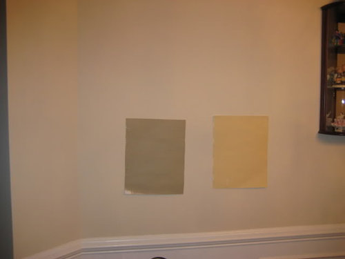
    HERE ARE THE SWATCHES - ASHEN GREEN ON LEFT AND CLAY ON RIGHT.

    WEIRD HOW THE FABRIC CHANGES!!

    ASHEN GREEN ON THE WALL

    ASHEN GREEN AND CLAY CLOSE UP ON THE CHAIR

  • 18 years ago

    Except for the first two pictures, the fabric and the swatches are all looking blue/grey to me, and I know the Ashen Green isn't blue! You're going through what I did a month ago, I so feel your pain. I'm going to have to get my samples out tonight and look at them.

    I know I'm partial to the color, but I still like the EG the best in there.

  • 18 years ago

    That's bizarre! Does the chair's green have any blue in it? In the first pic, it looks like a more saturated version of the color I put on the walls. Kind of a blue-gray-green color.

    It's truly impossible to help as the colors are completely off. ! I only see blues and grays in your latter pics.

  • 18 years ago

    I know is that the most bizarre fabric?? It really does look green but from afar it looks blah. When I chose the fabric for the chairs I had no idea that it would look like that.

    But really Squirrel - I thank you so much for your help. It really helped me see that gold would not look good in there and a blue/gray/green may not look so bad. I phoned EK today and ordered a sample of Ashen Green. For some reason I really like that color and it does look really good next to my gold drapes.

    Kabergs - if the Ashen Green doesn't work out I will probably go with EG. According to the EK website AG does have some blue. Did you check the card you have? Now that the chandelier is in there we get a lot more light at night so it won't seem too dark. Sage was too light and I think I want some drama in there. I have also decided not to go with GG in DH's library across the hall. It is just too baby blue so I ordered a sample of Pumice which is more of a warm gray. DH keeps asking me when I am going to order the paint. I have until the last week in Feb bc the painter starts on March 15. I am good to go with all the other colors so I hope I don't change my mind again. How do you like your new colors???

    Thanks for all your help!!

  • 18 years ago

    Out of curiousity, do you have a BM or SW deck? I'd like to know what colors are similar to the AG if you see any.

  • 18 years ago

    No, I don't have either one of those decks. After you painted the room I went to the BM site and looked through the colors and found the ones you suggested. I was trying to find a green/blue/gray but didn't see any. I will paint the board when the sample comes and then maybe you could paint it in.

    Maybe someone has both EK and BM decks.....:)

  • 18 years ago

    That fabric is goregous! in any color :) In the room pic, it looks like a simple plain weave in beige.

  • 18 years ago

    Was looking for a brown red and just happened to see something that reminds me of Val's accent wall color. SW strip 31. Check out strips 30, 31, 32 in the 'Fundamentally Neutral' section of their 'Color' line (that's the deck name I have) if you have a SW store near you.

  • 18 years ago

    I don't have a SW store nearby that I could go to this week. I looked online but I didn't see the fundamentally neutral choice.
    Maybe someone has the BM/SW decks and they could match it up with Ashen Green. I hope the paint sample pot comes tomorrow so I can paint a splash of it! I looked at the sample card today when I got home and it still looks pretty good to me!

    Thanks- so check back to see if I have a poster painted tomorrow.

  • 18 years ago

    Hi Hoyamom, I have the EK paint cards, BM and SW fandeck. I went through the same as you with the EG Ellen had suggested for my kitchen, so I know how you feel. I tried to find a color similar to it in BM and SW and couldn't come close. You know that about FS paints, as I did, but I tried anyway. :( My kitchen is NE facing, so similar light. At first all I saw was a muddy green, that looked almost brown! Then I painted a portion of wall and I loved how it looked with white trim! I like the AG also for your room. Did Ellen suggest that too? I empathize with you right now, I really do. In the end, I went for the EG as suggested. FS paints are so hard! Everchanging might be a good thing, but h*ll when making a decision because of it!.

  • 18 years ago

    So, kmcg, do you think the FS paints are better for Northern light?

  • 18 years ago

    Hey Kmcg - if you have the BM or SW fan decks could you find a color that is close to the Ashen Green so that Squirrel can "paint" it in that room? She was trying to find a color like that but didn't have the EK sample cards to compare the color.

    I really want to use the FS paints it's just a matter of which color! That is too funny how your AG looked brown and muddy green - that is what it looks like in that room from the sample poster I painted. I love how it looks in your kitchen and Kabergs too so that is why I was heading toward that color. Ellen emailed me that she thought that would look great in there. But when Squirrel photoshopped a blue/green/gray in there I really liked the look so I got my cards out and found Ashen Green which is a green/blue/gray. Like I said, I have ordered the sample pot and I will paint a poster and compare it to EG. I don't want to paint on the wall bc I like to move it around.

    The diningroom window gets the tail end of the sunset (the house next door blocks most of the light) and the livingroom front faces north.

    Thanks so much for your support - it's just paint, right....:)

  • 18 years ago

    Are you painting it yourself or hiring out?

  • 18 years ago

    hoyamom: Love the furniture arrangement. It's intresting to see what others have done with their pianos. I saw the comment above where you were wondering about the color of my accent wall. It's Behr False Cypress from Home Depot. It's hard to get a true feeling for the color on a computer monitor, though. Mine is a tad greener and darker than what you are looking at. Perhaps because your room looks to get more sun than mine the color samples look a bit washed out. Personally, I'm finding it very difficult to work with the greens because I am worried that they will clash, but then if I match it then the colors blend together. Have you thought of going a shade lighter or darker than the background color on your chairs? One of the other colors I was considering was BM Tyler Taupe. It was a bit too dark in my room with the Northern Exposure, but I could see it working well in yours--like matching to the little darker color outlining the gold in your upholstery fabric. Whatever you decide don't let your DH pursuade you to paint it white--your trim is lovely and you need a color to accent it.

    Have you thought about putting some decorative cushions on your chairs--perhaps something with a larger scale pattern? The small size pattern does tend to disappear from a distance--so does mine.

    Also are you thinking of putting an area rug in your music/living room?

  • 18 years ago

    hoyamom, yes it's just paint, so why does it make us crazy? LOL

  • 18 years ago

    Squirrel - I am hiring out - he will be here March 15 for an entire week painting - LR/DR (Ashen Green, EG, ?), DH's study (pumice? which is a question mark right now bc DH likes white but I am trying to put some color in there), entry foyer, down the hall, up the stairs to the landing (wheat), MBR sitting and sleeping area (cognac), dressing area and bathroom (parchment), jack/jill bathroom (aqua), powder room (berry red), basement bathroom (berry red using the leftover paint). I think that's it.... He said it would take his crew a week.

    Valinsv- thanks for letting me know what color your accent wall is. I wonder if it is a cool or warm color? I think if I go with the Ashen Green with the blue in it it might give me some sort of contrast. You are right about putting pillows on the chairs - I will prob work on accessorizing after the paint goes on so I can get a sense of the color overall. At some point I would like to put the hardwood in there and then I will put a rug down. I had a rug on top of the carpet upstairs in the sitting room but I didn't like it. I like them better on the floors vs. carpet.

    Yes, brutuses - it does make us crazy! I saw that you chose your paint - congrats! I hope to have my final decision by next week so I can order the paint. But you know, I will probaby be doubting my decision the entire time. LOL

  • 18 years ago

    Here are some "almost-but-not-quite" matches in BM. Knowing the complexities of FS, you know what I mean:)
    BM Yorkshire Tan, Huntington Beige, Danville tan, Providence Olive. The reason being, is that those are warm colors in the green, gray, brown category, and that is what EG has also. Remember, being a warm color is good for the cool north and east light. Hopefully, that partly answers your question Squirrel. I'm not sure it is just FS that is good for these exposures. They say if you want to warm up a cool exposure, use warm colors. Any paint can do that. That is the same here. I remember asking Demifloyd about the EG because it looked so brown-muddy on the card. Once on the wall she said it looked nice and they were happy, so I bit the bullet! I can't stress this enough...THE COLOR CARD DOES NO JUSTICE!! In cooler light, like no incandescent, just daylight, I see more green. So, green in cool light and warm green-brown in lamplight. Maybe kabergs sees the same? Trust me, I feel your pain! (but that was 2 years ago :) Did you ask EK about the Ashen Gren? It definately has blue.

  • 18 years ago

    Sorry I fell off the planet..juggling work issues and the kids at home (vaca week)!! I owe you a response.

    I just pulled out the Ashen Green and I do like it, it does have more blue than the EG as you know. I think it would work in the room. Did you ask EK?

    I agree with Kmcg about hte EG. I see more Green in daylight and more brown in low light. It really doesn't get muddy at all in my house , and the card doesn't do it justice. I can't tell you how many complements I get on it. If you want me to take more pics if you think that will help, by all means let me know.

  • 18 years ago

    Kabergs - thank you so much for offering to take more pictures but I think I'm good.
    This room of mine sure is weird. DD (the one who is the artist) came over for dinner tonight and I showed her the two colors - EG and AG. She liked the EG in the diningroom area but preferred the Ashen over by the chairs!! Is that weird or what??? I think it is because the diningroom has the crystal light that shines yellow and by the chairs I have the reveal light bulbs. She didn't think the Ashen looked bad in the dining room though.

    I will arrange to talk to Ellen once I paint the sample board with Ashen. It did not come in the mail today so I want to wait.

    Kmcg - thanks for taking the time to look up those colors that were close to Ashen. I figured it would be hard to find one that was a match bc the color is so unique. If Ellen thinks the EG will work better I have no problem going with it.

    So we wait for the postman .... until tomorrow .....

  • 18 years ago

    Hoyamom, amazing how we agonize over paint, isn't it? At least DD likes both choices (but in two rooms!) I'm actually in my kitchen/living room and I'm looking at all my Eg, espcially in a dark corner and it's still green, just a little more green. You know, I do have a blue/green w/t in my kitchen and I'm wondering if it's similar to your chair color. I'll see if I can get a good picture of it tomorrow for you, it might help you visualize one of the choices.

    Hopefully the sample will arrive tomorrow and you can set up your call with Ellen! I cannot tell you how much I emailed her over my bedroom color, which I LOVE. I don't know if the paint just cured or if I'm used to seeing blue in there but I don't see the aqua that was bothering me when it was first done. I love my other colors too, especially the Tulip Leaves and Adobe. It's funny I was at the neighbors with the kids earlier today and one of their rooms is painted a yellow similar to Sunshine and as I was looking at it all I could think of was how "flat" the color was and how much more I liked mine!!

    back to my homework now.......

    let us know if you get the sample!

  • 18 years ago

    one of their rooms is painted a yellow similar to Sunshine and as I was looking at it all I could think of was how "flat" the color was and how much more I liked mine!!

    Sold! To the squirrel in pearls. Now I know I must try the EK/FS paints :) Thank you very much!

  • 18 years ago

    Squirrel, LOL! Is that just a hint of sarcasm I'm detecting? I wasn't trying to sell anyone on the paint..... ;-) However, I will admit that I am a FS convert and I'm beginning to bring DH around, although most of the time he just thinks I'm nuts.

  • 18 years ago

    Hmmm. No I was excited to be sold on FS paints. ! Wasn't sure, before, why they were better. One thing I notice when I see paint on walls, even when I see a beautiful color or application, is that they are so flat. I love handmade pottery and those beautiful gas-fired glazes with all their depth and murky interest. :)

    Sorry to be sounding sarcastic (as some think that's a bad thing :) Not on this thread though! I am under terrible stress, and cranky. :) Esp when my cats jump on my desk and knock all my papers onto the floor!

    So, 'thank you' for your wordage above on your neighbors yellow! Now I just need to get all these nail pops fixed :( The real problem.

  • 18 years ago

    No need to apologize at all! I for one am usually very sarcastic but sometimes it's hard to recognize in this medium, so I wasn't sure where you were coming from. Sorry to hear you're stressed and cranky. I've been feeling a bit of both myself, which is possibly why I misinterpreted your post.

    Seriously, I do love my EK paints. They really do have an added depth and richness that is hard to describe. My master bath and kids rooms are the only non EK colors I have. I cannot wait to repaint them FS...although I don't think EK has a "6 yo girl bubblegum pink". ;-)

  • 18 years ago

    My description of FS paints is that it looks like velvet! The depth and color change depending on the light always reminds me of velvet!

  • 18 years ago

    lol, I still can't read my post mis-interprettedly! Usually I can see where it went awry. Nevermind :)

    I wonder if her paints are more interesting than some of the other FS's. It seems like the color selection is so limited with her line. Say, just a few greens to choose from. I just love those great big fan decks :) with all sorts of tones and colors imagineable -- except, of course, the ones in your mind!

  • 18 years ago

    No, It's probably me. Please don't give it another thought!!! I debated about whether to even post that portion because I didn't want to offend anyone by saying the paint was flat, so when I saw your post I immediately took it the wrong way.

    KMCg, I would agree, velvet is a good description.

    Squirrel, I thought she had a limited selection at first too, but then discovered that it ruled out many options (which is a good thing for me!). Seriously, aside from me painting almost every blue she has on my bedroom walls, having too few color choices wasn't an issue. I think it opened my eyes to the whole "coordinate instead of match" school of thought.

  • 18 years ago

    I'm going to give it all a shot when I get to repainting. I suspect I will find it all very pleasing to my ever-hungry eyes!

    (Thanks for explaining. Maybe that makes a little sense to me now, on the 'whether to comment on a flat paint might offend.' It's pretty near impossible to not offend when one is talking to 100 people at once, though :) Your comment just hit head-on with painted walls for me, though, and it all just became so clear! as to what I see, lol :)

  • 18 years ago

    Hoyamom, here's the picture for you. The green in my wt looks similar to what I'm seeing in the first close up of your chair fabric. Maybe this will help:

    {{!gwi}}

  • 18 years ago

    Thanks Kabergs for posting the picture. Sorry it took me so long to get back to you but I have had to study for my midterm and had other homework to get done... but that's another story! I love your wts - they have the colors I like in them and you are right, they look close to the color of my chairs.

    I received the sample pot and painted a poster board size of the ashen green along with splotches of both greens around the rooms. I still like the ashen better but DH likes the EG!! I scheduled a call with EK for Monday so she will have to break the tie. My hesitation about the EG is that it is too muddy at night and that's when I would be entertaining and seeing it the most. For some reason the blue in the Ashen calls to me. I know it's hard to get a true picture of the colors but here are some pics anyway. Oh, btw, I did look at the sample fabric that I sent to Ellen - I pulled some threads and there are BLUE threads in that fabric so that's why it casts such a blue color!!

    Next to the drapes at night with lights on.

    Next to the weird chair!!

    Either way, the decision will be made this week!!

  • 18 years ago

    Just bumping this up for squirrel to see.

  • 18 years ago

    Your room is stunning. I can't wait to see the "after". Could you share if your drapes are ready-made or custom? They are gorgeous! TIA.

  • 18 years ago

    They are goblet pleats custom from Silk Supply (they have a website on the internet).
    Any votes for which color???

  • 18 years ago

    Ok. I can see both of them working. I do like the blue in the AG. That is the one I had asked Ellen about for my kitchen because my accent tiles in my backsplash have a slight verdigris to them. She voted no. I forget why though. Anyway, I can see why you like it. Truthfully, I can see both of them working. After speaking with EK let us know her feeling. If she says it can work, then I would go with your gut. Over in the gallery under greens I think, or EK Colors, is a pic of AG in someones home in case you haven't seen it.

  • 18 years ago

    I checked the greens gallery and the first one was ashen green - it looked really light in amy's room. I don't know why I didn't do a search in the first place!!
    I think I will post a thread asking Amy to give me her opinion. I hope she is still on this board!

  • 18 years ago

    OK, this is going to make matters worse, good thing you're talking to the expert tomorrow!!!

    I like both. I like the EG with the chair and the AG with the drapery panels. I echo Kmcg's thoughts, if EK says the AG will work, then go with your gut. Although that doesn't help b/c DH likes the EG and you're liking hte AG.

    See, I told you I wasn't going to be of help! I hope the midterm went well. My class on Fri was cancelled b/c of snow..I'm like little kid, so excited to have "no school".

    Let us know how your call with Ellen goes, what time is it?