

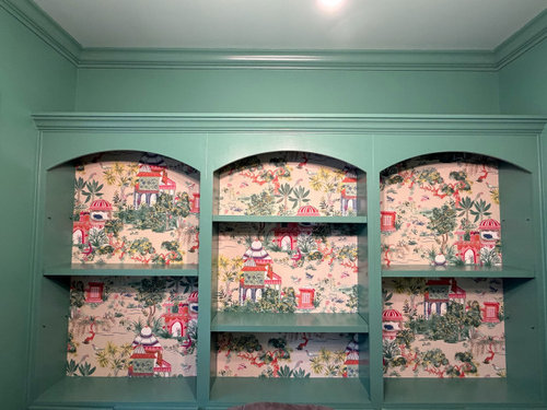
Need help for shelf styling
22 hours ago
Sort by:Oldest
Comments (18)
Related Stories

GREEN DECORATINGA New Breed of Space Heaters Helps You Stay Toasty in Style
Shiver no more with style-conscious heaters that let you turn down the thermostat and snuggle up in warmth
Full Story
GARDENING GUIDES8 Unthirsty Plants Help You Save Water in Style
Spend less effort and money on your landscape with drought-tolerant and native plants that liven up your yard
Full Story
Sixties Southern Style: Inspiration from 'The Help'
Oscar-nominated movie's sets include formal entertaining spaces, front porch breezes and lots of florals
Full Story
LANDSCAPE DESIGNNative Plants Help You Find Your Garden Style
Imagine the garden of your dreams designed with plants indigenous to your region
Full Story
ARCHITECTUREHouse-Hunting Help: If You Could Pick Your Home Style ...
Love an open layout? Steer clear of Victorians. Hate stairs? Sidle up to a ranch. Whatever home you're looking for, this guide can help
Full Story
KITCHEN DESIGNShaker Style: 5 Details to Introduce to Any Style of Kitchen
Whether your taste leans contemporary, country, rustic or Victorian, these Shaker details can add beauty and function
Full Story
ARCHITECTURERoots of Style: Shingle Style Is Back — Here's How to Spot It
Intimate or rambling, in the coast or by the sea, Shingle homes are seeing a revival. Has your home joined in?
Full Story
MODERN ARCHITECTURERoots of Style: International Style Celebrates Pure Form
Using technology and materials of the time, International style is always current. See its expression in these 16 homes around the world
Full Story
KITCHEN DESIGN8 Fireplaces to Feed Your Kitchen's Style
It's easy to find good kitchen help these days — these fireplaces help you cook, provide focal points and create delicious warmth
Full Story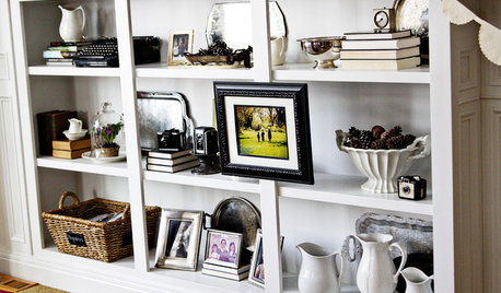
ORGANIZINGHandmade Home: How to Style Your Bookcase
A few simple tips can help you transform a bookcase into an artful display
Full Story
Boss Design Center
Stella POriginal Author
Related Professionals
Richmond Interior Designers & Decorators · Niles Interior Designers & Decorators · Quincy Architects & Building Designers · Greenville Architects & Building Designers · Charlottesville Architects & Building Designers · Willmar Architects & Building Designers · Kirksville Architects & Building Designers · Cleveland Architects & Building Designers · Lawrenceburg Kitchen & Bathroom Designers · Lynchburg Kitchen & Bathroom Designers · Newburyport Kitchen & Bathroom Designers · Bronx Kitchen & Bathroom Designers · Anderson Kitchen & Bathroom Designers · Kearney Furniture & Accessories · Helena Furniture & AccessoriesJill Seidner Interior Design
Diana Bier Interiors, LLC
chispa
Lyn Nielson
Boss Design Center
SF INTERIORS
Diana Bier Interiors, LLC
chloebud
Emily
Stella POriginal Author
SF INTERIORS
thinkdesignlive
thinkdesignlive
thinkdesignlive
Emily
Emily