Software
Houzz Logo Print
amysrq

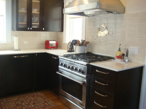
Finally, my Pratt & Larson backsplash is in

15 years ago
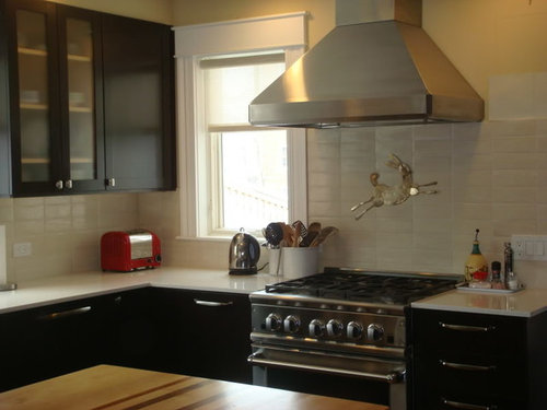
Well, after more than two years, two countertops, and numerous trips to NY, Boston and all points between in search of the "perfect" tile, my backsplash is in. I was nearly in tears (of joy) during the installation...it was so unbelievable that it was finally happening. This was followed by exhaustion-enduced panic that I really could have/should have done a better job with the colors. I was away all day yesterday and returned to see the finished, grouted results after dark. This morning, in the bright light of yet another snowstorm, I am actually feeling good.

The uppers in the following pics will likely be painted a lighter color. The glass will become more opaque with the addition of a film on the inside. The wall color will go asap. There are two large chips of BM Ashwood being auditioned on the upper right. I plan to look for different outlet covers and switches, but I'd rather have white than a close-but-not-quite match. Looks like my bunny need a polishing, too. :-)

I am very pleased with how the roller shades and the tile work together. I was afraid of competing textures, but I think I pulled this off pretty darn well. The colors are nearly perfect.

I have always been a "color" person. This is my first serious (and expensive) foray into neutral territory. I advise people all the time about how tricky it is mixing neutrals. At the peak of my panic the other night (4am!!) I lay in bed wondering why the hell I didn't just get a color again, like I always do. As of this moment, I am happy with the neutrals. I may have to pick a new color for the LR, which opens onto the Kitchen, but that's fun for me....no biggie.


I have said it before, but it bears repeating, the help and support I have received here over the last two years has been amazing. This is a community beyond anything I have ever witnessed IRL, at least in terms of the design process...maybe in any terms. So, a million thanks to everyone who slogged through this process with me.

Comments (33)

  • 15 years ago

    I love it, where is your hardware from?

  • 15 years ago

    Beautiful! Looks really great. And I love the red toaster :)

  • 15 years ago

    Amy, those are beautiful and the colors look perfect on my computer... Amazing how a agonizing it is. Great job!

    I like your cabinets too. I must have seen them before but don't remember. And your cute D&A rug.

  • 15 years ago

    Beautiful texture and tile amy... great!

  • 15 years ago

    It's just beautiful. Would you mind telling me the names/colors of your tile and counter material?

  • 15 years ago

    what brand is that potfiller??? heeheehee

    It looks so great! I'm so happy for you.

  • 15 years ago

    hi amy...

    Oh my! I am familiar with your screen name, but I've never seen any pics of your kitchen before...I love it! I like the color of your cabinets as they are, but I guess I tend to favor dark cabs.

    Seriously, the way your kitchen looks right now...well, that's my kind of kitchen..calm, neutral, but contrasting light and dark....

    Oh..and very nice backsplash!

    KA:)

  • 15 years ago

    My kind of kitchen, too. Love that backsplash. Now I'm thinking about a backsplash again.
    That bunny is so darling! Tell me about it.

  • 15 years ago

    Beautiful backsplash and kitchen, Amy! I can see why you're so happy, and relieved.

    I have to agree with pinch me -- the rabbit is wonderful, the story behind it, please!

    Becky

  • 15 years ago

    Really wonderful...and I'm lovin' the bunny!!

  • 15 years ago

    Amy, love your kitchen as is. Assuming the dark uppers are bugging you--may I ask why? What color are you repainting them? Love your BS and cab hardware! Details, please. And your bunny is so quirky--love him/her!! How did you afix the bunny to the tile? Your countertops are lovely and exactly what my mom is looking for. Quartz? Also love your butcherblock island top and would love to see more pics!

    Are you happy with your roller shade? I'm thinking of using one in my kitchen.

    Thank you so much for sharing your kitchen!

  • 15 years ago

    I think it looks great! So glad you're happy with it. Out of curiosity, what made you do a roller shade, instead of say a flat roman. I can't decide which direction to go in my space and was curious as to your thought process. Thanks!

  • 15 years ago

    Looks perfect. Now that it is in, to everyone else it probably looked like a "no brainer." But to all of us here we understand your struggle and frustration and offer you best wishes and congratulations on a job well done!

  • 15 years ago

    ~~nailed it~~ perfect choice.

  • 15 years ago

    Thanks everyone! It's so nice to finally have good news to post.

    Here are some answers to questions...

    The hardware is from Restoration Hardware. Knobs are Adeline in SN. I have a few extras. (hint hint) Pulls are Bistro in 6" and 8" depending on the size of the doors/drawers. (also have extras...)

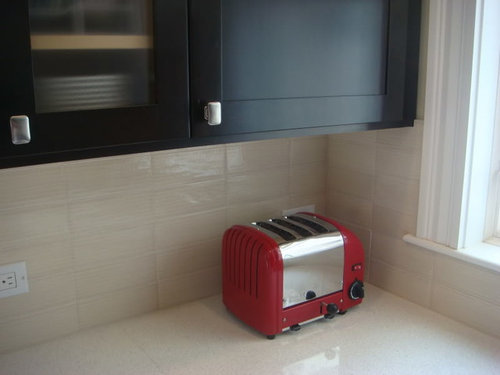
    That toaster came off the clearance shelf in TJ Maxx for $52. It is a Dualit, 3-slot and not cheap at retail.

    Tiles are P&L Intaglio. W78 is the color. Counter is Cambria in Snowdon White. The sample I got was warmer and a bit creamier. IRL, my counters are cool and gray-ish. That's the color issue I have with the tile + counter. Wish the counter were more like the sample...but whatever.

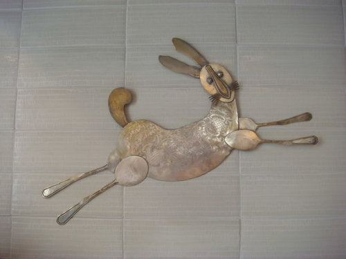
    My potfiller...uh...err...bunny is a souvenir from a trip to CA last March. I bough her from a crafter at the San Rafael farmers market. I had no idea what I'd d with her, but kind of liked her there over the stove. Sadly, she does get discolored from the heat, less so when I remember to take her down before a big cooking extravaganza.

    I am thinking of painting the uppers because of a perceived balance problem in the kitchen. Also because I have always wanted a painted kitchen and figured that if those uppers went well enough, maybe I'd have the guts to keep going. We'll see...

    The butcherblock design includes a few stripes of cherry and walnut, to tie into the dark cabinets and the cherry floors. It was a design my BIL, an architect, originally created for himself and later my step-son and his wife.

    For those who asked about the roller shade, the reasoning was that I wanted to obscure as little of the window as possible. So, a roman shade didn't seem right. I also needed to do an inside mount because of the way the corner cabinet sits right next to the perpendicular window.

    Now that these are in, I keep them rolled down part way anyway. Go figure. Technically, they are solar shades and I can see a lot of sky and trees through the fabric. So, it is still better than a fabric roman shade. They are also woven vinyl, which I hope will be easier to clean should I ever feel inspired.

  • 15 years ago

    Thanks so much for the details, Amy. I just love your kitchen!

  • 15 years ago

    Everythingis so great! I'm glad you gor your install dome! The texture on those tile makes them so earthy, but yet they are classic at the same time. Yummy!!

    I like the dark cabs too. Your kitchen is neutral, but warm and definitely NOT boring. Great job!

  • 15 years ago

    I love your tile. It's classic but different from what you see everyday, and it ties all the elements of your lovely kitchen together. Worth the wait!

  • 15 years ago

    Wow. I mean W-O-W! The v. first word which popped into my head was "elegant." Elegant as in classy, refined, sophisticated, serene. The subtle texture in the tile is really nice for the eye -- not bland but not HELLO I'M HERE if you know what I mean. It is such a beautiful backdrop; your red touches (like the toaster which picks up the red in your rug which picks up the red of your salt which ties in with the red in your eating area, etc.) are able to pop and not pow. And none of it feels twee. It feels gorgeous!

    Now I am ready, Friend, to see the new colors in your living room. No pressure! Just excitement.

    Seeing your kitchen was truly a sight for sore eyes. I LOVE it (as always). Oh, but I did see an even *more* gorgeous picture and it was of you on a lawn! No offense, Kitchen, but your master is cuter.

    xo
    Brooke

  • 15 years ago

    Where'd you get that adorable bunny?

  • 15 years ago

    I WANT THE BUNNY!

    Where did you get it?

  • 15 years ago

    I really love your tile, and the way you matched them up rather than in a brick or subway pattern. It's gorgeous!

  • 15 years ago

    Good morning. The bunny came from an artist named Brianna Kaufman in the San Rafael farmers market. The woman makes all kinds of animals out of vintage flatware. I also have a rattle she made and I gave a small poodle to my step-daughter. I found a link with some pictures of her work.

    Here is a link that might be useful: A couple of Brianna's things

  • 15 years ago

    Thanks for alerting me, Amy -- very very nice! I see P&L came through for you in terms of color consistency, yes? : ) I really like the slight pillowing of the tiles--didn't remember that that was a feature of them, but installed en masse it comes through beautifully, complimenting the regularity of the installation. Great combination of the handmade and the uniform.

    I know that you have the paint samples up, but I'm thinking it might be wise to let the kitchen sit for a while before you paint anything more! Let yourself love it as it is for now. You've earned a rest (or a change of focus -- what's happening in the living room? Is that a post for the HD forum? :)).

  • 15 years ago

    Hey Fly. Glad you found this...being a fan of P&L. Actually, they did not come through on the color issue. The replacement tiles had a heavier layer of glaze, resulting in a more saturated color and less texture (because more of the little indentations were filled) and a heavier crackle. Quite disappointing, but I suppose this is the nature of handmade tile.

    What made it all work was the incredible team of tile guys I hired. One guy was the big, quiet artisan installer. The other guy was the small, friendly Make-the-Customer-Happy guy. We talked about the color issues, the flaws in the glazing and some of the warped tiles. (I had sorted and graded every tile twice!) They were patient enough to listen and understand and were very accommodating whenever I would cruise by and say, "Oh, please pull that tile...it looks horrible!"

    We worked together, strategizing on how to work around the glaze differences. We placed tiles with color issues in obscured places, or up under the cabinets and sills where the natural shadows would grace the problems. They chose specific tiles for the outlet cuts based on the location of goobitzes in the glaze.

    A lot of installers would have rolled their eyes and just proceeded without consulting me. I feel incredibly grateful to have been referred to this company. It was actually an amazingly positive experience.....a real blessing in light of how difficult the build was.

    Oh, and Brooke, I just wanted to say...you make me smile! Always. :-) I know you get the context of the spaces...red bookcases, etc. There is so much going on visually in such a small space, it was essential to me to have a calm intersection between breakfast room and LR.

    As for the paint, I am feeling more like the LR will stay as is. (EK Amy's Sarasota Sand...my builder beige!) I was afraid it would clash with the tile in the sightlines. But, I think it will be okay. I hear what you're saying Fly about taking a break. I am going on vacation soon, so it won't happen immediately, but the Sarasota Sand is painful to look at with the tile. It is a classic pink-ish beige with yellow-ish beige. Bleargh...

  • 15 years ago

    Hmmm, I hate to say it but I do think that's within the realm of handmade tile. If you want absolutely even, you need to go with rectified, or machine made for regularly even (like the big manufacturers), I'm afraid. And even then, I hear about warpage in larger format rectified tiles. Funny how I was liking the quilted look...

    I just checked Heath, IMO the reference standard for quality in handmade tiles, and I see the same unevenness, even when installed with a stagger, which is supposed to minimize the visual impact of the warping.

    Smart about minimizing the color differences with placement in shadow!

    Have a great vacation -- hope it's somewhere beautiful.

    Here is a link that might be useful: e.g. 2nd row down, far right

  • 15 years ago

    Looks great, Amy. Well worth the wait! Love the bunny too. Need to scroll through and see where you purchased.

  • 15 years ago

    Wow! Those are gorgeous tiles! The perfect choice! Love the spoon art, too. Very fun!

  • 15 years ago

    amysrq,

    BEAUTIFUL!!!!!!!!

    ~boxer

  • 15 years ago

    You nailed it. This is beautiful! And I'm loving the art, it makes it playful. Well done.

  • 15 years ago

    Nice!

  • 15 years ago

    Your tiles and bunny are awesome and the space seems very balanced. The entire scheme is very pleasing and natural looking.

  • 15 years ago

    I love your kitchen! Everything looks so good together and I love your tile. That bunny is the cutest little touch--so whimsical. Also love your dark cabinets!

Sponsored
Hope Restoration & General Contracting
Average rating: 4.7 out of 5 stars35 Reviews
Columbus Design-Build, Kitchen & Bath Remodeling, Historic Renovations