Software
Houzz Logo Print
palimpsest

Lurking inside a aging, mild-mannered split...

13 years ago
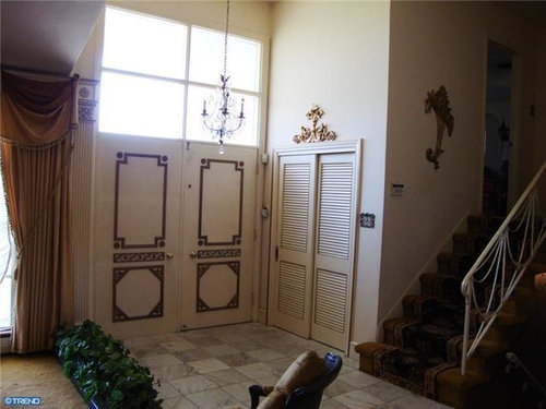
it's Ver-(sigh)--maybe to be confused with Versailles.
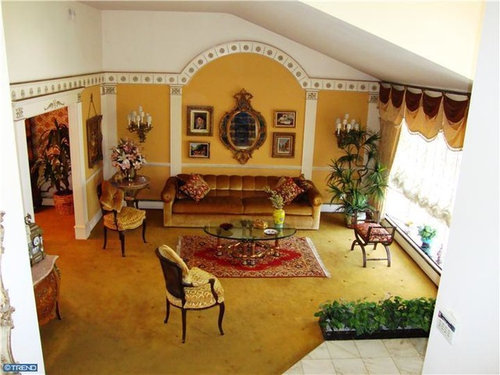
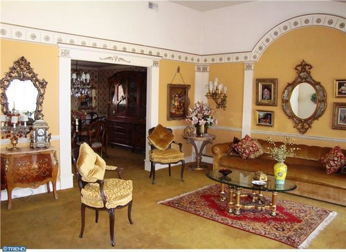
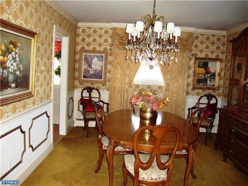
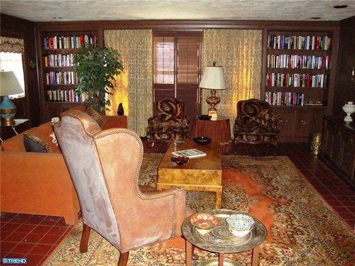
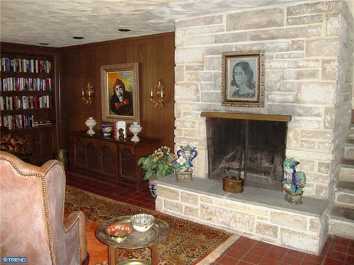
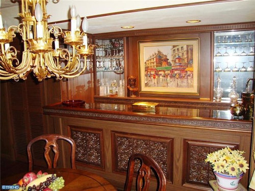
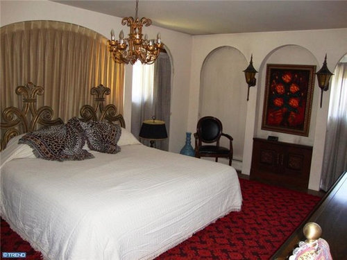
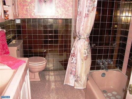
I appreciate its consistent vision. (Trend photos from Prudential Fox Roach)


This post was edited by palimpsest on Sun, Feb 24, 13 at 15:08

Comments (37)

  • 13 years ago

    I kinda like the library. The bathrooms are just ouch, IMO. And then the kitchen...it just does not fit with the rest of the over-the-top rooms.

  • 13 years ago

    I like the rug in the library, but is that a CLOWN painting to the left of the fireplace?

  • 13 years ago

    In a completely different home and in a nice rectangular high-ceilinged room, I kind of like the living room styling.

  • 13 years ago

    omg. I think I bought a house from these people once. I can't believe they were able to duplicate it again in another unsuspecting home when they moved in....

    Except they had a red carpet in the house we bought from them....

    And yes my3dogs, your eyes don't deceive you it is a clown portrait. Personally I think that they should switch it with the portrait over the fireplace, you know add some color to that area...

    And the outdoor lanterns in the bedroom....

    Seriously...I think I know these people.

  • 13 years ago

    I'm afraid of that clown.

    I'm pretty familiar with this kind of look - it was favored by quite a few of my older, now deceased, relatives. While the style itself makes me alternately giggle and shudder, I can respect and appreciate the thought and money that went into this. In my relatives cases, nothing was purchased without thought to its placement and its quality. And then little was ever changed. Their houses were meant to be showplaces that announced how well they were doing in this country. Real living like heavy cooking or serious relaxing were done in the basement or the garage. I don't know if that's true of the people who own this house, but I'd be pretty surprised if it weren't.

  • 13 years ago

    Well has anyone stayed at the Westgate Hotel in San Diego? I stayed there for meetings several times, and the first time, I was like "You have got to be kidding" (I also got off the plane with a migraine which didn't help. But I have stayed there every time I've been back to San Diego and I can really appreciate its High-mid-century-Regency interiors for what they are.

  • 13 years ago

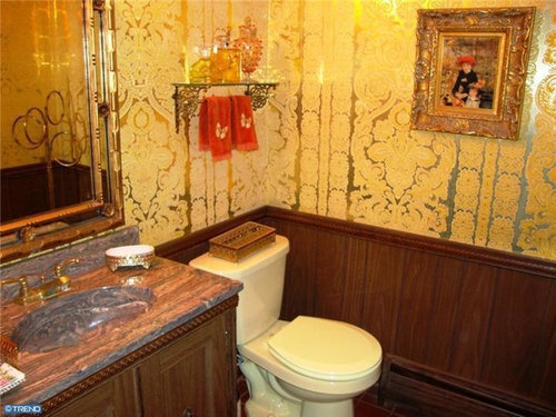
    IâÂÂll take the sofa in the formal living room, the two colorful chairs, rug, coffee table and teal lamp in the library area, the painting and black lamp in the bedroom and the mirror in the gold bathroom. I canâÂÂt bring myself to appreciate the thought that went into the rest at one time. However, once stripped of its flippityflews it looks like a great house with the volume ceilings and lots of light in the living area.

  • 13 years ago

    Certainly shows pride of ownership. There's something to be said for that!

  • 13 years ago

    Consistent vision indeed.

    My parents bought velour-covered, brass & glass, caned-backed, earth toned "Mediterranean" furniture in the 70s. In their defense, that was all that was available in their small town stores. They still have the furniture to this day, and it's still in pretty good shape. At least they never bought clown art!

    My MIL had that very same red lantern in her breakfast room with floral small print wallpaper -- Victoriana also was popular back then.

  • 13 years ago

    The pictures look like it's pretty big for a split. What's the square footage?

  • 13 years ago

    On the one hand it is vulgar and the clown terrifies me. On the other hand, it has a certain exuberance.

  • 13 years ago

    The decorator had a good sense of scale, at least. Has this home been staged? Like in the sense that a lot of stuff has been removed & maybe an appropriate piece added here or there?

  • 13 years ago

    I find it terrifying - even without that rather tragic clown.
    But you have to admire their perseverance.
    Nothing like knowing exactly what you want.
    Some of it reminds me of the interiors in the first half of "Married to the Mob."

  • 13 years ago

    It just doesn't seem right to me - where are the plastic slip covers on the chairs and lamps?

    Now here I thought it was safe to open this post- but what do I discover in the very last photo - the dreaded mylar/reflective wallpaper! It immediately reminded me of what the master bedroom looked like in this home when we bought it 30 years ago. Below the chair rail was mirrored gold and silver wallpaper, above the rail was another reflective paper with blue and silver peacocks. And this was in a room with blood red carpet - which of course was reflected in the wallpaper.

    The previous owners (who did have plastic slipcovers on their living room chairs) paid a Philly interior decorator to do this house. I can't remember her name but she used to advertise in Philly magazine on the inside of the back cover - Dorothy Lerner perhaps? When we walked through the house with the agent she referred to is as 'open wallet' decorating.

    Oh my I thought I had buried that image in the deepest recesses of my mind. Thanks Pal for resurrecting it.

    It was Dorothy Lerner - I just goggled it.

  • 13 years ago

    I like the pink bath fixtures. And I actually like the metallic tile as well. Just not together.

    The coffee table and chandeliers are exquisite. As are both sofas and coffee tables. And the quarry tile and fireplace.

    Many of the individual pieces are wonderful. It's just that more isn't always more to our modern design sensibilities. Piling all of the detailed objects and shiny shiny together gives you visual clutter overload.

  • 13 years ago

    I like the stair railing in the first picture. After that it's a slow slide to the clown picture and there it drops off the cliff. Married to the mob--- exactly, bmom!

  • 13 years ago

    I like the bar! Even though it does remind me a little of the Shining.

  • 13 years ago

    Funny to see. Reminded me of some homes I've been in as a kid. I can almost smell the moth balls and that musty old smell. Ick!

  • 13 years ago

    The house is not in prime Dorothy Lerner territory, but it could be her work. This house is actually in a Main Line township although I don't really consider where it is part of the Main Line.

    I agree about the furniture, many of the pieces are very good. I guess you have to see a lot of it to compare and contrast, but this isn't really a plastic slipcover house--and it's not a plastic slipcover zipcode either. That's much closer to where I live.

    This bathroom is NOT in the above house, but this is from a house in prime Dorothy Lerner territory and seems a bit more along the lines of her form of expression: again, I admire the commitment to the form. We have become mired in a relative "blandness for resale" doldrums, by comparison.

    This post was edited by palimpsest on Sun, Feb 24, 13 at 19:43

  • 13 years ago

    Oh. My. Goodness.

  • PRO
    13 years ago

    I believe that is an original John Wayne Gacy hanging next to the fireplace. Kidding aside, I must be in magpie mode. I love the metallic tile and don't mind the metallic wallpaper either. The rug in the library is gorgeous.

  • 13 years ago

    I wonder what the first-hand experience of the metallic bathroom is. Things like this always photograph looking harsher than in real life, but I still think that bathroom could be fun house disorienting.

    The only current producer of such foil papers is Signature Prints out of Australia, who is reintroducing the designs of Florence Broadhurst. I *try* to like them, but there is something that just doesn't work for me about them. If it's the pattern I like, I don't like the scale or colorways or something. I like that they are produced, but I don't know that I could ever specify one.

  • PRO
    13 years ago

    Oh wow pal. That was a fun little trip poking through the site of Signature Prints. Thanks for pointing them out.

    Yes, some of the Florence Broadhurst series are rather taste specific - like the cockatoos in the Refresh Collection. Others have a great over the top aspect that appeals to me. I could see the Japanese Floral in the Blueprints series in a powder room.

    Here is a link that might be useful: Signature Prints

  • 13 years ago

    As for the Master, I don't know whether to put a quarter in the bed or order a quesadilla.

  • 13 years ago

    I'm going to stick my neck out here and say that there's a certain elegance and uniqueness that you just don't find in the apparent constant pursuit of Pottery Barn and its lookalikes. It's nice to see rooms where people aren't afraid of color and style...but I certainly could do without the (shudder) clown painting.

    Helene

  • 13 years ago

    I appreciate it for what it is. It was a fine home in its day and there was a lot of money and a lot of thought put into it. It most likely had a very lovely family and a lot of happiness and laughter, because it appears to have been well cared for by its owners.

  • 13 years ago

    Doesn't Trump's home come close to this, albeit in today's world?

    Pal, You are so much fun here.

  • 13 years ago

    Yes, the modern version of this type of thing is being created daily.

    I think for a high baroque 1960s Regency kind of thing it is mostly well done--again "for it's genre." The living room is rather serene, somehow.

    I can't quite like the red gothicness of the bedroom at all, but there is a pink bedroom that isn't bad in it's Zsa Zsa Gabor kind of way.

  • 13 years ago

    I keep wanting to put a window box on the floor and I haven't had the courage/confidence. I notice they are using one as a room divider by the front door. In a room that didn't have such a tall ceiling I wonder if it would look better.

    I strongly dislike this house, and I wouldn't like it much better without all the embellishment. So I guess you could say I don't like it any worse with the red "velvelour", except it would be old and crumbling and hard to clean.

    You mentioned "stabilizing" in a previous thread, Pal. That's what we try to do with our old houses, but some things can't be both clean and odorless and also stable. There's a real art to "stabilizing".

  • 13 years ago

    Oh, I could completely understand someone coming into this house and stripping it bare. These aren't particularly nice houses overall--they have that mid-period Levittown kind of quality that doesn't hold up so well. The similar houses on the market that are "as built" time capsules with the varnished millwork and no details of any sort are kind of dismal. And people don't seem to like contempoary very much, which these are-- so there have been some strange half-hearted decorative embellishments in some of them that just make them look worse.

    This house at least took an idea to completion.

    I just thought it was an interesting time capsule and while much of the furniture is really good quality, I feel like it could generally be put to more current use.

  • 13 years ago

    Go for baroque.

  • 13 years ago

    LOL birdgardner.

    I really love split homes. Is it a real split? not a bi-level? I think there are regional differences with that.

    I was *almost* able to find a split my last home purchasing go round. Then I zoomed out the google search on line and realized that yes, there were acres of woods behind the house, but behind that, was a huge fence and the prison yard. :(

    It is over the top, but I would be tempted to leave it that way, but then it would probably drive me nuts. :)

  • 13 years ago

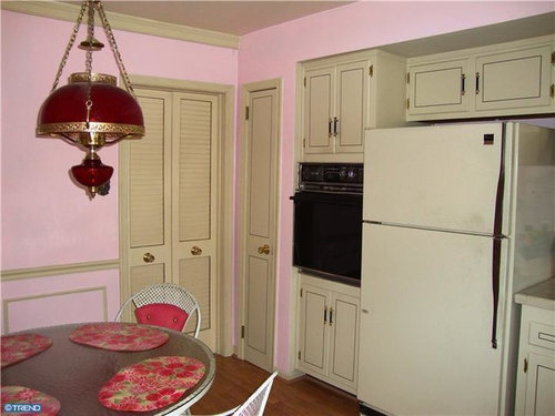
    Just a little too much for me. The pink kitchen walls are so not the right color for the cabinets in there.

    I'd love to see the outside of this house. I picture it as an aluminum sided home that matches all the neighbors, and the home owner put all their creative juices into the interior - 40 years ago. Some of the rooms are really not all that bad - FR is nice with the built in bookcases.

  • 13 years ago

    It's not me, but I very much appreciate it. Someone put time and thought into it.

    Actually, I love that sofa.

  • 13 years ago

    Allison took the words right out of my mouth!

  • 13 years ago

    Thank you, Pal.
    I enjoyed seeing this house.
    It reminds me of one I remember from "back then."
    A Greek couple, friends of my parents-their decor was unexpected in our neck of the woods.
    Red carpeting, very shiny gold patterned wallpaper, loud colors everywhere. Fun people!

    Good memories.

  • 13 years ago

    bronwynsmom - "Some of it reminds me of the interiors in the first half of "Married to the Mob."

    My ex-DH lived in a suburb of Chicago that was popular with the Mafiosa middle-management. He called this style "Mafia Moderne"