Software
Houzz Logo Print
grumpydave

Does this paint color work in this room?

14 years ago
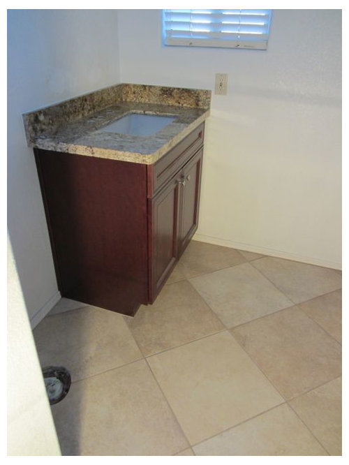
I'm remodeling a very small powder room. The new cabinet and floor tile are very warm earth tones. When I look at them the only color I can imagine working on the walls is cream/yellow/gold but I don't want to go that way because it gets to be too much. I'm thinking of trying a light grey/blue but I just don't know if it's going to work or not.

Here's the room:

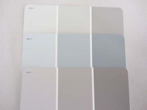
This is a chip I picked up at random from Lowe's. It doesn't have to be this exact color but perhaps something similar?

This picture demonstrates how blue it is which isn't so apparent in the first picture (to me). The color I'm contemplating is the middle row on the left.

Would this work? Do you have any other suggestions? I'm famous for having painted my old living room seven times back-to-back before giving up and living with it!

Comments (21)

  • 14 years ago

    It is hard to tell with out seeing the color next to the tile and counter. How about a green? On my monitor I don't think I like the gray because I don't see any other gray in the room.

  • 14 years ago

    Ohhh I completely relate to re-painting a room 7 times. I have been known to do the same thing until I achieve the look and color I want! I re-painted our dining room 3 times and now I love it so the trial and error is worth it in the end.

    I agree with the poster above me, that the gray is probably not the best choice with such warm counter and tiles.

    Have you considered a deeper darker gold that has more brown tones in it rather than yellow? Or maybe you can put up a chair rail and paint below the chair rail in white or off-white and above the chair rail can be a bold darkish warm color such as a chocolate brown or bronzey goldy kind of color. I also think green might be an option as well, depending on the shade of green.

  • 14 years ago

    I'm taking my chances here with a nic that has grumpy,lol, but here goes. Your vanity has a reddish tone in it which is begging for earth tones. I've included what I think would work very well. I prefer the large color but the others would work too.

    Here is a link that might be useful: Neutral earthy colors.

  • 14 years ago

    How about a darker blue like below, or maybe even darker (or slightly teal)? I used BM Lucerne and really like it.

    Here is a link that might be useful: cream and blue

  • 14 years ago

    Why not jazz it up and use wall paper? I think wallpaper in a powder room is a WOW factor.

  • 14 years ago

    can we see a close up of your granite? or the name of the granite?

  • 14 years ago

    Thank you, everyone, for pretty much confirming what I suspected. I'm stuck with earth tones. Not that I dislike earth tones. If I did I wouldn't have chosen that tile and cabinet color. At least you spared me one or two paint jobs, and repainting makes me Grumpy!

    Andreag, I don't know what the name of the granite is. It was a remnant and that vanity is the only piece I have. I don't normally go for anything that busy but it works well for such a small and infrequently used room. Here's a closer shot.

    {{!gwi}}

  • 14 years ago

    I'd avoid any light greyed blues but if you like blue the deeper blue would work IMO.

  • 14 years ago

    Oops, forgot to address a few of the other comments.

    nutmegxo: I like chair rails with white below and color above. I did that in my old house. However, I don't think it really works with the style of my current home (Southwestern desert).

    The room is so small I'm hesitant to do anything dark or bold, and I'm generally not afraid of either.

    yayagal: Smoky Taupe. Yeah, something like that is probably where I'm headed. Thank you for taking the time to make a recommendation. nosoccermom too.

    jeannie01: Wall paper. I hate hanging wall paper. I hate removing wall paper. My walls are textured. I can't remember the last time I saw wall paper that I liked. That's not to say that I haven't seen very nice rooms that had nice wall paper though. It's just not for me but thanks for the suggestion.

  • 14 years ago

    Sorry grumpydave:( I can't see blue working with that warm granite and those tiles. I'm envisionning warm golds or greens in this space.

    Please reconsider using dark or bold colours in small spaces. I think small rooms really are perfect for bold paint colours or wallpaper (although I can well appreciate your not wanting to deal with wallpaper!)

  • 14 years ago

    A darker grey-blue would be stunning with the tones in the granite and floor. Just not a pale, washed out version, because it won't stand up to the visual weight of the warm tones in the granite and floor.

    As for being afraid of a dark color on the walls, a small, infrequently used space is the perfect place for something like that. You have window, which will give you some light, and of course you want to have good lighting above the vanity. Paint the ceiling the same color as the walls, or do a warm gold in a metallic finish for fun.

    Get fabric on the window that brings out the blue and gold tones, and works with the Southwestern desert vibe you are after. Ikat or suzani patterns would both probably work with the look you want, and both are popular right now. Or, you could simply go with a denim in a tone similar to the wall color, and get some interesting trim to add along the hem of a roman shade, for example.

  • 14 years ago

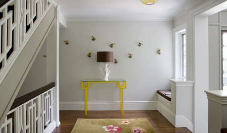
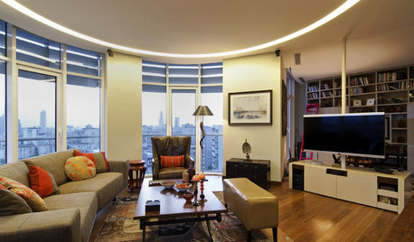
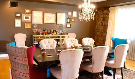
    I don't think I would like gray in your bathroom, but I do think blue and warms tones can work. I couldn't find any bathroom pictures, but here's a few that I've saved that mix the two together just to give you an idea.

  • 14 years ago

    The granite in my kid's bathroom is the similar and we painted a pumpkin color. It looks terrific, but I don't know if you want to go that bold.

  • 14 years ago

    How about a medium or deep blue-green? Green could work very well with the tile and vanity colors, and it can have a richness and warmth to it. I realize that blue/brown is a common combo for a reason, but what I see on my monitor looks a bit cold and uninviting. Even the idea of it seems not too interesting to me.

    I understand where yayagal is going with the smokey taupe idea, but for me at least, an all-neutral powder room is not particularly interesting either. Maybe it's me, but I'm moving completely away from the whole neutral-beige-taupe-etc. idea.

    We have a bathroom with earthy-toned tiles, and they look a little like your own. As it happened, we'd hung two pieces of art on the walls that have some blue-green in it. I'd never have come up with such a color independently, but the art prompted me to try out paint chips in various blue-greens and green-blues. I think that in combo with our floor, such a color will look stunning. I think it could work beautifully in your powder room as well.

    I also agree that a small powder room is the perfect space to try out darker, dramatic colors.

  • 14 years ago

    My next suggestion was what clax66 posted. A soft gold or a green would be nice too. I have brownish cabs and cream bordeaux in my mb and I used EK champagne gold. I really like the gold. Trim is cream

  • 14 years ago

    I like the middle color in the top row. the color you've chosen is going to look a lot bluer on the wall. It may even turn baby blue.

  • 14 years ago

    Thanks for the continuing suggestions.

    msrose, thanks for the pictures!

    I will reconsider the dark/bold option. I think the key to making dark work well is good lighting, and this room doesn't have good lighting. The only light fixture is the vanity light over the mirror. The room is kinda "L" shaped so the light doesn't directly hit one of the walls.

    Green is another option I'm considering.

    The big problem I usually have isn't picking a color in general, it's going down to the paint store and seeing 200 shades of that color and trying to figure out which one to use. You know that show on HGTV where the lady builds a color wheel from familiar objects and has the homeowner pick a color from the wheel for each major element? I HATE THAT SHOW! If all I had to do was pick from 12 or so basic colors life would be easy. It's picking just the right shade of those colors that drives me nuts.

  • 14 years ago

    IMO a really warm cream would be lovely, perhaps a soft peach would be nice too.You could do a very toned down gold so that it reads cream.

    In my opinion, neither green nor blue would work well in that space, but i tend to like warm colors with warm and cool with cool.

    Have fun with your project. I've just recently gone through a similar situation in a bathroom I'm redoing. The colors I chose ended up being much too dark and I had to repaint. i'm happy with the new colors but, yeah, repainting makes me grumpy too! Sometimes it's unavoidable. Putting large scale samples and checking for undertones and intensity of color might save you from having to repaint. Wouldn't it be great if there were an easier way to choose paint color? But when your room is done you will love it and it will be beautiful!

  • 14 years ago

    Can you handle purple? I'm serious.
    I think a lilac hue would play well off the yellow/gold of the countertop and complement the cabinetry as well.

  • 14 years ago

    We have a similar granite, at least the darker parts, in our kitchen. We painted an ICI Dulux color called Antique Bisque. Not a peach or pumpkin, but like a very light terra cotta color. Looks great.

  • 14 years ago

    Have you ever seen a small powder room in dark colors? They are stunning. One would think dark colors in a small room like that would make it seem cramped, but for some reason they work in small powder rooms.

    There's an elegance factor to dark powder rooms. What would make your's great is you already have the dark cabs and countertop.

    I think a dark copper/gold/brown would be pretty in there.