Software
Houzz Logo Print
crobl

What to goes with BM Jamestown Blue

14 years ago

Quite by chance, we've found the BM color Jamestown Blue and really like it in our dining room. We have large, floor-to-ceiling swatches of it up. But, it's too dark for the whole house, which poses a bit of a problem because of the layout of our house. The living room and dining room are oriented like an L, with the living room being the vertical part of the letter, and the dining room the horizontal. There's no doorway or opening separating them, and the only divisions between the two are the exposed brick of the fireplace at the inside corner of the L and hallway extending along the same axis as the long part of the L at the outside corner.

We've tried a few things so far:

Buxton Blue - too pale blue, turned an ugly green next to our wood floors

Stratton Blue - too pale green

We saw a designer at the paint store last Saturday, who suggested

Woodlawn Blue for the living room

Monroe Bisque for the family room

Carrington Beige for the hallway

Cotton Balls for trim

After putting up samples, I'm just not in love with any of the wall colors we picked out. The Woodlawn blue seems too yellow-green, or too light, baby boy's room sky blue, depending on the light. The Monroe Bisque seems too straw gold. The Carrington Beige seems good, and Cotton Balls, too, though it's hard to tell how semi-gloss will look from these flattish eggshell samples.

Help me, please. I'm becoming an obsessive, looking at paint swatches constantly, dreaming about painting, fearing there's no answer.

Thanks in advance

Comments (7)

  • 14 years ago

    Did you go to the BM website? They recommend color combos and give other shades to go with their paint colors. One of the other shades is Smoke which you might consider.

    Also, can you post pictures of your space? That would help,

  • 14 years ago

    My first post to THS and the title is an embarrassing ungrammatical mess. Here are some pictures. I hope they post correctly.

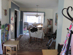
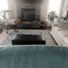
    Dining room with family room beyond

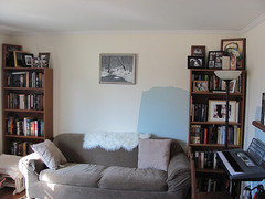
    Living room east wall


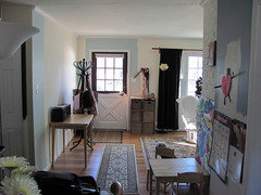
    Living room and front door, viewed from dining room. East wall is off to the right around the corner.


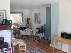
    Dining room, with family room beyond, viewed from living room.

    Light blue is BM Woodlawn Blue, which looks too baby blue to me in the day, and too greenish at night. The dark blue is the BM Jamestown blue, which we like. The color in the family room is BM Monroe Bisque (seems a little too green to go with our couch), and the color in the hallway is BM Carrington Beige. We've painted a bit of BM Mink on some trim, but won't be going that way, except possibly on the front door, whenever we replace it (soon I hope). As you can see, we've made a mess. My wife says she has a hard time visualizing from sample sheets, so we've half painted the dining room. I'll be sanding most of it away with my new Festool, and skimming over the rest, so no big deal, I hope.

    I've spent lots of time on the BM website, and have collected many color swatches, too. 'Smoke' looks a little too baby blue to me.

  • 14 years ago

    BM suggests the two palettes Soothing Green and Cottontail, and Mink and Meadow Mist to go with Jamestown Blue.

    For what it's worth, I don't think JB is too dark.

    Here is a link that might be useful: Jamestown Blue Living Room

  • 14 years ago

    We've looked at those colors. Meadow mist was a contender, but too green for trim, and too muted for our walls. Cotton tail, too peach. Perhaps I should look at soothing green again.

    That picture of the Jamestown Blue living room looks like a different color. It seems so much darker on our walls. Our dining room doesn't get much natural light.

  • 14 years ago

    I've been looking at those same paint chips for my laundry room and had the same thoughts about the woodlawn, buxton and stratford blue. I don't like colors with too much white in them either. Right now I am looking at BM quiet moments and BM beach glass (they are next to each other on the chip). They seem to complement the Jamestown Blue really nicely and aren't too babyish.

    I like the Jamestown blue in your dining room btw : )

  • 5 years ago

    Benjamin Moore’s Historic Collection colors are timeless- I have been flipping houses for the better part of 3 decades and always use colors from that collection on my flips, rental properties and my own home for both indoors and out.

    You are wise to use the Aura Paint! It is the only paint we use with the exception of ceiling paint- it is a little tricky to work with at first but once you become accustomed to working with it it will become a preference. Tip- do all cut in work on a wall first, then roll. As soon as you finish the wall immediately backroll the entire wall starting at the ceiling and going to the floor. Remove the roller from the wall and continue the process across the entire wall. During this process the roller must only move in one direction. If you keep contact with the wall and roll back up from the floor to the ceiling you will end up with a finished paint job that looks like freshly vacuumed carpet and often times runs you don’t notice until it is too late

Sponsored
Hope Restoration & General Contracting
Average rating: 4.7 out of 5 stars35 Reviews
Columbus Design-Build, Kitchen & Bath Remodeling, Historic Renovations