

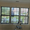
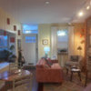
Need Help with Wall Color
16 years ago
Sort by:Oldest
Comments (18)
Related Stories
SHOP HOUZZShop Houzz: Products to Help You Create a Gallery Wall
Curate a stunning collection for a gallery wall that makes an artful statement
Full Story
COLORPaint-Picking Help and Secrets From a Color Expert
Advice for wall and trim colors, what to always do before committing and the one paint feature you should completely ignore
Full Story
PRODUCT PICKSGuest Picks: Help Your Home Blossom With Floral Decor
Sprinkle hints of spring around your rooms with fabrics, wall coverings and more that recall nature's charms
Full Story
DECORATING GUIDESDownsizing Help: Color and Scale Ideas for Comfy Compact Spaces
White walls and bitsy furniture aren’t your only options for tight spaces. Let’s revisit some decorating ‘rules’
Full Story
PRODUCT PICKSGuest Picks: 20 Frameworthy Works to Help You Get Motivated
Conquer your goals and lift your spirits with encouraging art prints of inspirational quotes for your walls or shelves
Full Story
DIY PROJECTSHelpful Hangers: French Cleats Support Projects Big and Small
From cabinets to birdhouses, French cleats hold projects securely in place
Full Story
HOUZZ TOURSMy Houzz: Saturated Colors Help a 1920s Fixer-Upper Flourish
Bright paint and cheerful patterns give this Spanish-style Los Angeles home a thriving new personality
Full Story
REMODELING GUIDES8 Tips to Help You Live in Harmony With Your Neighbors
Privacy and space can be hard to find in urban areas, but these ideas can make a difference
Full Story
COLORPick-a-Paint Help: How to Quit Procrastinating on Color Choice
If you're up to your ears in paint chips but no further to pinning down a hue, our new 3-part series is for you
Full Story
COLORPick-a-Paint Help: How to Create a Whole-House Color Palette
Don't be daunted. With these strategies, building a cohesive palette for your entire home is less difficult than it seems
Full Story
fuzzywuzzer
gmnolenOriginal Author
Related Professionals
Tuscaloosa Interior Designers & Decorators · Fort Myers Interior Designers & Decorators · Fergus Falls Interior Designers & Decorators · Santa Fe Interior Designers & Decorators · Minot Interior Designers & Decorators · Greenville Kitchen & Bathroom Designers · Sierra Vista Kitchen & Bathroom Designers · Amarillo Kitchen & Bathroom Designers · Provo Kitchen & Bathroom Designers · Anchorage Kitchen & Bathroom Designers · Emporia Furniture & Accessories · California Furniture & Accessories · Oklahoma City Furniture & Accessories · Ottumwa Furniture & Accessories · Oxnard Furniture & Accessoriesbestyears
kjmama
gmnolenOriginal Author
scanmike
homebodymom
mitchdesj
User
saltnpeppa
gmnolenOriginal Author
patty_cakes
scanmike
miller88
User
jockewing
moonshadow
User