Software
Houzz Logo Print
charlikin

Paint color redux

17 years ago
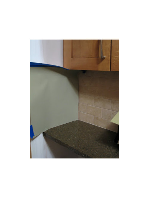
Well, I've been rethinking the paint color. (Seems to be a lot of that going around here!) In my original Suggestions for paint color thread, I loved the smokey blue idea. Unfortunately, once I got the samples, it didn't really work for me.

Then I thought I'd just go neutral, paint something that would blend in with the backsplash, and get color out of my window treatment instead. Since I'm painting my living room a neutral shade (probably BM Shaker Beige or Wheeling Neutral), it would have been easy to just carry the same color into the kitchen. Both colors seemed to coordinate reasonably with the tile.

But it still wasn't working for me - too boring. No pop to it. Not that I want a lot of pop in the kitchen - it's really tiny and I don't want to overpower it. But the neutrals did nothing for the kitchen.

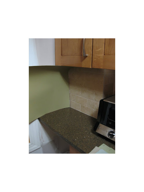
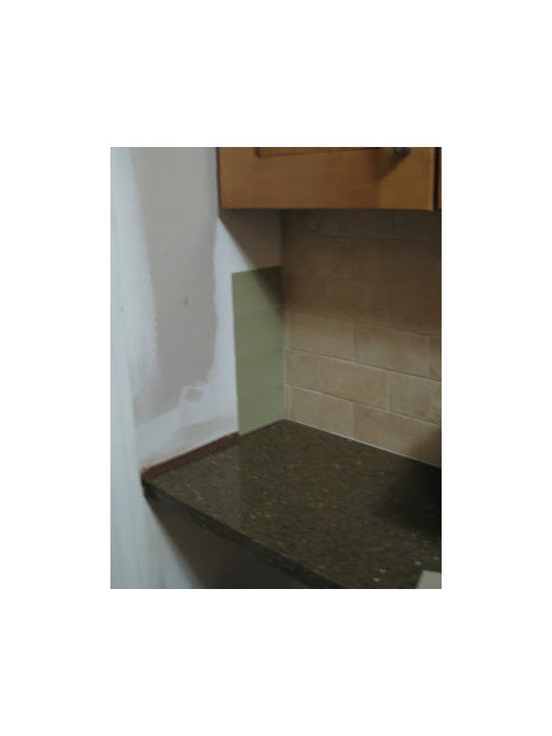
So now I'm swinging over to green. I'm thinking one of those soft neutral-ish gray-greens... not something that screams GREEN. There seem to be a number of shades that would work (it's so much easier when you're not trying to *match* the tile!), so I just have to figure out which I prefer. I looked over some of the other paint color threads, here and on the home decorating forum, and brought home samples of some of the more popular colors. Here are a few examples:

This is BM Nantucket Gray (hmmm...I think the picture looks too blue here - it's a little more green-gray in person):

BM Olive Branch (and this photo looks too intense - color should be a little more muted):

BM Dry Sage (this is pretty accurate):

Am I on the right track? Anyone have any preferences? Any favorite green you think might work better??? (And hey, any tips for taking pictures with more accurate color? I set the color balance on the camera, which got me in the right ballpark, but the colors are so hard to photograph accurately!)

Thanks!!!

Comments (23)

  • 17 years ago

    Since I'm a "green" person, I love the colors you've posted, particularly BM Olive Branch. Two other greens you might want to try that are green-gray are BM Baby Turtle and BM Flowering Herbs. They are on the same color strip, Baby Turtle being darker. I am using both throughout our renovation. Good luck - love how the kitchen turned out!

  • 17 years ago

    I love the Olive Branch as well - at least I think a yellow rather than blue based green would look better. Try BM Camoflage - I think its neutral although the darker colors on the strip are olives.

  • 17 years ago

    Oh, it's so hard to do with pictures! And since everybody's monitor shows colors differently it doesn't even matter much how accurate the pix are. Sigh.

    What I'm seeing on my own machine, the gray brings out the color in the granite the best, whereas the two greens compete more.

    What I did when I was painting my rooms is buy quarts of all my good choices (also Benjamin Moore) and painted large swatches on different walls, with a couple of inches between. Then I went away for awhile and stopped thinking about color, and let them spring on me as I walked in.

    This turned out to be such a blessing! I was all set to paint my living room a beautiful, historic, butterbeige color until I saw it on an overcast morning. It made me want to weep it was so depressing!! I ended up with a gray-green that looks good in all lights and sets off the furniture.

    It might be worth trying!

  • 17 years ago

    I'm a color person so color works for me. I have a green dining room and I love it the kitchen and dining room are detached by a small hall, my kitchen is barn red and beleive it or not those colors are very compatible, my husband got me over my fear, just look at it this way its only paint you can always repaint I know its work but be brave. I started buying quarts of a color and painting large spots to see if I like it. I have quite a few quarts that didn't work but I now have a house with color that I love. Have fun with color, and happy painting

  • 17 years ago

    I just painted my kitchen in olive branch. i love it! I got lucky on this color and got it right the first time. i was going to try to post a photo, but photobucket is not working for me. i don't know what is going on, but I tried to post just like I always have, but something has happened,

  • 17 years ago

    I like dry sage or olive branch.

  • 17 years ago

    BM light khaki might be worth a look. It's much beiger than anything you're looking at, in fact, it's barely green at all. But put it next to your backsplash, and I bet it will read green. It's a great "get-along" kind of color.

    Probably not what you're looking for, but a green I've always tried to find a place for is BM rainforest dew. One of my kids is going to go off to college, and come back to find that I've hijacked their bedroom, lol!

  • 17 years ago

    Oh, Charlikin, I feel your pain! I am in my own paint color hell right now too (However, I AM trying to pick a paint color before everything is installed so that is most likely contributing to my hell).

    Camouflage seems like it would be a nice neutral green and I think that is available in the 2oz samples. That seems worth a try. So is Sag Harbor Gray, but it might blend a little too much with you cabinets.

    Other than that, I feel like I have sampled them all. Nantucket Gray, Dried Basil, Spanish Olive, Baby Turtle, Flowering Herbs, Tree Moss, Grecian Green, Olive Branch.

    I have sampled the Nantucket Gray at 100%, 75%, and 50%. Depending on your lighting situation, Nantucket Gray can be kinda dark. If you like it, but just want to lighten it up a little try it at 50 or 75%. (At 50%, I found it very similar to Spanish Olive. At 100%, Nantucket Gray is almost a match for Dried Basil).

    I think Tree Moss and Grecian Green a pretty greens. They lean a little more towards blue than Nantucket Gray, but they are not too blue. They might be just bright enough to add some contrast while still working with the neutrals you have in the rest of your house.

    Sorry, I don't know I am any help...I am really not very good at this stuff. Good luck to you! Can't wait to see it!

  • 17 years ago

    Last week I painted my kitchen and br SW Grasslands, and I'm pleased with it. It's on the same paint strip as Svelte Sage, a popular color, one shade lighter. The paint guy said it has black and umber in it. I consider it a green with beige undertones, soft and not overpowering. The light that comes into these rooms is filtered and not too intense.

  • 17 years ago

    Lots of greens here...

    Here is a link that might be useful: Greens in the Home Decorating forum

  • 17 years ago

    I like BM Nantucket Gray a lot. It's my go to color, but I don't like it in your picture. Maybe try Baby Turtle?

  • 17 years ago

    I liked grasshopper when I held it up to the screen, but it was a bit bright when I photoshopped it in.


    And this is baby turtle.

  • 17 years ago

    Sherwin Williams has one that is stunning. Called Svelte Sage.

  • 17 years ago

    Ah, Sherwin Williams. I always see such beautiful SW colors around these forums, but they don't seem to sell it in NYC.

    Have to get back to Janovic and pick up some of the samples you're all suggesting. Laxsupermom, thanks for the photoshop images! Those look much too yellow to me, though - I guess I'm not into the yellower greens. Even Olive Branch, which is a beautiful color, looked too - well, *olive* to me this morning. OTOH, Nantucket Gray didn't look green enough. The Dry Sage looked like a good compromise - more olive than NG but less olive than OB, but it also looked kind of dark. (My kitchen gets very little light.) So I've either got to find a lighter shade, or maybe try it at 50%.

    Merimom, it looks like we're on the same path - and you're way ahead of me in terms of samples tried! Gotta catch up. ;-)

    I wish I could have painted before my cabinets went in. It's such tight quarters in there, I'm worried about damage. Especially with the heating pipe in the corner - I should have insisted that at least it be scraped down first - I don't know how the painter's going to scrape it without damaging the cabinets, or the crown molding that's notched around it.

    I think I want to get the painting done just so I can stop worrying about these things!

  • 17 years ago

    This is RL olive tree.

  • 17 years ago

    charlikin - most paint places can match/mimic the paint colors from other manufacturers. So if you like a SW color, ask them if they can do it.

    Oh yeah - on better monitor today and am liking Dry Sage more.

  • 17 years ago

    I love greens. Several rooms in my house are various shades of green. I go for the dry sage or olive branch.

  • 17 years ago

    Someday I'm actually going to paint.

    I really like BM Dry Sage as a color, but I think it's too dark for my tiny kitchen. So I moved over to Tree Moss - beautiful soft green slightly more on the blue side than the yellow side. When the light is on, I think it's lovely. When the light is off, it's too dark.

    So then the options become Camouflage or Spanish Olive, which is almost identical. When the light is off, they're perfect. With the light on - they're pretty, but I worry they'll be too washed out.

    Which way am I going to look at my kitchen more, with the light on or the light off, you may ask? You'd be surprised. My "office" is right outside the kitchen, and I spend a lot of time looking into the kitchen at the window with, yes, the light off. :-)

    In this photo, that's Tree Moss bottom left, and Camouflage is on the strip cards, it's the color closest to the cabinet:

  • 17 years ago

    I think the greens look nicer in your kitchen than the beiges and taupes. The camouflage, on my screen, turns your backplash too washed out and orangey. It isn't a ton of wall space, so it is the perfect place for a more saturated color to make everything else pop. Love your kitchen!

  • 17 years ago

    We used Lapand by BM Auro paint. Also in the green family and it came out beautiful. I like your olive branch or sage. (the 2nd looks a little more like it has a blue hue). Good luck. We brought home lots of samples swatches and made our on boards to hold hold till we decided. Picking the wall color was harder than picking the cabinet.

  • 17 years ago

    Astonishingly, still haven't chosen paint colors. I think I'm getting to the point I was in with cabinets, where I hated all finishes in all species of wood across all brands - except for ONE (Kraftmaid Maple Ginger Glaze). I wish I'd find that ONE in a paint color!

    Anyway, I bought a bunch of samples from myperfectcolor.com - I love that you can choose any color from them, not just the choices from the little sample jars, and that you can adjust the color to be darker or lighter. I'm taking advantage of that to try to get lighter versions of colors that I like but that are too dark - for example, I'm probably going with Lenox Tan at 50% in my living room. It still has that nice light coffee-ish tan in the day, and unlike the 100% version, doesn't get too dark at night.

    But back to the kitchen... Here are the samples on the walls on either side of the window:

    There are three shades here - Spanish Olive on top, Dry Sage (50%) in the middle, and Tree Moss on the bottom. I like that the Spanish Olive is lighter, but it might be a little grayish. (It's very similar to Camouflage, but Camouflage is even grayer still!) I like Dry Sage but think it's still too dark, maybe. I *love* Tree Moss in other people's pictures, but think it might be too blue for my countertop - the counter seems to want more of an olivey color.

    On this side, I have Spanish Olive again on top, and Dried Basil (50%) underneath. DB is the next color down from SO on the color strip, and even at 50%, it's a little darker than the SO. Same family of color, though.

    I'll also throw in a better look at my countertop:
    {{!gwi}}

    They all look practically the same and I should just choose one, right? ;-)

  • 17 years ago

    I like the Spanish Olive (as much as one can say using photos and monitors). A little bit of a grayness is actually a good thing. It can introduce a bit of tension and pop up the granite.

  • 17 years ago

    As much as I love creams, blues, grays... I'm agreeing that the very soft greens work with your kitchen. The Tree Moss on my monitor does read slightly blue. I think you need something that reflects the light some so I'm going with the pick that keeps coming up for you (should tell you something there charli!)... Spanish Olive.