Software
Houzz Logo Print
lindamarie1

Exterior 1910 House

13 years ago
last modified: 13 years ago
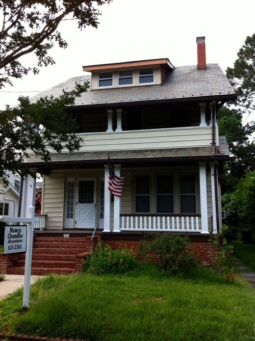
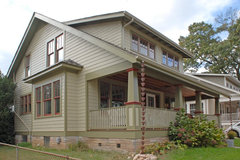
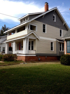
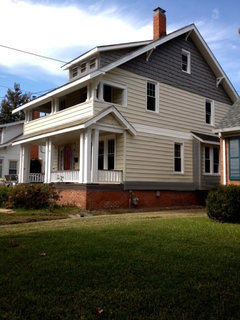
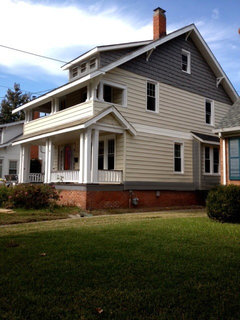
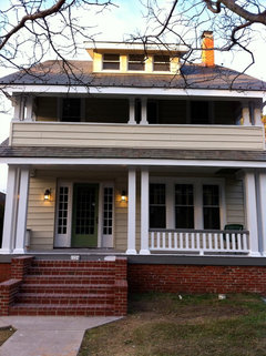
I posted this house a couple of months ago and thought I would ask for your assistance once again. All of the brown trim (and the for sale sign) was the house at time of purchase. The slate roof is complicating matters as far as a cohesive color scheme, to me anyway. The roof from the 2nd floor up is nice, mostly grays with some red similar to the brick on foundation and chimney. However, the roof from the 2nd floor down has green in the slate along with grays and reds. The siding is a soft banana cream color and, considering the age of it looks remarkable so of course we do not wish to replace it. Along with the new white cornice wrap we've installed, we painted the shingles up toward the eaves, on each side of the property, BM Dolphin which goes darker on the cloudy days and much lighter on sunnier days. To my eye, the house isn't flowing and would love some input. There remains some brown on the porch railing which will be painted this week along with some foundation plantings that help to detract from the red foundation.

Comments (102)

  • 13 years ago
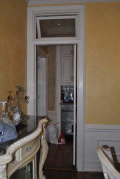
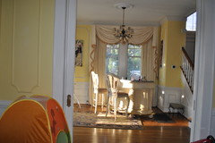
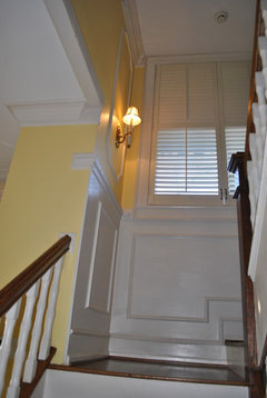
    LOVE the crown molding and arched doors...these are interior shots of ours. Please keep in mind this is NOT our furniture....I wouldn't keep a bar in the foyer...maybe in my 20s...but I'm definitely beyond the animal house frat house look now. The dining room furniture is not ours either...but chandeliers and mirrors stay...YAY!
  • 13 years ago
    Lindamarie...I obviously have the same picture problems as you! LOL couldn't delete a duplicate. Here is what I tried to post!
  • 13 years ago
    I don't understand--aren''t the spindels on the stairs already white? Yes, refinishing the newel posts and the treads would be very nice. A runner would be the finishing touch. Love those old pocket doors.

    I don't like high gloss finishes. Every little imperfection shows. They are more durable, so the first coats can be high gloss and the top a matte or semi. Poly scratches though. Some swear by Marine Varnish (really a poly) but some say that is only for areas with high humidity and water issues. There are some new European type finishes out there that have characteristics of both--high wear and more natural looking. And there is a return to Amber Shellac, which is green and easily touched up, but not terribly water resistant.

    It is worth checking various options with a professional, not just the guy at the home improvement store. You can ask for quotes and the products they would use.
  • 13 years ago
    I think all you might be misisng is some "headbanding" on the exterior and some weighty trims around the windows. Looks great. Good luck
    [houzz=
    exterior · More Info
    ]
    [houzz=
    Traditional Exterior · More Info
    ]
    [houzz=
    Craftsman Home · More Info
    ]
    [houzz=
    Sears Craftsman in Del Ray · More Info
    ]
    [houzz=
    AA Trueline Construction Services Inc. · More Info
    ]
  • 13 years ago
    I think all you might be misisng is some "headbanding" on the exterior and some weighty trims around the windows. Looks great. Good luck
    [houzz=
    exterior · More Info
    ]
    [houzz=
    Traditional Exterior · More Info
    ]
    [houzz=
    Craftsman Home · More Info
    ]
    [houzz=
    Sears Craftsman in Del Ray · More Info
    ]
    [houzz=
    AA Trueline Construction Services Inc. · More Info
    ]
  • 13 years ago
    I think all you might be misisng is some "headbanding" on the exterior and some weighty trims around the windows. Looks great. Good luck
    [houzz=
    exterior · More Info
    ]
    [houzz=
    Traditional Exterior · More Info
    ]
    [houzz=
    Craftsman Home · More Info
    ]
    [houzz=
    Sears Craftsman in Del Ray · More Info
    ]
    [houzz=
    AA Trueline Construction Services Inc. · More Info
    ]
  • 13 years ago
    I love your house, very quaint. If it were mine, I would put hayrack style window boxes off the second floor porch, 2 large ones or an expandable one all the way across. In my old house, I used the hayrack style ones with coco fiber and in the winter, fill it with greenery and berries and in the warm months, sweetpotato vine and flowers. You can use them down below as well. http://cdn.kinsmangarden.com/images/thumb/KC26.jpg (this picture shows an expandable one, same one I used in my old house, and it worked wonders)
  • 13 years ago
    I love you home it reminds me very much of the praire or mission style that Frank Lloyd Wright was so famous for.
    I would do the first floor railing the same as the second floor & put in planter boxes across the railing of both. That way you could add season colors & plants to add more interest.
    If you would rather go a less expensive route add horizontal pieces of would between the vertical railing in a pattern to add interest to the bottom railing & add a wider ledge to the top edge.
  • 13 years ago
    victorianbungalow; where do you want me to repost, my project books (idea books)?
    I like awning idea over pedestrian door, black rounded with scalloped edges maybe to coordinate with the upstairs blinds? Yes, the spindles are white but they're talking about paining "all" of it white including balusters. We "never" put high gloss anything in our houses, ewww.
    Robyn, I love window boxes but, being winter it's and not living there it's hard to keep them up. Of course now for Christmas they could be made spectacular.
    Sandrapratt, I also like the vertical siding idea, I've seen that before and haven't given it a thought since we didn't side the house ourselves.
    Great ideas, love the interaction here!
    Regina, what's wrong with a bar in the foyer, less steps to take at 5:00 after "one of those days".....lol?
  • 13 years ago
    I'm not familiar with the term headbanding, I'm presuming it is the exterior trim between floors?
  • 13 years ago
    The colors of any awnings should coordinate with the house colors, not inside blinds or curtains.

    So if you are doing a green door, then green with a yellow stripe with a bit of Dolphin type grey and a bit of dark brown, or a similar combination could be nice. Porch valances are another way to add a bit of color to a house and could match the side valance and pull it all together. I'm not sure how much that would cost, but it could look fantastic.That might help with the balance and increase the visual weight of the porch of the house, especially with a dark base, not the white one..

    Create a new project book and post your various house photos. Then I can use an updated photo for any rendering rather than an old one.
  • 13 years ago
    I was referring to the slight scallop edging of the blinds only.
  • 13 years ago
    Victorianbungalow; I loaded the photos to a new project book. We are painting the dormer today in the Dolphin color.
  • 13 years ago
    OK, I'll take a look tomorrow! Hope you loke the results of painting the dormer. How are you getting up there? Cheick the flashing and caulking whilte you are there.
  • 13 years ago
    can u help me in my project pls
  • 13 years ago
    me dng architecture i want sm grt ides to make my design and interor look oosum
  • 13 years ago
    I'm wondering if painting the dormer Dolphin will add to the top heaviness of the house, perhaps having a color made to match the existing siding would be better.
  • 13 years ago
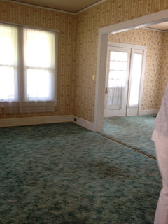
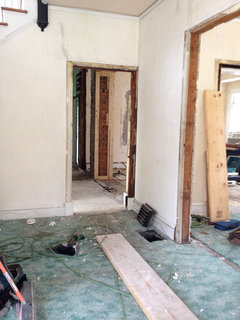
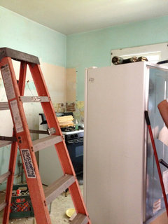
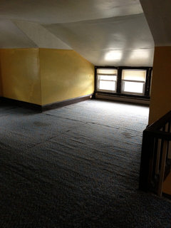
    Thought I would put up some photos of what the house looked like when we started demolition for everyone that would like to follow the project.
  • 13 years ago
    Above photos are living room into foyer, foyer into hall/dining room, kitchen is obvious (cabinets going in today) and, the third floor with the problem dormer and associated
    windows which are getting grids today.
  • 13 years ago
    Parul Jain,
    What do you need help with?
  • 13 years ago
    last modified: 13 years ago
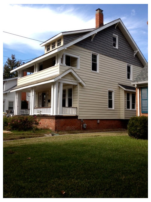
    Here's some renderings with the Dolphin dormer (I hope the color is not too heavy):

    1) A painted white beltline (originally a trim board, but faked by painting two rows of siding, lined up to match the molding on the top of the bump out) should go all around the house. Don't have to mask--just keep a bucket of water and some rags or a sponge to quickly wipe any goofs.

    2) A painted drip board--two bottom rows of siding, in Dolphin, painted all around the house, perhaps continuing as sort of a baseboard for the porch area.

    3) Dolphin painted bump out (Optional, but I think it would look great.

    3) Options with the white trim board under the porch (current) with the brown to match porch floor (past) and with Dolphin. I prefer the darker options. May have to copy onto computer and blow up to see difference. (Not sure of exact tonalities in the sun for the Dolphin on the dormer and porch--can look quite a bit lighter than on side I think. I wonder if it is too heavy for the dormer and too light for under the porch. A related but darker version might be a possibility)

    4) Dolphin top rails on porch

    5) Bright brick red front door. I like the green too, but this will have more of a punch and brings the red color up. I would paint all doors this color, maybe even the storms. Or the storms could be Dolphin.

    6) Doesn't show on this, but I would paint the thin front entry trim outlining the door and sidelights Dolphin too. Keep the white for the sidelights and the panels below the sidelights.

    7) Awning: Crestview makes wood awnings (I have very old wood awnings on my house actually--probably date to the 40s or so) and that could be a good option for the side in Dolphin, possibly with a bit of red or whit highlight (just two wood strips painted perhaps--paint red, run a line of painters tape over down the center, and then paint white) Or go with a canvas one. You will have to call to get prices or find a local dealer. http://www.crestviewdoors.com/browse/products/easy-up-awnings.html

    Anyway, I think the paint like this will be enough to help balance it out. It restores some of the detailling it probably had originally and keeps the sides from looking so flat. Even just doing the detail painting on the front porch will help.

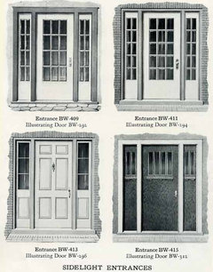
    I also found a millwork catalogue with your front door in it. I really like the style.
  • 13 years ago
    i personally like it better without the trim board painted white.... still looks very nice. M
  • 13 years ago
    The house colors look great.!! You did a great job.
  • 13 years ago
    Victorian; are you using photoshop?
  • 13 years ago
    NO ME NT
  • 13 years ago
    Can you speak in English?
  • 13 years ago
    Can you post a picture of what you need help with?
  • 13 years ago
    Parul,
    You might try using DISCUSSIONS at the top of the page and start your own thread with photos of the space you are decorating and a clear question of what you need. You will find many people willing to help. If you are studying architechture and just want interesting ideas, you might peruse the PHOTOS section of houzz.com instead to get ideas.
  • 13 years ago
    OK
  • 13 years ago
    OK
  • 13 years ago
    ACTUALLY i hv to prepare my portfolio for training so can u tell me wht all i hv to attach in that
  • 13 years ago
    Parul, this isn't the best forum for that discussion. You might try doing that in discussions and posting photos of your portfolio there.
  • 13 years ago
    ok thanks
  • 13 years ago
    pls one more question ...... u people are critics ??
  • 13 years ago
    sorriii
  • 13 years ago
    Well, maybe I should have used the word "could" rather than would. All of it is optional, including the white middle trimboard, and it probably would be less bright than pictured. The orignal was probably a little narrower and slightly higher, but I was trying to work with the existing siding.

    The bump-out is optional too, or could be white--and I think the apparent difference in planes would be greater in real life. I do think the bottom trim helps with the transition from the brick and helps ground the building, and the front should be dark rather than white under the porch..

    I used Photoshop for my first posting and Microsoft Picture-It for the second. I find Picture-it easier for adding and changing structures and moving and resizing stuff to paste in or copy, but Photoshop is better for color matching and texture, and experimenting with different color combinations. I have an old version of Picture-it so I am thinking about updating to see if they have expanded the masking and color controls. It is great for a quick collage of photos too, and much cheaper than Photoshop, and doesn't seize up my computer like Photoshop can..

    I discovered that it is best to insert or draw shapes with the bounding box and fill in with the approx color, magic wand select it, and then brush over it in transparent layers on top. I do that in Photoshop too, and compensate for perspective, so it takes a bit of fiddling around to make it look somewhat right, esp. in shadow areas.
  • 13 years ago
    My daughter uses photoshop and said she'd help me with the learning curve. I tried using Benjamin Moore's personal color viewer, and my computer just about went flying across the room.
  • 13 years ago
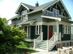
    We painted the door Great Barrington Gray, what do you all think?
  • 13 years ago
    What about black?
  • 13 years ago
    Before worrying about colour, I's make sure that the elements of the house are true to the period. For example, did they really have boards on the top balcony and pickets on the lower balcony? Maybe they did. I would make it flow in black and white photographs first.
  • 13 years ago
    It is a lot to read through, but they are selling and did not want to change the siding that much and was afraid that uncovering the 2nd foor railings would be one of those little turned big projects.

    Actually craftsman style houses did have enclosed railings, usually combined with masonry piers. Was it originally like this? Probably not.

    Lindamarie, I see you painted the trim under the porch gray, so that looks much better, and makes the address and columns stand out more. The green door looks good with the new light fixtures. . Nice to see it clearly now. Did you paint the porch floor too? Looks like you changed your mind on the dormer, which is probably good.

    I think I would like the green of the door on the top railing. The grey just isn't quite warm and heavy enough of a color. Not terrble or anything, just needs a bit of something. Try those inexpensive urns with the greenery--will dress it up all winter and make it look less bare. Another chair and a little table on the porch will cozy it up a bit.

    If the temps are dipping below 50, I would call off painting for awhile. The paint can fail, wihich is a huge mess. Make sure the temp is OK early in the day so it has time to dry and finish what you started.

    It looks like some trim is sagging on the top porch on the far right. Little stuff like that drags a house down.
  • 13 years ago
    So, you think the green is the right green and not too bright? I'm more accustomed to the subtle tones (black always looks good to me) so it's a bit out of my comfort zone. The temps are okay off and on for painting, think we're going to get our landscape in this weekend.
    Yes, I see the trim and I'll check that out.
  • 13 years ago
    last modified: 13 years ago
    Dormer is getting siding color and, porch will be painted when the construction traffic slows down.
  • 13 years ago
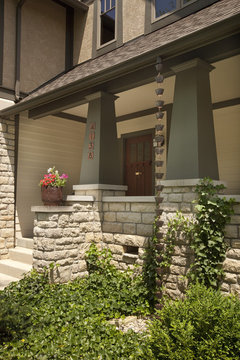
    Nice. I'd spring for better quality larger house numbers. Like this house shows. I'd place the house numbers as this photo shows, too, the numbers near the door will draw the eyes up to the nice front door area and not the less attractive stair area.
    Porter Street Bungalow · More Info
  • 13 years ago
    Lol, yes we are not planning on keeping the flowered/ceramic numbers on the porch.
  • 13 years ago
    The green is definately not too bright. If you look at old house drawings, they were definately not afraid of a little color, and being under a deep porch it has to be a bit brighter than usual for it to show up.

    Definately better to have the numbers higher up on the house, perhaps left of the door. I got some nice old-fashioned but classic house numbers from Home Depot and it made a huge difference. They were basic Roman style font, but with a bit of flair to them. With the siding, it might be easier to put them on a board first.

    We tried brass with a black plaque on our current house, but it looked terrible and was hard to read. My husband thought it would be brighter and easier to read, but it wasn't. We now have a solar lighted numbers--a compromis because so many people have trouble finding us.
  • 13 years ago
    VBR (I hope this abbreviation is okay with you)
    I will check them out next time in HD, which lately is daily. Thank you for all your help, I cannot wait to get it done.
  • 13 years ago
    My husband just told me he's planning on getting a black plaque with "white" numbers. I would like to see this reversed......
  • 13 years ago
    We are refinishing the existing pine floors, very narrow 2 l/2" in width and are very yellow/orange in color. We have painted the interior walls BM Anew Gray with Shell White trim and this color floors will not work. What stain color would be recommended to give a darker, but not too dark, walnut looking finish?
  • 13 years ago
    Maybe you should start a new thread on that. Amber shellac and varnish is a historic finish that is regaining popularity because it is green, but it isn't really water resistant. However, ours is at least 50 years old and still going strong.

    Not an expert on wood finishes. Poly looks plasticy and scratches. Have a friend who swears by their Marine Varnish, but that is normally not recommended for indoors. There are some European type finishes that are supposed to be inbetween a wax and a varnish (not Danish Oil). Maybe you can get some flooring guys in for a quote and ask what they use.
Sponsored
Wannemacher Interiors
Average rating: 5 out of 5 stars26 Reviews
Customized Award-Winning Interior Design Solutions in Franklin Cnty OH