Software
Houzz Logo Print
pipdog_gw

Please help picking out wall art layout - Pics

15 years ago
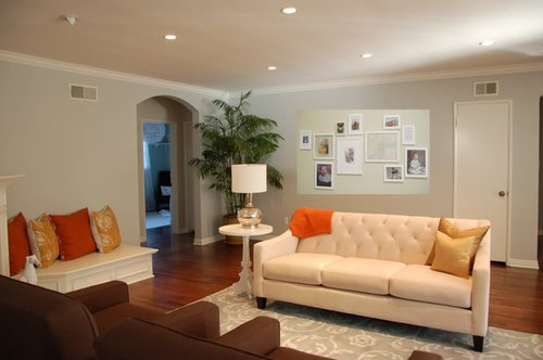
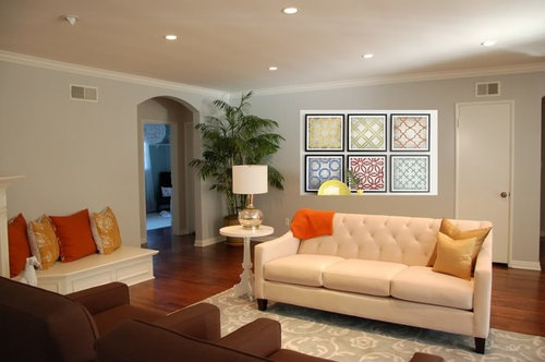
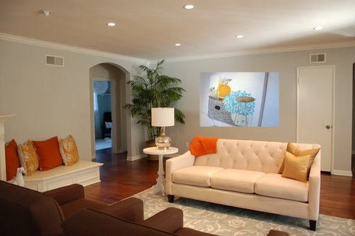
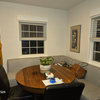
We have one large wall behind our sofa that needs some frames or art. I'm considering doing white frames in either 1) 8 frames side by side with B&W photography or colorful prints; 2) an asymmetrical layout with random family photos and some photography; 3) 6 frames side by side with orange and turquoise geometric prints; or 4) a piece of artwork (I can't afford this piece, but I'm thinking of DIY one similar with orange/turquoise colors). Here are the ideas -- what do you all think works best in this space? Also, do we need a table on that wall?

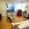
Option 1:

{{!gwi}}

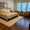
Option 2:

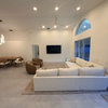
Option 3:

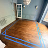
Option 4:

Comments (16)

  • 15 years ago

    Just for perspective, here is another view of the room with artwork on the mantel:
    {{!gwi}}

  • 15 years ago

    I like #1 or #3. I prefer the symetrical layout with your furniture. Also, I prefer the black frames in #3 to white in #1. I think black frames with either colorful or black and white photos/art would be great. And, a long narrow table against the wall would be nice too.

    Love the doggie!

  • 15 years ago

    #4 is my favorite (by a mile) ,,, and I wasn't swayed by your post (I looked at the pictures first). Especially, if you are doing a long, narrow table (or sofa table), I would do a large statement piece or two (versus a grouping). If you did a table, what would you put on it? Thinking about that might help in selecting wall art.

    Anyway, it looks like the dog is checking out the wall and trying to help out too!! :)

  • 15 years ago

    I like #1, then #3. Beautiful room! You've done a great job!

  • 15 years ago

    I think I like #1 with colorful prints and then #3. It would depend on the prints you found, because I do like the ones in #3.

  • 15 years ago

    My first vote is for Option 2 with the random asymmetrical display of photos. The room seems to have very clean lines and the randomness display of this option would help soften and balance it all out in my opinion. My second vote would be for Option 3.

  • 15 years ago

    I love option #4. I think it goes with the elegant, understated feeling in your lovely room. I think the others are just ok, and not really special.
    Dee

  • 15 years ago

    Thanks for the input - it's very helpful! I love, love, love the painting in #4, but it is well beyond our budget. I would like to think I could DIY a "statement piece", but I'm not so secure in my artistic abilities. I'm going to buy some paint this weekend and test it out - we'll see how it looks.

    If it makes any difference, we're adding a glossy turquoise painted coffee table that I've re-habbed. I'm now thinking that with the pops of color (the orange throw and pillows, turquoise table), black and white photography might be the best option. The table would look something like this (obviously turned in the other direction):
    {{!gwi}}

  • 15 years ago

    I love option 3. Where did you find those prints?

  • 15 years ago

    I like #3! You're getting so many different answers, LOL

  • 15 years ago

    alicate, the prints are from Crate & Barrel.

    If we did a table on the back wall, I'm not sure what we'd put on it. Probably not a lamp since there is one on the little white table next to the sofa. Maybe just some books and a vase?

    Here is a link that might be useful: Symmetrical art from Crate & Barrel

  • 15 years ago

    Lovely room!

    Any chance you would consider flipping the couch and the two dark chairs? I am asking because I think the dark chairs,with their greater visual weight, would anchor the sitting area more effectively floating in the middle of the room as opposed to the lighter and sleeker couch.

    That might also allow you to use a narrow sofa table behind the couch for some lighting on that side of the room, or you could wall-mount a plug in fixture or pair of lights behind the couch. You won't want the overheads on when you are relaxing or entertaining in the space.

    The round table and lamp that are currently beside the couch could then go between the two chairs.

    As for your wall, would you consider these, hung one over the other horizontally? I like how some of the sections of the panels pick up the curved designs in your area rug, and the colors seem to be what you want to pick up the accents in your room.

    abstract wall art

  • 15 years ago

    Option #1-- gorgeous room!

  • 15 years ago

    hi les, thanks for the suggestions. We tried last weekend moving the furniture around. The foyer is behind the sofa so when you walk in, so the first thing you see when you walk in is the back of the sofa. One thing I don't love about the space is the lack of natural light in the living room, so we kept the sofa there because it made the room seem lighter.

    I like the art you picked out. The main problem we are having is that the wall is just so big and anything we put on it feels like it is floating. I think the colors of the art you suggested work fantastically in the space. I'm going to measure out the panels on the wall and see how they work.

  • 15 years ago

    Another option might be to buy Ikea's dirt-cheap framed mirrors and paint them all the different colors in your room, hanging them in a grid. They're $2.99 each; they used to be $1.50, so you could buy as many as would fit in your large area. They're easy to paint, but if you wanted to get creative, you could decoupage them.


    Dee

  • 15 years ago

    I liked les's idea, but was going to suggest you hang them horizontally. I see he's already said that. If that doesn't work, I like #3. I think a narrow table would reduce the "floating" feeling.