Software
Houzz Logo Print
susan1208

Should I continue???

17 years ago

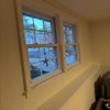
My painter couldnt make it today, he will be here tomorrow. I have no patience whatsoeverm, so I just finished painting that coral wall, so it is still somewhat wet and a bit darker, but close enough.

I put some of the aqua next to it.

I am liking it..........but always need to look thru other eyes.

So should I continue???

{{!gwi}}

{{!gwi}}

Comments (36)

  • 17 years ago

    FYI; my screen shows the color more accurate in the window picture.
    Other picture too bright and too blue.

    Thanks

  • 17 years ago

    Yes, yes, yes! It's gorgeous! Keep on! :-)

  • 17 years ago

    A yes from me too!!

  • 17 years ago

    Yes keep going and post pics when you're done :) Can't wait to see it.

  • 17 years ago

    Hmmm... I'd do a bit more subdued shade of blue-green-gray.

  • 17 years ago

    I would second what eliza has said.

    Your furnishings are rather sophisticated and the bright/bright combo may overwhelm them. Even in a tropical or beach area where people tend to decorated with more vivid colors this may be a tad too busy.

    Check out some historic building that use the coral/aqua/buttercup combos for inspiration.

    Here is a link that might be useful: Art Deco - South Beach

  • 17 years ago

    I too think your home/furnishings are rather sophisticated and this combo will be tricky. I'd try a number of shades first and then try one wall.

  • 17 years ago

    On the Art Deco link, the "Cavalier, detail" picture show a combo of your colors,
    although the bright aqua is in a lesser quantity.

    Maybe you should repost your room pictures so people get a general idea of the large space that will be aqua.

  • 17 years ago

    I agree that it may be too bright an aqua to give the sophisticated vibe, and balance the depth of the coral in the kitchen.

    I think you need a deeper, more 'peaceful' aqua/teal color. Maybe something like BM Boca Raton Blue, or even Kentucky Haze. Of course those particular colors may not be right in your space, but something along those lines.

  • 17 years ago

    I've never felt that aqua was right for your space, based on your furnishings, but I don't live there so I haven't commented. However, I keep sensing that YOU are not convinced that aqua is right for your space. If that "old world" looking trunk in the picture above is an indication of the things that you will fill the space with after painting, then I would halt the bright vivid aqua.

  • 17 years ago

    Here is the space I will be painting. Ignore the mess, I put everything away to make room to paint.

    The drapes will be either off white or white sheers. The lamp is not staying, going for something more contemporary. Don't know yet what I will be doing with arched windows.

    So this is the space to be painted.


    Thanks..........and I am running out of time, so please all advise is appreciated.

  • 17 years ago

    It's a beautiful blue, but I have to agree with some of the others. I can't see it in this space. I would go with a more subdued blue green - a little darker and a lot greener and less intense that the one you have. Wish I had some paint chips to make a suggestion. Don't feel pressured by the painters schedule. Take your time and be sure. You want to love it when you are finished.

  • 17 years ago

    I'm thinking more of a barely-there version if you stick with that color. Maybe doing something like that on the ceiling instead would be better too.

    I think it's just too much for both adjoining spaces to have such strong, countering fields of color. They don't have a real separation between them. I love those two colors together but with one as an accent. I just can't see it working. The 'pink and blue' of it all would bother me.

    Take your time and be sure before having someone else do it.

  • 17 years ago

    I'm agreeing with tgd on this one.

  • 17 years ago

    Okay,

    I am going to agree that my color was too bright and strong for my room.

    I ran over to SW and got some more paint chips.

    I likr SW watery and raindrop. They are a more subdued color. I looked at the Boca Raton Blue, too dark for my taste. My paint store with BM was closed by the time I got there.

    So any other color suggestion..........I can't believe I am still looking......want to cry...........

    SW Watery or Raindrop? Is this okay.

  • 17 years ago

    I would say Watery over Raindrop; on my fandeck, Watery looks a bit more grayed down. It's still quite bright, though, IMO. Have you looked at any of their more "neutral" aquas? The Fundamentally Neutral section of my fandeck has SW 6219 Rain, 2 up from Moody Blue (which I used as the foyer accent color in the posterboard mats I posted on another of your threads). It might be a touch less green than Watery, but it was still a true aqua for me.

  • 17 years ago

    even being a designer i'm having a bit of a challenge seeing the blue in the space..i'll admit..im not a fan of blue since our fire so i may be a bit biased (had a lot of blue in my before fire house)

  • 17 years ago

    There must be a full moon. There's just a lot of posts that I'm not *getting*, lol.

    For the life of me, I can't understand why you want to take your window treatments, that it looks like you've chosen to blend with the kitchen color, and pitch them for white sheers. I've mentioned this on another of your posts.

    Don't get me wrong, they can look lovely. Many posters showed you theirs. If I recall correctly, though, they didn't have large leather furniture and woven wood blinds (which are great).

    I'm assuming you want to change your look to a light and beachy look. IMO, your furnishings won't support that.

    Very few can get away with such bright colors. Jen is one because the rest of her things are cohesive with that style.

    I'd do a drabbed out green in the same value as the coral and leave the WTs as is.

  • 17 years ago

    I'd go Tidewater (one up) at most. Sea Salt is pretty, more green and grayed but in this light I see some blue-green to it. Or Rainwashed.

    Don't know how they actually paint up though.

  • 17 years ago

    Of the two, I think the Watery is better. Also, for softer color, look at SW Opaline and Water Squirt.

    But I would not rush into this, and I think you need to try the colors in the room before painting the whole space. Please don't cry - this shouldn't be an unhappy time, but a color adventure.

    I also wanted to ask if you are planning to remove the dark blinds or shades when you change the drapery?

  • 17 years ago

    I was going to keep the bamboo shades, but honestly I dont need shades on either window. So, it would be the bamboo or nothing.

  • 17 years ago

    Susan - yes, please don't cry. I sense that you are feeling way too rushed. I forgot to add in my post above that your decision to paint your pantry was a good one. It looks great! It also looks like you have a new art piece over your sofa - maybe I missed that, but have you posted a close up of it? I'm wondering if there is a good color that can be pulled from it.

  • 17 years ago

    I really agree with parma and some of the others who have posted today! Your space is already BEAUTIFUL and very sophisticated just the way it is. Everything in your room works so well together now, but it seems like you are trying to force a rather bold element that, IMO, just doesn't seem to work with all the rest. I can truly understand your need for color but I think the color you are looking at may be the wrong one for this space....or at least the wrong depth of color.

    I personally think that the greens look better with what you already have in place but that is definitely just my personal opinion. If you are set on an aqua, I think it should be something soft, not something that competes so much with your coral.

    Did you see the inspiration pics I posted yesterday??? I'm attaching the link. There are a few lighter colors on that thread. I like SW TideWater, as tgd suggested, and SW Rainwashed. I also think BM Waterfall might could possibly work. My favorite on that thread is SW Aqueduct but I'm thinking it might be too bold as well.

    Whatever you do, don't get too down and upset! It is just paint and the painters can wait. You need to be happy with your decision regardless of who likes it besides you and no matter how long it takes!!

    Here is a link that might be useful: IS AQUA REALLY BLUE?

  • 17 years ago

    Thank you Rogue,

    I substituted the crying with two glasses of wine. Feeling better!

    As for the art, yes it is new, yes I like it, not committed to it though.

    I returned my other one, got this because it was the only one I really thought would go with the room. As I said not committed.

    My first thought was to go with the Blonde, like in my DR. But I wanted something different and more tropical. So I thought green or blue green. I got all caught up in the aqua, loving the color yet forgetting my own room's furnishings and style. Boy, I think it would be easier if I just moved! LOL.

    Anyway, back to the green or blue/green. If I was to go green (wouldn't have to change drapes or other accessories) it was to be Behr's grass cloth. I really liked it and thought it would go with everything, even the drapes.

    Now I am stuck..........can't figure out the right blue/green.

    Here's the picture over sofa.

    Thanks
    Susan

    Please don't stop the advise, I promise I won't cry!!!
    {{!gwi}}
    {{!gwi}}

  • 17 years ago

    I think your space is charming, Susan, and you have quite a flair for decorating.

    Anyone can make a beige room that looks "nice," but often there is but a tiny difference between pure decorating genius and bozo-ness. Some of the most brilliant decorating decisions I ever made were pretty high-risk, and with more than one project I stopped in the middle, stepped back and looked, and terror struck in my heart thinking I was surely making a colossal mistake. But in the end they turned out. And a few of them didn't, and they had to be redone.

    Your coral is quite bold, as is your aqua. I think both are lovely colors. But the thing that bothers me about coral and aqua together is that in terms of color psychology they say "affordable/cheap." Now, I am sorry to say this, but you asked... in my neck of the woods the interiors of Taco Times are coral and aqua because that is the message they want to give. I fear that particular color combo for that reason. But I think your coral is dazzling there and was a bold move that so far is very good.

    If it were me, I think I'd cop out to a pale tan at this point -- the color of the mats on your pictures, but just a tad lighter. In fact, I would love to see that wall behind the sofa done in a grasscloth wallpaper in that color, to add texture. I think that would be smashing. Then I'd do the rest of the white walls in a matching paint.

    I like your new art, btw. And I think when you are done with this room it is going to be wonderful. I hope that if you do use the aqua it comes out stunning. I'm just not so sure, sorry.

  • 17 years ago

    Really like the new art!!!! I also would love to see a softer blue green in your space. It probably should also be a grayer shade too. Maybe it should be a paler version as well like what is in your new art piece. I think the bamboo blinds will add to your tropical look. You are getting closer but as Les said, don't rush yourself. For the 1/2 circle windows I think you can get sheers or shades that fan out to fit window exactly. I think J.C.Penney might be able to help you.

  • 17 years ago

    As you know, I absolutely LOVE the Grass Cloth! It is my absolute favorite! Here are a few of the colors that I mentioned above with your coral. I know this is still hard to tell but at least it gives you a little something to go by.

    SW Rainwashed, your coral, BM Waterfall

    SW Tidewater, your coral, SW Aqueduct

    And, here is the GrassCloth again but with your old pictures.

    Would it be too bold, too?? I'm not sure but I think it looks great with everything you already have in place. I've seen it work before.

  • 17 years ago

    I like the green Scarlet posted better than the aqua.

    But THIS is the grasscloth I think would look stunning behind your lovely sofa, and with your coral walls:

    Here is a link that might be useful: Real grasscloth

  • 17 years ago

    The coral swatch above looks quite red here. With that swatch, the b-g's still look too clear and strong. I'd try something even more washed out and grayer. It would still be fresh and happy. I think the hue is more pronounced along with your coral.

  • 17 years ago

    Thank you all for your support, advice, kind words and your talents.

    My head is spinning, so I am going to bed and hope the "decorating fairy" visits me and puts some decorating cents (sense) under my pillow.

    Tomorrow is another day

    Goodnight and thanks
    Susan

  • 17 years ago

    It's hard to tell, but this does seem to be the wrong shade of aqua. But before you abandon aqua or your white sheer drapes, my question is -- what style do you want for this room? What is your vision? Are you happy with the elements you already have, or do you want a drastic change? Do you want a beachy, clean, look? or do you want a more traditional style? Are you unsure? If you want to change your style, then I wouldn't make these decisions based solely on trying to work with things you already have (drapes, furniture, etc). Your current decor and paitn color are all nice, but if you're no longer 'feeling' them, trust your gut and move in another direction, and don't let your old things hold you back. Your sofas are neutral, and with their rectangular lines they really could go either way (traditional with a slight tropical touch or a more current beachy look). If you want to keep the style and just freshen it up, though, by all means choose a color that works with the things you already have (and for that i think the grasscloth paint color or a lighter celery would be best).
    It's just a question of what look you want.

    Also, if you love the idea of aqua and want a more tropical/beachy look overall, would you be open to bringing the aqua in as an accent color rather than the primary paint color? I.e. in throw pillows & other accessories? And maybe you could save up for curtains that have a little bit of an aqua accent, whether it's a pattern or a neutral/off-white curtain with an aqua border/stripe? That would look nice with a neutral wall color or the grasscloth wall covering/ paper that was posted earlier in the thread.

    If you do want to stick with an aqua wall color, here's an aqua room that i saw on a blog today that had a nice color. I don't know if this blue is too subdued to complement your coral, but I think this is a picture of benjamin moore bali (picture is from a redo posted on thisyounghouse.com).

  • 17 years ago

    One thing I learned studying website design layout is that orange-y reds and aquas will "flare". (See?) Never use red print on a black back ground and never use aqua print on a whtie background. They are the two colors to avoid using together in layouts and never to use them together, ever.

    If you look at the Art Decor South Beach link I posted above you can see that the colors used are rather soft and pastel on their own with one strong color in the mix. Mixing the colors so close together, then makes the whole building look vibrant.

    You can't take two or three strong colors and mix them close together or the result will not be pleasing.

  • 17 years ago

    Hi,

    I'm posting the pics I promised here....Also, some inspirational fabrics which has your palette (green/orange/aqua) which hopefully help. Most people use aqua with white painted furniture & mouldings, but I think the combination of pale aqua, very dark wood/rattan/ combined with shots of coral & green works as well. It has more sugarcane plantation vibes -- don't know if you know what I meant. :-D


    This fabric has your colors in it...

    {{!gwi}}

    This room uses aqua & coral together --

    {{!gwi}}

    Benjamin moore Birdsegg which is pale aqua

    {{!gwi}}

    Darker wood with pale aqua --

    {{!gwi}}

    {{!gwi}}

    Hope this help getting that creative juice going. :-D

  • 17 years ago

    When I first started to read your color threads, this struck me,
    "My first thought was to go with the Blonde, like in my DR"
    you had a picture that showed a part of your blonde dining room and it was a natural fit.

    then on another thread , someone did this mock up for you and I personally think it suits the space the best, I read a green undertone and looking at the green throw pillows, I think it's there.

    Going with the blonde or another neutral would enable you to keep all you have in there that was already working. Your new picture is great.

    Behr's buffalo grass

  • 17 years ago

    Bella's second pic shows the color theory best - a very strong aqua, but the coral is a washed out version. It works.

    You already have the strong color in the coral, so you have to go with a washed out aqua to make it work.

    Personally, I would go with the Blond on the LR walls and just add big bold Aqua accents in the room. Maybe add a couple more tropical plants to give it the feel you are looking for.

  • 17 years ago

    I'm wondering, have you decided, Susan?