Software
Houzz Logo Print
jeniferrlynne_gw

Help picturing layout...too much on one wall?

17 years ago
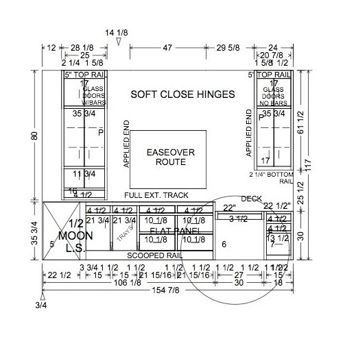
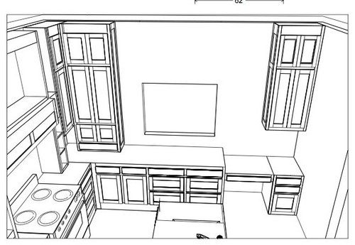
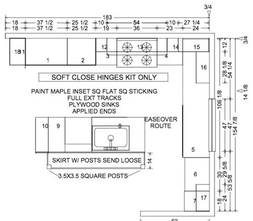
I need help with our Kitchen Cabinets. We got back our 2nd mockup, though it doesn't have everything labeled. I tried to move some things around according to some suggestions. I think I got it moved where at least if someone is needing in the fridge while I had the dishwasher open, it can happen. I can't redo plumbing so sink is in island with dishwasher to the right. Fridge is labeled as bank 1 and the micro is over an apppliance garage in #2. The counter pantry is labeled 16. 15 is kind of a weird upper in the corner. Maybe I should just shove the pantry (16) in the corner and leave it open in front with no #15. I am planning on doing some open shelving around the window.

I am wanting a farm sink though not drawn so. The hood is going to be a mantel type surround. So one of my questions is that type of hood too much for the space? Too much cabintry? Should I do a regular silver exposed hood/vent to open it up? I feel like #17 should be brought down to balance. I just don't know. The door to my pantry is on the wall next to the desk area.

My inspiration pics are on another computer but maybe I can add them soon. Any general thoughts and questions are welcomed. This is so hard!


Comments (11)

  • 17 years ago

    Something doesn't look right to my eye either. I think it's the layout of your upper cabinets. I can't quite tell for sure but it looks like you've got cabinets coming down to countertop on either side of the range as well as on the window wall. I think that makes the design look top heavy and unbalanced, esp since the window cabinet run ends with a lower desk height cabinet and a standard height cabinet above that. I had a similar set up with an appliance garage near my range and having shallow counters made the workspace feel inefficient when I was using my half sheet pan and big roaster esp.
    I think your work triangle looks great, very functional.

  • 17 years ago

    Hi, as a professional cabinet designer there are many things I would change. Feel free to contact me if you woule like. markladd@upstatekitchens.com

    mark

  • 17 years ago

    Hacked on your elevation a bit - another answer to the "weight" problem is to increase the weight on the desk wall.
    {{!gwi}}

  • 17 years ago

    I just can't seem to get the details of this correct. This desk was under the window and the drawers were to the right but the desk seemed more in the way and the drawers seemed to far away to hold anything and be functional.
    Here is an old copy of the east wall ( I didn't get an updated copy this time). The cabinets above the hood mantel are gone for a more open look above. The pantry has moved to the window wall instead of where shown. Maybe this will help visualize.

    OLD COPY

    OLD WEST WALL WITH DESK UNDER WINDOW

    I just don't know what to move or delete at this point. I really like the idea of openshelving around the window. I think I like the micro near the fridge for function but the hood/surround and corner are a booger.... as is the desk? Maybe I shouldn't make it a typical height desk? I put a desk there as we didn't build a separate office space and we really would use this.

  • 17 years ago

    I made my kitchen desk counter height, and it allowed me to use a stool that matches those at my island. This has come in handy many times when I need a fourth stool. That said, I don't use my desk a lot as a desk to sit and work at, but I do sit at the island with my laptop from time to time, and the stools are perfectly comfortable for this kind of work.

  • 17 years ago

    Some more responses before I could post. I really would like some open shelving if possible. It isn't pictured I know since we are having the trim guy do it. What I like about the old one is the balance of the window wall. I could move the pantry into the corner like I mentioned and it would give that balance back to that side. I need to go over above responses... since you guys are quick

  • 17 years ago

    You can't have open shelving and cabinets coming down to the counters. You need to lose something before you add anything. I think you've got too much even if you don't add anything. You need to make some choices.

    Are the cabinets to the counter for a functional purpose (do you need the storage) or are they a look you like? Either way, there is too much of it for me, and you are losing valuable counter space. I would raise the desk to counter height (if not rethink that all together -- more people regret them than love them) and have the cabinets to the counter on that wall only -- lose them on the stove wall. You could go the other route, but I think it's important to have some workspace around the stove and you look tight there.

    That could be a space for open shelves, but you need to look at what will go where and put things in a location that makes sense. Things will also get dirtier there and that may make sense for serving pieces but not pates and bowls. So think about what you want to display and why as well as how often you will use or clean it.

    Even huge kitchen have to make some choices and prioritize. Mine isn't huge, so I had to do a bit more prioritizing and deciding what worked together and what fought the other elements. I still got a lot better use out of my kitchen than was in the same footprint before and no one else walks into my kitchen and says "great kitchen but why didn't you put in _______________?". They, and I, see what I do have and how easy it is to work in -- not what isn't there.

    By the way, I am assuming that the sink is shown placed as it is due to a software limitation, but you should not. You have to live with the results. I do not. If it is placed back like that, you will have terrible back problems in a very short time. The sink should be as far forward as possible.

  • 17 years ago

    What you are asking about is personal opinion or decorating stuff in some senses. To me, that means that all answers are valid, but also just an opinion. This is mine. I did misunderstand the opening - I though it was a passthru, not a window.

    The cabinets on the west wall are out of scale to the cabinets on the south wall. The cabinets on the south wall are floor to ceiling, mostly solid. The window on the west wall should be a feature - but its too small. The cabinets on the west wall are these wimpy things with a lot of naked wall. Like a seedling gets all stringy when there's too little light.

    So! You can do the south wall as all tall cabinets. You just won't have any functional counters on that side. I don't think that's horrible, given that you do have space on the island and some on the adjoining wall.

    GIVEN the south wall, there are two visual solutions for the west wall - have more or have less. Adding cabinetry to the west wall is good. I think I would prefer to see the west wall stripped of uppers - including the corner structure by the south wall where it wraps onto the west wall.

    I think I'd do the desk as a drop lid desk with a wide cabinet or shelf unit over top of the drop-lid area - probably not reaching to the ceiling. I've seen one that someone here did that had a bar on the bottom of the lid so that a laptop could be parked on the lid and used while the lid was closed. It gives you a place to hide the junque that will accumulate there. Maybe I'd emulate some expensive desk stuff by have the shelves inside the cabinet cut back a bit so I could mount a tack board on one cabinet door and a white board or calendar on the other. The first shelf would be down low enough to have an outlet inside for all those chargers for stuff, but the chargers and the stuff would be out of sight inside the cabinet.

    I could also have full depth drawers underneath the drop-lid area for either more junque or more kitchen stuff.

    Holligator has a great point about raising the desk surface. It's a good idea. I don't think you'd want to move the desk to the center because the desk chair would be backing into the island - It's only a three foot aisle. Raising the desk could clear up a bit of the visual problems.

  • 17 years ago

    1. Yes I agree raising the desk surface is a good idea for balance.

    1. The window is not to scale for some reason. It is 4 ft across, but 5 ft tall. I am hoping to add some lovely wide trim around it.
    2. So as some suggest get rid of the cabinets coming down to the counter by the range (half depth mantel leg cabinets) and open the space and counter up.

    and finally the biggest problem.....4. Still some options with the pantry unit piece. Yes I do like those pantry looking units that come to the counter and I really could use the space for some concealed food storage at hand. I do have the walk-in pantry room for more food storage but it is away from the main prep area by a few steps.
    I think I like this idea best Make the counter to ceiling "pantry unit" on the oven wall in the corner (similar to old drawing in that corner) and add a small upper to window wall next to pantry unit corner. Then it would balance out the desk uppers?

    5) I understand everyone's concern about the naked window wall but that is the wall I designated for open-shelving on either side of the window. They didn't draw it in because they are not the ones doing it. So I am asking for help and imagination! Hence the reason I am sure they really didn't pay attention to the height of the window.

    bmorepanic - I am trying to understand your desk idea, it sounds really cool but I am having trouble visualizing/following!

  • 17 years ago

    Sorta like this. Probably better if the drop lid is a bit shorter, but this height lets you stand and type if you're reading recipes. I just made-up cabinet fronts for the idea. They are definately not a suggestion - I think you're going for Georgian and these are more shakerish.
    {{!gwi}}

  • 17 years ago

    Thanks bmorepanic, now I get it. I like the lid idea. I am still hoping to get a chair in under the desk area if possible, but the lid is interesting. I am still working on how that wall should look with upper shelving to balance out that unit above the desk. Hoping I can make it work or that it wouldn't look weird only on one side of window. It might just work!