Software
Houzz Logo Print
bedelia_gw

Kitchen color help

16 years ago

I love this forum - always lurking to see what others are doing. We've been in this house (built 1996) for 4 yrs, and the kitchen is the last room to paint.

There was a white vinyl floor which we just replaced with a gray/brown tile (carpet in FR is gray). The room faces north (and backyard) and we have a lovely backyard with lots of trees and greenery.

Right now the color is SW Sand Dune (painted by PO), which I liked since it was so warm (we have cold dreary winters). Now with the new floor it looks very dark. Can't decide if I like it or should go lighter. The FR is SW Biscuit (accent wall SW Bagel), and the foyer is SW Modest White (also painted by PO). The LR/DR is also a natural color.

Everything is staying as is in the kitchen, except I'd like to get new light fixtures, and add color with fabric, etc.

I got chips of different greens, but not sure if I like the way they go with the gray countertop. I liked Powell Buff but then all I see is a sea of gold.

Should I just go lighter with one up on the Sand Dune, or change color completely? I am definitely design challenged and seem to make a lot of mistakes in decorating.

I'd love some suggestions of color and anything else that catches your eye.

{{!gwi}}

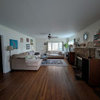
View from FR

{{!gwi}}

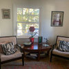
Foyer view

{{!gwi}}

Looking into FR

{{!gwi}}

Comments (22)

  • 16 years ago

    My cabs and apps are just like yours, counters white, floor hardwood, room faces north. We have no curtains on the windows or french doors to obstruct our view.

    Our Soffits are papered in a dark red, below the chair rail is a golden paper with wildflowers in reds, greens, a little purple. Above the chair rail and between the cabs and countertop is SW Sunlight paint. We have a mainly red with a little blue and gold wool rug in the middle of the kitchen floor.

    I'd say my kitchen is about the same size as yours, similar layout. The deep colors are fabulous here, lots of compliments, very cozy and warm but not closed in. We like it very much.

  • 16 years ago

    Hi there, I think you could do just about anything with your kitchen because your bones are so neutral. I also think an apple green color would look terrific with your gray counters and floor. I just finished up my kitchen and have gray wilsonart laminate counters...oiled soapstone. They are a darker gray (at least compared to what I see on my monitor) but I have white cabinets and a white tile floor and I used Gleeful by SW. I have touches of black to ground things. My kitchen also faces the northeast and is small (10 x 10).

  • 16 years ago

    I too have similar cabinets and layout. A cheerful apple green would definitely look great with the bones of your kitchen. Right now I have Ralph Lauren Gold Finch yellow and it too works well. I love the golden glow it offers in the mornings when the sun's peeking in. :c)

  • 16 years ago

    I'll look at some brighter greens, and stay away from the darker/sage ones. I just didn't know if they would go well with the gray countertops, or they would make my cabs stand out more (which I don't want). I think I'm so used to the darker color, that I can't picture something green. I'll have to pick up a couple of samples to see.

    Thanks for the suggestions.

  • 16 years ago

    Green would go great and blend with your other colors.
    Here are a few ideas..

    Behr GrassCloth

    Sycamore Green Behr

    RDQuilters did this beautiful Sage Brook Green

    Cookiing Apple Farropw and Ball

    Cooking Apple

    Blue Gray 91 Farrow and Ball paint

  • 16 years ago

    Boxerpups is that Behr Grass Cloth in your home? I remember you saying you liked it when I posted a photo of it in our home, but I never heard if you used it. I love that dragonfly mosaic.

  • 16 years ago

    Green was the first color that came to my mind. Second was a color from your pretty pillow in the living room. Like a tomatoey red. Very pretty home.

  • 16 years ago

    Hi Lukki,
    No I wish I had gone with Grasscloth.
    I went with Sage Tint by Behr.

    The problem I have is that I have a bright cherry red
    sofa in the next room. I was fearful that Grasscloth might
    be too much. But now I regret the Sage tint as it feels
    to light and not enough punch.


    Help, Help... I think I need to start my own post.


    Here are some greens to think about. Notice the how well
    the greens go with light maple or oak wood. So many
    greens so few walls to paint. : )
    ~boxerpups

    Golden Delicious by Benjamin Moore

    Spring Behr

  • 16 years ago

    My kitchen is darker (I have no direct windows/sunlight), I think my cabinets are slightly darker than yours and my counters are a dark gray. I wanted to brighten up the space and have a warm feeling in the kitchen. I ended up going with BM Ladyfinger. I love it. It's yellow without being "yellow" more like a creamy tan yellow? Sorry I'm not good at describing color LOL

    I also agree with the green suggestions - I could def see a light green or sage colored green in your kitchen.

  • 16 years ago

    With your cabinets, I would pick a green with yellow in it. We have a maple banister and went with a darker yellow green (BM Hiking Path) and the wood just pops and looks rich. In our last house, we had cabinets like yours, and the warm paints we picked made them look gorgeous. If you paint up poster boards, you'll be able to hold them next to the cabinets and see what I mean.

  • 16 years ago

    Oh boxer, that is a bummer. Yes the sage is light, but I understand your apprehension with the Grass Cloth. What to do, what to do, hmmmm...maybe do a 50% or 75% mix? I've heard that can work well in these sort of situations. CALLING FUNCOLORS!!!!!

  • 16 years ago

    If you did a green, I really like the Sycamore as shown above. I've never been a fan of greens with the colors of your cabs. I know it's popular but to me they just don't go together! lol.

    I also like the idea of some red in there like the tomato red on the pillow. Nothing dark though. It would look great beginning on the wall next to the outside cabinets.

  • 16 years ago

    Hmm, I'm not a big fan of wood cabinets, so I'd paint them white. I agree with a yellow toned apple green in a 75% mix. By keeping it yellow toned and warm, you can bring red in as well.

  • 16 years ago

    I love all of the suggestions. I myself love the red but the furniture in my LR/DR on the other side is a seafoam green with lavender and rose accents. I think red would be too big of a shock. I have a ton of pillows in the FR waiting to be recovered once I decide on color.

    The yellow greens sound fab and I never thought of yellow, which may work too. My monitor doesn't show the true colors, so I need to get chips/samples to try.

    So I gather from the suggested colors that keeping the present color/shade isn't the best choice?

  • 16 years ago

    I would do a white tiled backsplash to brighten the kitchen and match your appliances. It's hard to really see your floor. Is there an accent color in it that you can use on your soffits? I think that since you have so many neutrals, some contrast is what you need, as well as touches of black. Also, the back of your pennisula is bothering me because it seems to be a different color that your cabinets. Maybe it's just the lighting, but if it doesn't match your cabinets, can you purchase a matching panel or stain it to better match your cabinets? Beautiful home, BTH. Your view is so nice, I don't even think I would do a kitchen window treatment.

  • 16 years ago

    I'd choose the pillow fabric and go from there to tie in the two rooms. I'd use a deeper color (or two!) and I don't see any place for a backsplash.....which I have had and hated, but which I understand is very popular. (Paint is much easier to keep clean, IMO.) Also, your cabinets look to be in excellent condition, so I sure wouldn't paint them.

    How about painting the soffit and little wall that faces the FR a deep shade of the color you use between the counter and upper cabs?

  • 16 years ago

    bedelia, here is our kitchen with the yellow both before and after we installed our granite. It's my intent to eventually paint the cabinets a cream (still working on DH for that one) but as you can see, our cabinets are & counters were very similar. I like the yellow, but when we paint our cabinets, I'm going to be painting the kitchen Behr Grass Cloth Green. I have that in several areas of our home and LOVE the color. In our particular lighting, it's perfection.

    {{!gwi}}

    Not with the dark granite, you can see as Joanie suggests, black really helped to enhance the other colors in the room.

    {{!gwi}}

  • 16 years ago

    Bedelia,

    I found a few more ideas. While trying to think of a new
    paint color for me, I keep coming across ideas for your
    kitchen...

    Have a great weekend,
    ~boxerpups

    Harmonic Tan by Sherwin Williams

    Tuscon Tan Behr

    Sangria Benjamin Moore

    Gray light blue

  • 16 years ago

    You all have been so helpful.

    Joanie - I've attached a pix of the floor and countertop. The floor is mainly gray with brown and taupe marbling. I too hate the back of the pennisula. I was going to ask about that. It's the back panel of the cabs, and our neighbors have it also. I would like to put fake doors on them (we have slide outs on the other side). Lukkiirish has her panels finished off. A backsplash would be nice but it sounds like a lot more work than I'm up for.

    {{!gwi}}

    {{!gwi}}

    Lukkiirish - your kitchen is a lot like mine and looks great with the yellow. Will that be enough contrast for me? Love your granite.

    Boxerpups - thanks for all the pix. So many ideas.

    I painted boards of BM Castleton Mist (yellow green, similar to grasscloth), and Ladyfinger as Nik211 used. I like them both. I also tried golden delicious and it was way too bright for me, and sycamore too dark. If I were to paint the facing wall a different color, do I carry that color to the other side of the room also?

    Thanks again to everyone.

  • 16 years ago

    Ok, so I just couldn't resist. I used colors from Sherwin Williams but it's hard with my monitor to find the right colors. Here are some visuals...yellow looks WAY better in person that when it's just mocked up. Also, I painted the back part of your cabinet that is not paneled in chalkboard black. If you have kids, it could be a great solution.

    This is the closest match to Grass Cloth I could find & I used a gray for the ceiling:

    Ryegrass Green

    Afterglow Yellow

    Cajun Red

    Cooled Blue - a lighter blue would be prettier but didn't translate well on the screen.

    Slate Tile

  • 16 years ago

    Lukkiirish - this gives me a great visual. I like the cajun red, but I do think it would out of order in my house since all of the other rooms are light neutrals. Plus I did red in an apt. many moons ago, and it was a b***h painting over it.

    So far I have samples of BM ladyfinger and Valspar grasscloth hanging out in the kitchen. I like the ladyfinger but it just seems to blend in with the cabs and my FR. Is that a good thing? It's more in my comfort zone, which is boring neutrals as you can see.

    Still getting used to the green, but liking it.

    Loved the chalkboard idea - we don't have kids, but I like the idea. I saw another poster here who put beadboard up in that spot, but I think that would be out of place in my space.

    Thanks again. I'll let you know what I decide.

  • 16 years ago

    Bedelia, I agree that doing the area between the soffits and the cabs and counter is too much of any one color. I have paper on the soffits similar to the Cajun Red, and the area between the cabs is paint similar to the Afterglow Yellow. It is a beautiful combo. Think about choosing one of the deep colors from the adjoining room for your soffits and a lighter shade for the between area.

    As for painting over red, don't worry about that. Kilz will take care of everything in one coat.