Software
Houzz Logo Print
jscozz_gw

Will this back splash work?

15 years ago

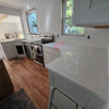
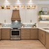
My wife and I ordered handmade Sonoma tile for our back splash. The order had an issue, and an important piece did not get ordered... so it will now be another 6 weeks of waiting... but now that we finally see the actual tile and not just a 1x1 sample sheet, it looks VERY different! It is much more varied than the sample, and we are concerned that it is too similar to our counter top and will not look good... the plan was for a row of 6x12 (right in picture), then a row of 1x8 glass (left in picture) then 4x4 on diagonal above that (center in picture)... but we now feel that the 6x12 is too high for the bottom course, and leaves only 11" above it for diag 4x4s. AND, more importantly, the tile is very similar to the counter and we are concerned it is so similar it looks like we tried to match but made a mistake! What do you think? We have a medallion for over the stove that uses both of the colors here and a sugar baby dark brown... but that brown is not available in any field tile, or I would use that as the bottom course to put a solid break in between the counter and back splash field tile.

I am thinking about cutting the 6x12 into (3) 4x6 tiles for the bottom course, so it is only 4" high, but still has the rectangular shape.

Any advice would be greatly appreciated!

Comments (24)

  • 15 years ago
    last modified: 11 years ago

    Oh, God no.

    Sorry--you're asking an opinion.

    The tile itself is beautiful and I have 67 sample pots of paint testifying to the fact that reality is often quite different than samples. I can see where you were going. But this just doesn't work. You're exactly right--it looks like you couldn't afford to put your granite up your backsplash and used this tile as a substitute. It's way too similar and busy.

    Can you return it? Use it elsewhere? Or maybe you can take more pictures--one shot can be deceiving.

    I'm sure you'll get responses saying "do what you love!" and "it's byoooootiful!" But not from me.

    Good luck!

  • 15 years ago
    last modified: 11 years ago

    Because the tiles are 1 color, I think it might work. That is, it depends on what color grout you'd be using. The grout color should tie both the backsplash tiles and the countertop granite together.

    I would also suggest to install the backsplash tiles diagonally. That way it won't look like you're trying to replace it from the granite.

    I did something similar to my kitchen, (link below).

    Here is a link that might be useful: NTT Refaced Kitchen

  • 15 years ago
    last modified: 11 years ago

    Hi. It is so much easier to be objective when it isn't your own tile/granite/kitchen, and you haven't been stewing over the decisions, and staring at it endlessly, isn't it? I agree with marcolo, that from the photo, it appears that the tile is "close"- but "close" only counts in horseshoes or hand-granades as the saying goes. I don't think the tile does anything to complement your beautiful granite. It appears to have a pinkish beige undertone that that is "fighting" with the golden tones of your granite (at least it appears that way on my moniter.) My first instinct is that the tile should either be lighter or darker- not mid-tone like the granite. What color are your cabinets? Maybe post a photo of your medallion to see if anyone knows of a tile or stone that would work for you. Maybe it was a blessing that your order was delayed--can you cancel or exchange?

  • 15 years ago
    last modified: 11 years ago

    Thanks for the feedback... here is a pic of the medallion. It has both of the tile colors (burlap and the glass tile) as well as a darker brown (although the glass specs in the medallion do not match those in the 1x8 glass tile like they are supposed to either). Then another picture of the cabinets, counter and back splash tile.

    This tile cost almost $3K... and is special order and non-returnable... so, we are trying to figure out if a different tile for the first row, like the brown in the medallion, or a light, solid color decorative tile with some raised design on it might help break it from the counter top... the sample piece looks VERY different than the actual tile... it is lighter with less brown specks, more solid light color... a major lesson learned here... to never buy special order imported tile based on a 1x1 sample.

    Any advice would be greatly appreciated.

  • 15 years ago
    last modified: 11 years ago

    I think it works, your last two photos look like it all goes well. This is the hardest part trying to envision it all but don't really know till it's done.

  • 15 years ago
    last modified: 11 years ago

    You're gonna hate me, but I agree with Marcolo. Its just too much. Too close to the granite. Too busy with the granite. There's no visual rest between the two so neither one can shine as the focal point. In your last picture I see the pinky undertone too. I wish I had a solution for you.

    Good point about this being a good lesson not to buy special order tile from a tiny piece.

  • 15 years ago
    last modified: 11 years ago

    Try the suggestion about separating it from the granite with a another color that is plain. It might not look like it was fighting the granite for attention that way.

  • 15 years ago
    last modified: 11 years ago

    I think it's too early to panic or despair. Your medallion is super cool. I think you are on the right track exploring other things to bring into the mix. I would suggest you grab samples of a variety of tile colors in various directions, both darker and lighter, in a variety of undertones and perhaps even materials. See what works with what you have, narrow down some selections and then post your options. The tile and the medallion may both work as accents where they don't work as field tiles. It could look like you meant to evoke the counter in a particular place. But again, try darker, lighter, everything you can find, and let's see what works.

  • 15 years ago
    last modified: 11 years ago

    Thanks, everyone, for your opinions. My wife and I are going to mock up a board with the patterns we are testing (with double sided tape) and I'll post some more pictures of them in place... we'll see if we can make it work... otherwise, I wonder what the market is on ebay is for imported Italian tile? :)

  • 15 years ago
    last modified: 11 years ago

    Looking at my own picture, the medallion set next to the counter top... the decorative pieces surrounding the medallion are the same color/texture as the field tile that I hate against the counter top... but having the pattern/design on them makes me like them better against the counter top... that was another option... putting a row of decorative tile along the counter in the same color as the field tiles... I am sure the decorative will be even more expensive than the field tiles were...!!

    This link is to the Sonoma tile we used...

    http://www.sonomatilemakers.com/LineList.aspx?prod-line-id=5&line-list-id=13&IsLineList=True

    and shows the decorative pieces they have available... think one of them would work as a break against the counter in the same burlap color as the field tiles above? So, it would be layered as follows:

    Cabinets
    4x4 field tile diagonal (burlap)
    1x8 Glass tile strips
    Decorative tile (4x8? 2x8?) (burlap)
    Counter top

  • 15 years ago
    last modified: 11 years ago

    I don't think it works either. The tile has pink undertones while the granite has gold but it could be my monitor. I think your on the right track by seperating it from the countertop. Since you can't return it, I agree with others. Play around with darker or lighter tiles touching the granite then use your really pretty tile. I'm sure you can find a combination that will work

  • 15 years ago
    last modified: 11 years ago

    Do you have any photos of your "inspiration" backsplashes so we can see the look you were going for? The tile is very unusual so your granite aside, I'm not sure I know what the end look is supposed to be.

    If the variance is really great from the sample, if it were me, I'd go back and take a photo of your tile with the sample tile and go back to Sonoma and ask they accept a return for a credit. Its one thing if you just didn't like it in the end but if it didnt look like the sample, I'd be working to return it. It doesnt necessarily help companies to have unhappy customer either for reorder or word of mouth. If you have a reasonable case, Sonoma would be unwise not to work with you.

    However, I love the medallion.

  • 15 years ago
    last modified: 11 years ago

    I think the issue is also that the texture of the tile is scaled very similarly to the speckles of the similar color in the granite. I don't think its just the color, imo.

    If you were able to use just the medallion in a field of simpler tiles this relationship could look intentional because of the breathing room between the two.

    I think adding rows of more design may lead to the same net effect of "too much" texture fighting with the granite, just in a different way. It is separating the two textures and colors you don't like together but adding more. Remember too, that the countertops will not be bare, there will also be things on them, and it may just end up visual chaos.

    Perhaps they would be willing to take the field tile back or at least take it back for a restocking fee. I would rather spend $600K taking away something I wasn't happy with than $3000+whatever the extras cost to compensate for something I didn't like.

  • 15 years ago
    last modified: 11 years ago

    They are definitely not playing nice together. As mentioned the scale of the "pattern" between the granite and the tile is the same and shouldn't be - way too fussy. You might be able to get away with the colour but not with the pattern size.

  • 15 years ago
    last modified: 11 years ago

    I think the extra decorative tiles are a no-go. They are supposed to be an accent. You already have enough accent. It's like you're making a meal of all ketchup.

    You need simpler tiles for breathing room--not more pattern or design.

  • 15 years ago
    last modified: 11 years ago

    Don't hate me--I think it's yucky with your granite. The glass strips though--nice!

    It looks better in the second photo though. I just don't know. But if it's really different from the sample, maybe you have enough of a beef to get a refund.

  • 15 years ago
    last modified: 11 years ago

    Hi JSCOZ. I am so surprised that whomever you bought the tile from didn't recommend that you order a sample first-esp. if it is handmade and subject to variation. The tile shop salespeople are supposed to be the "experts" and they should have warned you and let you know of your options to get a sample. I have had the various tile shops I've visited suggest that several times-esp. for natural stone to see the current "lot" color. If they hadn't, I wouldn't have even known it was even possible to get one. And I have ordered the samples--thankfully- or I would have made an expensive mistake.

    The tile shops around here have designers that will help you with your design. Did you buy your tile from a store with a knowledgable designer that can help you? They may be able to suggest something.

    In second group of your photos, esp. with the one with the gorgeous medallion, the color of the tile looks like a better fit with the granite- it looks lighter and more golden. Which photo shows the true color? The glass liner accent looks very close to the color of the tile. Is that correct, or is the photo deceiving? Just curious.

    Try calling the Sonoma tile company and showing them your photos, and explain your dilema- maybe they have knowledgable designers that could suggest a solution from a design standpoint- and maybe even offer to exchange some of the pieces.

    I really don't think the tile looks that bad with the granite, esp. after seeing the other photos and your off-white cabinets which will give some lovely contrast with all that brown. The tiles are gorgeous, and I personally don't think they look like they are are trying to "copy the granite". From a perfectionist standpoint, you probably wouldn't have gotten them if you knew this was how they would be (since they are not like the sample you liked), but they can be made to work with just a little "massaging", as my architecture colleagues used to say. I think just the right grout color could work wonders, as well. You know how putting one color next to the other can "fool the eye". Having an accent band running around the backsplash will also help draw your eye to it- instead of to the junction between the granite and tile.
    Here is one thought for a border at the base of your backsplash: How about mixing the glass liners, with 1 x 1 glass tiles (tantrums)in a lighter color along the base, maybe 2-4 rows high? You can possibly even mix in some strips of the field tile in your existing color, as well as the same tile in a lighter color, to keep the cost down. You can play around with it to find a design that looks good. There are lots of these kinds of mixed mosiacs around- you can find some in a tile shop for inspiration.

    Here is a link below to a photo on the sonoma website that made me think of another option. Look at the 3rd photo down on the right side as another possibility for a border along the bottom of the backsplash made up of light colored 1 X 1 tantrums (would that be too expensive?- I know those are pricey!)It would be simple. Hope this helps give you some food for thought.

    Here is a link that might be useful: Sonoma tantrum border

  • 15 years ago
    last modified: 11 years ago

    I love all your elements except for the larger textured tiles. I've gotten kinda lost in what you're now considering and all the advice. Are you thinking about using the smaller medallion tiles as accent tiles on the backsplash along with the glass strips (love both of those!)? Love the over the stove medallion too! What would you think of a lighter, contrasting yet complimentary color of smooth ceramic field tile. It would brighten up the backsplash (which is kinda important) and let the countertop and accent pieces shine more :) Like I said, I'm not keepign up with all the suggestions and this one may be totally out in left field so feel free to ignore me :)
    Monica

  • 15 years ago
    last modified: 11 years ago

    My wife fell in love with the glass tiles... then the medallion... and since the other color on the medallion was the burlap, that is the field tile that was chosen.

    We are working with a designer at a LARGE local tile shop... and we brought in a piece of our granite counter top at the time we were working on the design. IF the field tile was smoother and had less dark in it like the 1x1 sample did, I think we would be perfectly happy with it all... but since the 1x1 was very different than the full field tiles, that is why it is conflicting with the counter top.

    Cabinets
    4x4 field tile diagonal (burlap)
    1x8 Glass tile strip (horizontal; 1 row)
    Decorative tile (4x8? 2x8?) (burlap)
    Counter top

    The bottom row is what we are trying to make work. Choice is a decorative strip (very expensive), or 4x6 field tile (still problem with this next to counter), or 4x4 on diagonal below and above the 1x8 glass strip.

    I guess we could also use larger grout joints similar to what the medallion would require, in all the field tiles. The larger grout lines might help to break it all up too... we had picked an antique white grout.

  • 15 years ago
    last modified: 11 years ago

    On top of the look of it... my wife's concerns is that it is so rough, compared to the sample we saw, that it could be a nightmare to clean, especially the stuff right behind the cook-top/griddle.

  • 15 years ago
    last modified: 11 years ago

    Here is an example of a solid white border along the counter top, then tiles very similar to mine above that (same Venezian gold counters also)... May be, instead of decorative first row in same burlap color as I previously posted, a more plain tile as the first row at the counter top, matching my off white cabinet color, and possibly the picture frame moulding I am using around the medallion (which was going to be burlap also)...

    http://finishedkitchens.blogspot.com/2006/09/caroleoh-s-kitchen.html

  • 15 years ago
    last modified: 11 years ago

    I really like the medallion. I can see where you were going with this, and I think you can get there.

    I agree that the lighter tile won't play nice with the granite and needs to be separated, but with a good border - ideally a band of a darker brown like the center of the medallion - the original plan with 4x4 diagonals would read as their own thing and not a wannabe granite, and look great. I don't think the glass tiles work with this plan, basically they're too sparkly and glossy.

    You said there wasn't a field tile in the brown color. Really really doesn't exist? Not any source, not any approximation? Because I think that would solve your problem if you could just find it.

  • 15 years ago
    last modified: 11 years ago

    The matching brown color in any size, isn't made by Sonoma... but we will have look to see if we can get it from another manufacturer.

    The glass tiles are part of the medallion... although another complaint we have is that the ones in the medallion are much browner... and they are supposed to be the same.