Software
Houzz Logo Print
ni_2006

Please VOTE for backsplash choice

17 years ago

jodi_in_so_calif was kind enough to photoshop these subway tiles in my kitchen.

The tiles in the left are made by Quemere International Tile (the color is called Pumice). The tiles on the right are made by Horus Art (the color is Bianco).

I am still having a hard time making a decision and wanted to ask your opinion on which tiles look better?(By the way, the tiles in the second picture are more uniform creamy color in real life. Some of the tiles in the middle row appear gray in this picture.)

Thank you so much in advance!

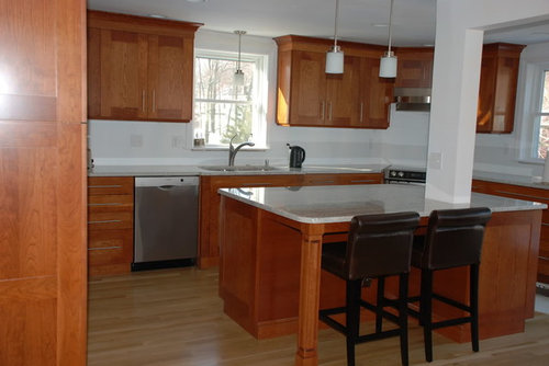
This is a view of the kitchen.

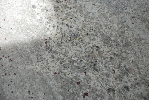
Here is a detailed view of the granite.

Comments (34)

  • 17 years ago

    Can you post pics of each sample board lying flat on the granite? The darker line through the Horus Art PS pic may be from a shadow when you had the board under the cabinet, just the way the one Anna did with the vertical placement was.

    Are you going subway only, or are you thinking of adding some deco tiles/chair rail?

  • 17 years ago

    We are thinking about doing tiles everywhere except behind the cooktop. We might incorporate decorative glass tiles behind the cooktop.

    Here are a couple of pictures of the tiles on the granite.

    Here is the pumice color

    Here is the bianco color

    I found a sample of the Horus tile in Biscuit. It's a bit more buttery/creamy than the Bianco color. (This is not the tile in the photoshopped picture)

  • 17 years ago

    I think the tile on the left is a little too gray. I like the color on the right better, but with a grout that doesn't make the grid pattern stand out. Too busy for your kitchen. What would be stunning is a clear, white backed subway tile. More sparkle and pizzaz and keeping with the modern feel of your kitchen. I would also like a larger format glass tile such as 4 X 8 or 4 X 12 there. If you look around you can find great deals. The touch of blue green in those would play against the tones in your cabinets better too. I would also like a touch of blue green in the ceramic tile if you use a light gray. Very pretty kitchen, BTW ;-).

  • 17 years ago

    I actually like the left pumice one, which wouldn't compete with your granite. It's nice and quiet, letting your beautiful cabinets and granite be the bling.

    A

  • 17 years ago

    They all pick up different colors in your granite, but since you don't have much natural light (you said) I would go with the lightest one. I think that's the Bianco. Agree that you want the grout very close to the same color.

    If you want to do something more decorative but not the glass with the Horus, then the Pumice does have very nice decos (the "bubbles" for a small space, and the chair rail is nice too. I don't like the Horus Art chair rail.

    Sorry I'm no help LOL!

  • 17 years ago

    another vote for the ones on the right. i like the slight contrast with the creamier ones. i think the gray may be a bit drab for me.

  • 17 years ago

    I like the pumice, but do I see snow? I'd avoid grey in a snowy clime unless you've got some bright accents planned for the room. (Whoever bought my old house in Michigan probably had to buy primer by the drum to cover some of the paint I used...)

  • 17 years ago

    Can you clear your mind, then envision which one you'll want to greet you in the mornings? Which one you'll want to look up at as you cook and chop away? I really tried to do that in making my color and material choices.

    How about the pumice with a sparse random scattering of the Bianco to brighten it just a little? This will give it a little contrast and point out that the tile is actually grayish, enhancing the color, rather than having it, perhaps, look like a white that's dull. I hope that makes sense.

  • 17 years ago

    I like rhome410's idea. But I'd tend to make the predominant color the lighter one (Bianco) with maybe a line (since it's a crackle glaze, not the same as Horus) of the Pumice. That will work better than scattering too if the sizes are slightly different.

    Is one less $$ than the other?

  • 17 years ago

    Oh, sorry...Was thinking they were the same tile in different colors, so didn't think about a size issue. I could see a line of one in the other...Either way. I happen to like gray. :-) But I'd choose to use whichever really blends with your granite best for the field color and do the other for accent.

  • 17 years ago

    I like the Bianco. It could be the difference in monitors, but I think the pumice makes your granite look dull and the bianco makes it pop.

  • 17 years ago

    I usually pick soft grayish tones but in your case think I prefer the bianco but would use a soft gray grout.

  • 17 years ago

    I like the bianco, too. I like the contrast and warmth with the bianco tile. Just my two cents worth.

  • 17 years ago

    I like the one on the left in the top row in your post. I like the soft greyness of it and the fact that the edges blend into the tile so well - makes it look like a clear glass sheet. Like the closeup look of them too, as per your last post.

    I think the white - which is otherwise always lovely - contrasts too much against the dark cabinets. The grey colour integrates nicely with the granite AND doesn't make the cabs look quite so heavy.

    Beautiful tiles.

  • 17 years ago

    I like ajsmama's idea although I would do the grey as the field and the white as the accent strip. I think the grey goes better with your cabinets.

  • 17 years ago

    Thanks for your feedback so far.

    I forgot to mention in my original post that the ceiling height is about 7.5 feet and the kitchen does not get a lot of direct light until later in the afternoon (ajsmama - you remembered from another post. Great memory!). Oh, we are located near Boston, so we do get plenty of snow.

    Keep your feedback coming!

    This pictures is an example of how dark the room is in the morning. (It was a rather gloomy day when I took the picture, though.)

  • 17 years ago

    I like the pumice *slightly* better... does it have a crackle to it, where the bianco doesn't? Either would look lovely.

    Though I do second blondelle's suggestion of white backed glass tile. That would be a little more contemporary, and IMO, more in keeping with the style of your kitchen. (Plus I really wanted glass tile and couldn't get it, so I think you should have it. ;-))

  • 17 years ago

    I like the darker one on the left of the first picture. It is serene and I think shows off your granite and cabinets better.

  • 17 years ago

    I vote for the bianco. It seems to provide a little more contrast and interest with the granite counter. Pumice is a little drab and too uniformly looking next to the granite, although I liked the crackle look. Because you said the Boston light is low in your kitchen, I think keeping it lighter color (bianco, or even biscuit) will brighten up your day.
    BTW Ni, are your barstools from Overstock called Metropolitan? How do you like them, are they comfortable, and are they holding up? And is it really leather, or leather looking vinyl? Sorry for being OP here.

    Beautiful kitchen if I may say so.

  • 17 years ago

    I vote for the bianco

  • 17 years ago

    I vote for bianco - I do prefer how it looks with your granite.

    Are these the 2.5x5 crackle Horus art subways? They were a contender for our kitchen - I loved the price vs. look and kinda like subways other than 3x6 in a kitchen, to mix it up. (we're doing subways in our bath, too.) We're doing 2x6 Meredith tiles because they were the exact match for our cabinets - but I love the Horus Art tiles too.

  • 17 years ago

    Bianco.

    With a granite like that, you want to be really, really careful with going yellow. As soon as you head down that road the granite starts looking dingy and drab and just blah. (I've seen the same thing happen with my granite.)

  • 17 years ago

    Here it is with a white backed clear glass larger tile. That bit of blue gray pops the cabinet color. Not my best work, but feeling lazy tonight...LOL!

  • 17 years ago

    I like the bianco tile.

  • 17 years ago

    Definitely the bianco. The other looks a bit drab to me.

  • 17 years ago

    I vote for the Bianco as well. Willowdecor used the Horus art bianco tile in her kitchen if you want another look at it installed. Here's a link.

    http://ths.gardenweb.com/forums/load/kitchbath/msg0119361411997.html

  • 17 years ago

    I thought she used marble?

  • 17 years ago

    I'm new to this website and I also have a question about which tile to use for my backsplash. Should I post it here or how do I start a new thread. Please help.

  • 17 years ago

    I have a sample chunk of Bianco Romano that I have been dragging around to check backsplash tile samples also. I agree it is really hard to find the right balance. Those that are too white can end up making the stone look dull and even a bit dirty, and others just plain miss on connecting the tones together.

    I actually like the glass one that Blondelle shows. I tried one that had a bit of a gray tone (I'm east of Toronto Ontario and we definitely get dark drab & winter)and it showed nice and bright (not dull) and actually perked up the white factor in the BR granite. Mind you I'm leaning to a gray tinged wall paint so the gray could work. Having said that I will wait and go through the whole process when like you I have the cabinets & countertops installed.

    Of the 2 you show, I tend to agree that the pumice allows your granite to appear brighter, and the bianco tends to take centre stage and give your granite a deeper tone. Which do you want to play up?

  • 17 years ago

    I love the Bianco, but I have a definite preference for warm tones.

  • 17 years ago

    Thank you all so much for taking the time to give me your feedback. It sounds like there are a lot more votes for the bianco tiles from Horus Art. These tiles do have a subtle translucent crackle that does not come across in the pictures.

    blondelle - thank you for photoshopping the glass tiles. It gives me an idea of other alternatives for this kitchen.

    katienic - good luck with finding the backsplash for your granite. I hope your search will be easier than mine! One of these days, I will take a picture of the tile samples I have collected since August 08

    budgeteer_s - those stools are from Overstock. They were a good deal and I got a 10% off coupon based on a recommendation from a GW posting. The stools are actually made from genuine leather, which was a nice surprise! They are quite comfortable, too!

    At this point, we are going to remove the gray tiles from our list. DH is still convinced that we should do marble mini subway tiles. The choice is going to be between the bianco Horus tiles and marble mini subways. Stay tuned!

    p.s. Thank you all so much again. Have a great weekend!

  • 17 years ago

    ni 2006

    I know you have already voted but I had to say I love
    your kitchen !!. You chose an excellent granite. It
    looks amazing. I can not wait to see the finished pics.
    I am in the boston area too and going
    with Bianco will help out next year in late Jan
    when we are all sick of snow and coldness.
    Bianco looks brighter.

  • 17 years ago

    Another vote for the Horus Art Bianco.

    I ordered a sample after seeing it in Willow Decor's kitchen and I love it! We'll be using it and I live in Boston too-so I hope it brightens up the looooong winters....

  • 17 years ago

    I vastly prefer the Horus Art tile, although I can't really say why!