

Can't make up my mind!!
17 years ago
Sort by:Oldest
Comments (12)
Related Stories
WALL TREATMENTSCan't Find the Right Wallpaper? Make Your Own
For one-of-a-kind walls, just use your imagination. Custom wallpaper is easier and less expensive than you might expect
Full Story
DECORATING GUIDESMeet a Houseplant That Doesn't Mind Neglect
Got better things to do than remember to water your houseplants on schedule? Schefflera will forgive and forget
Full Story
PETS5 Finishes Pets and Kids Can’t Destroy — and 5 to Avoid
Save your sanity and your decorating budget by choosing materials and surfaces that can stand up to abuse
Full Story
LIFEYou Said It: ‘The Wrong Sink Can Make You Hate Your Kitchen’
Design advice, inspiration and observations that struck a chord this week
Full Story
SMALL SPACESHow Portability Can Make You Happier at Home
Downsizing your stuff and going for maximum mobility can actually make your home feel bigger and your life feel fuller
Full Story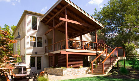
MOST POPULARSee the Difference a New Back Deck Can Make
A dramatic 2-story porch becomes the centerpiece of this Ohio family’s renovated landscape
Full Story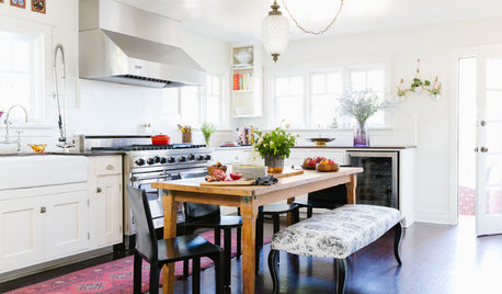
RUSTIC STYLEThese Rustic Accents Can Really Make Your House Feel Like Home
Add warmth and personality with woven baskets, wood ladders, quilts and more
Full Story

FEEL-GOOD HOMEThe Question That Can Make You Love Your Home More
Change your relationship with your house for the better by focusing on the answer to something designers often ask
Full Story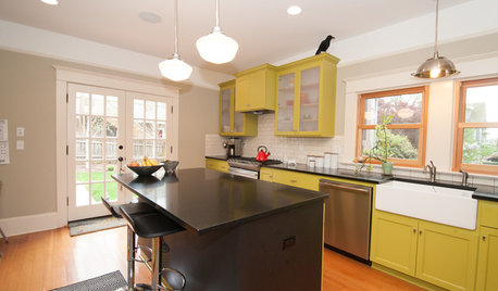
KITCHEN DESIGNKitchen of the Week: What a Difference Paint Can Make
A bold move gives a generic Portland kitchen personality without a major overhaul
Full Story
solstice98
day2day
Related Professionals
El Dorado Furniture & Accessories · Washington Furniture & Accessories · Abilene Furniture & Accessories · Middletown Furniture & Accessories · Portland Furniture & Accessories · Hot Springs Interior Designers & Decorators · Huntington Interior Designers & Decorators · Norfolk Interior Designers & Decorators · Cowansville Interior Designers & Decorators · Oxford Flooring Contractors · Charleston Flooring Contractors · Brooklyn Flooring Contractors · Tucson Flooring Contractors · Orange County Flooring Contractors · Eureka Flooring Contractorskathi_mdgd
grammyp
geezerfolks_SharonG_FL
maggie_sue
User
solstice98
msmeow
biwako_of_abi
fran1523
jck1210Original Author