Software
Houzz Logo Print
emmers_m

comments on photography

12 years ago

Hello,

I'm busy reading the back pages of this forum (usually hang out in gardening) while trying to sell one house and buy another.

I am at the point of finishing/listing the house I need to sell after being depleted financially, emotionally and physically by a two-year studs-out renovation. Lesson learned.

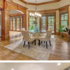
There is little I can/am willing to do on the house anymore, other than touching up trim and putting another coat of finish on the floor, but I am looking for comments on the professional photos my realtor arranged.

I know I should cut down the number of pics - which would you suggest I remove?

Other comments on the photos that might be able to be adjusted by editing or retaking would be appreciated. (Bright/light enough? Probably should have turned light in the staircase on?)

I'm sorry about the paint colors - they are not neutral, but I will not be re-painting. Hopefully they are not too broadly offensive.

House is a 1300 sq Ft 3/1 on a street 'in town' (25 speed limit/walk to train and restaurants/mixed residential and commercial). Everything new except floors (100 yr old).

Exterior photos still to come (painting.)

Thanks for your input!

Here is a link that might be useful: virtual tour slideshow, no bouncing/zooming/music

Comments (16)

  • 12 years ago

    The brightness and photo quality is fine. I've seen much worse. I would eliminate:

    1 or 2--same photo
    8--I don't like the way the counter takes up a large part of the photo
    11
    18
    19--an awkward angle--the bathtub looks like it's a triangular shape

    Keep 9 and 10 of the kitchen

    The living room/dining room photos make the usable space seem smallish and awkward to use. If you want to get the entire room, stand near the stairway and in the corner that the fridge is on, near the window.

    Is it possible to put some furniture in the house? With this layout I think it would help buyers see how livable the space is. Perhaps in person the space is more usable, but based on the photos I would wonder how to place furniture and be concerned if it would fit.

  • 12 years ago

    I would delete:

    1 (same as 2)
    4 (accentuates the refrigerator side that extends beyond cabinet)
    5 (prefer the similar closer view)
    10 (makes kitchen look small)

    Your paint isn't neutral, but I like it (except for the bathroom). However, I suspect buyers may not like the living room paint. I think it is helpful when each bedroom is a distinct color, as it makes it easy to tell the rooms apart, without furniture.

  • 12 years ago

    duplicate

    This post was edited by mjlb on Wed, Aug 27, 14 at 11:18

  • 12 years ago

    I wouldn't call that one picture dining room (the space seems very small); maybe call one of the large pic living/dining. Would delete the first one called kitchen. The island counter looks really lonely. Also, the last one called kitchen. It isn't really, is it? Is one of the bedrooms the master? Is there only one bathroom? Also what about outside pictures?
    Overall, it looks very nice and move-in ready. I like the colors.

  • 12 years ago

    Overall the pix are nice and bright. They are well done.

    1 or 2 - same photo, but I'd try and get one without a car parked right outside the window. It looks like it's parked very very close (which it may be, but remember the photos are to get someone to come look at the house, and when they do that, they'll see how the entire street looks overall)

    I don't like #5. This is a photo that could use some major staging. #4 and #6 are enough to get a sense of the space.

    #8 too much countertop and redundant.

    I don't like #10 either. This one shows me how poor the layout of the kitchen is with tiny countertops on either side of the range and the island looks really far away. #9 covers the kitchen adequately.

    Stick to one picture each of the bedrooms - whichever one shows off the windows. People can see the closets (or whatever those doors are for) when they come see the house. These pix could also use staging, if possible.

    I think the colors are fine. That's one thing that's easy for a buyer to imagine.

    Good luck!

  • 12 years ago

    I always approach these reviews with the question in mind: "If I were looking to buy a house, would I go see this one in person?" I don't get as nitpicky about the details and suggestions as others do.

    My impressions:
    -nicely (re)done. Colors are au courrant. Sure I might change them after move-in (particularly the red bathroom), but that's no big deal.
    -kitchen looks a little small. I'd be looking at the listing info for size details.
    -without furniture, and with a wide-angle lens, it's hard to tell how big the rooms are.
    -I was wanting to see more of the bathroom, since you've got only one shot and you can't see it all.

    So I'd be asking about the square footage to see if it was in the range I was needing. But if it was, I'd definitely schedule a showing.

  • 12 years ago

    I think the pictures are fantastic and I love the open floor plan. I think you did things right and I believe this will sell quickly (especially without furniture).

  • 12 years ago

    They certainly are nice, clear, crisp photos. I wonder whether the color of the living room is really as vibrant as the photos?

    I would reduce the number of photos. One of each bedroom should be enough.

    And, I love the blue-gray color in the bedroom with the black fan (currently photos 14 and 15). Could you tell me what color that is?

  • 12 years ago

    Do you have a yard? Front? Back? Landscaping? I won't go see a house unless I can see what it looks like front and back. Photos of empty bedrooms and ceiling fans annoy me. I just want to know how many and what size. On the bright side, the colors are great; don't repaint. Cut out photos that are the same - or almost the same - as others.

    I have been working on a reno house for 4 months and have just about lost my mind. I can't imagine doing it for two years. STOP! The house is lovely; one I would like. (Inside, at least.) Keeping on and on, trying to guess what buyers will like is a losing game.

  • 12 years ago

    What a lovely home, you have done a nice job.

    I like all of the photos - nice bright and they really describe
    the house to me. I think the paint colours are fine.
    I wouldn't repaint. Also, I personally like the multiple
    pictures of the bedrooms.

    My only comment that would slightly concern me as a
    buyer is that the floors on the main floor, seem to be
    either mis-matched, or stained differently or something.
    The shine and/or stain seems different in quite a few
    places. I don't know if this is as noticeable in person,
    but it shows up in the pictures. You mentioned putting
    another coat of finish on the floors. Maybe this would fix
    things.

  • 12 years ago

    Can you tell me what that blue bedroom color is? I love it! Are the living room walls purple or is that just how they are reading?

  • 12 years ago

    They look great! But I agree with the posters that mentioned eliminating duplicate photos. All you need is that hook to get them in the home--as long as you have clear, well lit, flattering photos of the major areas people most want to see, quantity isn't as important as quality.. My only question is, how awkward is that living room set up with that support in the room? That's the one thing that gave me pause. If it's awkward in person, I'd consider staging.

  • 12 years ago

    daylily1234, looks like shadows cast by the pillar and cabinets etc due to the natural light coming in. Floors look fabulous to me.

    I think it would be easier to visualize the space with staging furniture, but if that's not practical the photos are great.

  • 12 years ago

    I would remove photos #2,5,7,8, and 18. Duplicates that also don't really show the rooms to their best advantage. I would replace the removed photos with outside shots. Front shot of the house. A back yard shot, nice landscaping,etc. Love the colors you chose for the rooms. I'm not a fan of boring neutrals in a home. It is crisp, clean and looks to be move in ready. Best of luck in your sale! NancyLouise

  • 12 years ago

    I can't put my finger on why, but the house looks 'cold' to me. I see no warmth in the photos. That could be because there are 'warm' colors and 'cold' colors.

    The home does seem to fit for an active couple that does not do a lot of cooking as there's little counter and prep space near the sink. But that's the design you chose, and someone will like it, I'm sure.

  • 12 years ago

    Hi, all,

    Thanks for all the constructive comments.

    To answer the questions on paint, they are all from an 'eco-paint' company called Bioshield. Upstairs bedrooms are "Polar Ice" (blue), "Lavender Dream" clay paint (purple), and we mixed gray and white clay paint for the gray bedroom.

    Downstairs is called "Purple Twilight" but it is a silver/gray/ blue/purple - much less purple than in the photos and most people read it in person as a grayish blue.

    The floors are 100-yr-old southern yellow pine (I think) that are very warm with rich yellow and red hues in person. Upstairs they are in great condition, downstairs they have a lot of 'character.' I will have to work with my realtor on some language in the listing to manage expectations there. Hopefully the pairing of the old warm distressed floors with everything else new crisp and clean will be appealing to some (like me). I still do need to put the final coat of finish on downstairs which should even out the shine.

    On staging, my realtor recommended we leave it empty to emphasize the 'new, never used' feeling - although she might just know that we can't pay for it. I have no applicable furniture. She did toss out a comment about 'virtual staging' which I might have to follow up on now that I know the main floor looks small (the living/dining space excluding the kitchen/laundry/back entrance is over 500 sq Ft).

    Exterior photos still to come (painting.) But the house has no curb appeal/style, so the interior has to be our selling point.

    I think there is some consensus on removing photo 1/2, 5, 6, 10 and 18 - I'll start there and see where we are. When I get the exterior photos done I will try to get a better 'overall' shot of the main floor (with the stairway light on and no cars!)

    Thanks again!