Software
Houzz Logo Print
dingoaint

How do I pick floor colors?

17 years ago

I'm hoping for some advice on colors. Do I want contrast? All the same? Purple?

Here's what we have picked (or gotten stuck with) so far:

-old fashioned regular medium orangey oak floors in adjoining rooms, meeting the kitchen at two doorways.

-Cabinetry and trim will be white (Kelley Moore Swiss coffee, which is a neutral slightly warm edible-looking white) like trim throughout the house (I like it! And I didn't even pick it.).

-Counters will be brushed stainless steel and Carrara or similar marble.

-Backsplash will just be paint, maybe with some marble behind the cooktop.

-Appliance vertical faces will be paneled, minimal stainless (slide-out hood), and a big black oven/micro combo which we're just gonna pretend isn't there.

So it's all quite bland. Grey. White. Paint will probably be something pastel but bright (I currently have a nice swimming pool turquoisey-aqua I might redo), but the floor has to go with paint and the oak.

I plopped my Marmoleum brochure on the oak floor and circled the ones that go nicely with it. They range from really light to very dark.

So how much contrast do I go for? Everything is light, so if I go with a light floor won't it look, um, too light? Will a dark dark floor look goofy? Do I go medium? Are there guidelines for picking floors?

Comments (5)

  • 17 years ago

    I can't remember whose kitchen it was that had a great assortment (4 or 5 different colors) of Marmoleum tiles (It was a small kitchen with white cabs and soapstone or other black stone counters). That's what I envisioned when you described your space. Or if you're going 'fun' on the walls, how about a really fun Marmoleum color for the floor. An intense pool blue sounds like it could look great with your other elements...Or just go creamy white and let the walls, which are easier to change, be crazy.

  • 17 years ago

    The dark marmoleum colors are nice, but when we brought samples home (including a dark brown and a dark gray) and scattered some dust on them we decided we couldn't live with how every single spec of dust is visible on the surface of the darker colors. Oddly enough, even our chocolate lab's fur stands out on the dark brown more than on any of the lighter colors. Anyway, point is, bring some of the big samples home and lay them on the floor for a while, it'll help.

  • 17 years ago

    I totally agree with the samples suggestions. Even in your old kitchen, with your own daylight, your own things, you'll ahve a much better idea of what it looks like.

    Re function, besides dark showing dust, light reflects light and helps brighten up a kitchen. With the white cabinets and light counters and walls that's not really necessary, but it's part of the consideration. Very few Marmoleum colors are truly light, though, anyway.

    Are you planning to use the click?

    For function, sheet goods are terrific in a kitchen. No micro cracks for water and gunk to get into.

    But the other thing you can do with sheet lino is cut interesting shapes. You just stack the pieces and cut straight down through both layers. You could do ripples in your swimming pool, for instance.

    Contrast? It's a floor. If you don't do anything that attracts attention, it doesn't matter that much. Not like paint does, for instance. It's harder to change floor than paint, but easier to change lino than most, so if you want to go for something fun, you could change it after a number of years, even though it will probably outlive you and the rest of the house if you don't.

    I'd probably go contrast (blue-ish) to the orangy oak, rather than matching, or at least go analogous (yellow or orange-red). Not the putty creams they have.

    I like Rhome's deep swimming pool color (Whispering Blue?). Or Rhythmic Blues Flax. I love Lapis Lazuli, but it's probably way too intense.

    But you didn't say what colors you were looking at. Re value, as I said there are almost no true lights, and lots that are very intense, so rather than asking what we think you should use, maybe the question should be what do you think you like?

  • 17 years ago

    Thanks for the input. I remember that floor, Rhome. We've been here too long I think! The spouse is a little conservative on the floor though. Says it's easier to repaint than refloor. (Pretty sure it's NOT easier, although it IS cheaper!) So no blues or fun checkers. Possibly a green.

    I think we'll end up with a brownish or yellowish, and there's about 15 or so of those to check out. They all have different colors of...um...color mixed in so if we at least pick out an intensity I guess we can work from there for the paint.

    Bwaibel, good point about samples and dirt. Makes me think going the same intensity as our medium oak would be good. It shows nothing. Even colored Cheerios are hard to spot! And the plain ones? Gone!

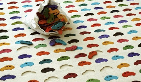
    Then there are the Marmoleum colors that look like clown puke. I missed April Fool's day on those, alas. For example:

    {{!gwi}}

    That would have freaked out the spouse!

  • 17 years ago

    Plllog, I'll definitely get samples. Not sure where we'll be able to appreciate them, though. The current kitchen is yellow cabinets, bluegreen walls, pink counters, and yellow fluorescents. Nothing looks good or representative!

    We'll be doing sheet, and I had planned on just a plain sheet. the spouse is interested in having the line thing done to outline the room but I'm not sure it'd be worth it.

    I'd been looking at colors like Asian tiger, golden saffron, and rust, but I do have fairy blue on my list. I think it might be too clown pukey though. :) And I do like cool green. More likely to get the spouse to go with greens than blues.