Software
Houzz Logo Print
rich825

Kitchen color help!

13 years ago

Hi all....love the help and assistance here. This is my second post (moved from the paint forum to here based on a recommendation), but I am a long time reader. I have tried and tried to find the right color for my kitchen to no avail. I have painted and repainted and can't seem to find the right thing.
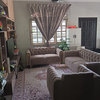
I have one of those big, open houses with family room adjoining kitchen. The family room is painted in Behr "Juicy Fig" PMD-67...a dark olive green color. It has a 2-story fireplace with rust colored stones. And large 2-story purple curtains. I was going for a triadic color scheme in the family room.

The adjoining kitchen has light maple cabinets and a crazy pinkish/orange countertop. The floors are going dark brown wood-look porcelain later this week.

I have tried a neutral gray(with blue undertones..."Dolphin") in the kitchen...it looked horrible. I tried a soft green (Martha "Garden Shed").. .it looks bad.

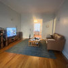
Attached is a picture...edited in the Behr helper with a soft green yellow yuk. (and my angry wife on the couch...lol).

According to Behr's site, "New Penny" will provide a match to my juicy fig? Seems kinda bold. Hopefully the picture will give you an idea. Help...PLEASE!

Thank you all!

Comments (20)

  • 13 years ago

    On the Juicy Fig color strip....can you go up to one of the lighter shades?

  • 13 years ago

    Maybe....Juicy Fig is a weird color. The next shade up is a green (Fossil Butte), then it moves to orangey peach. So I guess I could go up one. I have read about people adding white to their paint to lighten up the hade, perhaps I can search around for that technique. Thanks.

  • 13 years ago

    Going up a notch or two on a color swatch does not work with all manufacturers. It does work with BM color preview.

    The wall color looks very similar to BM savannah green, at least it does on my screen.
    {{!gwi}}

    So if you want to go up a few shades, you'd be looking at BM pale celery
    {{!gwi}}

    Or BM Hampton Green
    {{!gwi}}

    But my selection may not be right as I'm not in the room. Try to find the BM match to your wall and then you can go a few shades lighter. It should work nicely with the cabinetry.

  • 13 years ago

    The combination of New Penny and your drapes would be too much, I think.

    On the Behr site, there were several combinations. Look at Ryegrass since you were going in a green direction, anyway. Also Pebble path for a warm tan. Phantom Hue is a purple that will carry the drapery color into the kitchen.

  • 13 years ago

    Thank you for the thoughts. I worry about tan with the orangey/yellow cabinets? I proposed the lighter green to my wife and she said "too much green". She seems to want Smoked oyster, but I really don't want gray in there As for phantom hue, we tried a grey with blue undertones...almost periwinkle and it looked really bad. Maybe that was an issue matching the curtain hue? .Here's smoked oyster...

  • 13 years ago

    Did you use the color viewer? It's not real life, but Smoked Oyster is looking blue.

    Are you worried that your cabinets won't stand out with a tan? Using a color similar to the cabinet tone will blend everything. Using blue or purples will make the cabinets stand out. I guess we need to know what your goals are. Your Fig is really bold. Wimping out on saturation in the next room may be the problem.

  • 13 years ago

    If you don't want juicy fig in the whole kitchen, I would at least paint it on the window wall by the table. Then it would bring the color into the kitchen area but wouldn't be as much of it as doing the whole kitchen. Then select one of the coordinating colors for the other walls.

    Or maybe doing the fig on the cabinet wall might help blend the cabinet with the family room colors better and do something different on the window wall.

  • 13 years ago

    I really do not like the smoked oyster color with your family room color, it looks all wrong. What about Mascarpone a warm white that goes with many other colors, or just paint the kitchen the same "juicy fig" color but perhaps lightened a shade or 2 if you want it to be lighter? The rooms are so open to eachother it would be more cohesive to stick to the same color.

    This post was edited by tinan on Wed, Jun 26, 13 at 0:08

  • 13 years ago

    On screen, the smoked oyster looks to have a pinkish undertone which will not look good with your cabinetry.

  • 13 years ago

    Using Annie's thought that your Fig color looks like Ben Moore's Savannah Green, I have put a link below of some colors that BM says look great with it.

    Hmmm, two of them are pinkish!

    Here is a link that might be useful: GOES GREAT WITH...

  • 13 years ago

    Wow...lots to think about here! I think that's the issue, so much saturation in the Family room, and the kitchen is washed out. I think we will try to bring the saturated green into the kitchen on a small bit, then use either behr raffia cream or BM manchester tan.... We also have the little nook you can see through the open doorway where we want to do the dramatic purple...scary!

  • 13 years ago

    Funny, I don't see any pink in the "goes great with".

  • 13 years ago

    Match the color of the purple curtains -- and paint the kitchen in that tone. Really! :)

    The deep rich tone will create visual balance between the strong wall color of the family room; the black-and-silver tones of the appliances -- as well as the tones in the backsplash ....

    Add lots of silver accents throughout the whole space ....

  • 13 years ago

    If I loved the living room color, I'd totally do what Teacats suggested. POW! COLOR!

  • 13 years ago

    Annie, I was on a different PC this AM when I posted it. The one I'm on now shows all of the colors looking totally different than what the smaller monitor showed this AM. There was definite pink on the laptop monitor, and now they have a yellow tone tone on this one.

  • 13 years ago

    Side technical note...I hear monitors with IPS (In Plane Switching) will represent colors most accurately. Occasionally I will see a 24 inch IPS monitor at Dell for $300...check Slickdeals to find one on sale.

    OK...back to my quest.... I picked up a gallon of BM Manchester Tan this afternoon and put it on the walls near the window. I think this may be the winner... I also have some gold/yellow in my ottoman (large for the kids) and a couple pillows.

    Check this pic and let me know what you think.

  • 13 years ago

    At least on my monitor screen, Manchester Tan looks good with the kitchen and family room elements and blends nicely with the darker shade. Go for it.

  • 13 years ago

    In order to calm down the orange of the cabinets you have to use a color opposite on the color wheel which, in my opinion, could be a georgous pale aqua that would draw the eye to that color instead of the orangey yellow. It would also go with all the other tones. Perhaps BM quiet moments or ever deeper. Google kitchen with aqua paint and see what images come up that may suit your fancy.

  • 13 years ago

    Manchester Tan
    {{!gwi}}

    It's really hard to tell from the pic as in the pic the walls look almost yellow vs. a soft beige for manchester tan.

    If IRL it looks like the swatch above, I think it's a fine color.

  • 13 years ago

    Yaya, complimentary colors promote maximum contrast. The orange cabs would stand out against an aqua as opposed to analogous scheme which would blend them.

    Rich, the light from the fixtures is making it look yellow so I can't really tell. A natural light picture would give us an idea, but as long as you and your wife like it I say it's a winner! Glad you got it solved :)