Software
Houzz Logo Print
riff3

dining room updating/decorating help needed!

14 years ago
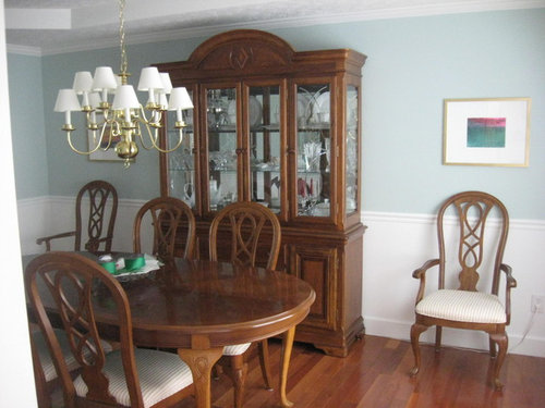
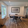
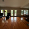
I have updated my dining room with new paint (SW Copen Blue), wood floors and white linen blend (PB) curtains. Have seen many blue and green dining rooms that I admire. Will not be replacing or painting my current dining room set (I know sets are 'out' but I already own it and am on a budget). How can I further update the room without changing the existing furniture?

I have ideas but then I get overwhelmed and give up on the whole thing! Questions I have:

1. Rug for under table - would sisal/seagrass be good, to reduce the formality of the dining room or would this be out of place?

2. Putting a small desk to the right of the china cabinet for my laptop - cannot decide between a vintage writing desk from craigslist painted a bright green to add color? Or the West Elm parsons white laquer look desk to make the room more modern?

3. Reupholstering the chairs - what fabric? Solid green, trellis green, or a white linen?

4. Want to add green ribbon to the drapes, but my trial experiment with iron on tape and the ribbon didn't go to well, and I don't want to ruin the drapes!

5. Light fixture that is less formal but budget friendly?

6. I have 2 abstact paintings from Etsy framed in gold, but any other ideas for the walls?

Hope this wasn't too long, thanks for any suggestions! I think the start of the room is there, but it needs color and pattern help.

Riff

Thanks for any help

Comments (22)

  • 14 years ago

    Additional shot of the curtains with the green ribbon sample.

  • 14 years ago

    You have a pretty, nice sized room! I have a seagrass rug bound in black in my dining room, and I think it helps to tone down the formality. I also have a similar chandelier that I painted with flat black spray paint so it looks like wrought iron. It was meant to be a temporary fix until I could find a chandelier I liked. 10 years later I'm still happy with it! The mini shades are silk and have some texture (They're either pleated horizontally or have some stitching - I can't remember and am too lazy to get up and go look.) and beading on the edges. I would reupholster the chairs in a less formal fabric - maybe some sort of print.

  • 14 years ago

    Seagrass is very hard to live with in a dining room - very hard to clean food out of it, and it stains like mad when one of your dear friends has an "oops!" moment with the red wine...

    Look into the newer indoor-outdoor rugs for your dining room. There are a lot of natural patterns and colors, and the good ones look wonderful and are a snap to care for. They're also very low-profile, so moving chairs around on them is really easy. Choose one that is big enough that when people are sitting in the chairs, the whole chair is still on the rug.

    To give that zing to your lovely room, I would suggest a bright white and Kelly green large trellis pattern on your chairs, with a 15-18" wide runner in the same pattern that ends in a point, and drapes over the ends by about 12" for your table. Then I'd put a big chinese porcelain bowl in the middle of the table.

  • 14 years ago

    I love the idea of a green and white trellis pattern to match your green trim! Can you have a seamstress add the green ribbon to the cutains for you?

    I've had seagrass in my dining room for 10 years and have never had a problem. Maybe my friends are just particularly careful and don't spill?

  • 14 years ago

    I would get get rid of the brass light fixture and picture frames as they look very dated with the dining room set. If your budget doesn't afford for new-- break out the oil rubbed bronze or brushed nickel spray paint. Also, I think the green ribbon trim is too dark and harsh against the white curtains and wall color.

  • 14 years ago

    I love the wall color...it is so soft, I wouldn't want to mix it with kelly green like in the ribbon you've chosen or in most lattice patterns I've seen. I'd keep the color palette soft throughout. I can see picking up on the rose tones in the art work on the wall.

    {{!gwi}}

    Yes change out the light fixture to something in satin nickel. An area rug would be nice also.

  • 14 years ago

    I see Annie's point - I'm always hesitant to use rose with furniture in that color range, however, because it can make the wood look too orange. But a faded brick color mixed with a leafy green headed toward olive, and a shot of navy blue, might work?

    What do you think, Annie? You have such a good eye.

  • 14 years ago

    Thanks for all the comments, I appreciate them! The light fixture is dated, it is 16 years old. But I just sprayed the frames gold! I think gold/aged brass (not the shiny 90's brass) is making a comeback, but not everyone agrees! I do like mixing metals and will look at satin nickle light fixtures.

    The wood is very orange toned and I would like to play that down. DR was burgundy before which did nothing for the orangey wood. The rose and blue is very pretty, but I'm not sure it is me. Going with blue is already a big leap for me, I've always been a green girl.

    It seems many don't like the kelly green, but I'm still attracted to it. I am weighing all options and appreciate all the ideas! I love the idea of the chinese porcelain bowl for the table too.
    Riff

  • 14 years ago

    Here's a possible inspiration photo from Phoebe Howard's amazing website -- LOTS of photos there ....

    I do like the touch of brass in the photo frames -- and if you do keep the brass chandelier -- add green ribbon to the edges of the shades.

    Perhaps post a few more photos of the other sides of the room -- so we can really "see" where a desk might fit into your decor ....

    Here is a link that might be useful: Phoebe Howard inspiration photo

  • 14 years ago

    Here's another dining room from Phoebe Howard ....

    Here is a link that might be useful: Another room from Phoebe Howard

  • 14 years ago

    I too think that the green you've chosen is too intense. If you do add green, go for a muted tone or softer tone.

  • 14 years ago

    There is something refreshing about a touch of clear green, and I think the decision point for you is, do you prefer the pale, misty quality of the Phoebe Howard rooms (drool!) or are you looking for a bright, youthful touch to enliven the place?

    I agree that the green in your ribbon is too dark. Although I said Kelly, I had something brighter and more tropical, with more yellow in it, in mind.

    You might also consider coral and white, also with a touch of navy blue. You can find lovely coral colors that are either bright or soft, if that appeals.

  • 14 years ago

    How about these colors? This is just an example ....

    Here is a link that might be useful: example of colors in fabric ...

  • 14 years ago

    Perhaps this color?

    Here is a link that might be useful: another example of possible color

  • 14 years ago

    Maybe this one?

    Here is a link that might be useful: House Beautiful -- green dining room

  • 14 years ago

    It appears I have much to think about. The ikat fabric is lovely. I had envisioned a bright fresh green, but all seem to think I'd be better with more muted. Does it change things to know the kitchen near the DR is yellow with white beadboard? The rest of the house is SW latte.

    The Mrs. Howard photos are fabulous (everything she does is). But my 90's tract home and small budget don't compare. Thanks for all the ideas!

  • 14 years ago

    I love your dining room and your dining room set! I like having a place for the family to have a quiet dinner.

    I share your fondness for the blue and white look. I think with the soft blue above and the white below, you could go with a chair fabric in a navy range, maybe in a lattice. This is a fabric I chose recently, but our dining room is part of the kitchen and that door opens to the garage. The general colors are similar though:

    Think how different it would be if you choose a lattice pattern or a stripe than if you went with a floral/botanical in essentially the same color range. I hadn't intended that entry mat to be part of the color scheme in the photo, but now that I look at it, a dark rug under your table is a possibility. Not black, but dark, and probably not a solid - it would show every speck.

    I'm not getting how the drapes fit into the room. The green stripe just seems not to go at all, but it must (even if not perfect) or you wouldn't have gotten as far as trying it out. Could you post a picture that shows how the drape wall fits into the rest of the room?

  • 14 years ago

    I have attached an inspiration photo from a decorating blog (sorry don't remember which one). This is the soft blue and kelly green that I was looking for.

  • 14 years ago

    Another inspiration photo from a blog.

  • 14 years ago

    I'm not always a fan of china cabinets, but I love yours. The detail on it is lovely. Would you consider spraying it white? Or perhaps painting the table white? It would soften the room to match the soft paint and trim colours.

  • 14 years ago

    You should go with your gut if you want to do kelly green with the light blue because you like it guess what You will like it.(Pink and Orange would never be put together years ago and now it is everywhere) I thought kelly green would be hard to find because of trends and stuff but here is a link that has a few http://www.spoonflower.com/spelunks?type=&q=kelly+green+&x=18&y=11 (cleo kelly is my fave)but Hollywood trellis and chevron are nice as well I'd be inclined to put a lighter table runner on to break up the darkness of the wood. Don't forget the finished pics once you decide.

  • 14 years ago

    Ah, now I see how the green comes in. Maybe the trick is that you have to have more green than just on the drapes, like the bedroom photo that repeats the green on a chair and bed pillows trim. (I see that green ribbon on the table pretending it's a centerpiece!) Another suggestion would be to get a series of green paint chips from the paint store and try out different shades of green to go with your particular blue. You won't be able to find a fabric that perfectly matches a paint chip, but you should be able to get in the right range. I love the kelly green, but maybe something more towards the olive in the LR photo would be better in your room. Then try the curtain stripe one more time and see how you like it with a slightly different color choice.