Software
Houzz Logo Print
hzdeleted_9268002

90% done master bath - need paint.........

16 years ago
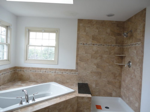
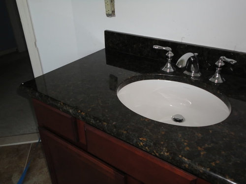
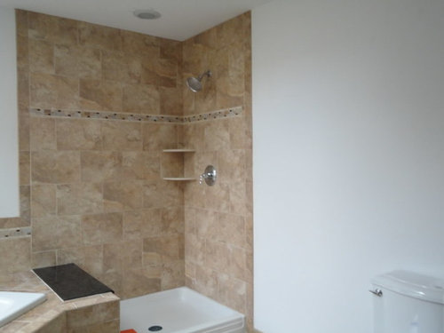
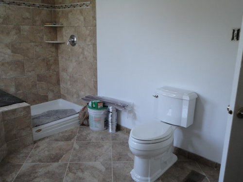
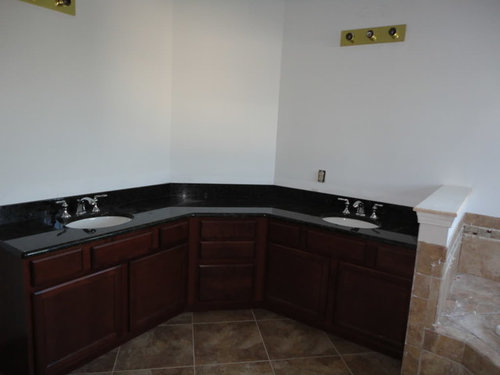
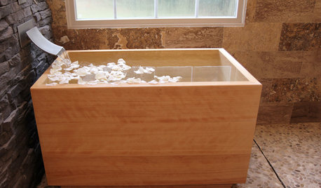
What a difference a few days make. The master bathroom is moving along quite nicely- the tiling is all done, fixtures are in-- and they are painting tomorrow. So I am sharing my photos and would love any feedback. I honestly think that off white/tan/beige is the way to go. I have very strong colors in the granite/tile/wood.

I really am super pleased and excited about this room. To be totally honest,the granite "seat" in teh shower doesn't thrill me but I am lovin everything else and I know once the doors etc go in, it won't look so glaring to me.

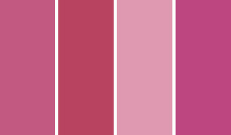
So here's the room- and the paint choices I am considering. (lol I will be deciding first thing in the morning so if you have any opinions- opinion away)

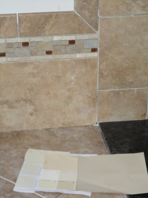
I love the border which I picked out last minute as an afterthought. love it.


some paints with tile/granite/border ( I am thinking I like the bottom left square of paint?)


The lights will be centered and no those are not the new lights.

Comments (13)

  • 16 years ago

    The bottom left is biscuit (SW)
    Above that is navajo white (SW)
    Above that is Eaglet Beige
    Middle column bottom row hepplewhite ivory(BM)
    Above that is october sky (BM)
    Above that Caien Stone SW
    Third column bottom powel bluff bm
    above mystic beige

    I know they're all so similar- does one jump out as superior?

  • 16 years ago

    I'm also liking biscuit.

    Laurie

  • 16 years ago

    I painted a dark bedroom Hepplewhite Ivory and it was very yellow, almost a lemon yellow. I ended up painting over it.
    I kind of like powell bluff. Don't know how accurate the color is on my monitor.

  • 16 years ago

    I have BM Putnam Ivory in my bathroom and it looks similar to what you are describing as Biscuit.

  • 16 years ago

    Thanks- the powell buff ( not bluff as I originally mis-typed) in person seems a bit too dark and brown. I do get lots of light in this room but I am finding that paint is typically slightly darker in My real life than from how I interpret it from the chip.
    Thanks for the feedback about the yellow undertones in Hepplewhite as that is a pretty color but yellow would not make me happy with that tile.........
    I do not think I have a chip of putnam ivory which I searched and does look quite nice but is darker than the biscuit. I am 99% sure I will go with the biscuit... going upstairs in a moment to do one final check. I am alittle concerned that biscuit might be too pale, but I think since ther is a good amount of richness of color in my other choices, less intense might be just fine.
    Oh the excitement.
    .. having the contractors all lined up is actually a good thing for me- as it forces me to make the decisions that I probaly would procrastinate over for months and then end up undecided or back to square one. I need to get on the program for my kitchen and family room which have been spackled and primed in parts for OVER 2 years. There I said it -
    do I win the procrastination/indecision prize?

  • 16 years ago

    Your bathroom is very nice. I find all your paint choices a bit too pale. But that might just be me.

  • 16 years ago

    I'm with lyban. I am a big believer in carrying the same saturation of color all the way around a bathroom, including the ceiling. I have pressed, cajoled, nudged and sometimes even bullied clients into doing that, and every time - really, every time - they say, "I would never have believed it, but we LOVE it."

    You have so many color choices in that tile, and the work so far is so good. I think a pale color will look as though you didn't finish the room. Remember that every apartment building paints bathrooms white or beige. Only in your own home can you express yourself there.

    A rich color would turn your windows into art on the walls, make your white appliances and trim stand out as elements, pull all your finishes together, and create a lovely cocoon for your daily ablutions.
    (I love an excuse to say "ablutions"...)

    The worst thing that can happen is, you don't love it, and you have to redo it. I encourage you to fling yourself out there and give it a try!

  • 16 years ago

    Well they didn't come on Friday so of course, I checked again. And, while I suspect that lyban and brownysmom are probably correct- that I need to use a stronger color, I don't want to overdo it and I am not as talented as you probably are.
    I was about set to go with biscuit which does pick up the nice nuances... but then of course I looked through my 59,007 paint strips and did in fact have putnam ivory-- which is indeed similar to the biscuit but a bit deeper and more intense (not really too intense but you know what I mean) and decided that is the one. I played around also looking at the LRV (light reflective/refractive? value) foro what its worth. So Putnam Ivory it will be.
    I really find these forums so helpful and I appreciate it so much.
    Now I have to decide on the cabinet hardware; deciding between pulls and knobs.This should bring up the whole page-- I think I like either the m1623 edwardian pull, or something like m1610 hudson knob.

    Well I just tried really hard to insert the link in this message............could not so here hopefully the old fashioned way works.

    Here is a link that might be useful: topknobslink hopefully

  • 16 years ago

    Wow...your bathroom is turning out great. I love all the angles. Looking forward to seeing it painted and the towels you select.

  • 16 years ago

    Another vote for the powell buff...........

  • 16 years ago

    Loos terrific! You know, our guest bathroom has similar colors--white fixtures and wall tile, noce/lt walnut travertine floor tile, and noce/white thassos/emperador dark accent/border tile. We use an Affinity/BM Aura color called Pensive. It looks very nice with all of the above (IMHO!). It's darker than the colors you're considering, but looks lighter than we'd originally thought it would.

    Pics wash it out but here's one to give you some idea how it looks:

  • 16 years ago

    If you paint your window trim white, I would suggest SW Softer Tan. Really makes the white trim and accessories pop.

  • 16 years ago

    Well, a happy ending-- I did go with the Putnam Ivory -and it looks wonderful. It is a definite tan/beige but not dark. I actually agree that I probably could have done darker, but I am pleased. I do have the white fixtures and white trim/window blinds etc so it shows nicely. And, DH who doesnt say much on color, commented what a good color it was in the room and why dont I consider it for the kitchen..ahem that is a huge compliment.
    The funny thing was I got a call yesterday at work from him saying the painter started and came to him to ask if it was the right color because it was so dark. He said it was a deep rust color? I said no way- it turns out somehow he had gotten BM HC49 instead of HC39 (putnam ivory).
    Got a good laugh about that one. I will take pictures shortly. The mirrors and lighting/towel bars and hooks are still not up.

    So I need to now finalize my hardware. I had posted it in the other post and no one commented on them.
    I think I have to decide today so here is what I am thinking. This is the pull, which I will probably use on all drawers and doors. But a piece of me is thinking that I might just use it on the drawers, and maybe do knobs on the doors? Any thoughts? hopefully before I have to let them know. If you click the link, it should bring you to the pull. Then if you put m1610 in the search box it should show the knob. I am really wondering if it would be good to mix and match or just do the pulls.
    And above is the layout of the vanity- 2 vanities each with 2 doors (3 fake drawers on top) and a bank of drawers that...

    Here is a link that might be useful: pull